

Tap the swatch to see it full screen. Hover it to magnify the weave. Colours on a screen are a guide, not a match, so come and feel the real cloth.
Scroll up or down to zoom in and out.
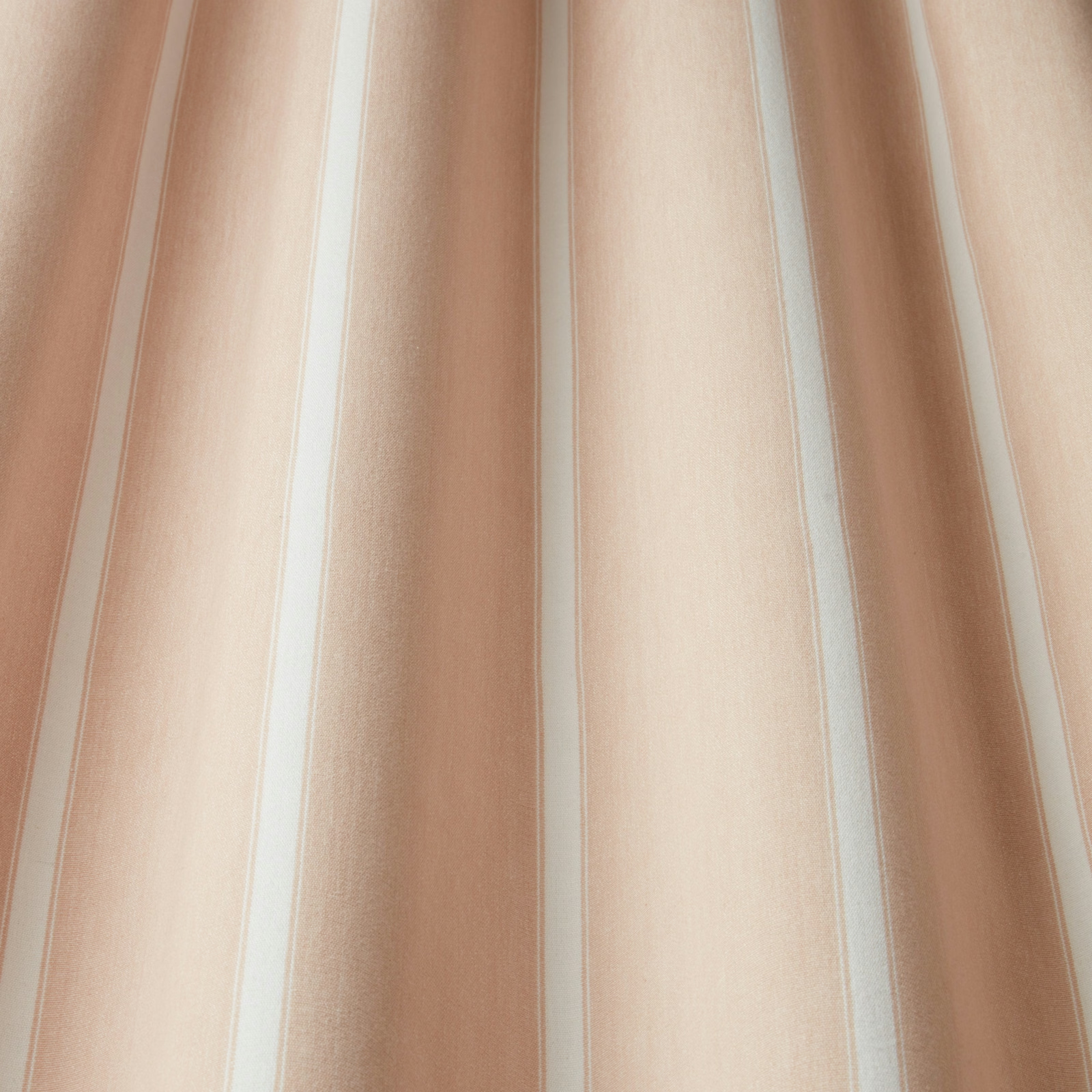
Portland Waterbury Rose Wavy
SS22 Images - Enchanted Garden, Geometrica, Water Meadow & Portland Fabric
Portland Waterbury Rose Wavy shows a soft, vertical stripe effect in warm rose beige, with creamy light bands between broader blush and tan-pink columns. The finish reads smooth and gently matt, giving the design an easy, airy feel.
You have used your previews for today. Send one to Simon and you can carry on.
Your board
0 fabrics
See this fabric on iliv's own site, then order it through us.
See Portland Waterbury Rose Wavy in your own room
A photograph of the piece you want re-covered. Straight on is best, and daylight helps. It is used to make your picture and nothing else.
Looking at your room
We found things here Portland Waterbury Rose Wavy could go on. Tap one on the photograph, or choose below.
We could not see anything to re-cover
, s
Portland Waterbury Rose Wavy, on your
Drag to compare. AI impression, colours indicative: ask us for a cutting before you decide.
About this fabric
Woven in 100% cotton, this Portland colourway combines broad flowing stripes with fine pale dividing lines for a soft wavy rhythm across the cloth. The 137cm usable width and 35cm horizontal pattern repeat make it straightforward to plan for curtains, cushions or light upholstery panels. With a 30,000 Martindale rub test and Heavy Domestic upholstery grade, it is a practical choice where you want a decorative look without sacrificing durability. The colour sits between blush, oatmeal and rose-tinted beige, so it feels warmer and gentler than a plain neutral while still staying restrained. It is treatable for FR drapery and upholstery, and the overall surface has a smooth cotton handle rather than a heavy texture.
How to use it
This soft rose-beige stripe suits relaxed schemes with linen, chalk paint and pale timber, especially where you want the room to feel warm rather than sugary. It also works well on statement curtains or a tailored occasional chair, where the vertical movement can subtly lift the space.
Use with pale woods and soft neutrals to keep the rosy stripes feeling light and airy.
More from SS22 Images - Enchanted Garden, Geometrica, Water Meadow & Portland
The same book, other colourways.
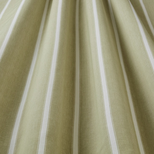
Portland Waterbury Olive Wavy
SS22 Images - Enchanted Garden, Geometrica, Water Meadow & Portland
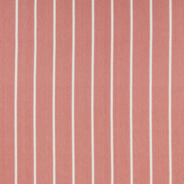
Portland Waterbury Raspberry Flat
SS22 Images - Enchanted Garden, Geometrica, Water Meadow & Portland
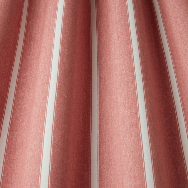
Portland Waterbury Raspberry Wavy
SS22 Images - Enchanted Garden, Geometrica, Water Meadow & Portland
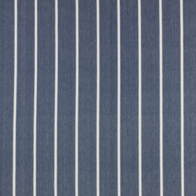
Portland Waterbury Riviera Flat
SS22 Images - Enchanted Garden, Geometrica, Water Meadow & Portland

Portland Waterbury Riviera Wavy
SS22 Images - Enchanted Garden, Geometrica, Water Meadow & Portland

Portland Waterbury Rose Flat
SS22 Images - Enchanted Garden, Geometrica, Water Meadow & Portland
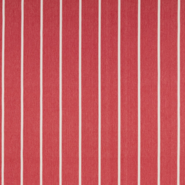
Portland Waterbury Rouge Flat
SS22 Images - Enchanted Garden, Geometrica, Water Meadow & Portland

Portland Waterbury Rouge Wavy
SS22 Images - Enchanted Garden, Geometrica, Water Meadow & Portland

Portland Waterbury Slate Flat
SS22 Images - Enchanted Garden, Geometrica, Water Meadow & Portland

Portland Waterbury Slate Wavy
SS22 Images - Enchanted Garden, Geometrica, Water Meadow & Portland

Portland Waterbury Stone Flat
SS22 Images - Enchanted Garden, Geometrica, Water Meadow & Portland
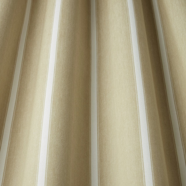
Portland Waterbury Stone Wavy
SS22 Images - Enchanted Garden, Geometrica, Water Meadow & Portland
Pairs well with
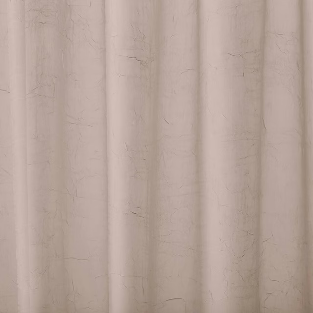
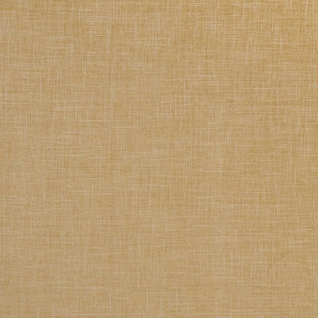
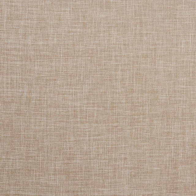
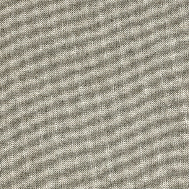
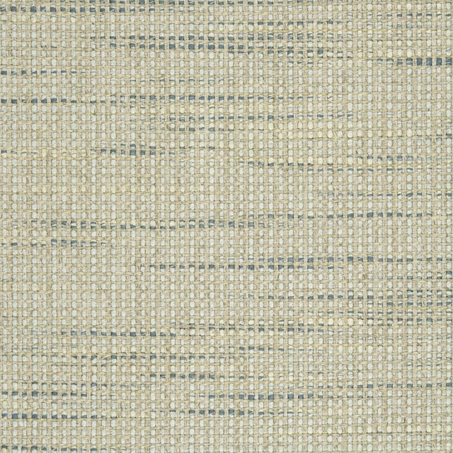
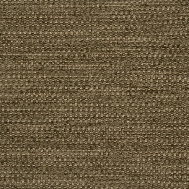
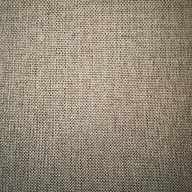
A pattern needs somewhere for the eye to rest, so these are the plains and textures that sit beside Portland Waterbury Rose Wavy without fighting it. Mixed across the houses we hold, which is the part a single supplier's book cannot do.




Paint that goes with it
Two ways to take the room. Both colours are from houses we hold, so a pot can come off the same order as the cloth. Screens shift colour, so treat these as a direction and bring the cloth to the shelf before you buy the paint.
To sit quietly behind it
Mochi
Little Greene · #bba593
To stand against it
Tuscan Red
Little Greene · #874535
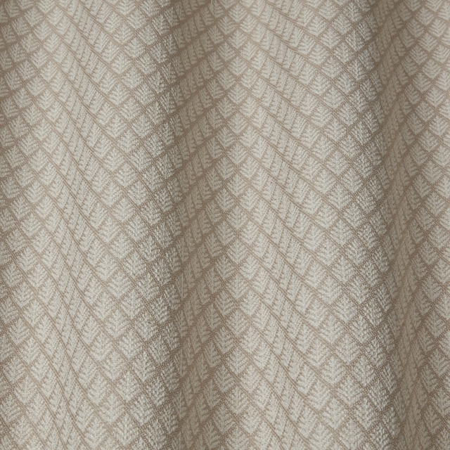
Other beige fabrics
Across the houses we hold. See all 4,485.
Jardine Florrie Stone Wavy
SS24 Images - Jardine, Luxoria & Orissa
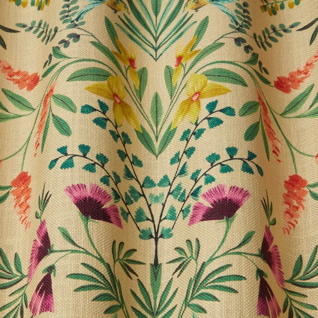
Jardine Melrose Wavy
SS24 Images - Jardine, Luxoria & Orissa
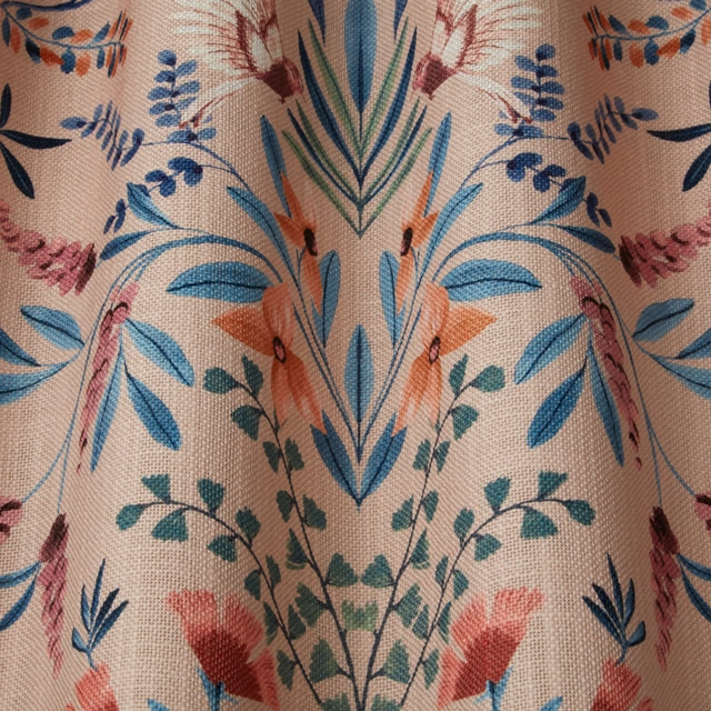
Jardine Rosa Digital Wavy
SS24 Images - Jardine, Luxoria & Orissa
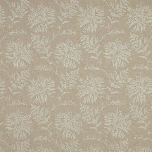
Jardine Seranita Stone Flat
SS24 Images - Jardine, Luxoria & Orissa
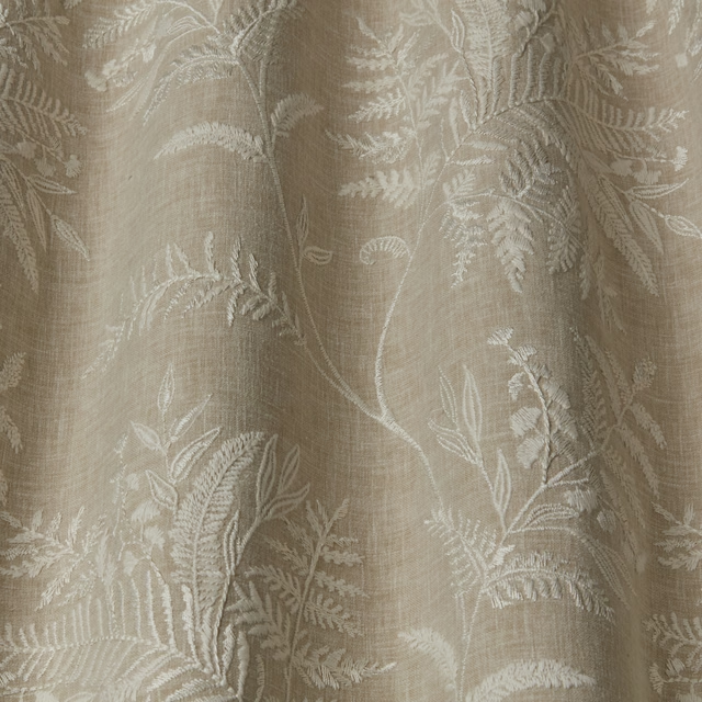
Jardine Seranita Stone Wavy
SS24 Images - Jardine, Luxoria & Orissa
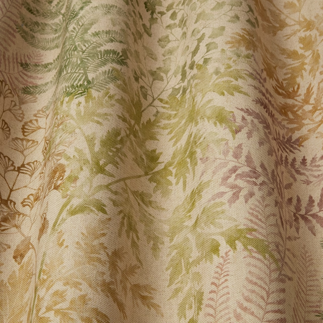
Jardine Sylvan Elm Wavy
SS24 Images - Jardine, Luxoria & Orissa
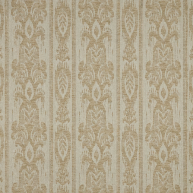
Jardine Vigneto Sandstone Flat
SS24 Images - Jardine, Luxoria & Orissa
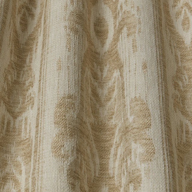
Jardine Vigneto Sandstone Wavy
SS24 Images - Jardine, Luxoria & Orissa
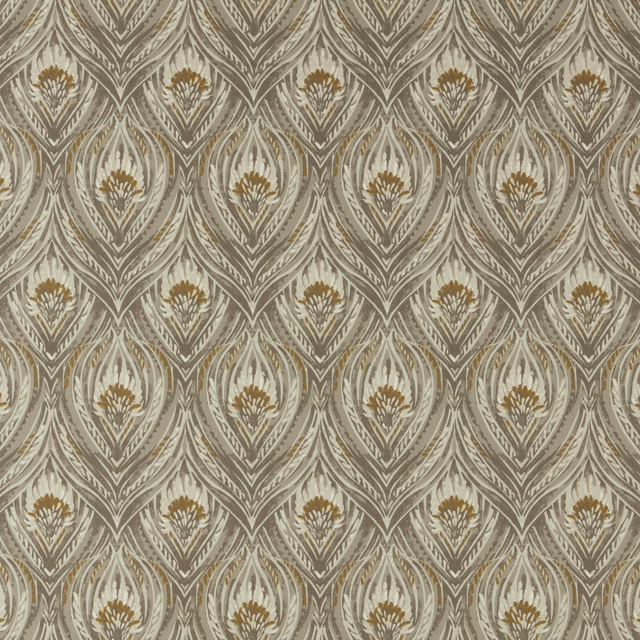
Luxoria Atticus Opal Flat
SS24 Images - Jardine, Luxoria & Orissa
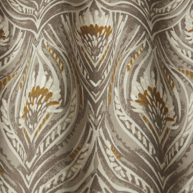
Luxoria Atticus Opal Wavy
SS24 Images - Jardine, Luxoria & Orissa
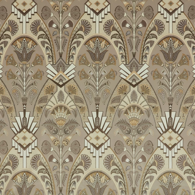
Luxoria Cabaret Opal Flat
SS24 Images - Jardine, Luxoria & Orissa
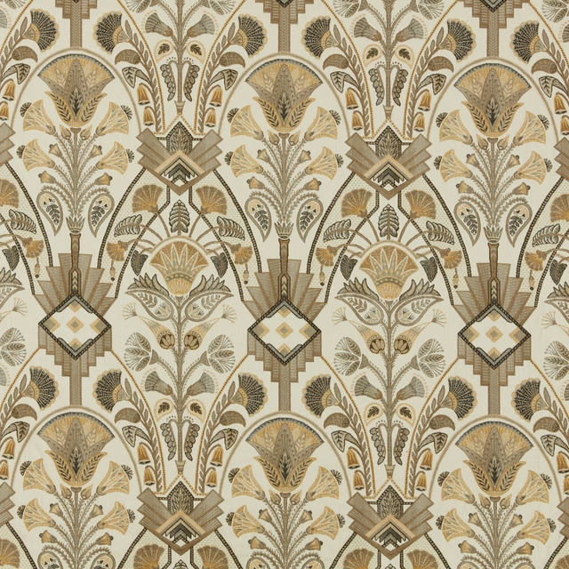
Luxoria Opal Flat
SS24 Images - Jardine, Luxoria & Orissa