

Tap the swatch to see it full screen. Hover it to magnify the weave. Colours on a screen are a guide, not a match, so come and feel the real cloth.
Scroll up or down to zoom in and out.
Brighton
Blues Paint
Brighton is a light, sea-washed blue with a clear green note, softened enough to sit quietly on a wall. In Little Greene’s Blues range, it feels airy rather than icy.
You have used your previews for today. Send one to Simon and you can carry on.
Your board
0 fabrics
See this colour on Little Greene's own site, then order it through us.
See Brighton in your own room
A photograph of the piece you want re-covered. Straight on is best, and daylight helps. It is used to make your picture and nothing else.
Looking at your room
We found things here Brighton could go on. Tap one on the photograph, or choose below.
We could not see anything to re-cover
, s
Brighton, on your
Drag to compare. AI impression, colours indicative: ask us for a cutting before you decide.
About this colour
At #BFD5CB, Brighton reads as a pale, cool-leaning blue-green that lifts light without turning stark. In north-facing rooms it can look a touch more muted and greyed, with the green undercurrent becoming gentler; in south-facing light it feels fresher, clearer and more distinctly blue. It sits well beside natural oak, painted joinery in off-white, and upholstery in chalky neutrals, linen shades and muted navy. On woodwork it gives a crisp but softened edge, and on walls it has enough colour to feel considered without crowding the room.
How to use it
Brighton suits bedrooms, bathrooms and calm living spaces, especially where pale timber or white-painted woodwork is part of the scheme. It works neatly with oatmeal, stone and denim-toned upholstery, and with curtains in washed neutrals or understated blue patterns.
A light blue-green like Brighton will keep a room feeling open while still giving the walls some colour.
More from Blues
The same book, other colourways.

Bone China Blue - Pale
Blues

Bone China Blue - Mid
Blues

Delicate Blue
Blues

Air Force Blue
Blues

Marine Blue
Blues

Pale Wedgwood
Blues

Bone China Blue - Faint
Blues

Celestial Blue
Blues

James
Blues

Grey Stone
Blues

Pale Lupin
Blues

Juniper Ash
Blues
Pairs well with
Brighton is a wall colour, so these are the cloths that sit against it: one of them on the curtains, the paint behind. Mixed across the houses we hold, which is the part a single supplier's book cannot do.
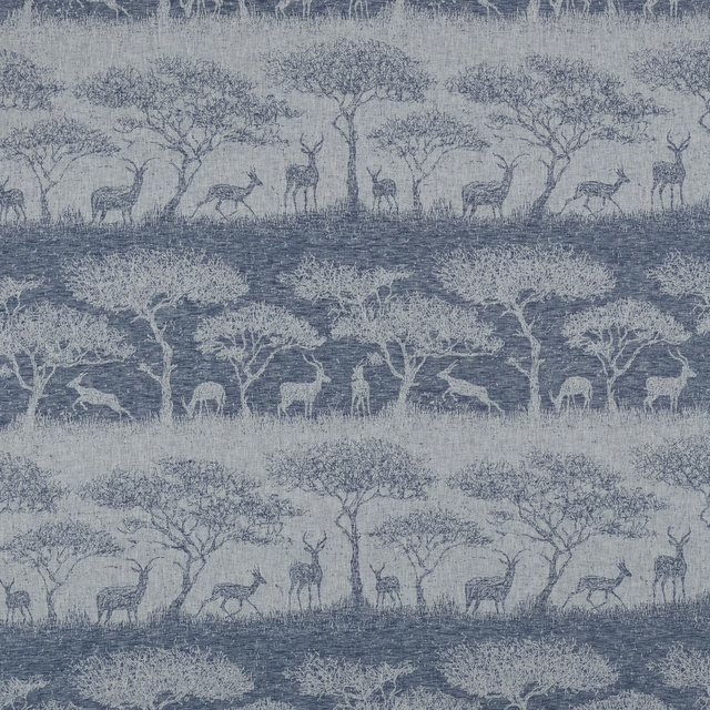
Hastings Danube
Belvoir Collection
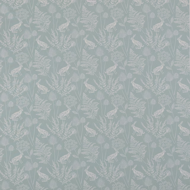
Kielder Seafoam
Belvoir Collection
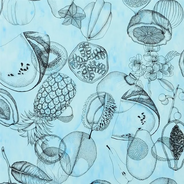
Agua Parati Celadon Wallpaper
Nouveaux Mondes WALLPAPER
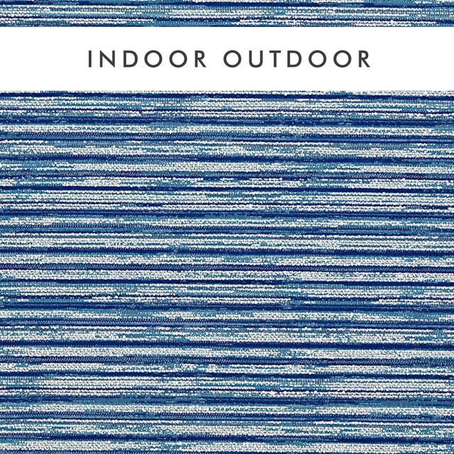
Waikiki Cobalt
Alfresco Indoor Outdoor Weaves
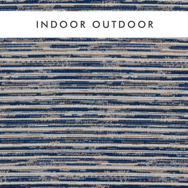
Waikiki Midnight
Alfresco Indoor Outdoor Weaves
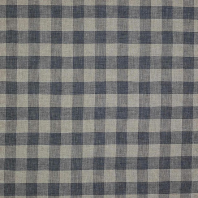
Appledore Check Blue
Appledore
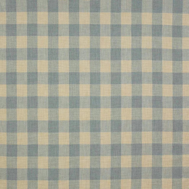
Appledore Check Old Blue
Appledore
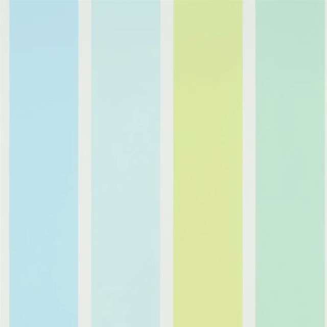
Fun Fair Stripe Aqua
Around The World WALLPAPER
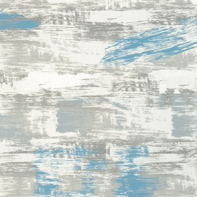
Sofiero Turquoise
Borgholm Fabrics
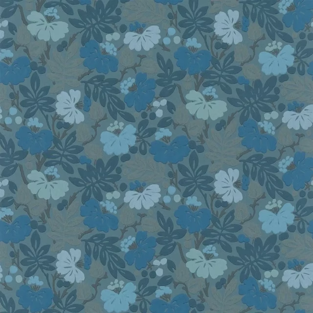
Carlisle Fauna Woad
Heritage Wallpaper
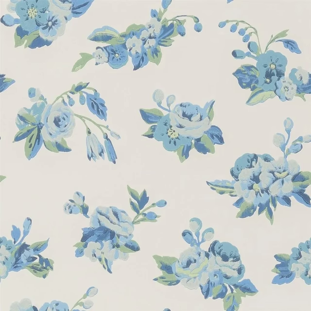
Craven Street Flower Delft
Heritage Wallpaper
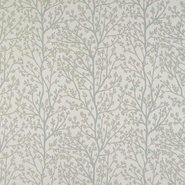
Ashley Duck Egg
Acacia
Other blue fabrics
Across the houses we hold. See all 7,566.
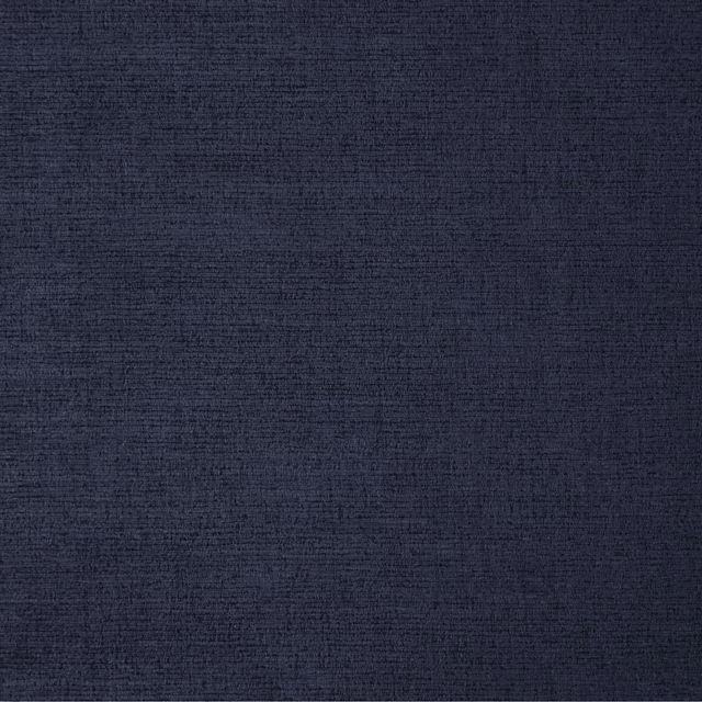
23 Midnight
Ballantrae
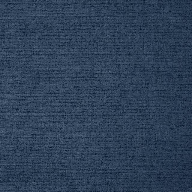
24 Indigo
Ballantrae

Smalt
Whites

Echo
Pastels

Drizzle
Pastels

Lodden Embroidery Indigo
Kelmscott Gardens Vol II
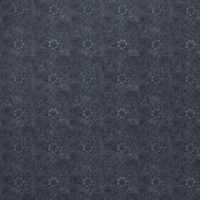
Marigold Velvet Indigo
Kelmscott Gardens Vol II
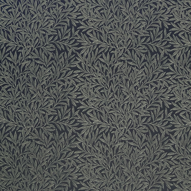
Willow Woven Indigo
Kelmscott Gardens Vol II
Alorain
Paloma Collection
Enya Indigo
Paloma Collection
Remiin
Paloma Collection
Mallory Indigo
Paloma Collection