

Tap the swatch to see it full screen. Hover it to magnify the weave. Colours on a screen are a guide, not a match, so come and feel the real cloth.
Scroll up or down to zoom in and out.
Pale Lupin
Blues Paint
Pale Lupin by Little Greene is a quiet blue with a greyed edge, softened enough to feel settled rather than bright. It sits in the Blues family with a calm, slightly dusky presence.
You have used your previews for today. Send one to Simon and you can carry on.
Your board
0 fabrics
See this colour on Little Greene's own site, then order it through us.
See Pale Lupin in your own room
A photograph of the piece you want re-covered. Straight on is best, and daylight helps. It is used to make your picture and nothing else.
Looking at your room
We found things here Pale Lupin could go on. Tap one on the photograph, or choose below.
We could not see anything to re-cover
, s
Pale Lupin, on your
Drag to compare. AI impression, colours indicative: ask us for a cutting before you decide.
About this colour
At #6C7892, Pale Lupin reads as a cool, subdued blue with enough grey in it to stop it feeling sharp. On a wall it lifts light gently without going chalky, giving a room colour and depth at the same time. In a north-facing room it will feel more restrained and steelier, while in south-facing light the blue comes forward a little more and the grey note softens. It works well beside pale oak, walnut, and painted woodwork in off-white, and it sits comfortably with linen, wool, and patterned upholstery in muted greens, taupes, and deeper indigos.
How to use it
Use it in a sitting room, study, or bedroom where you want a calm blue backdrop that does not overpower the furniture. It pairs especially well with natural timber, cream-painted joinery, and upholstery in moss, stone, or faded navy.
A muted blue on the wall that feels cooler in north light and softer in south light.
More from Blues
The same book, other colourways.

Marine Blue
Blues

Pale Wedgwood
Blues

Bone China Blue - Faint
Blues

Celestial Blue
Blues

James
Blues

Grey Stone
Blues

Juniper Ash
Blues

Etruria
Blues

Sky Blue
Blues

Blue Verditer
Blues

Tivoli
Blues

Mazarine
Blues
Pairs well with
Pale Lupin is a wall colour, so these are the cloths that sit against it: one of them on the curtains, the paint behind. Mixed across the houses we hold, which is the part a single supplier's book cannot do.
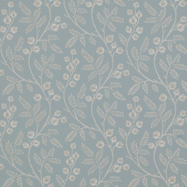
Morrigan Wallpaper Old Blue
Small Design W/Papers
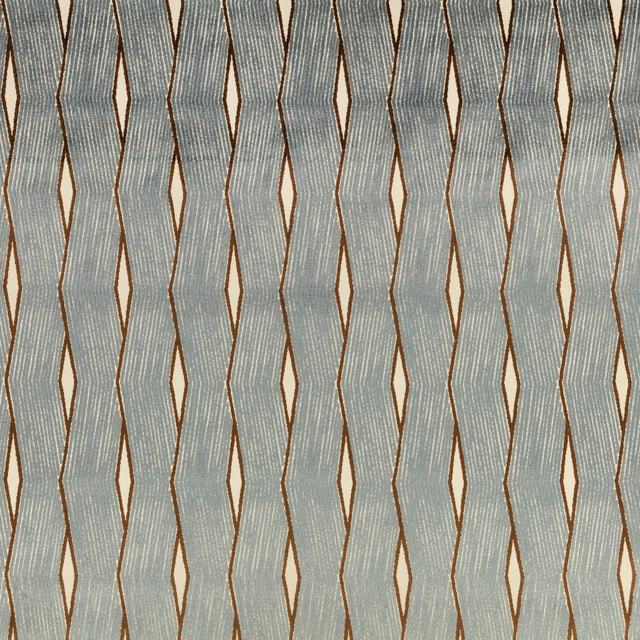
Zephi Blueberry
Zephi
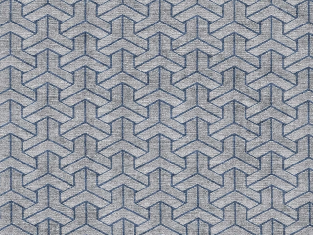
ACC3120
Accento
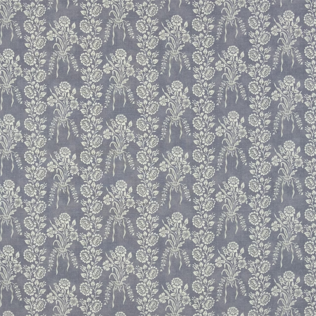
Amandine Iris
Exmere Fabrics
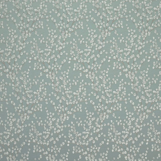
Berkeley Mineral
Caversham Collection
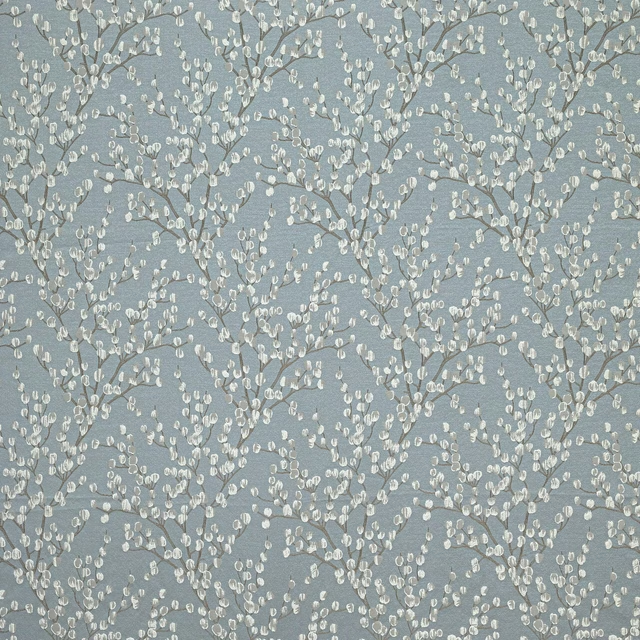
Berkeley Wedgewood
Caversham Collection
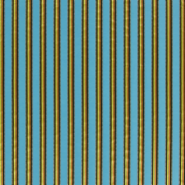
Grenadine Lagon
Carnets Andalous Fabrics
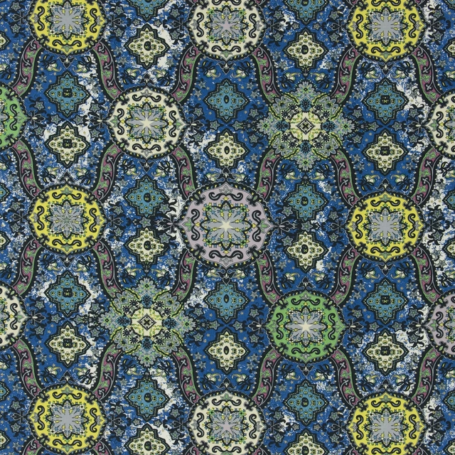
Wild Palms Cobalt
Carnets Andalous Fabrics
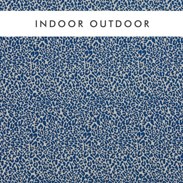
Arcata Cobalt
Alfresco Indoor Outdoor Weaves

Cameron Cobalt
Alfresco Indoor Outdoor Weaves
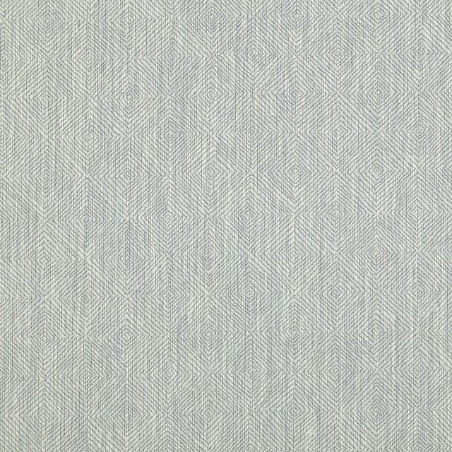
Albeck Aqua
Albeck
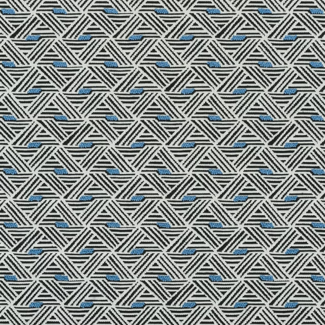
Ganton Cobalt
Berwick Fabrics
Other blue fabrics
Across the houses we hold. See all 7,566.
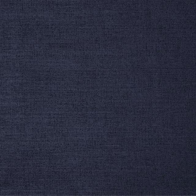
23 Midnight
Ballantrae
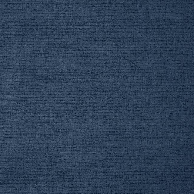
24 Indigo
Ballantrae

Smalt
Whites

Echo
Pastels

Drizzle
Pastels

Lodden Embroidery Indigo
Kelmscott Gardens Vol II
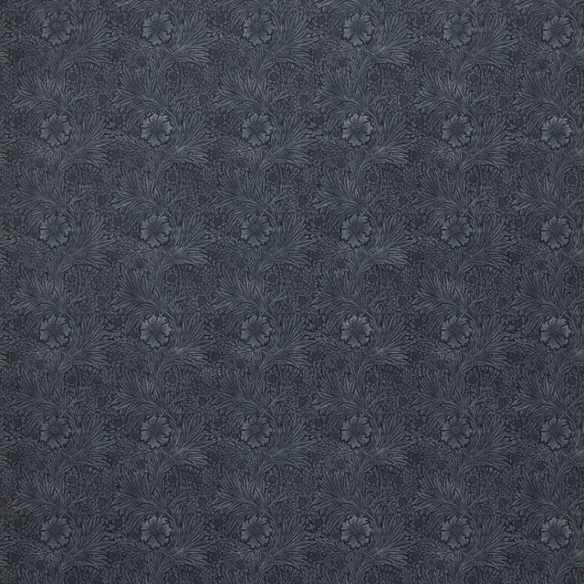
Marigold Velvet Indigo
Kelmscott Gardens Vol II
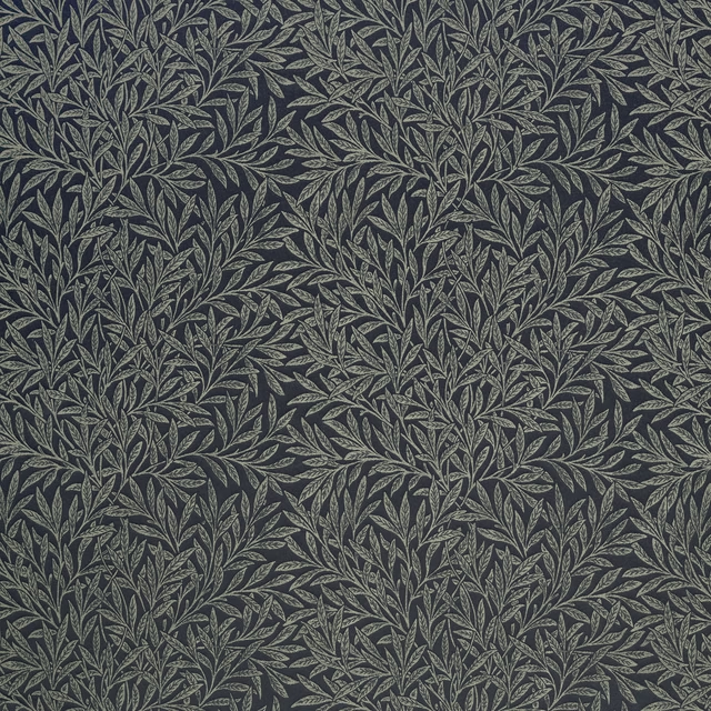
Willow Woven Indigo
Kelmscott Gardens Vol II
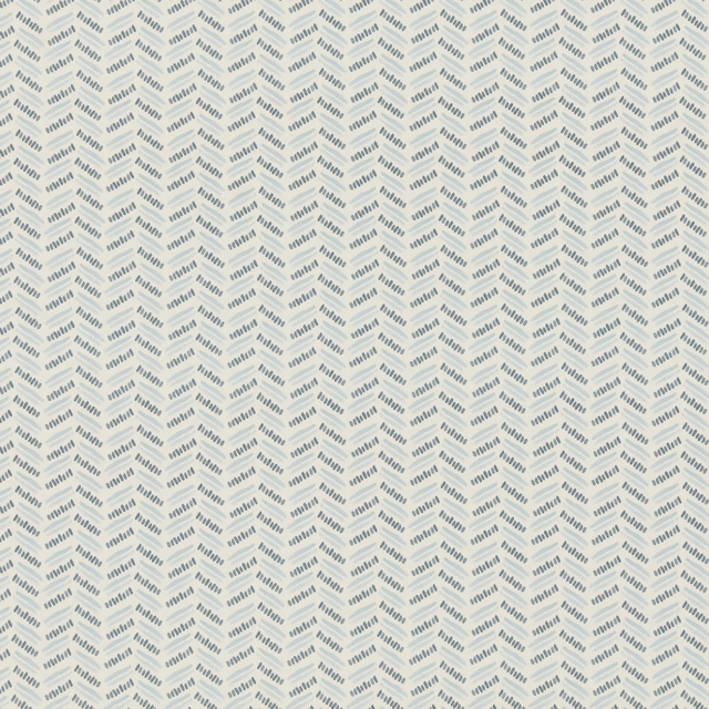
Alorain
Paloma Collection
Enya Indigo
Paloma Collection
Remiin
Paloma Collection
Mallory Indigo
Paloma Collection