
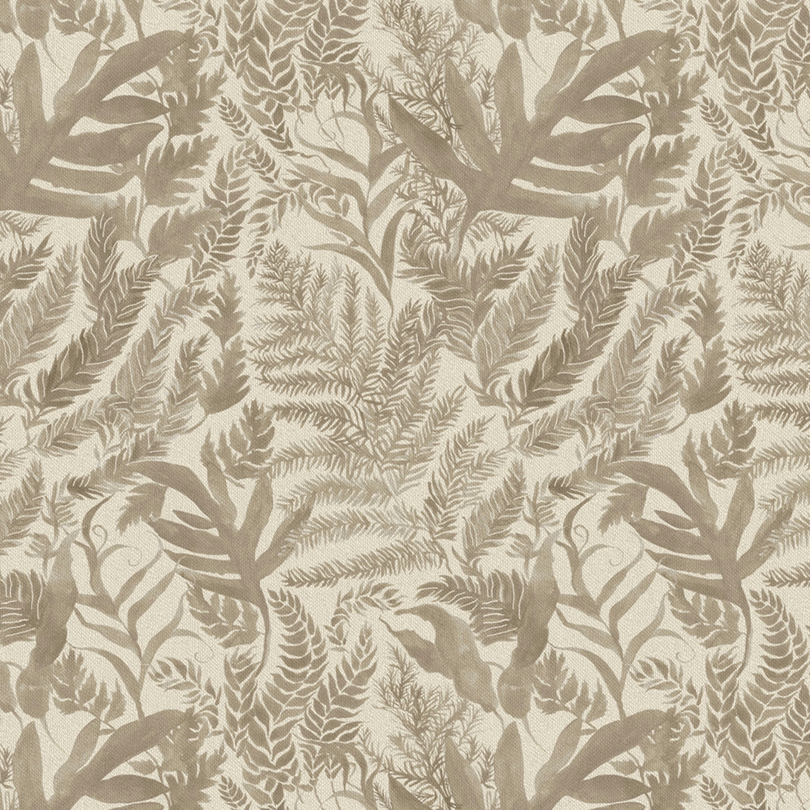

Tap the swatch to see it full screen. Hover it to magnify the weave. Colours on a screen are a guide, not a match, so come and feel the real cloth.
Scroll up or down to zoom in and out.
Bracken Jasmine
Bracken Fabricbracken/fa1/jas
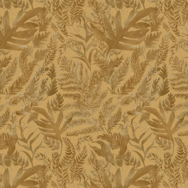
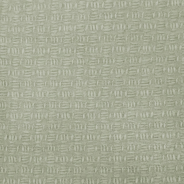
Bracken Jasmine shows a layered botanical design in warm cream and taupe tones, with the leaves and fronds blending softly into the woven ground. The overall effect is natural and quietly decorative rather than sharp or high-contrast.
You have used your previews for today. Send one to Simon and you can carry on.
Your board
0 fabrics
Part of the range we hold from Voyage Maison.
See Bracken Jasmine in your own room
A photograph of the piece you want re-covered. Straight on is best, and daylight helps. It is used to make your picture and nothing else.
Looking at your room
We found things here Bracken Jasmine could go on. Tap one on the photograph, or choose below.
We could not see anything to re-cover
, s
Bracken Jasmine, on your
Drag to compare. AI impression, colours indicative: ask us for a cutting before you decide.
About this fabric
Woven in 95% cotton and 5% linen, this 230gsm fabric has the reassuring body of a versatile decorative textile while still feeling light enough for window treatment and upholstery accents. The usable width is 138cm, with a 34.5cm horizontal repeat and a 48.69cm vertical repeat, giving the foliage pattern a generous, repeating sweep across the cloth. In this Bracken Jasmine colourway, the botanical motif sits in muted beige-taupe outlines over a pale cream ground, so the design reads as earthy and understated rather than bright. Dry clean only and iron safe, it is well suited to curtains, blinds and soft furnishings where its soft tonal contrast can be appreciated.
How to use it
Use Bracken Jasmine in rooms that already lean natural and calm, where its creamy ground and subdued taupe leaves can soften timber, stone and linen textures. It works especially well for relaxed curtains or Roman blinds in light-filled spaces that need pattern without visual heaviness.
A soft neutral leaf pattern that brings gentle warmth without overpowering a room.
More from Bracken
The same book, other colourways.
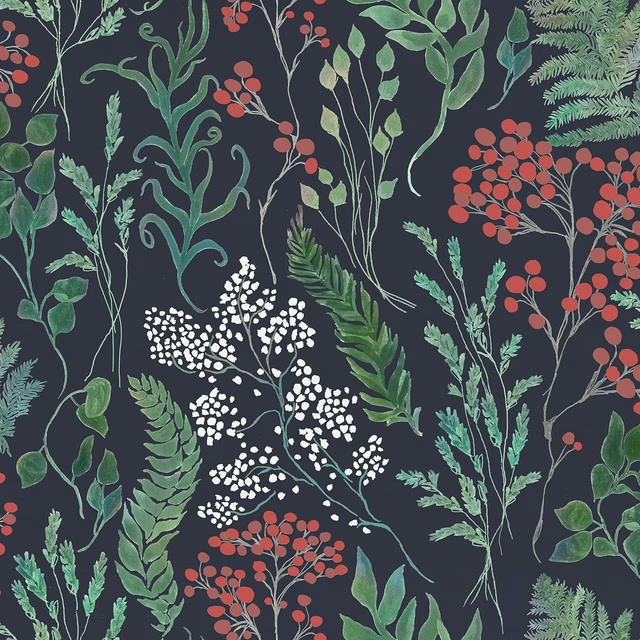
Aileana Midnight
Bracken
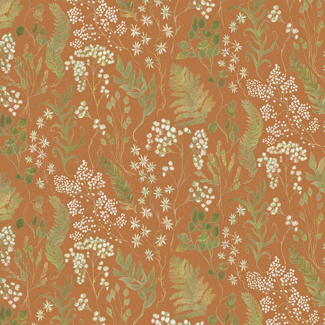
Aileana Amber
Bracken
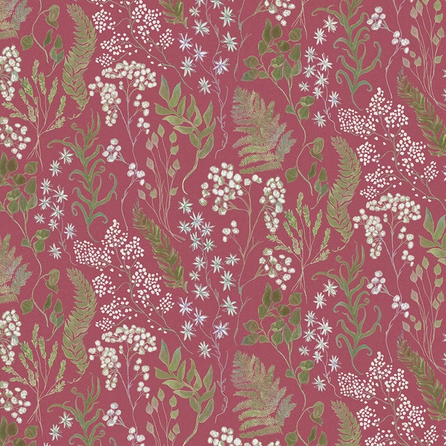
Aileana Fuchsia
Bracken
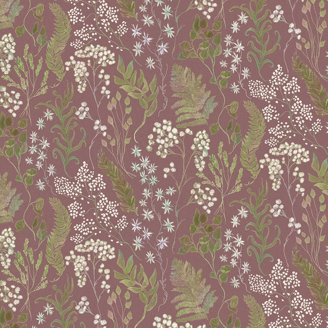
Aileana Heather
Bracken
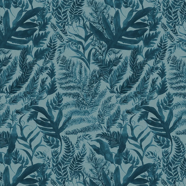
Bracken Atlas
Bracken
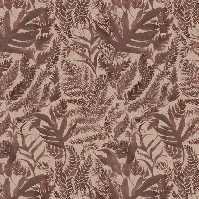
Bracken Sienna
Bracken
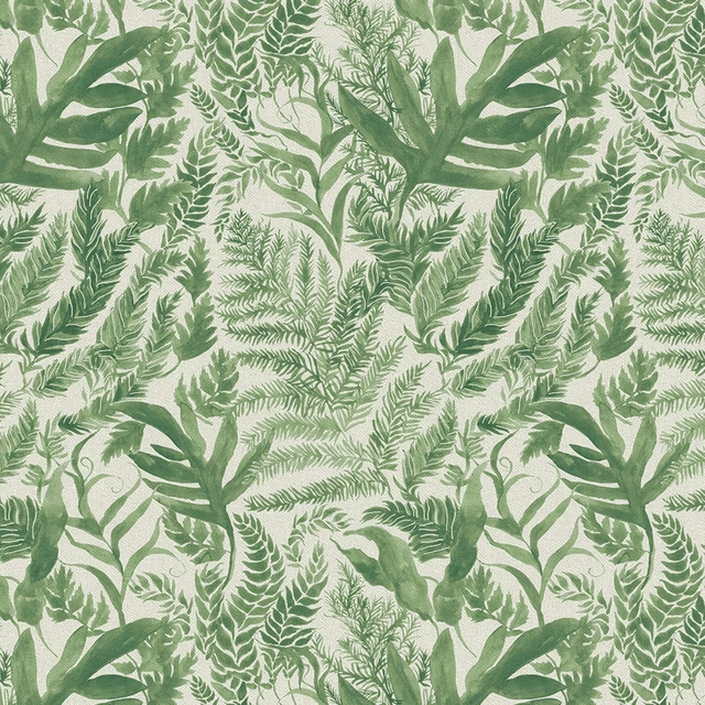
Bracken Isla
Bracken
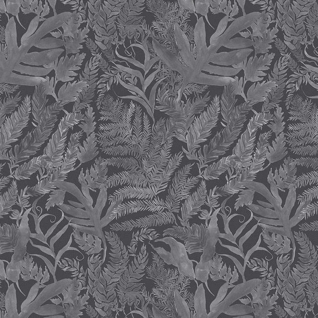
Bracken Aster
Bracken
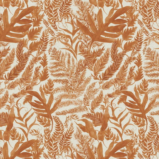
Bracken Amber
Bracken
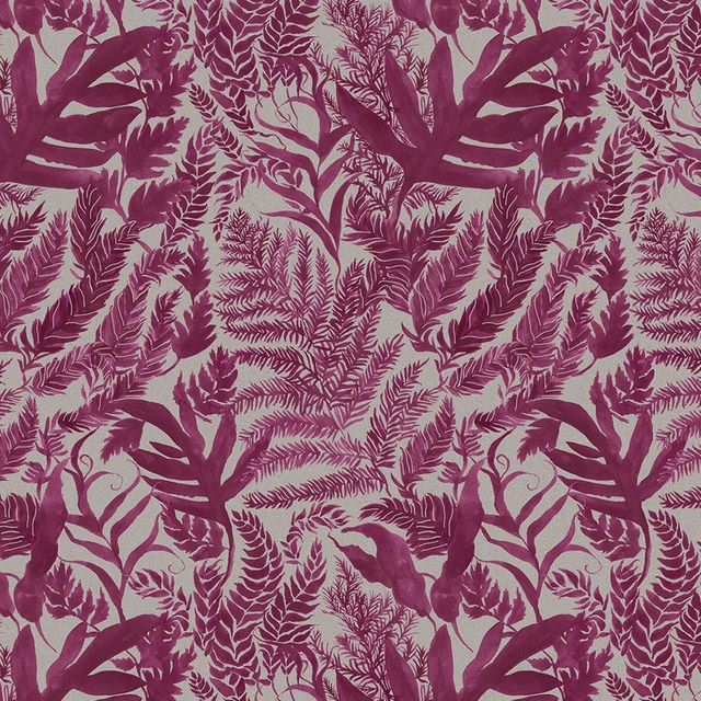
Bracken Berry
Bracken
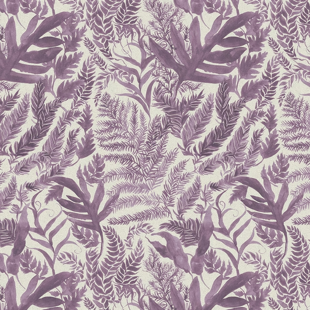
Bracken Dahlia
Bracken
Bracken Honey
Bracken
Pairs well with
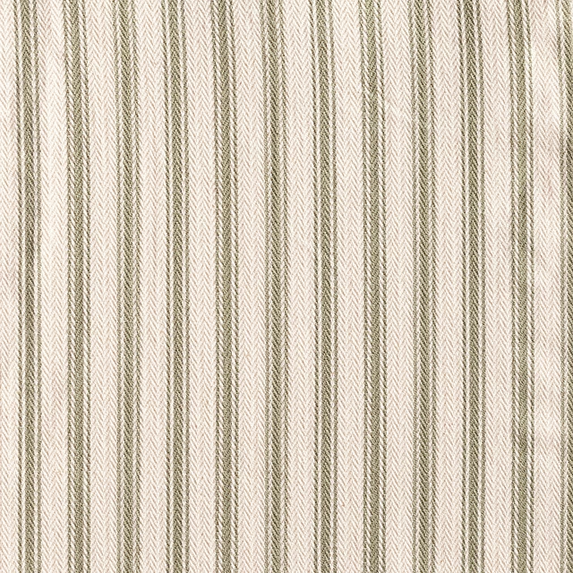
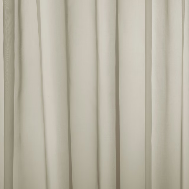
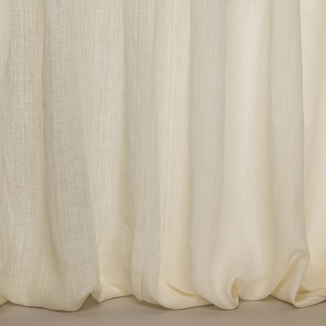
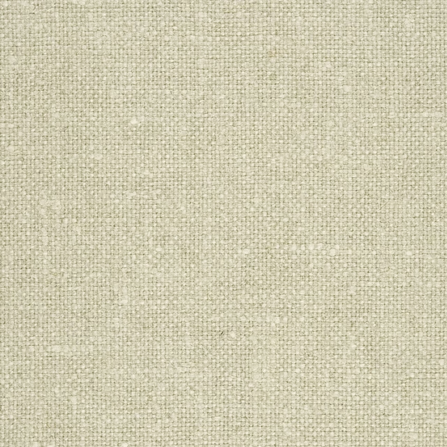
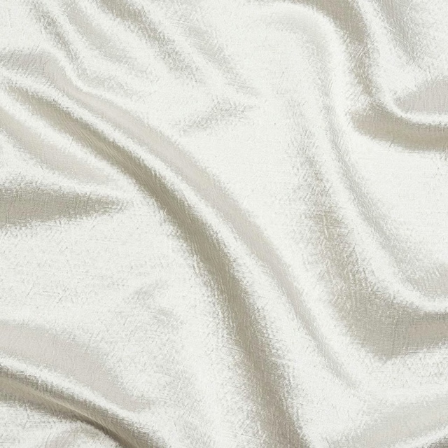
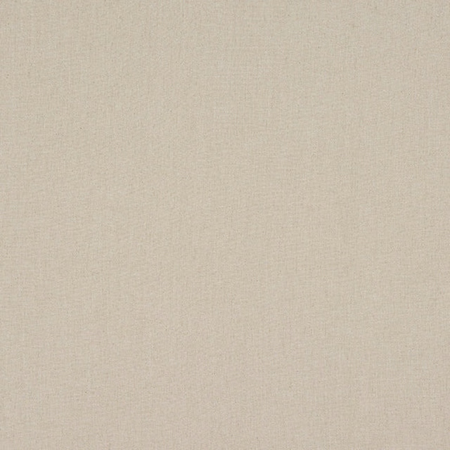
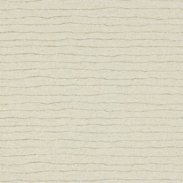
A pattern needs somewhere for the eye to rest, so these are the plains and textures that sit beside Bracken Jasmine without fighting it. Mixed across the houses we hold, which is the part a single supplier's book cannot do.





Paint that goes with it
Two ways to take the room. Both colours are from houses we hold, so a pot can come off the same order as the cloth. Screens shift colour, so treat these as a direction and bring the cloth to the shelf before you buy the paint.
To sit quietly behind it
Rooted
Coat Paints · #bdad9a
To stand against it
Rhodera
Sanderson · #bb687a
Other cream fabrics
Across the houses we hold. See all 4,572.

Dungannon cream
Woven Fabric

Melton 01
Woven Fabric
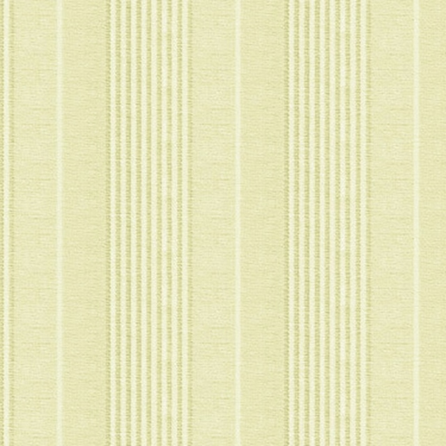
Piccadilly blanc
Woven Fabric

Sandringham Sand 02
Woven Fabric
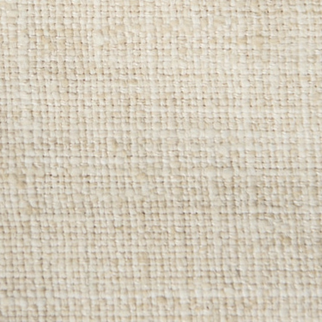
Tabby Weave Oyster
Woven Fabric
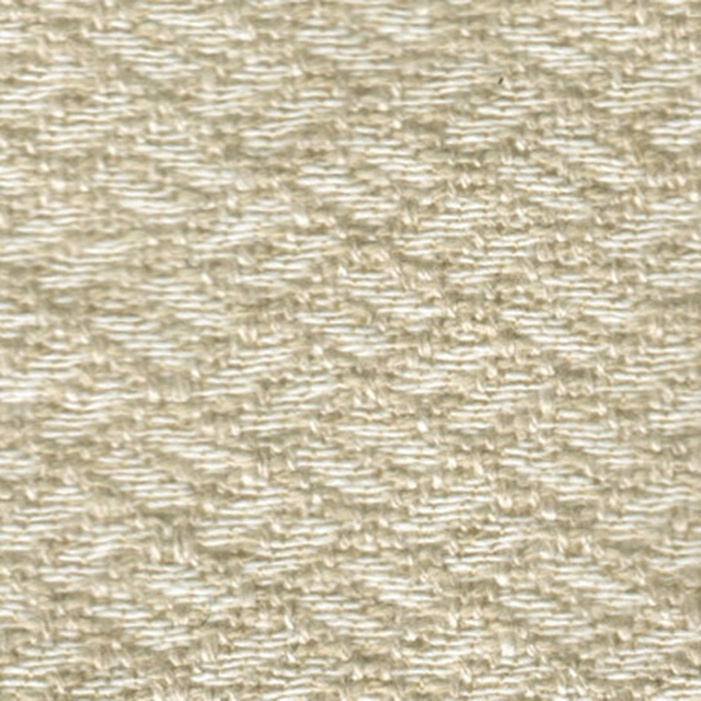
Taraz Ecru
Woven Fabric
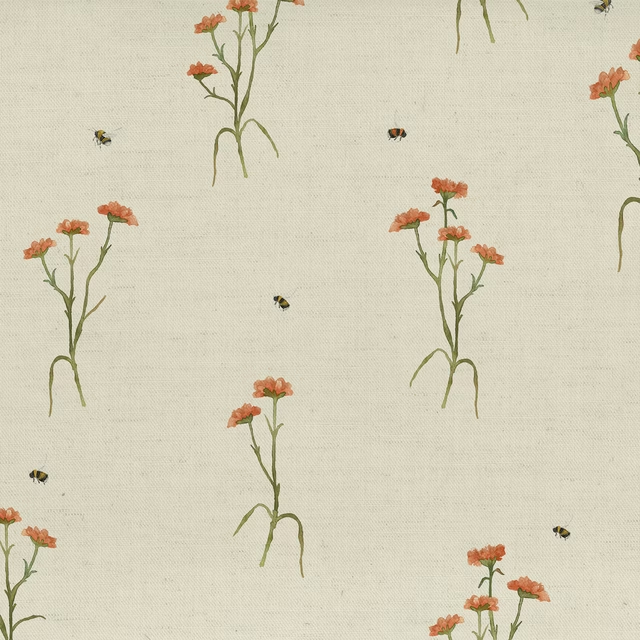
Allimore Linen
Botanical Stories
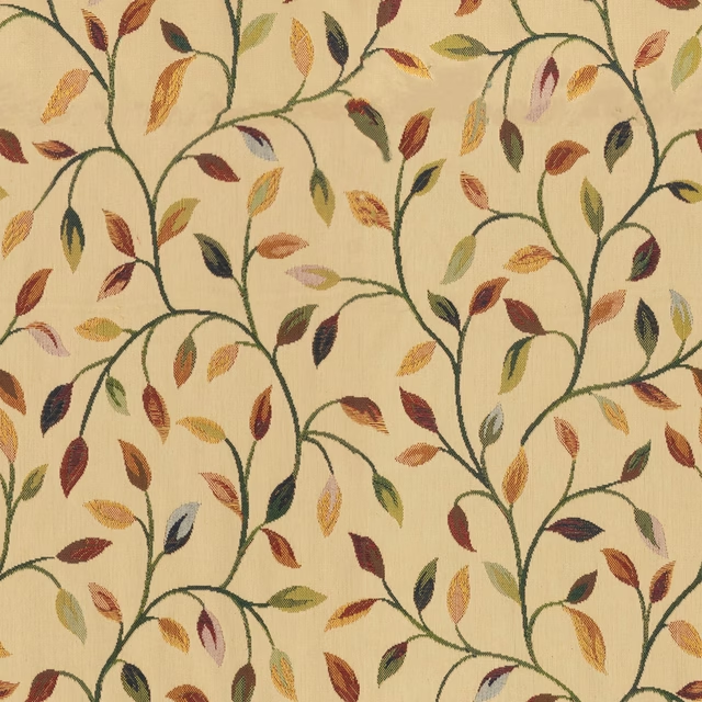
Cervino Aqua
Cervino
Chiaso Cream
Chiaso
Chiaso Feather
Chiaso
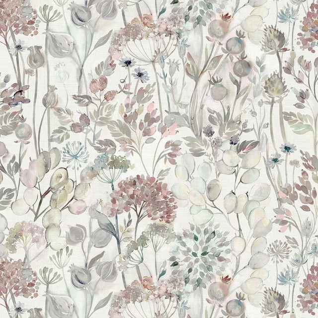
Countryhedgerow Dawn
Countryhedgerow
Nessa Linen
Countryimpressions