
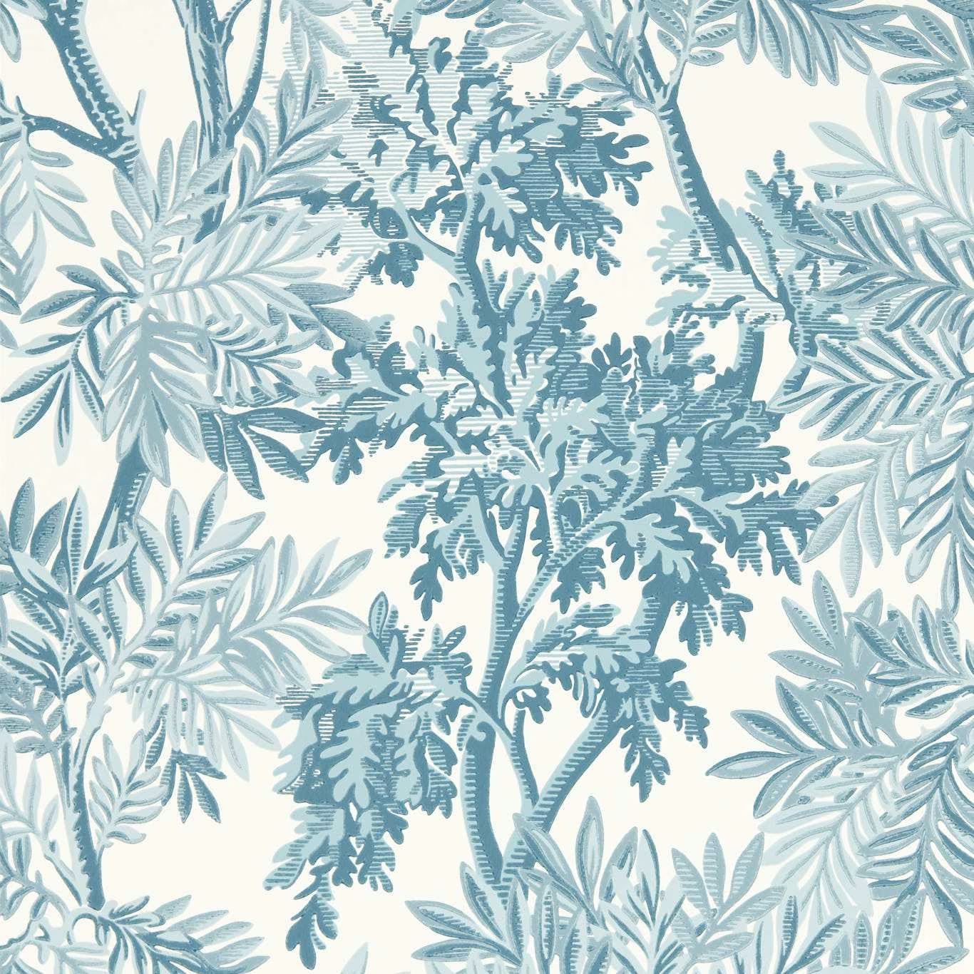

Tap the swatch to see it full screen. Hover it to magnify the weave. Colours on a screen are a guide, not a match, so come and feel the real cloth.
Scroll up or down to zoom in and out.
Tapestry Trees Pottery Blue
Country Woodland Wallcoverings WallpaperSAW0220-04
Tapestry Trees Pottery Blue layers finely drawn woodland branches, leaves and fern-like forms in cool blue tones across a softly contrasting cream ground. The design has a calm, airy character, with deeper blue foliage adding definition through the centre of the pattern.
You have used your previews for today. Send one to Simon and you can carry on.
Your board
0 fabrics
See this wallpaper on Sanderson's own site, then order it through us.
See Tapestry Trees Pottery Blue in your own room
A photograph of the piece you want re-covered. Straight on is best, and daylight helps. It is used to make your picture and nothing else.
Looking at your room
We found things here Tapestry Trees Pottery Blue could go on. Tap one on the photograph, or choose below.
We could not see anything to re-cover
, s
Tapestry Trees Pottery Blue, on your
Drag to compare. AI impression, colours indicative: ask us for a cutting before you decide.
About this wallpaper
This Sanderson wallpaper has a 147 gsm weight, a 52 cm usable width and a standard length of 10.05 m. Its 61 cm vertical repeat builds a dense botanical arrangement of branching stems, feathery leaves and darker oak-like foliage, while the horizontal repeat is listed as 0 cm. The Pottery Blue colourway is distinctly cool and muted rather than bright, combining pale icy blue leaves with mid and deep blue accents against a warm off-white background. The layered blue marks give the surface visual depth while allowing the cream ground to keep the overall impression light.
How to use it
Pair this cool, soft-edged blue wallpaper with painted cream, chalky white or pale blue furniture, using natural timber to echo the woodland branches. It would suit a bedroom, garden room or relaxed sitting room where the pale ground can keep the botanical pattern feeling open.
Use this cool pottery-blue botanical wallpaper to bring layered woodland detail to a calm, light-filled room.
More from Country Woodland Wallcoverings
The same book, other colourways.
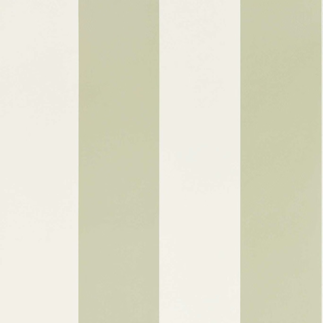
Sherwood Stripe Willow
Country Woodland Wallcoverings
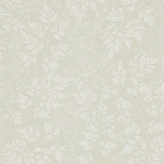
Spring Leaves Barley
Country Woodland Wallcoverings
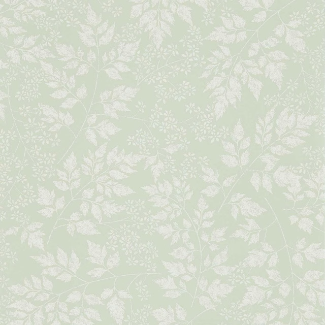
Spring Leaves Celadon
Country Woodland Wallcoverings

Spring Leaves Dove
Country Woodland Wallcoverings
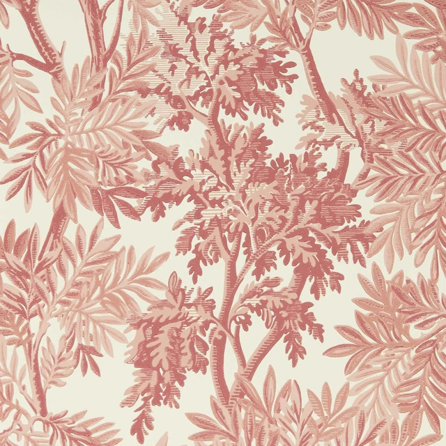
Tapestry Trees Berry/Pink Clay
Country Woodland Wallcoverings
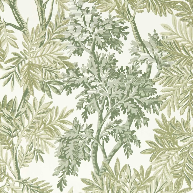
Tapestry Trees Forest/Willow
Country Woodland Wallcoverings
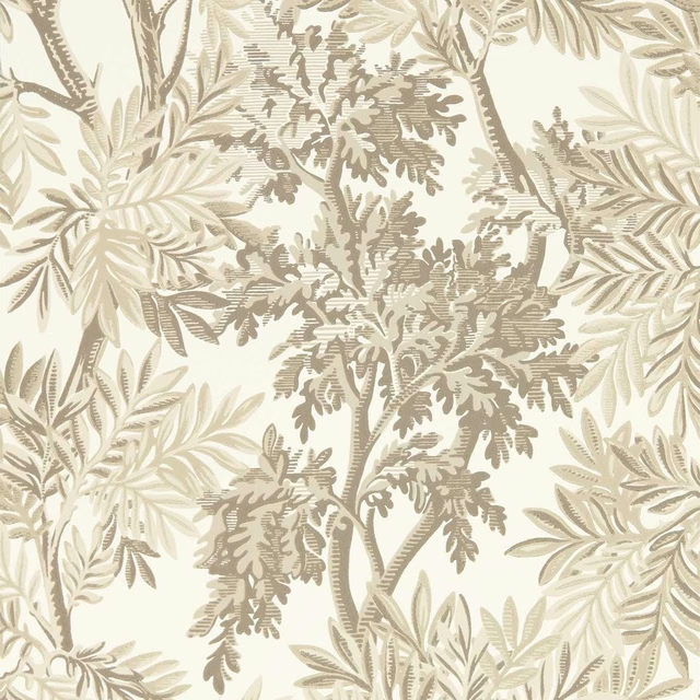
Tapestry Trees Raw Chocolate/Slip
Country Woodland Wallcoverings
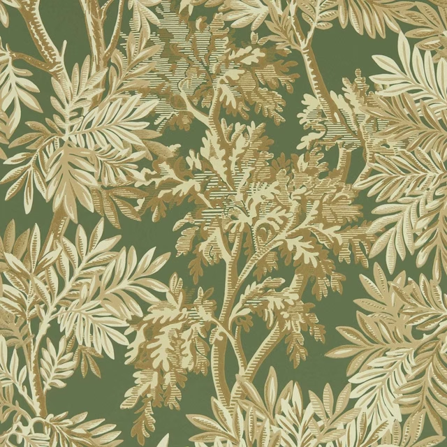
Tapestry Trees Woodland Green
Country Woodland Wallcoverings
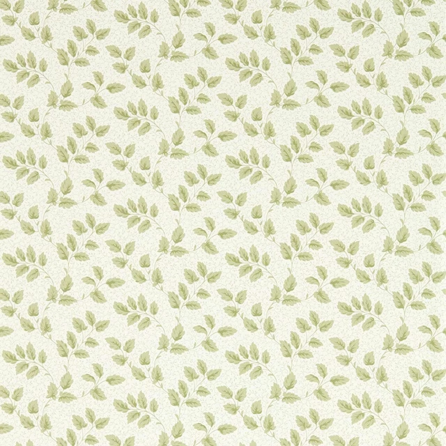
Tomato Leaf Leaf Green
Country Woodland Wallcoverings
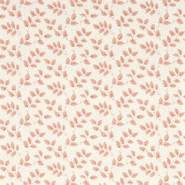
Tomato Leaf Pink Clay
Country Woodland Wallcoverings
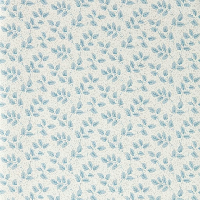
Tomato Leaf Wedgwood
Country Woodland Wallcoverings
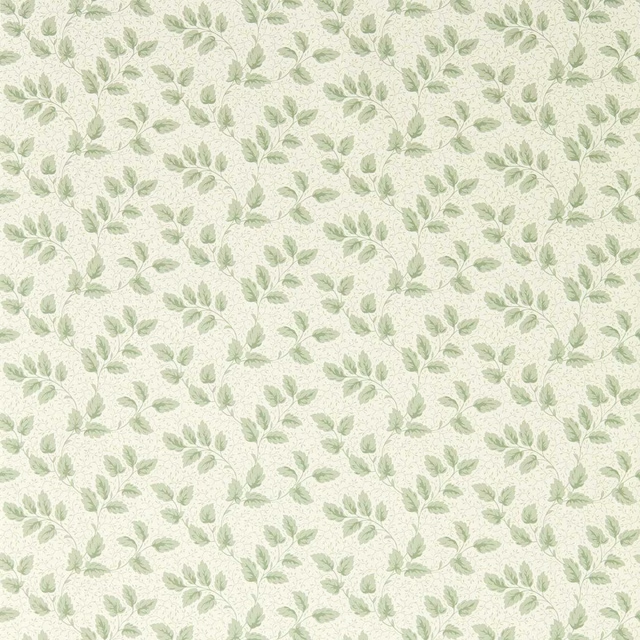
Tomato Leaf Willow
Country Woodland Wallcoverings
Pairs well with
A pattern needs somewhere for the eye to rest, so these are the plains and textures that sit beside Tapestry Trees Pottery Blue without fighting it. Mixed across the houses we hold, which is the part a single supplier's book cannot do.

Alaska Navy
Alaska Collection

Alaska Powder Blue
Alaska Collection

Beaux-Arts Nuit
Atelier Fabrics
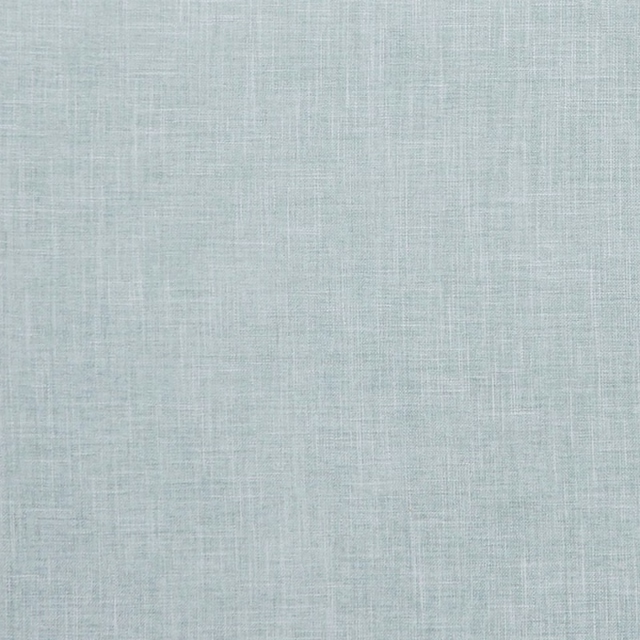
Albany Duckegg
Albany and Moray
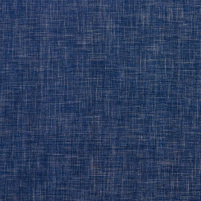
Albany Midnight
Albany and Moray
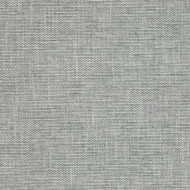
Brandon Aqua
Albeck
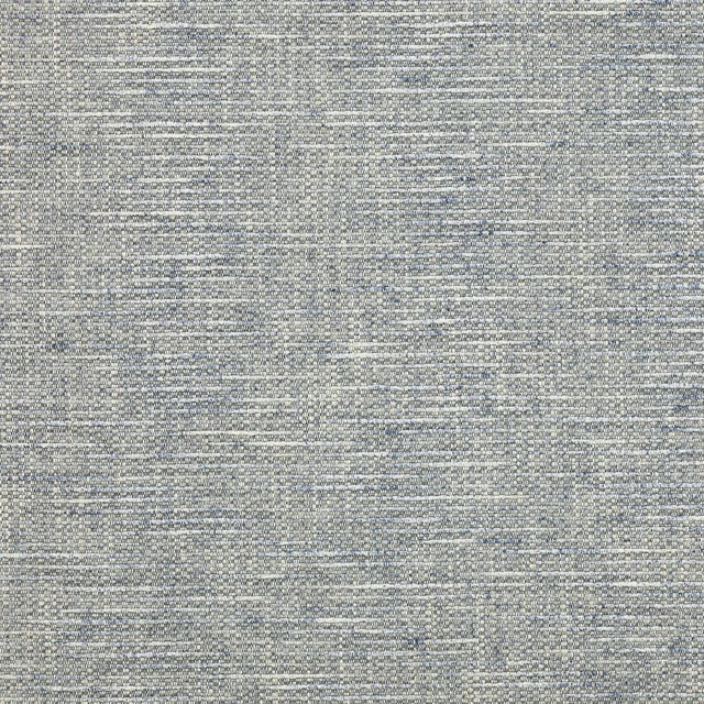
Brandon Blue
Albeck
Kalutara Indigo
Ampara Fabrics
Brera Filato Marine
Brera Filato Fabrics
Alchemy Indigo
Alchemy
Alchemy Navy
Alchemy

Allegra Atlantic
Allegra
Paint that goes with it
Two ways to take the room. Both colours are from houses we hold, so a pot can come off the same order as the cloth. Screens shift colour, so treat these as a direction and bring the cloth to the shelf before you buy the paint.
To sit quietly behind it
Bone China Blue - Faint
Little Greene · #c2d0d2
To stand against it
Ming Gold
Sanderson · #e6ca89
Other blue fabrics
Across the houses we hold. See all 7,566.
Gunnersbury Indigo
Country Woodland Fabrics
Osier Wedgwood/Silver
Country Woodland Fabrics
Coral and Fish Embroidery Marine Blue
Curios Fabrics
Delphiniums Indigo
Curios Fabrics
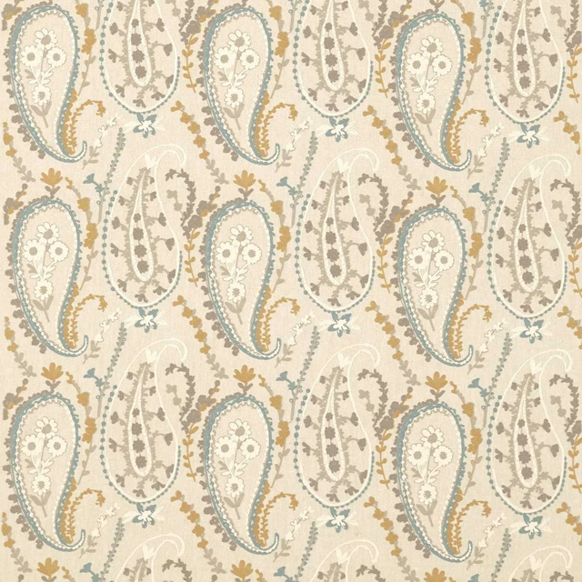
Jamila Wedgwood/Linen
Curios Fabrics
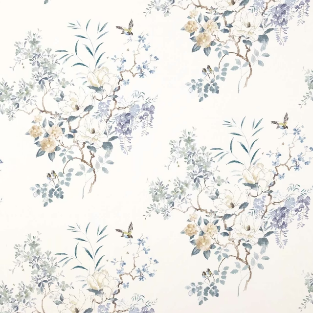
Magnolia & Blossom Mineral/Teal
Curios Fabrics
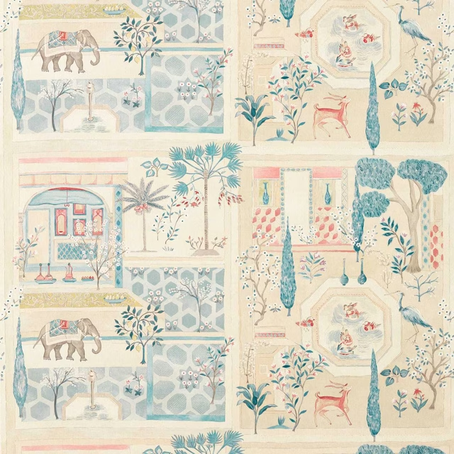
Sultan`s Garden Ruby/Teal
Curios Fabrics
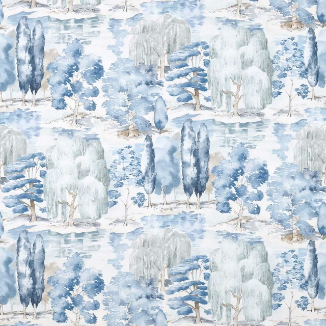
Waterperry Indigo
Curios Fabrics
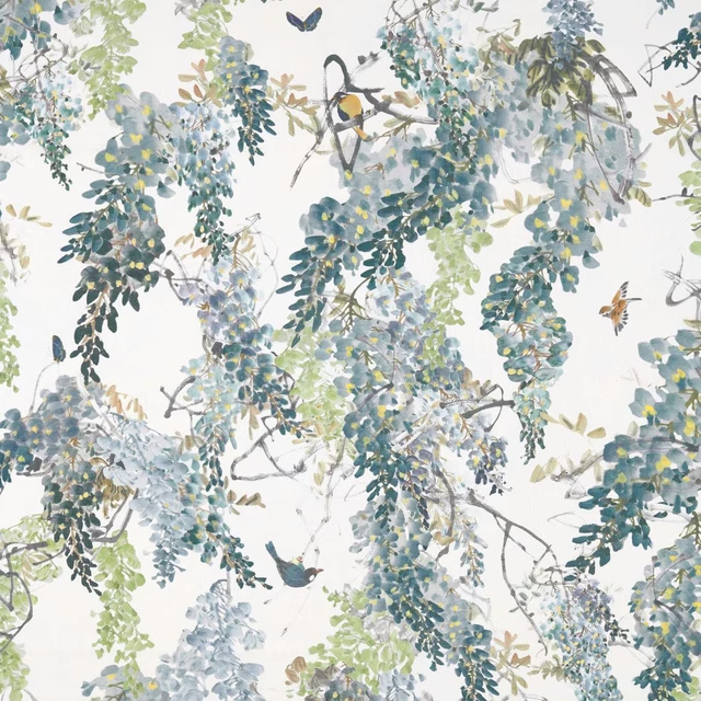
Wisteria Falls Mineral
Curios Fabrics
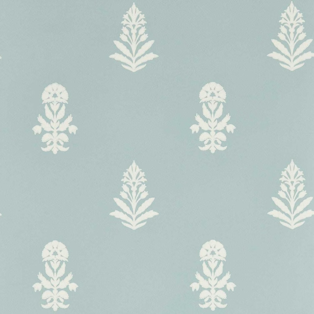
Dabu Porcelain
Curios Wallcoverings
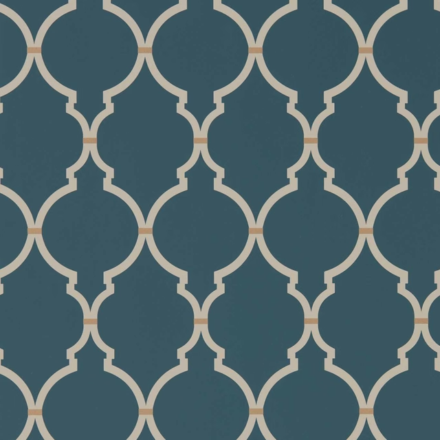
Empire Trellis Indigo/Linen
Curios Wallcoverings
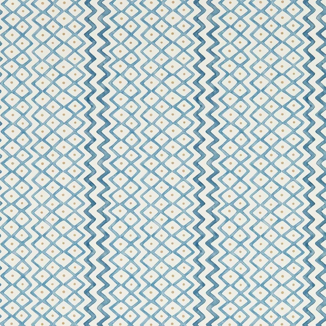
Khes Indigo/Woad
Curios Wallcoverings