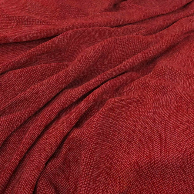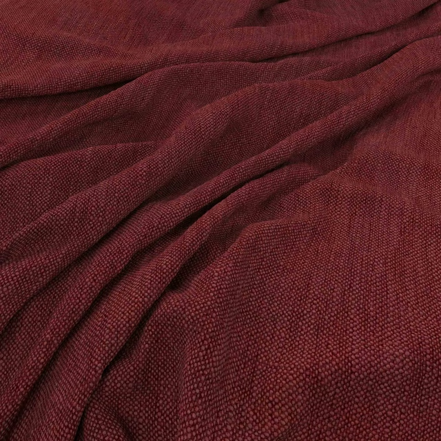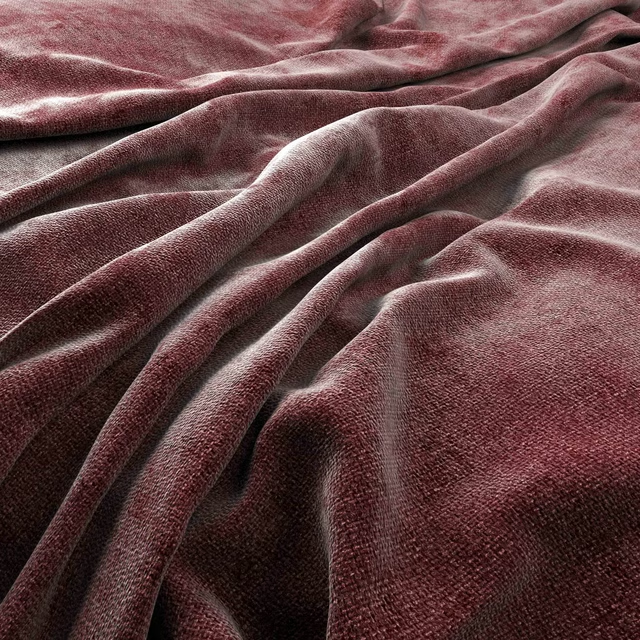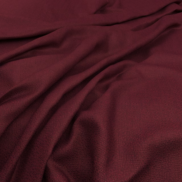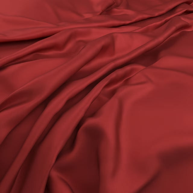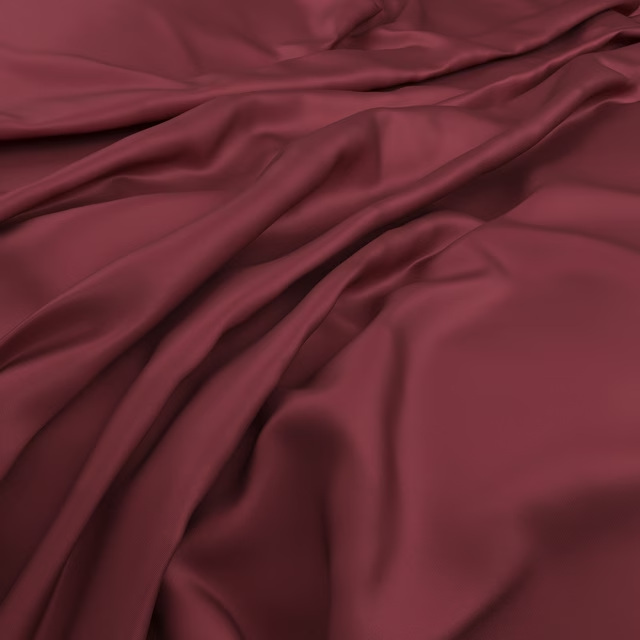

Tap the swatch to see it full screen. Hover it to magnify the weave. Colours on a screen are a guide, not a match, so come and feel the real cloth.
Scroll up or down to zoom in and out.
Raya Quince
Raya Fabric
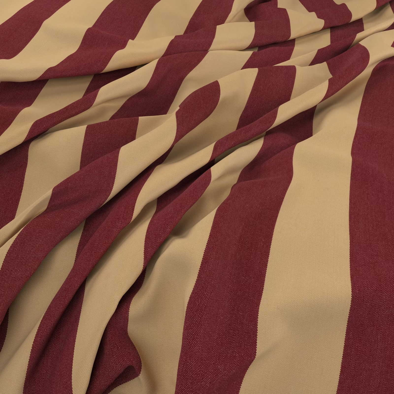
Raya Quince pairs deep burgundy with a warm oat ground in broad, irregular bands that bend and shift across the cloth. The softly gathered swatch shows a fine woven surface and a fluid drape.
You have used your previews for today. Send one to Simon and you can carry on.
Your board
0 fabrics
See this fabric on Warwick's own site, then order it through us.
See Raya Quince in your own room
A photograph of the piece you want re-covered. Straight on is best, and daylight helps. It is used to make your picture and nothing else.
Looking at your room
We found things here Raya Quince could go on. Tap one on the photograph, or choose below.
We could not see anything to re-cover
, s
Raya Quince, on your
Drag to compare. AI impression, colours indicative: ask us for a cutting before you decide.
About this fabric
The burgundy stripes have a muted wine depth, while the oat areas bring a mellow, golden-neutral contrast rather than a cool cream. Uneven stripe edges and changing widths give the design a lively, hand-drawn rhythm as the fabric folds. Its fine, close weave catches the light subtly, with the creases revealing darker turns and softer highlights. No performance features are noted for this fabric.
How to use it
Use Raya Quince for full-length curtains where its warm burgundy and oat palette can act as the room’s graphic focal point. Pair it with walnut, aged brass and quiet neutral upholstery to balance the energetic striping.
Use the bold burgundy and oat striping to bring graphic warmth and movement to curtains or relaxed blinds.
More from Raya
The same book, other colourways.
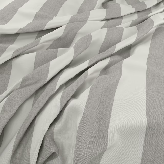
Raya Cloud
Raya
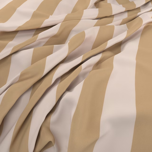
Raya Sand
Raya
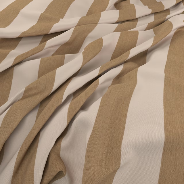
Raya Natural
Raya
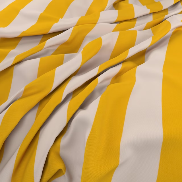
Raya Daffodil
Raya
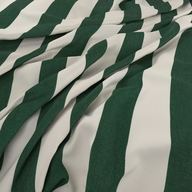
Raya Evergreen
Raya
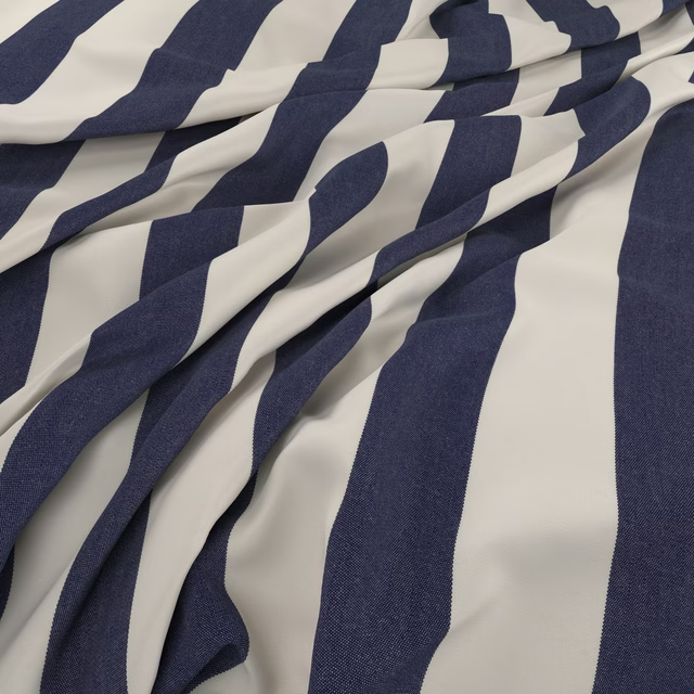
Raya Marine
Raya
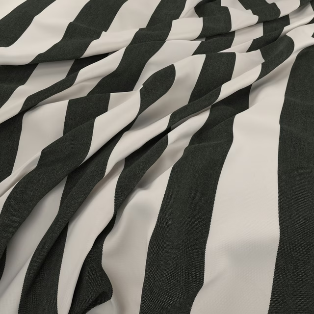
Raya Coal
Raya
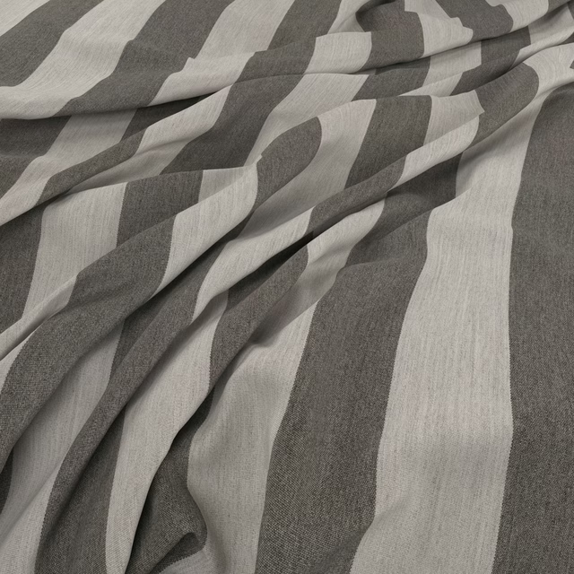
Raya Stone
Raya
Pairs well with
A pattern needs somewhere for the eye to rest, so these are the plains and textures that sit beside Raya Quince without fighting it. Mixed across the houses we hold, which is the part a single supplier's book cannot do.

Alaska Cinnamon
Alaska Collection
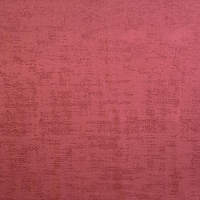
Dakota Claret
Dakota Collection

Roseau Garance
Atelier Camargue Fabrics

Castiglione Garance
Atelier Fabrics
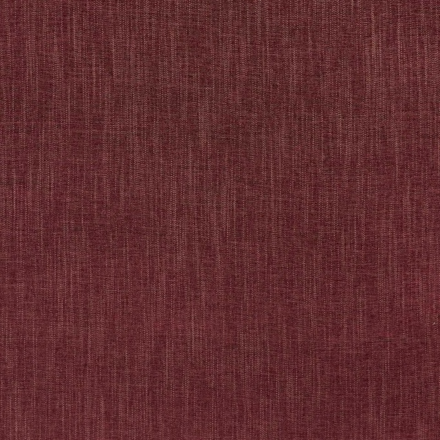
Moray Damson
Albany and Moray
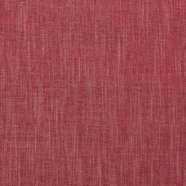
Moray Raspberry
Albany and Moray
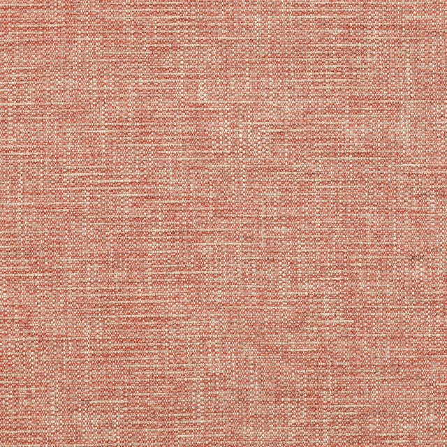
Brandon Red
Albeck

Marldon Red
Albeck

Chambord Claret
Chambord Fabrics

Cheviot Pimento
Cheviot Fabrics
Monza Raspberry
Arezzo

Kensington Brick
Brodsworth
Paint that goes with it
Two ways to take the room. Both colours are from houses we hold, so a pot can come off the same order as the cloth. Screens shift colour, so treat these as a direction and bring the cloth to the shelf before you buy the paint.
To sit quietly behind it
Muscovado
Little Greene · #86563e
To stand against it
Double La Seine
Zoffany · #a6afae
Other red fabrics
Across the houses we hold. See all 2,196.