

Tap the swatch to see it full screen. Hover it to magnify the weave. Colours on a screen are a guide, not a match, so come and feel the real cloth.
Scroll up or down to zoom in and out.
Raffles Spot 5
Decadence FabricRAFFLESCOL5
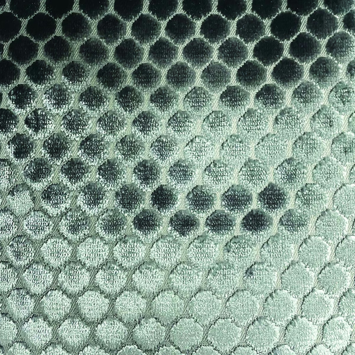
Raffles Spot 5 moves from deep charcoal green at the top of the swatch through smoky grey-green to a pale, cool sage. Its closely spaced rounded spots and tactile surface give the colourway a softly sculpted appearance.
You have used your previews for today. Send one to Simon and you can carry on.
Your board
0 fabrics
See this fabric on Art of the Loom's own site, then order it through us.
See Raffles Spot 5 in your own room
A photograph of the piece you want re-covered. Straight on is best, and daylight helps. It is used to make your picture and nothing else.
Looking at your room
We found things here Raffles Spot 5 could go on. Tap one on the photograph, or choose below.
We could not see anything to re-cover
, s
Raffles Spot 5, on your
Drag to compare. AI impression, colours indicative: ask us for a cutting before you decide.
About this fabric
The colour graduates visibly from a near-charcoal green upper section to a light sage lower section, creating depth across the design rather than a flat single tone. Rounded spots are arranged in a close, regular grid, with darker centres and lighter edges producing a pebble-like relief. Light catches the textured surface unevenly, making the darker area appear richer and the pale sage section more quietly luminous. No composition, width, rub-test or performance specification has been supplied for this colourway.
How to use it
Use the cool sage lower tones to soften a contemporary room, or let the charcoal upper shading add depth to an occasional chair, headboard or statement seat. Pair it with pale stone, brushed metal and deeper green accents to echo the swatch’s tonal graduation.
A cool sage-to-charcoal spot weave with a softly lustrous, tactile finish for statement upholstery.
More from Decadence
The same book, other colourways.
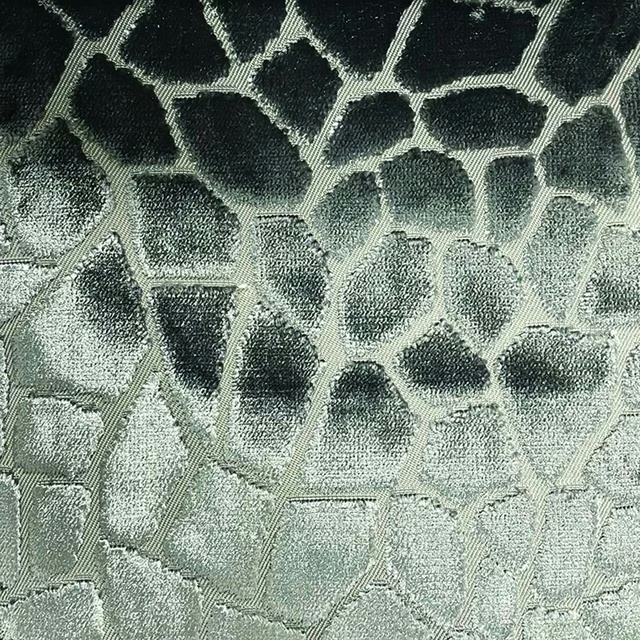
Raffles Mosaic 5
Decadence
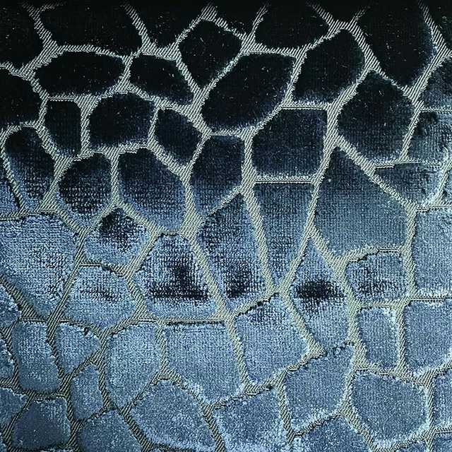
Raffles Mosaic 6
Decadence
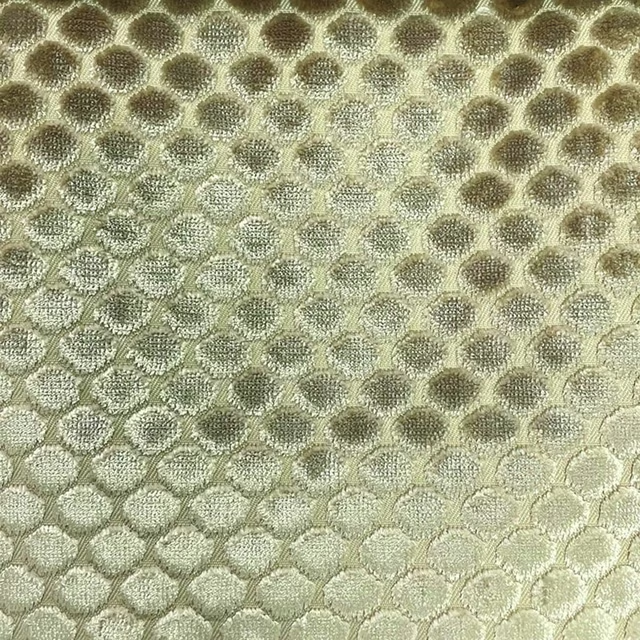
Raffles Spot 1
Decadence
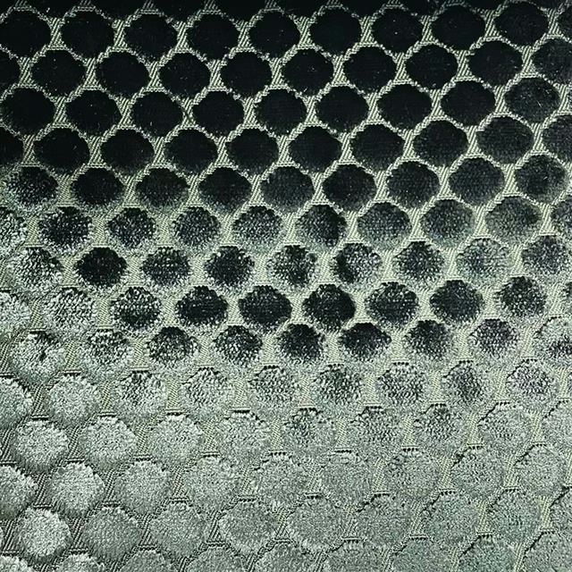
Raffles Spot 2
Decadence
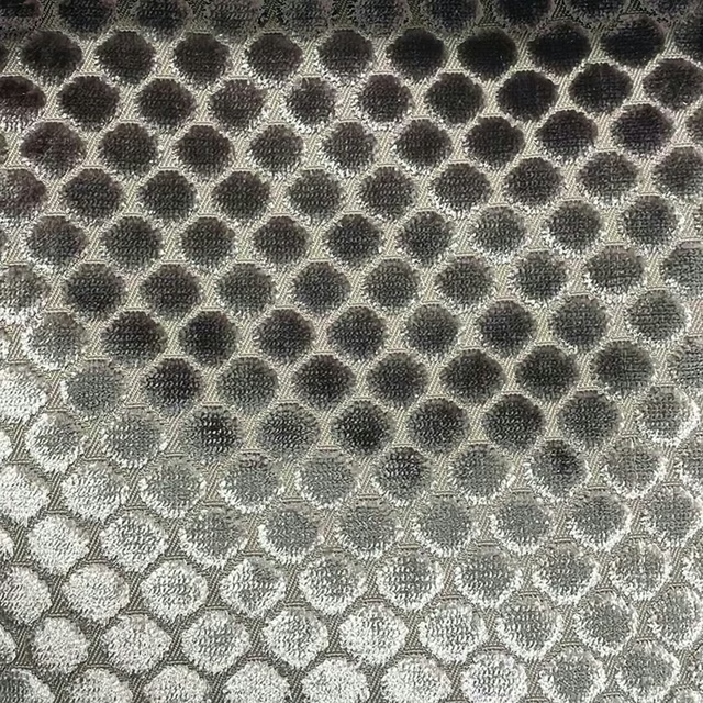
Raffles Spot 3
Decadence
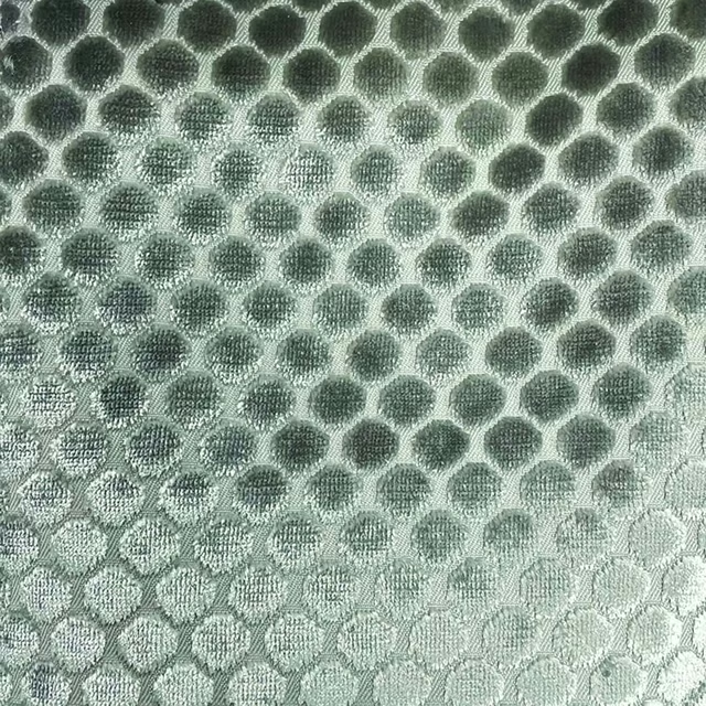
Raffles Spot 4
Decadence
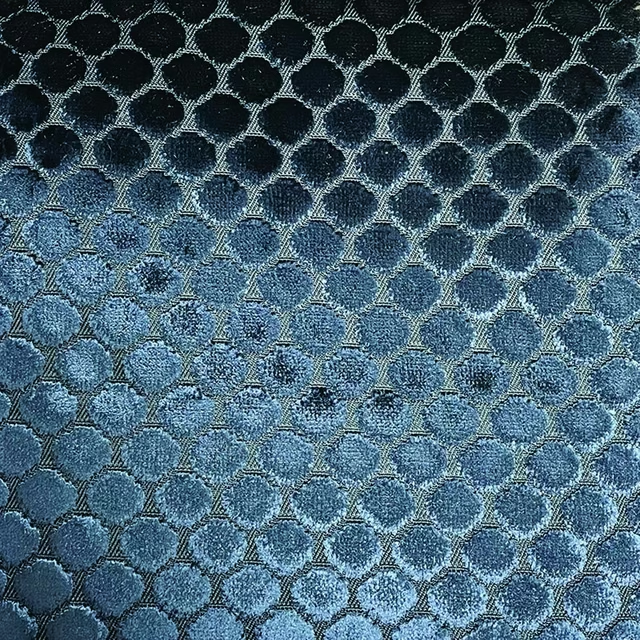
Raffles Spot 6
Decadence
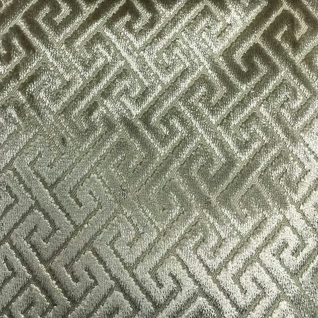
Raffles Trellis 1
Decadence
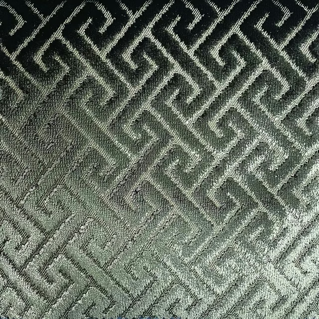
Raffles Trellis 2
Decadence
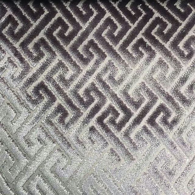
Raffles Trellis 3
Decadence
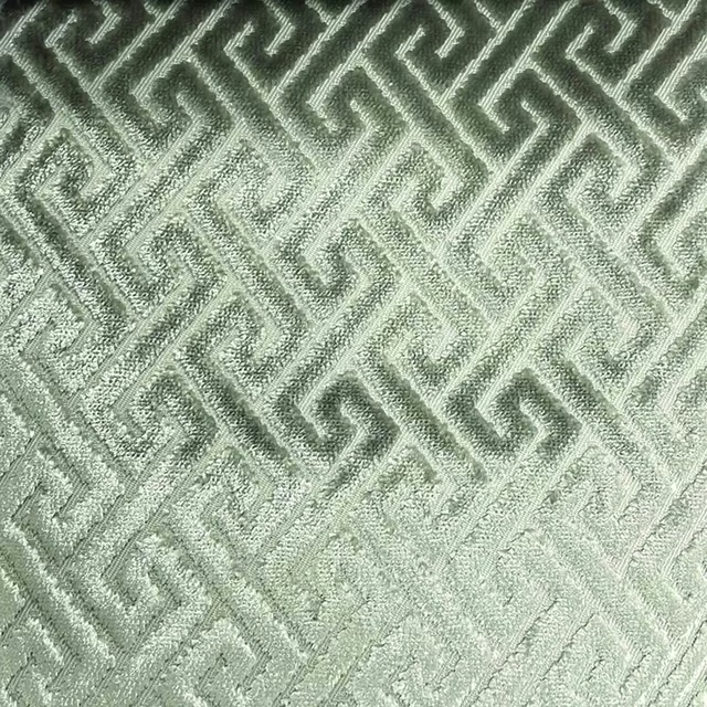
Raffles Trellis 4
Decadence
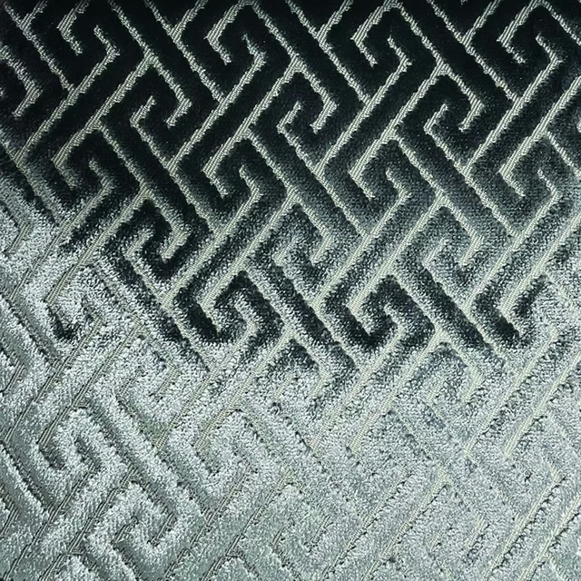
Raffles Trellis 5
Decadence
Pairs well with
A pattern needs somewhere for the eye to rest, so these are the plains and textures that sit beside Raffles Spot 5 without fighting it. Mixed across the houses we hold, which is the part a single supplier's book cannot do.

Jaipur Emerald
Jaipur Chenille

Cosima Cyprus
Cosima Velvet II

Dante Forest
Dante Velvet

Glamour Emerald
Glamour
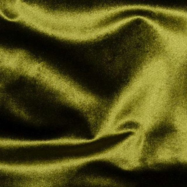
Glamour Sage
Glamour
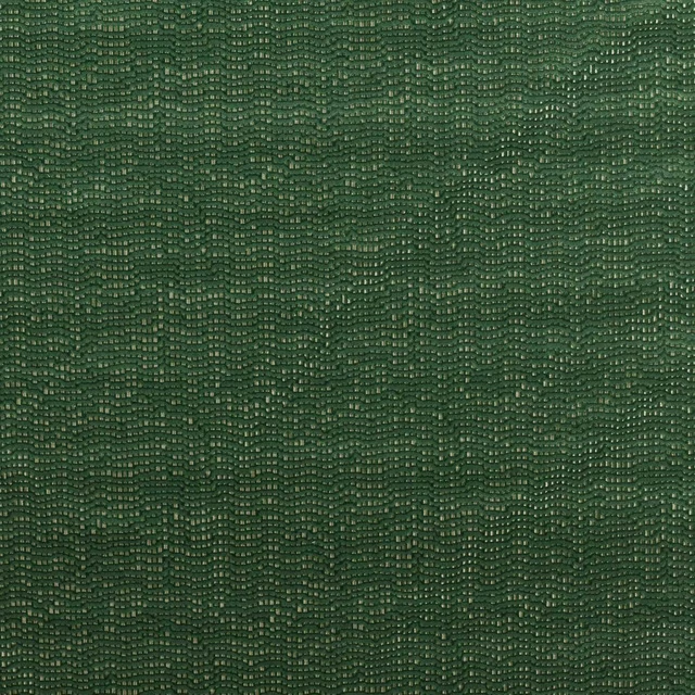
Chert Malachite
Defined Momentum Velvets
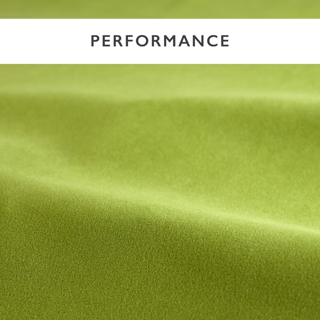
Performance Velvets Avocado
Performance Velvet

Odyssey Emerald
Odyssey
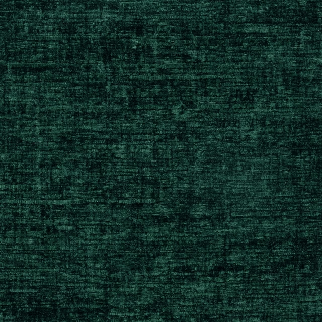
Soulful Teal
Soulful
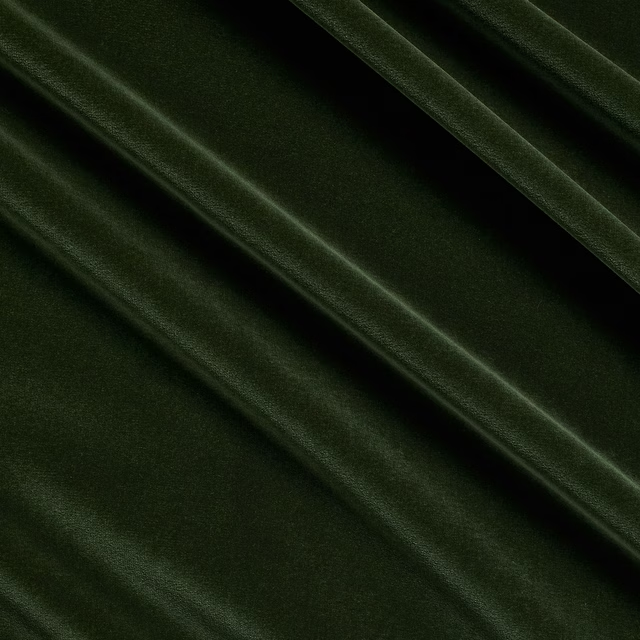
Beauchamp Velvet Fir
Beauchamp Velvet
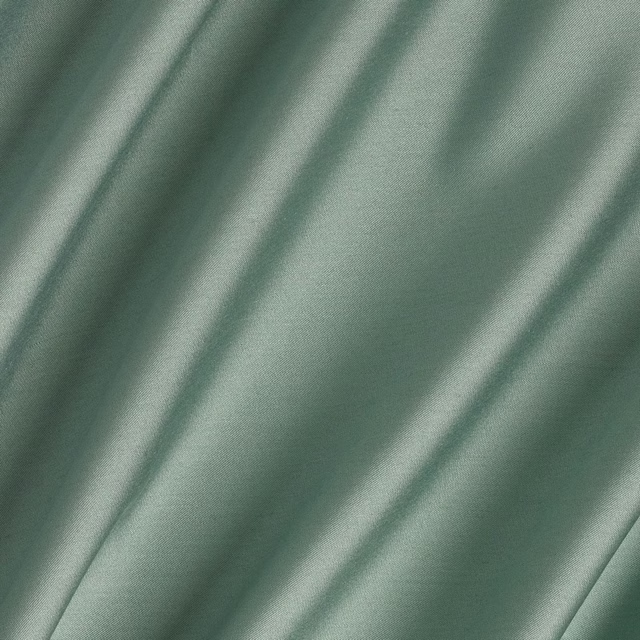
Connaught Silk High Tide
Connaught Silk
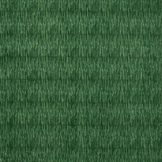
Mira Emerald
Zander Velvets
Paint that goes with it
Two ways to take the room. Both colours are from houses we hold, so a pot can come off the same order as the cloth. Screens shift colour, so treat these as a direction and bring the cloth to the shelf before you buy the paint.
To sit quietly behind it
Ambleside
Little Greene · #738478
To stand against it
Private Matters
Coat Paints · #9b5e45
Other green fabrics
Across the houses we hold. See all 4,855.
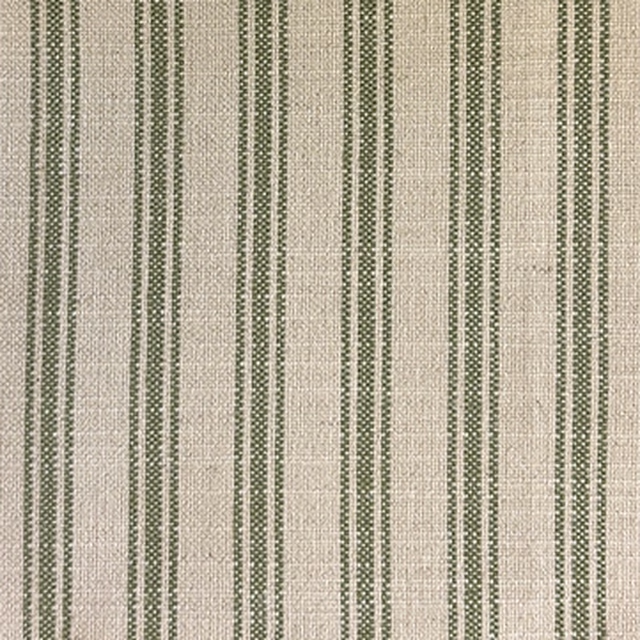
Camila Classic Ticking Stripe Sage
Camilla
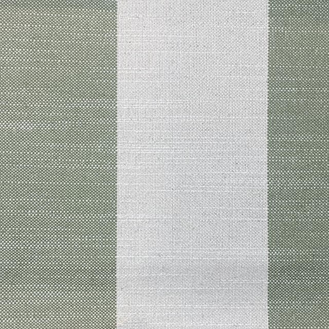
Camilla Broad Sage
Camilla
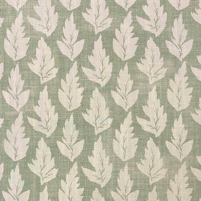
Ferndown colour 7
Dorset
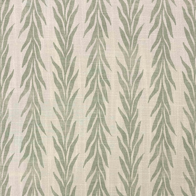
Lulworth colour 7
Dorset
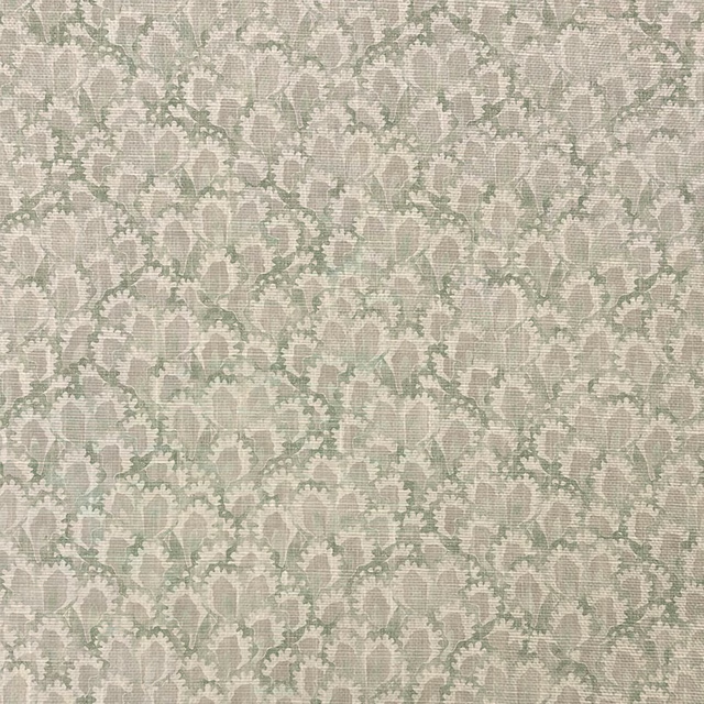
Pondbury colour 7
Dorset
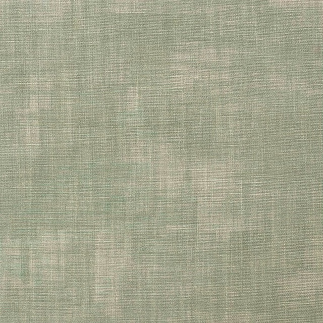
Wareham colour 7
Dorset
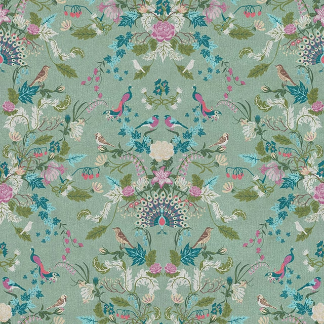
Aviana Peppermint
Earth Odyssey by Becca Who
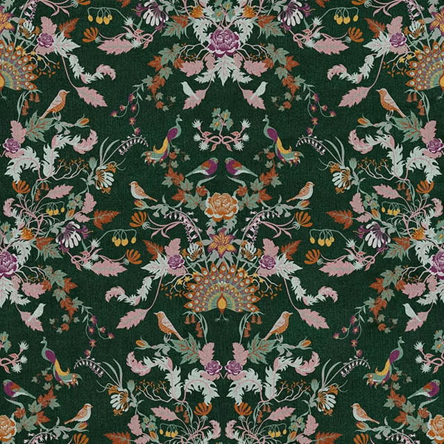
Aviana Verdant
Earth Odyssey by Becca Who
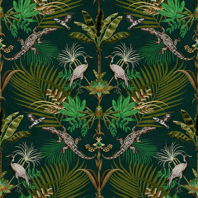
Crocodilia Jungle
Earth Odyssey by Becca Who
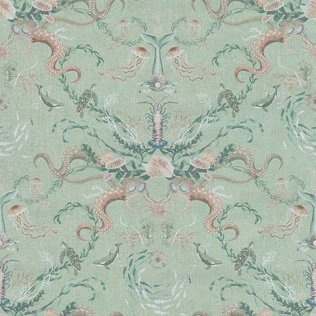
Ocean Treasures Coastal
Earth Odyssey by Becca Who
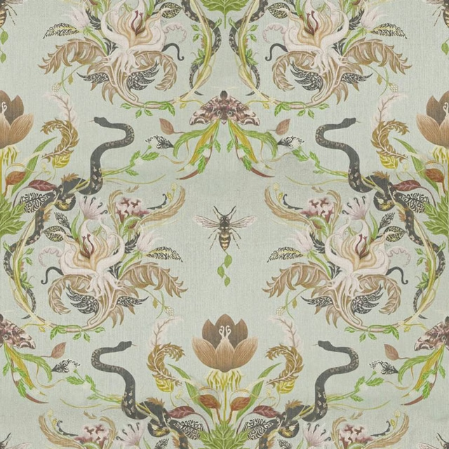
Serpentwined Pale Moss
Earth Odyssey by Becca Who
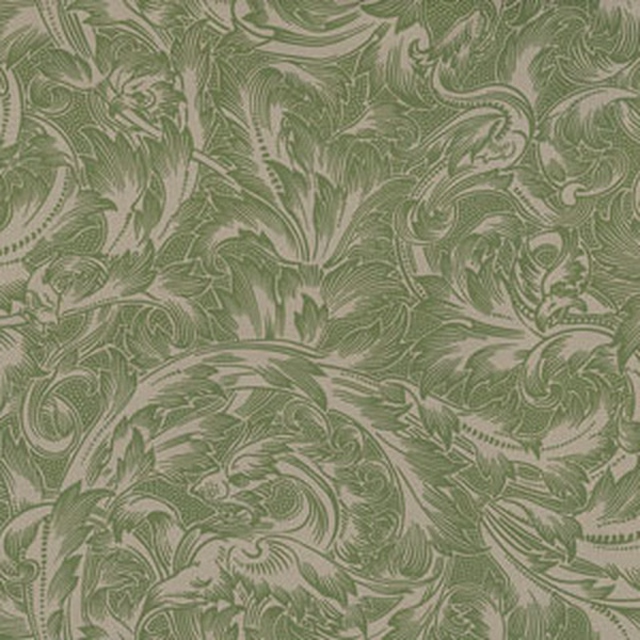
Foreman VI
Gawthorpe