
Tap the swatch to see it full screen. Hover it to magnify the weave. Colours on a screen are a guide, not a match, so come and feel the real cloth.
Scroll up or down to zoom in and out.
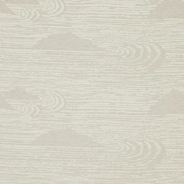
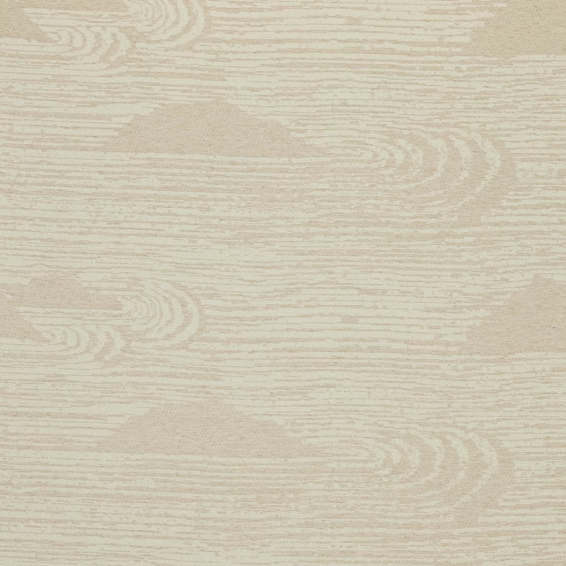
Celtis Natural
Betula FabricL9166-02
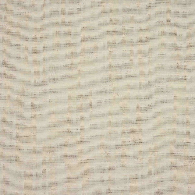
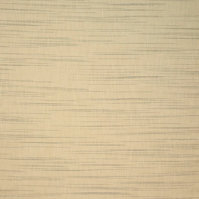
Celtis Natural is a quietly textured cream colourway with delicate horizontal striations that give the surface movement without strong contrast. The overall effect is soft, warm and lightly dappled, with the lines reading like fine pencil marks across a pale ground.
You have used your previews for today. Send one to Simon and you can carry on.
Your board
0 fabrics
See this fabric on Larsen's own site, then order it through us.
See Celtis Natural in your own room
A photograph of the piece you want re-covered. Straight on is best, and daylight helps. It is used to make your picture and nothing else.
Looking at your room
We found things here Celtis Natural could go on. Tap one on the photograph, or choose below.
We could not see anything to re-cover
, s
Celtis Natural, on your
Drag to compare. AI impression, colours indicative: ask us for a cutting before you decide.
About this fabric
This Betula fabric by Larsen combines 25% linen, 21% cotton, 20% polyacrylic, 20% wool, 7% bamboo, 5% polyamide and 2% polyester, giving the cloth a natural handle with a composed, woven finish. The swatch shows a warm natural cream ground crossed by very fine, broken horizontal lines in muted taupe-grey, creating a subtle striped effect rather than a bold pattern. With an approximate width of 134cm and zero repeat both vertically and horizontally, it is straightforward to cut and pattern match for a neat installation. The overall tone is soft and airy, with just enough depth in the thread detail to keep the surface from feeling flat. Care code Q 8 + T 3 and fire code K are supplied for reference.
How to use it
This pale neutral works well where you want texture more than colour, especially on relaxed upholstery, headboards or bench seating. It also suits full-length curtains in calm, daylight-filled rooms, where the fine linear pattern will read gently against plaster, oak or stone.
A soft neutral with subtle linear texture that works easily across upholstery and curtains.
More from Betula
The same book, other colourways.
Celtis Sand
Betula

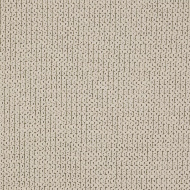
Cornus Mother of Pearl
Betula

Cornus Sand
Betula
Laurus Bone
Betula
Laurus Celadon
Betula

Laurus Ice Blue
Betula
Laurus Ivory
Betula
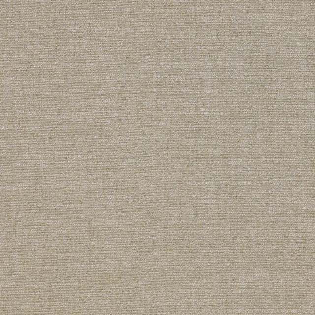
Laurus Linen
Betula
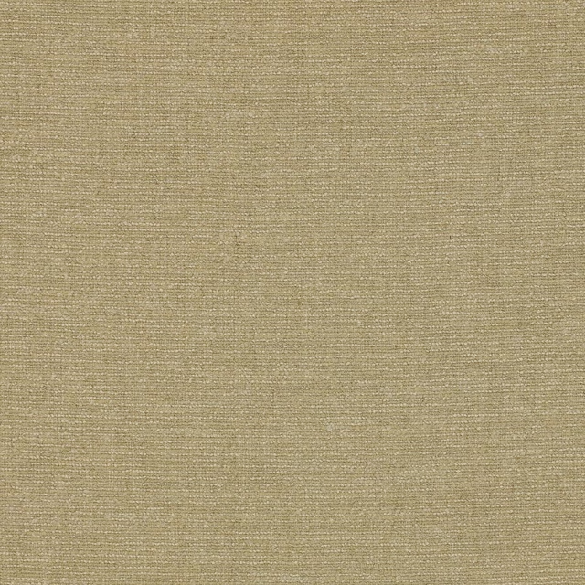
Laurus Sand
Betula
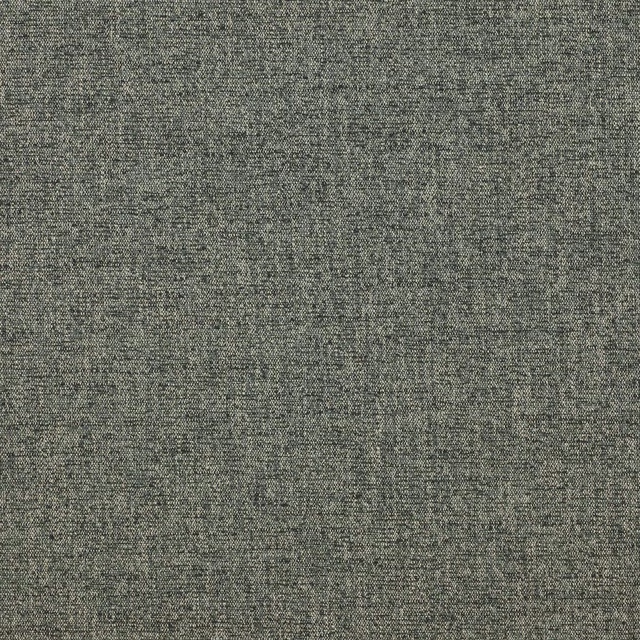
Laurus Slate
Betula

Laurus Snow
Betula
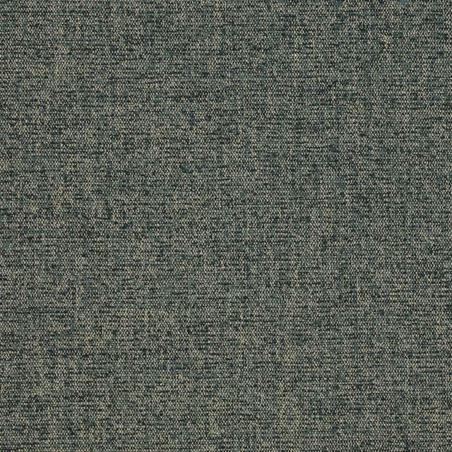
Laurus Spruce
Betula
Pairs well with
A pattern needs somewhere for the eye to rest, so these are the plains and textures that sit beside Celtis Natural without fighting it. Mixed across the houses we hold, which is the part a single supplier's book cannot do.
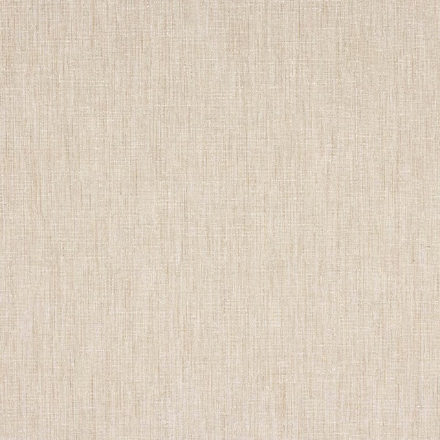
Wembury Natural
Bampton

Lux Boucle FR Natural
LUX BOUCLE FR
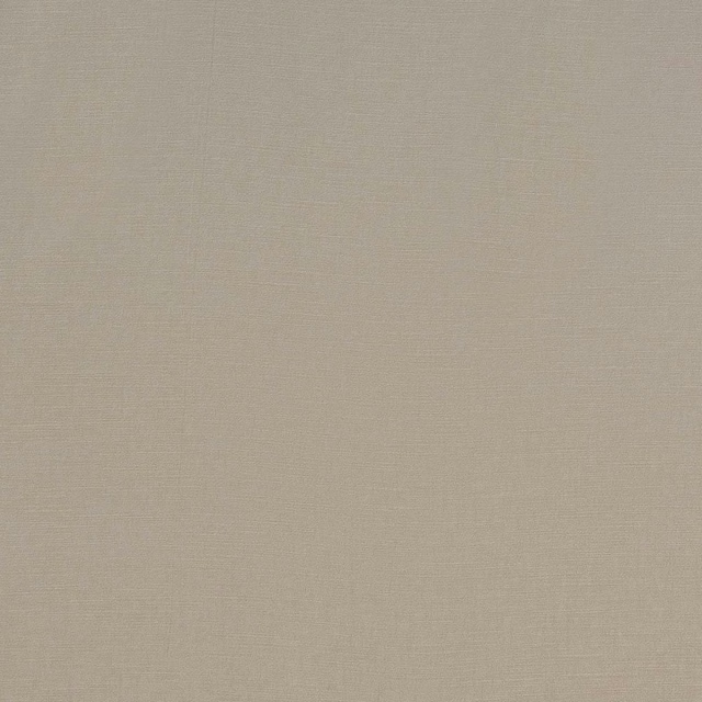
Carnaby Natural
Magma
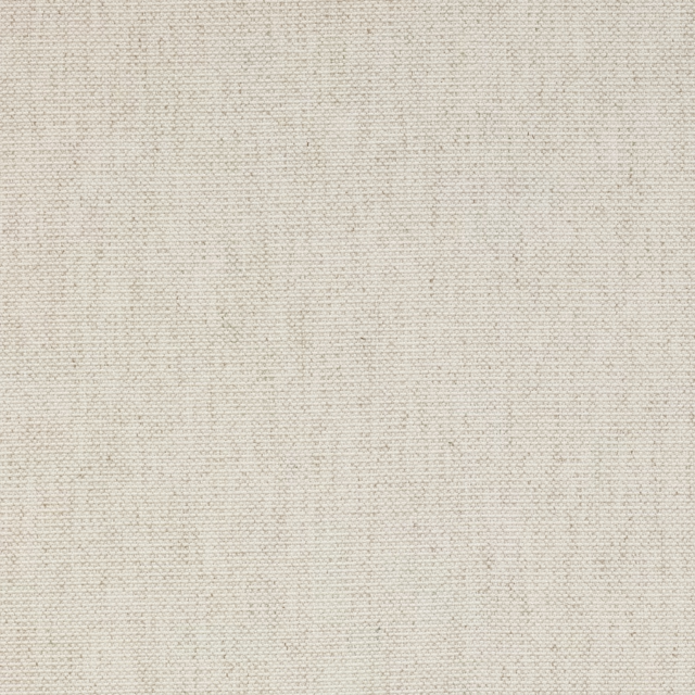
Alvaro Natural
Cristo

Carrera Natural
Leon
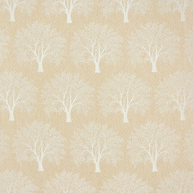
Levanto Natural
Other Fabrics & Weaves
Arenite Natural
Graphic Nature
Strings Natural
Heir
Araujo Natural
Roccapina

Alaska Cream
Alaska Collection
Baltic Linen
Atlantic Collection

Alvar Birch
Alvar 2
Paint that goes with it
Two ways to take the room. Both colours are from houses we hold, so a pot can come off the same order as the cloth. Screens shift colour, so treat these as a direction and bring the cloth to the shelf before you buy the paint.
To sit quietly behind it
Silk Yellow
Zoffany · #e1d3ae
To stand against it
Red House
Morris & Co. · #a36c57
Other cream fabrics
Across the houses we hold. See all 4,572.