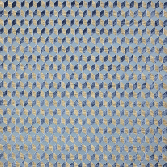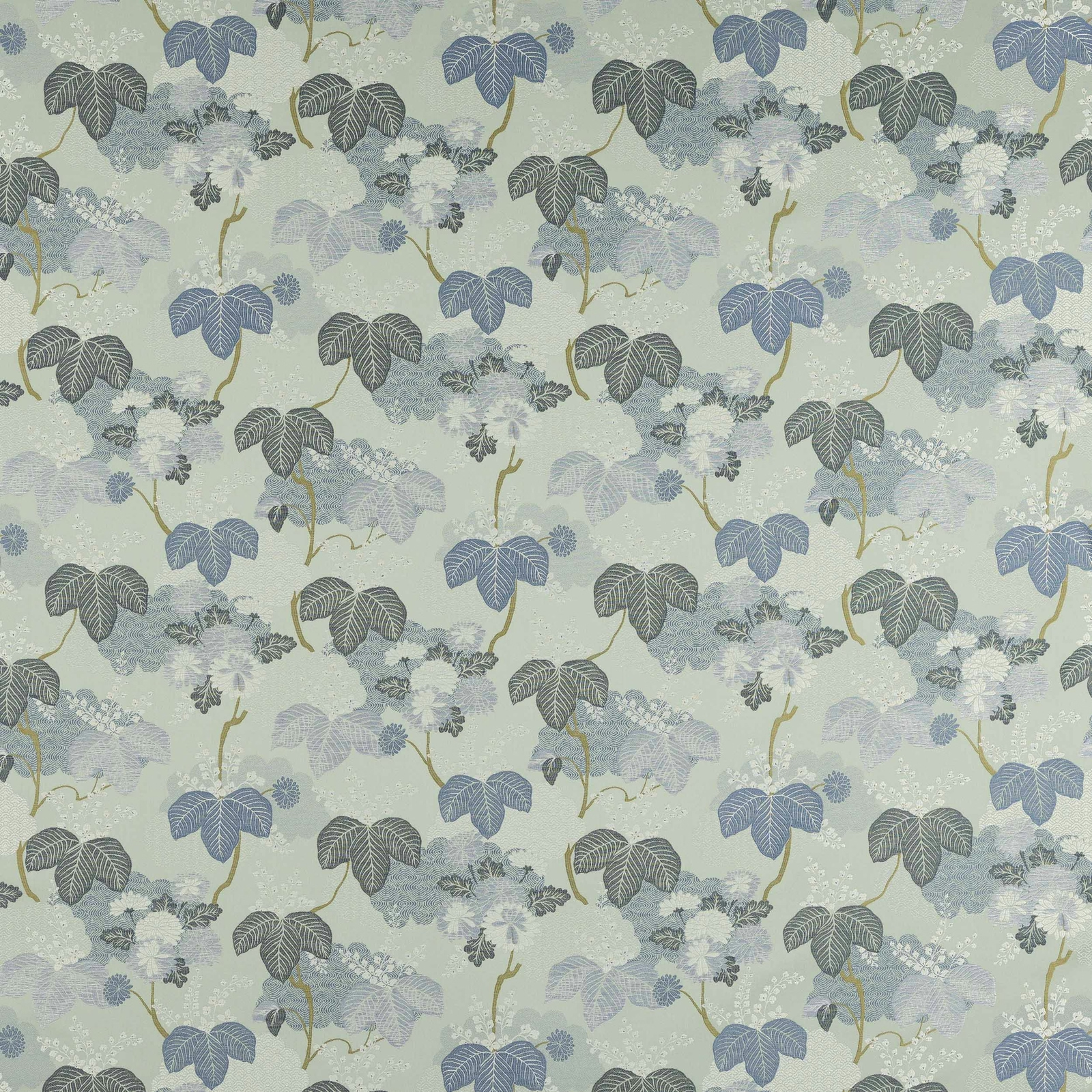

Tap the swatch to see it full screen. Hover it to magnify the weave. Colours on a screen are a guide, not a match, so come and feel the real cloth.
Scroll up or down to zoom in and out.
Lucia Mer
Ondine FabricM4141-02
Lucia Mer is a light, painterly leaf design set over a pale mint-aqua ground, with soft blue, slate and ivory tones threaded through the pattern. The overall effect is fresh and airy, with a delicate botanical rhythm that feels gently decorative rather than bold.
You have used your previews for today. Send one to Simon and you can carry on.
Your board
0 fabrics
See this fabric on Manuel Canovas's own site, then order it through us.
See Lucia Mer in your own room
A photograph of the piece you want re-covered. Straight on is best, and daylight helps. It is used to make your picture and nothing else.
Looking at your room
We found things here Lucia Mer could go on. Tap one on the photograph, or choose below.
We could not see anything to re-cover
, s
Lucia Mer, on your
Drag to compare. AI impression, colours indicative: ask us for a cutting before you decide.
About this fabric
Woven in 68% viscose and 32% cotton, Lucia Mer has a supple, textile feel that suits drapery beautifully and can also work for lighter decorative upholstery applications. The design repeats at approximately V 63cm and H 69cm, giving the trailing leaf clusters a generous, uncluttered spread across the width. In this colourway, the ground reads as a cool, watery mint with a faint pearl cast, while the leaves mix powder blue, denim blue and soft grey-green for a calm, misted look. Fine golden stems add a warm accent that lifts the palette without interrupting its softness. The result is a serene, medium-scale botanical with enough character to stand out while still feeling light in the room.
How to use it
Use Lucia Mer to bring cool freshness to full-length curtains, roman blinds or a relaxed headboard in a room with white-painted woodwork. Its pale aqua base and softened blues sit especially well with weathered oak, rattan and linen in coastal or garden-inspired schemes.
Works beautifully as airy curtains or statement cushions in a coastal or botanical scheme.
More from Ondine
The same book, other colourways.
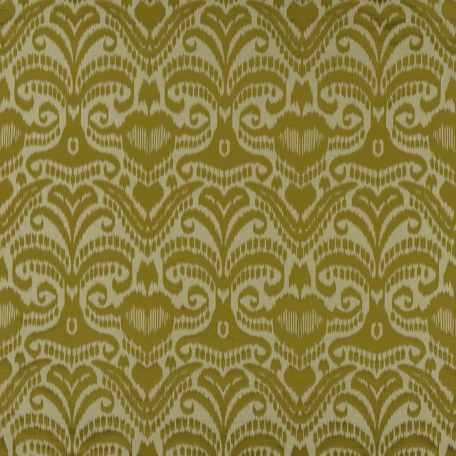
Adras Or
Ondine
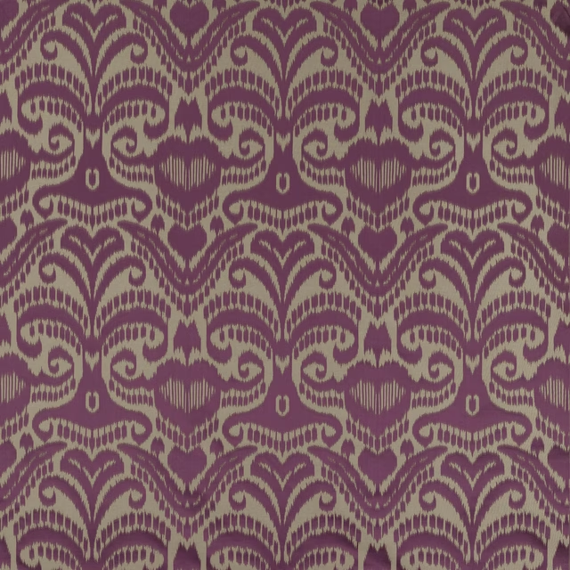
Adras Orchidee
Ondine
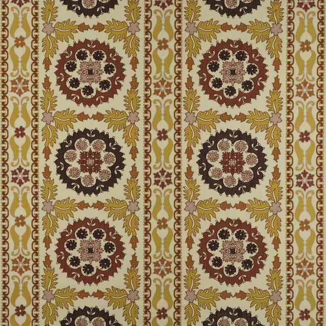
Kashan Epices
Ondine
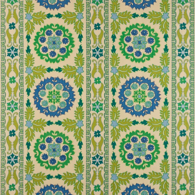
Kashan Kiwi
Ondine
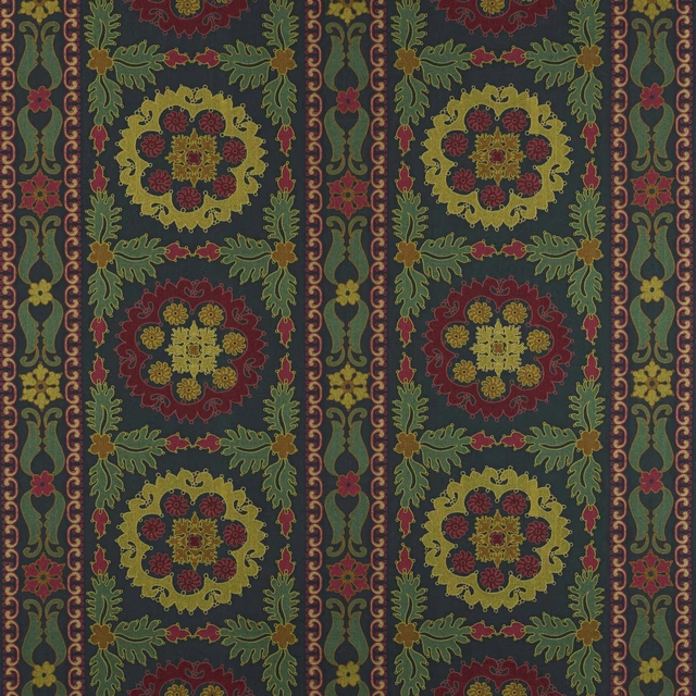
Kashan Nuit
Ondine
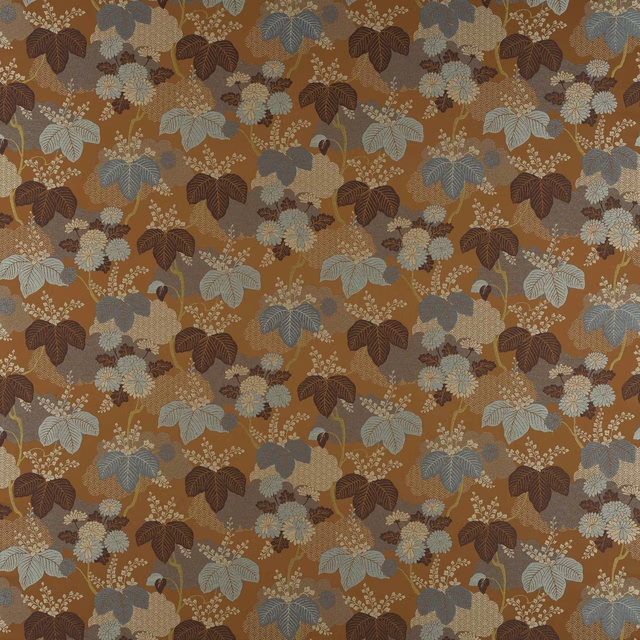
Lucia Brique
Ondine
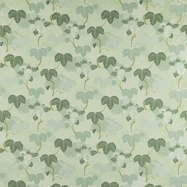
Lucia Opaline
Ondine
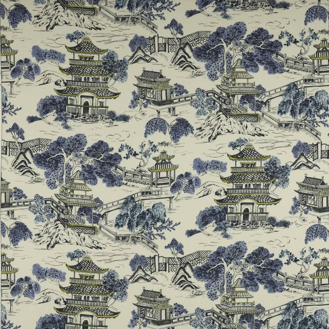
Mandarin Bleu de Chine
Ondine
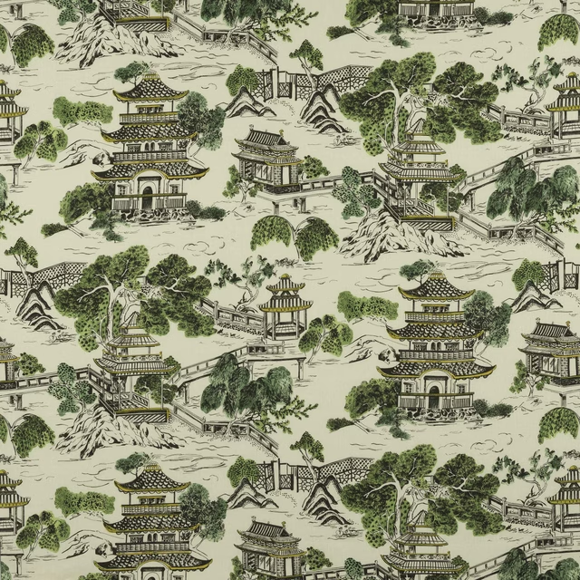
Mandarin Mousse
Ondine
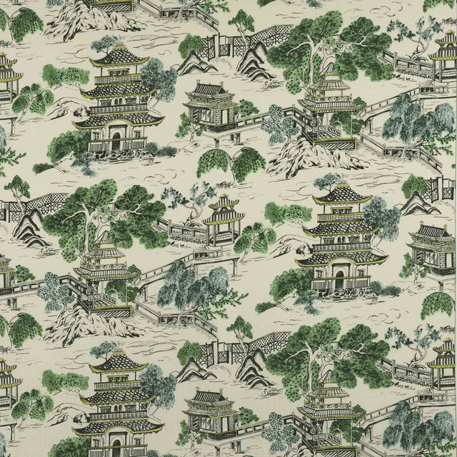
Mandarin Vert d'Eau
Ondine
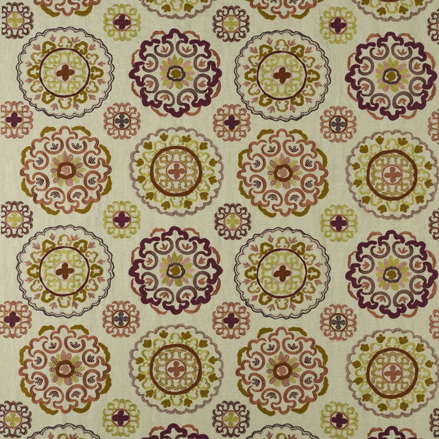
Margaux Epices
Ondine
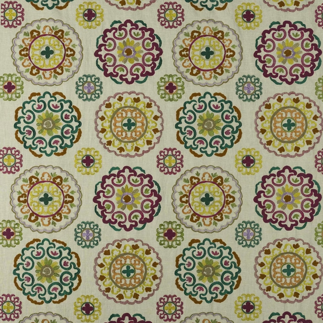
Margaux Fuchsia
Ondine
Pairs well with
A pattern needs somewhere for the eye to rest, so these are the plains and textures that sit beside Lucia Mer without fighting it. Mixed across the houses we hold, which is the part a single supplier's book cannot do.
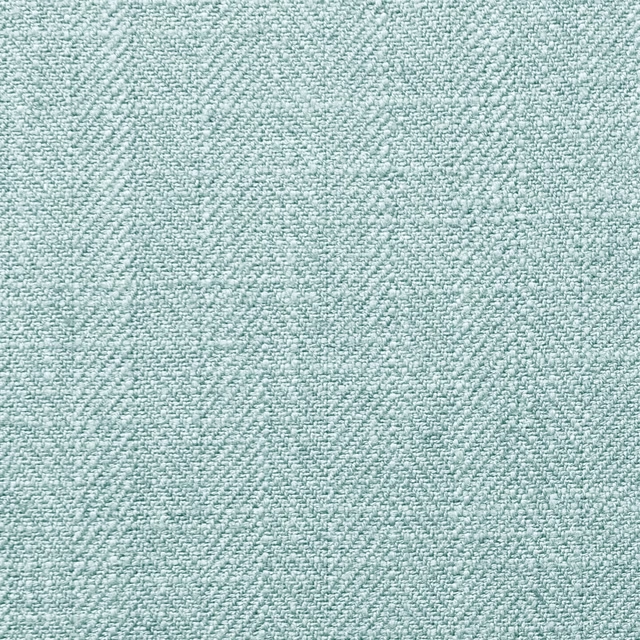
Henley Aqua
Henley
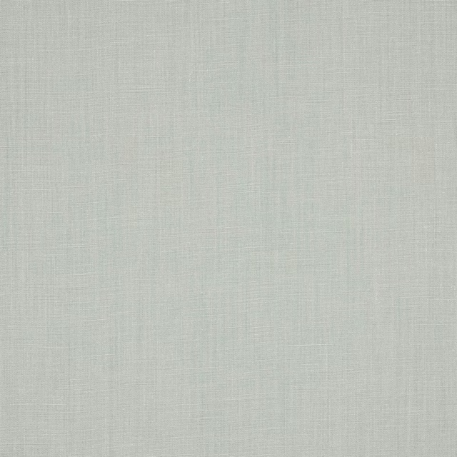
Flynn Pale Aqua
Flynn Linen

Belmont Plain Aqua
Naturals IV
Capri Eggshell
Patagonia

Robin Aqua
Boscombe
Montez Wallpaper Aqua
Camber Wallpapers
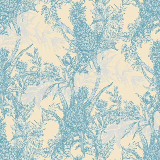
Pineapple Wallpaper Blues on Cream
Pineapple

Crammond Pastel Blue
Inchcolm Abbey

Dune Abalone
Dune
Emin Andaman
Emin
MUR3024
Murano
PIA1630
Piazza
Paint that goes with it
Two ways to take the room. Both colours are from houses we hold, so a pot can come off the same order as the cloth. Screens shift colour, so treat these as a direction and bring the cloth to the shelf before you buy the paint.
To sit quietly behind it
Crystal Palace
Sanderson · #b2b5aa
To stand against it
Vesuvius
Zoffany · #514b4f
Other blue fabrics
Across the houses we hold. See all 7,566.