
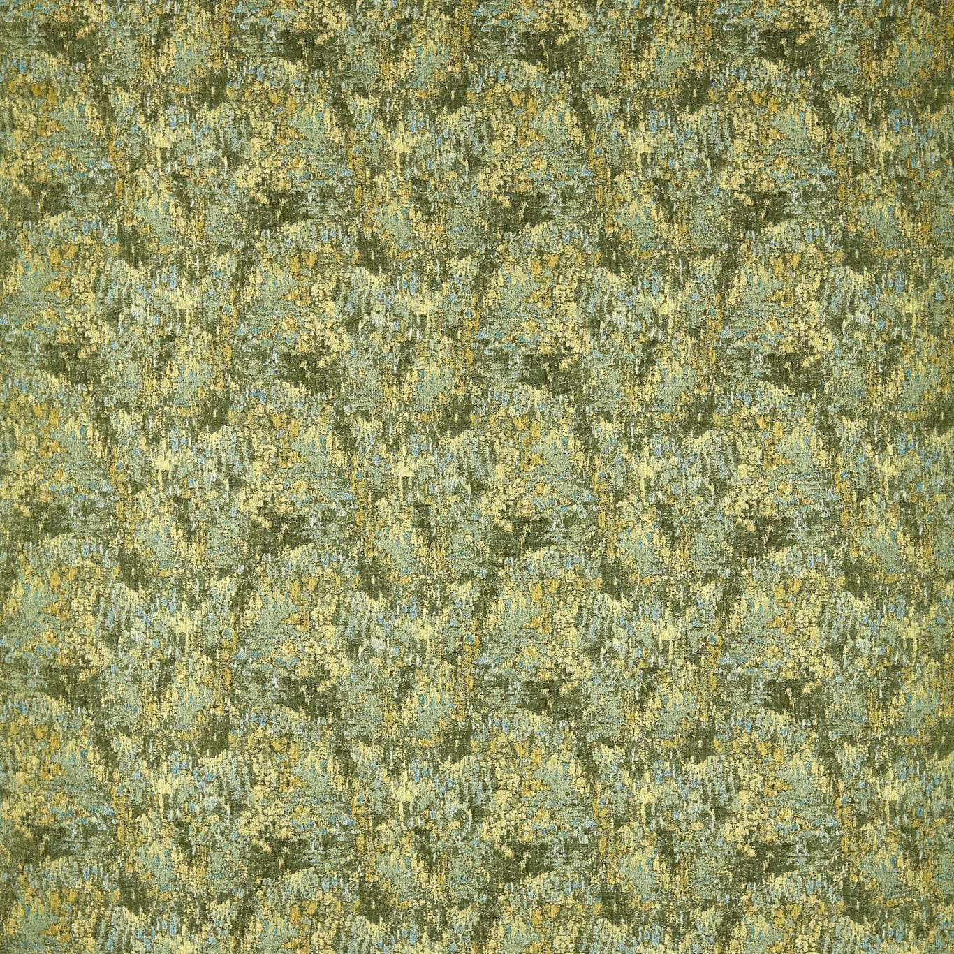

Tap the swatch to see it full screen. Hover it to magnify the weave. Colours on a screen are a guide, not a match, so come and feel the real cloth.
Scroll up or down to zoom in and out.
Eliasson Kyanite/Emerald
Defined Momentum Fabrics FabricHAF0635-01
Eliasson Kyanite/Emerald combines a cool mineral teal with emerald depths and scattered antique-gold highlights. Its close, painterly surface shifts between blue-green haze and darker broken marks, giving the 130 cm-wide textile a quietly atmospheric character.
You have used your previews for today. Send one to Simon and you can carry on.
Your board
0 fabrics
See this fabric on Harlequin's own site, then order it through us.
See Eliasson Kyanite/Emerald in your own room
A photograph of the piece you want re-covered. Straight on is best, and daylight helps. It is used to make your picture and nothing else.
Looking at your room
We found things here Eliasson Kyanite/Emerald could go on. Tap one on the photograph, or choose below.
We could not see anything to re-cover
, s
Eliasson Kyanite/Emerald, on your
Drag to compare. AI impression, colours indicative: ask us for a cutting before you decide.
About this fabric
In this Kyanite/Emerald colourway, a cool blue-teal ground is broken by emerald-green, mineral-grey and small gold-yellow flecks. The dense, painterly repeat has a softly distressed, almost foliage-like rhythm, while short directional threads create a textured, broken-light effect. At 360 gsm and 130 cm usable width, the cloth has a substantial mid-weight presence for upholstery or drapery. The pattern repeats every 42.7 cm vertically and 32.5 cm horizontally, allowing the mottled design to build across a larger surface. Its listed 149 threads per cm complements the close, intricate visual texture.
How to use it
Use this cool teal-and-emerald colourway to bring depth to a calm sitting room, pairing it with warm timber or aged brass to draw out the scattered gold highlights. Its 42.7 cm vertical repeat can create a softly animated statement on a chair, headboard or curtain.
The cool teal base and flecked gold detail suit tailored upholstery or full-length curtains.
More from Defined Momentum Fabrics
The same book, other colourways.
Cartography Storm
Defined Momentum Fabrics
Cartography Tourmaline
Defined Momentum Fabrics
Chaco Dove
Defined Momentum Fabrics
Chaco Moss
Defined Momentum Fabrics
Chaco Sand
Defined Momentum Fabrics
Eliasson Calcite/Rose Quartz
Defined Momentum Fabrics
Eliasson Myrtle/Rust
Defined Momentum Fabrics
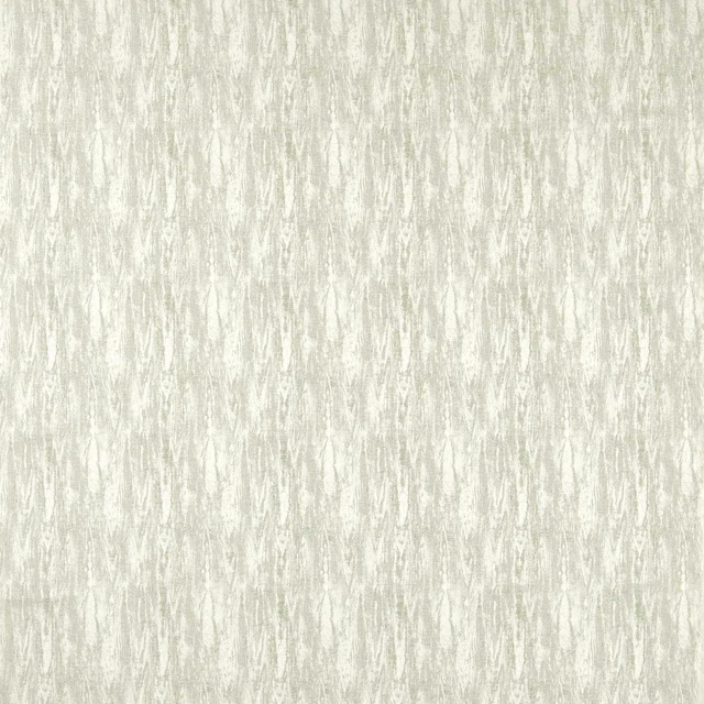
Erosion Aloe
Defined Momentum Fabrics
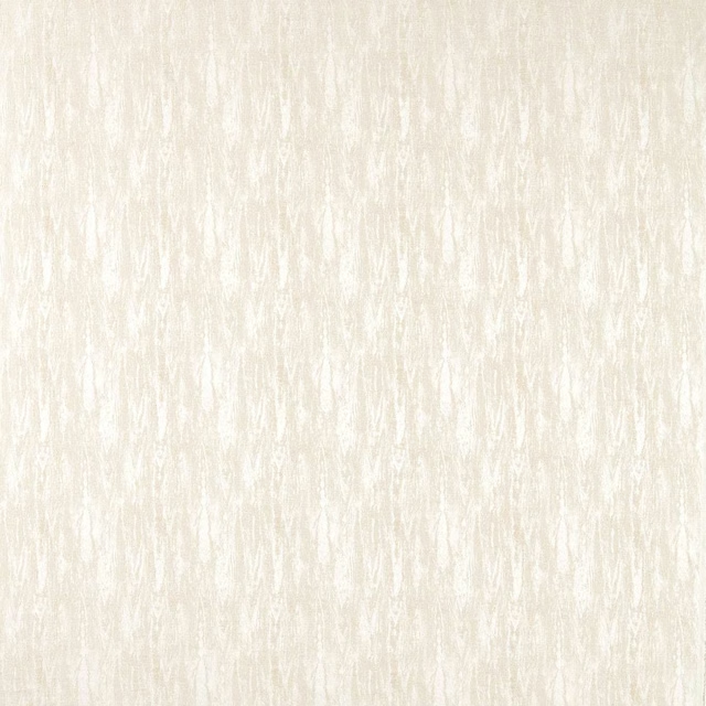
Erosion Chalk
Defined Momentum Fabrics
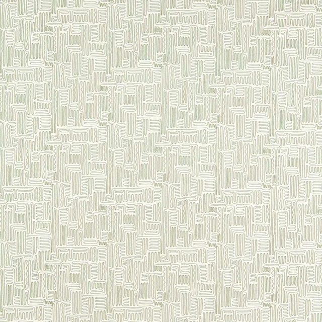
Hollow Evergreen
Defined Momentum Fabrics
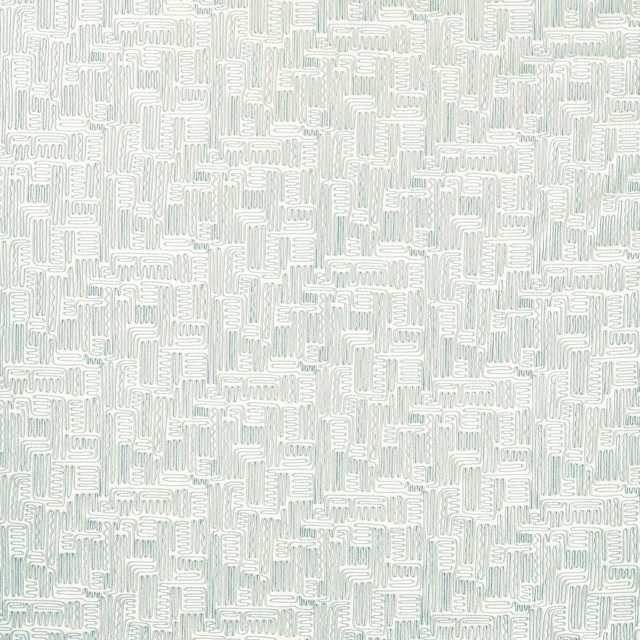
Hollow Sky
Defined Momentum Fabrics
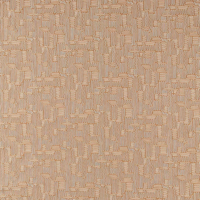
Hollow Tan
Defined Momentum Fabrics
Pairs well with
A pattern needs somewhere for the eye to rest, so these are the plains and textures that sit beside Eliasson Kyanite/Emerald without fighting it. Mixed across the houses we hold, which is the part a single supplier's book cannot do.

Alaska Teal
Alaska Collection
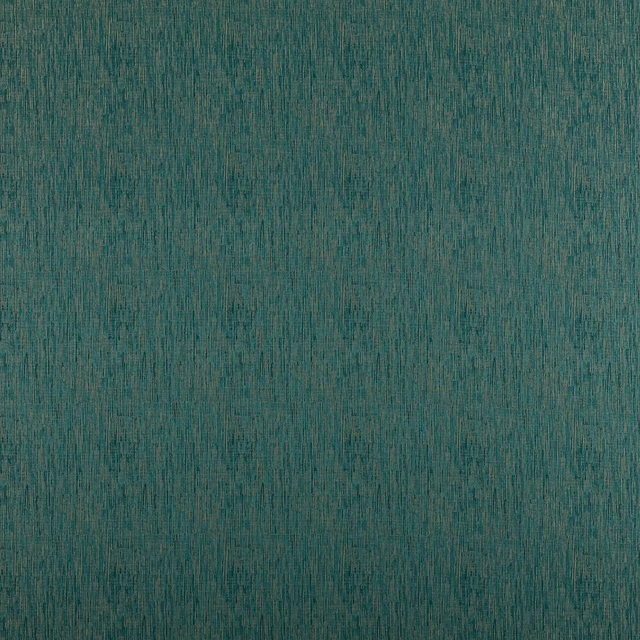
Alula Peacock
Comet Collection
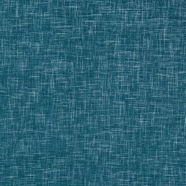
Albany Peacock
Albany and Moray
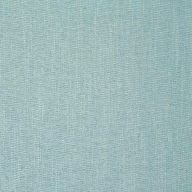
Moray Eau De Nil
Albany and Moray

Marldon Aqua
Albeck
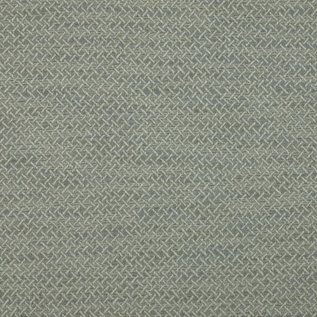
Medway Aqua
Brett Weaves
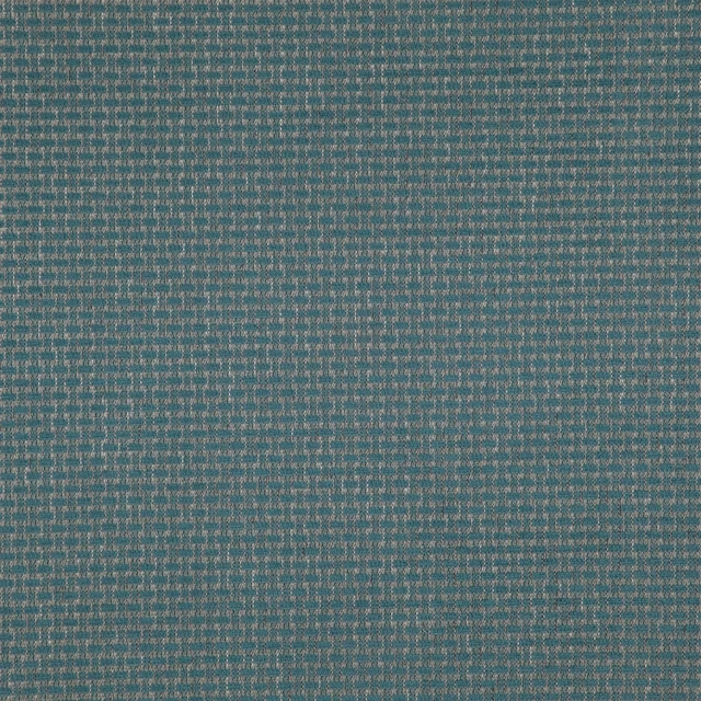
Barden Sea
Birkett easyclean Fabrics
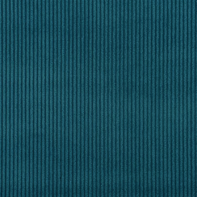
Corda FR SR Petrol
Corda FR SR
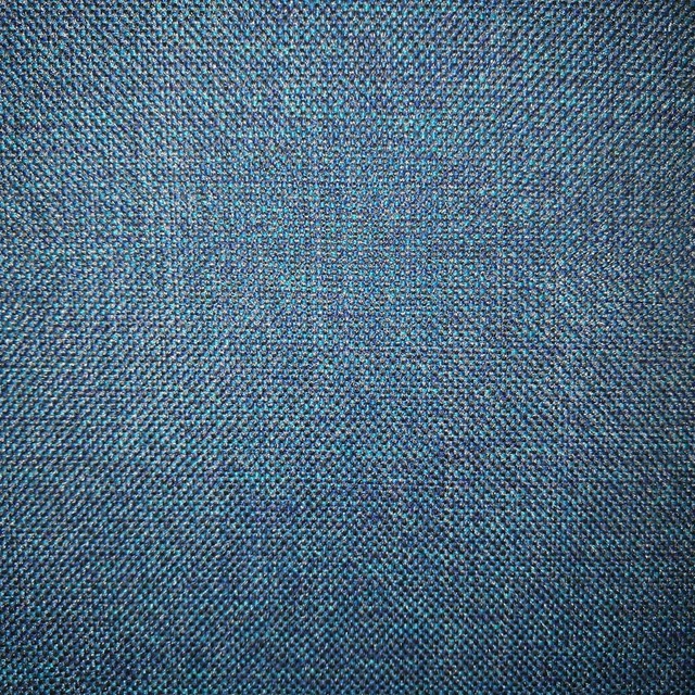
Arran FR Teal
Alderney

Naples FR Turquoise
Alderney
Amalfi Blue Grass
Amalfi
Amalfi Peacock
Amalfi
Paint that goes with it
Two ways to take the room. Both colours are from houses we hold, so a pot can come off the same order as the cloth. Screens shift colour, so treat these as a direction and bring the cloth to the shelf before you buy the paint.
To sit quietly behind it
East For Trees
Coat Paints · #949c74
To stand against it
Porcelain
Zoffany · #a4b5c9
Other teal fabrics
Across the houses we hold. See all 2,990.
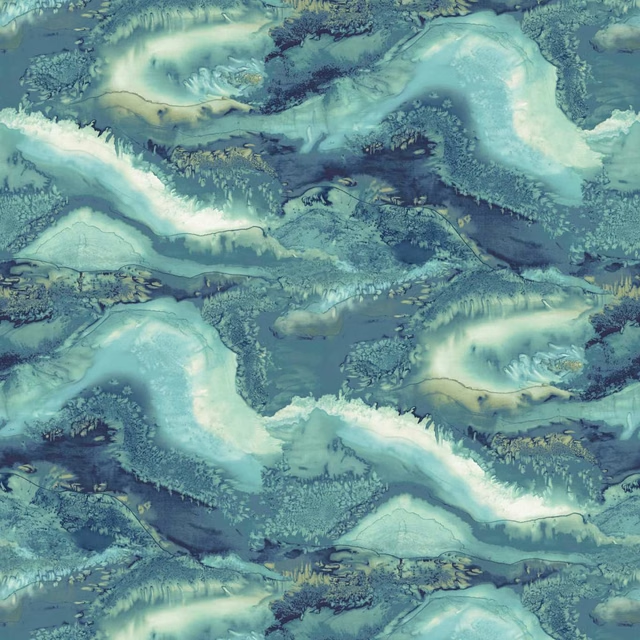
Reflected Obsidian Azurite
Colour 2 Wallpapers
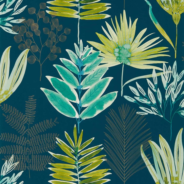
Yasuni Wide Width Emerald/Zest
Colour 2 Wallpapers
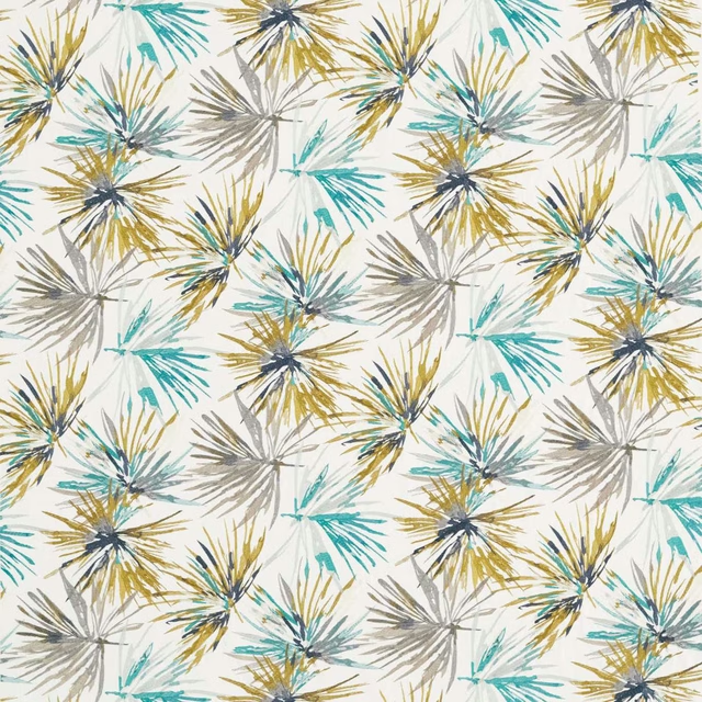
Aucuba Embroidery Teal/Zest
Colour 3 Fabrics
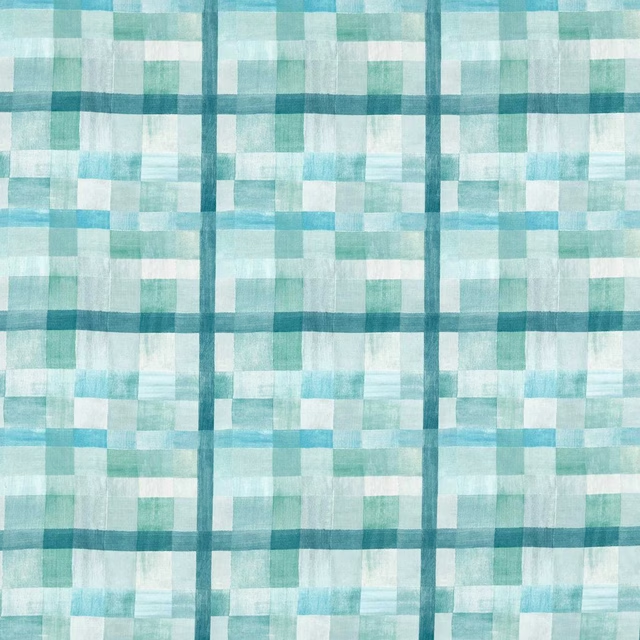
Ertha Celestial/Murmuration
Colour 4 Fabrics
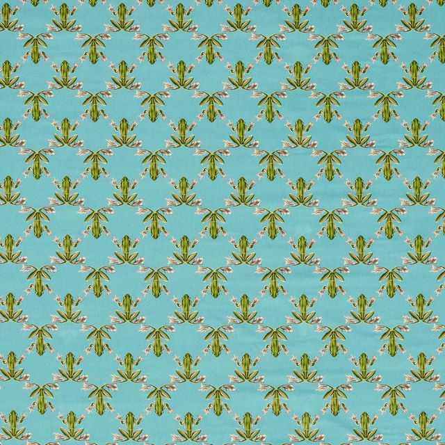
Wood Frog Velvet Azul/Forest
Colour 4 Fabrics

Empower Plain Riviera
Empower Plain
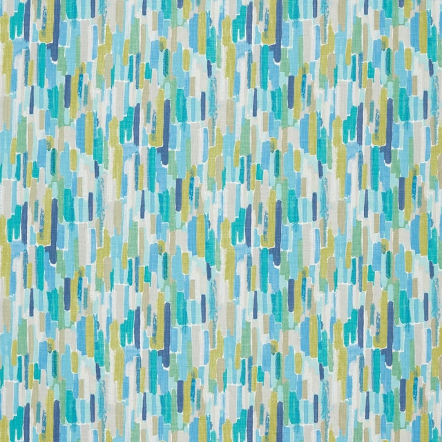
Trattino Turquoise / Ocean / Marine
Fauvisimo Edit
Florio Petrol
Florio Plains
Florio Teal
Florio Plains
Nickel Emerald/Marine
Hamada Weaves
Teesha Emerald
Hamada Weaves

Basket Weave Emerald/Aquamarine
Harlequin X Sophie Robinson Fabrics