
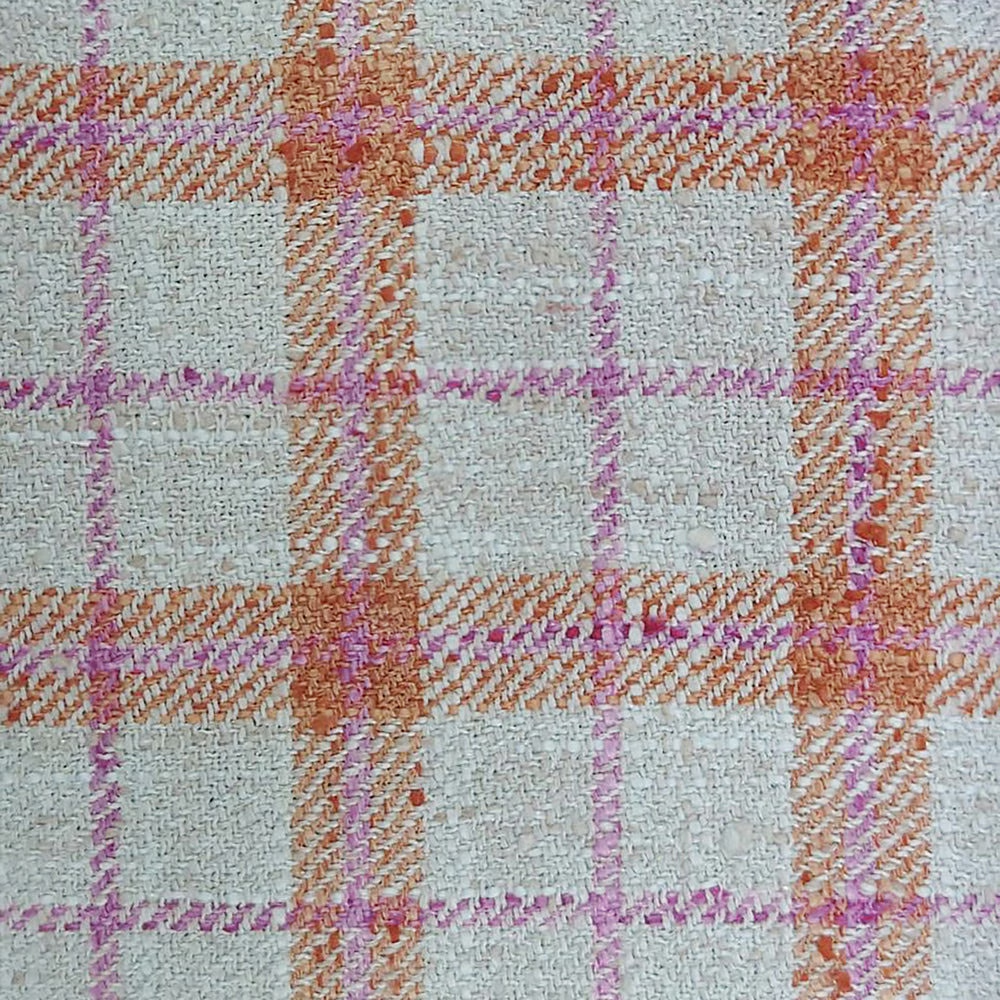

Tap the swatch to see it full screen. Hover it to magnify the weave. Colours on a screen are a guide, not a match, so come and feel the real cloth.
Scroll up or down to zoom in and out.
Painswick Russet
Painswick Fabricpainswi/fa1/rus
Painswick Russet brings a bright, woven check to a softly textured ground, with warm coral and pink accents lifting the design. The overall effect is cheerful and fresh, but still grounded by the substantial, upholstery-ready cloth.
You have used your previews for today. Send one to Simon and you can carry on.
Your board
0 fabrics
Part of the range we hold from Voyage Maison.
See Painswick Russet in your own room
A photograph of the piece you want re-covered. Straight on is best, and daylight helps. It is used to make your picture and nothing else.
Looking at your room
We found things here Painswick Russet could go on. Tap one on the photograph, or choose below.
We could not see anything to re-cover
, s
Painswick Russet, on your
Drag to compare. AI impression, colours indicative: ask us for a cutting before you decide.
About this fabric
This Painswick colourway is woven in 100% polyester and has a reassuringly durable 30,000 martindale rating, making it suitable for curtains, blinds and upholstery. The fabric reads as a creamy, pale neutral base crossed with orange-coral bands and fine pinkish lines, creating a large-scale check that feels lively without becoming harsh. Its 420gsm weight gives the cloth a substantial handle and a more structured appearance than a light drapery fabric. The visible weave is clearly textured, adding depth and a slightly rustic character to the bright colour mix. Dry clean only care and dry iron finishing make it a practical decorative fabric with a polished, tailored look.
How to use it
Use this shade where you want warmth and pattern against painted timber, rattan, or pale stone. It works especially well in country-inspired sitting rooms or relaxed bedrooms that can handle a confident orange accent.
Use it to bring a lively, softly rustic lift to tailored interiors.
More from Painswick
The same book, other colourways.
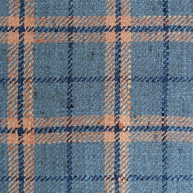
Painswick Cornflower
Painswick
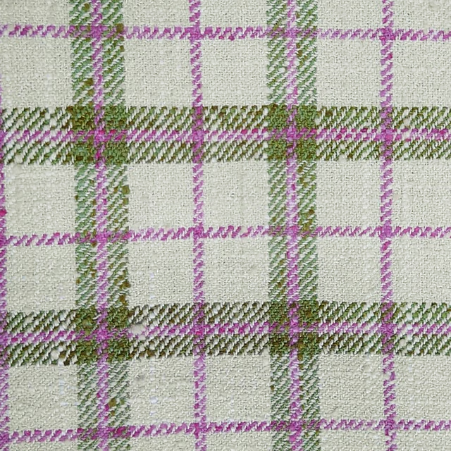
Painswick Blossom
Painswick
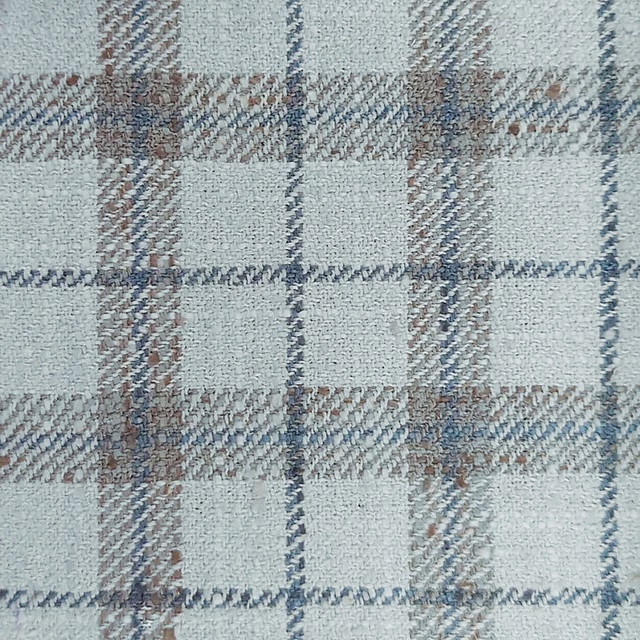
Painswick Steel
Painswick
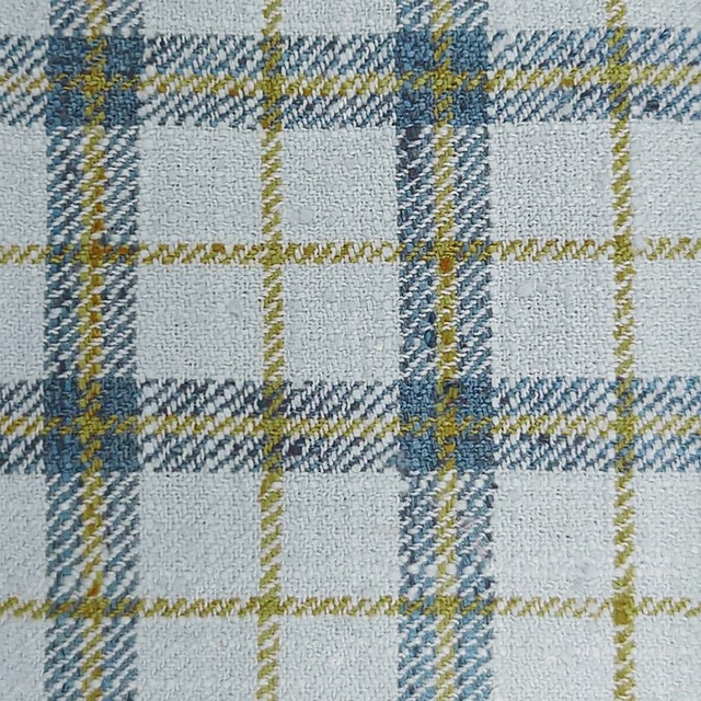
Painswick Dawn
Painswick
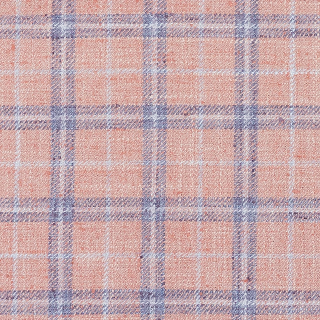
Painswick Blush
Painswick

Painswick Heritage
Painswick
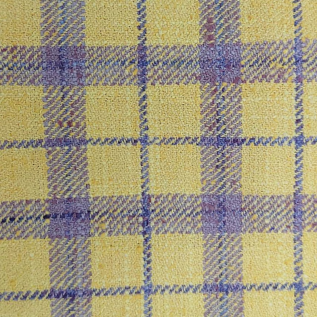
Painswick Dandelion
Painswick
Pairs well with
A pattern needs somewhere for the eye to rest, so these are the plains and textures that sit beside Painswick Russet without fighting it. Mixed across the houses we hold, which is the part a single supplier's book cannot do.
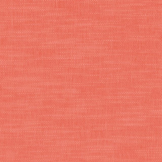
Amalfi Coral
Amalfi

Omega Velvet 4 Coral
Omega Velvet 4

Celino Koi
Celino
Linara Tiger Lily
Linara
Whitewell Seville
Whitewell

Kit's Linen Clementine
G P & J Baker X Kit Kemp Kit's Linen
Stanton Linen Coral
Tetbury Linens
Dakota Saffron
Dakota Collection
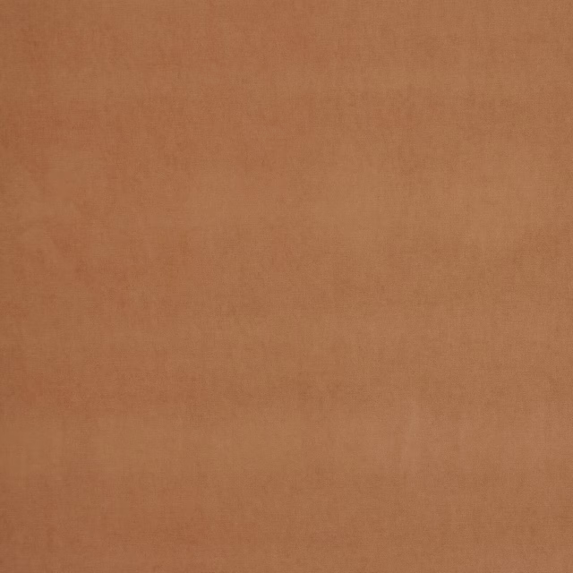
Arezzo Papaya
Portofino Collection
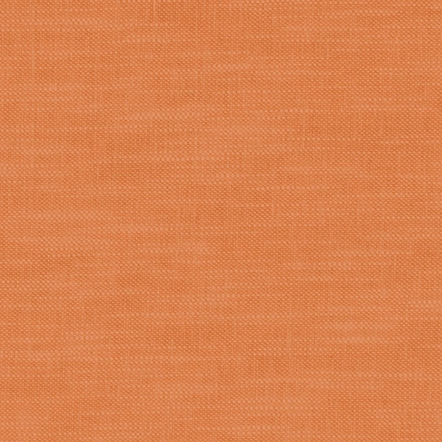
Amalfi Pumpkin
Amalfi
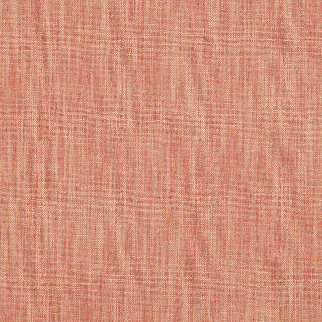
Carnforth Copper
Tarn
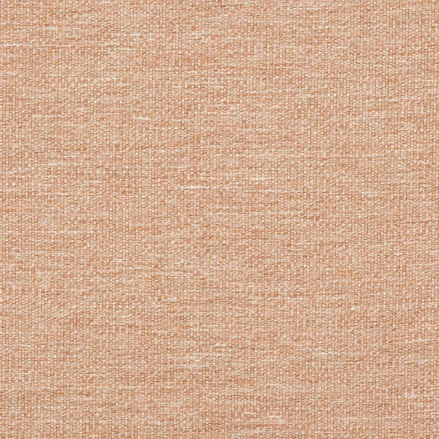
Kellen Sienna
Tarn
Paint that goes with it
Two ways to take the room. Both colours are from houses we hold, so a pot can come off the same order as the cloth. Screens shift colour, so treat these as a direction and bring the cloth to the shelf before you buy the paint.
To sit quietly behind it
Dusk
Zoffany · #a79d9e
To stand against it
Brasserie Brown
Coat Paints · #4e383a
Other orange fabrics
Across the houses we hold. See all 784.
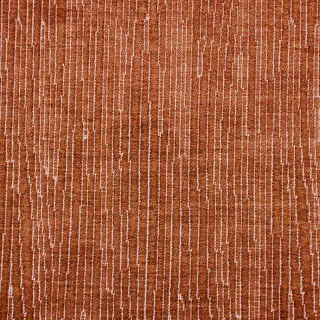
Linde Sunset
Misc
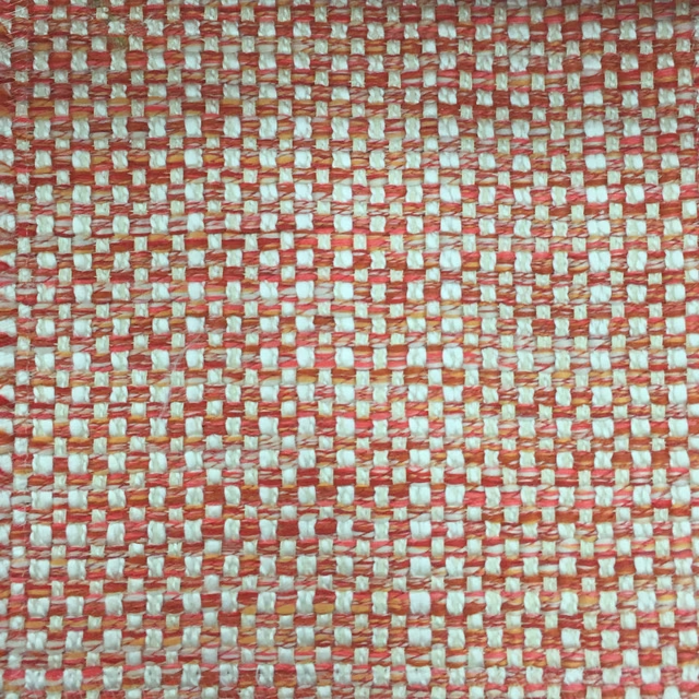
Meridianwoven Clementine
Misc
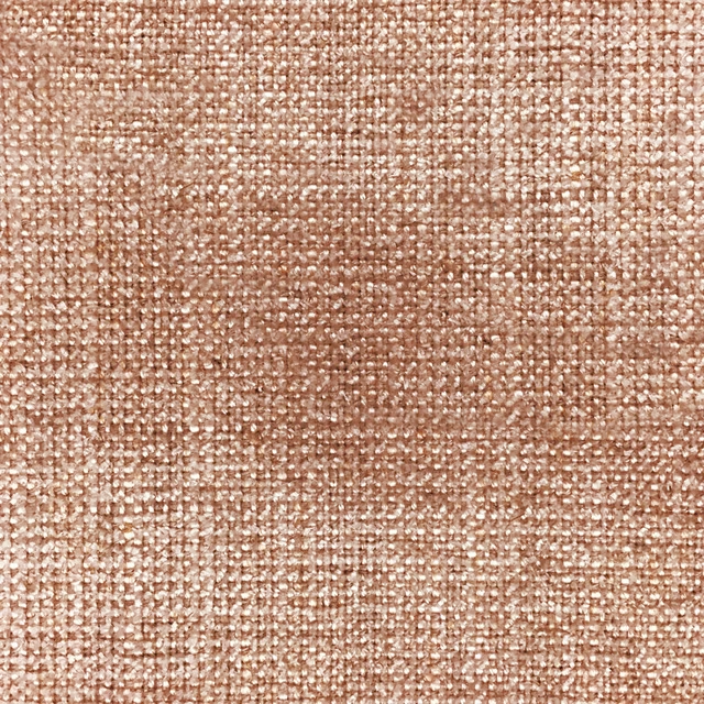
Quito Brick
Misc
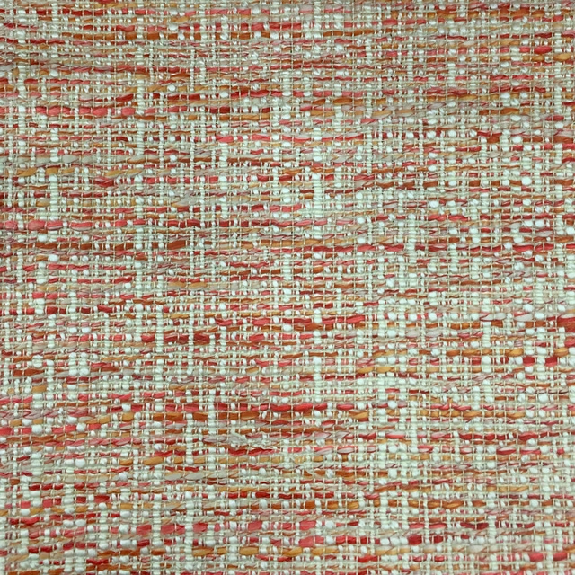
Samara Clementine
Misc
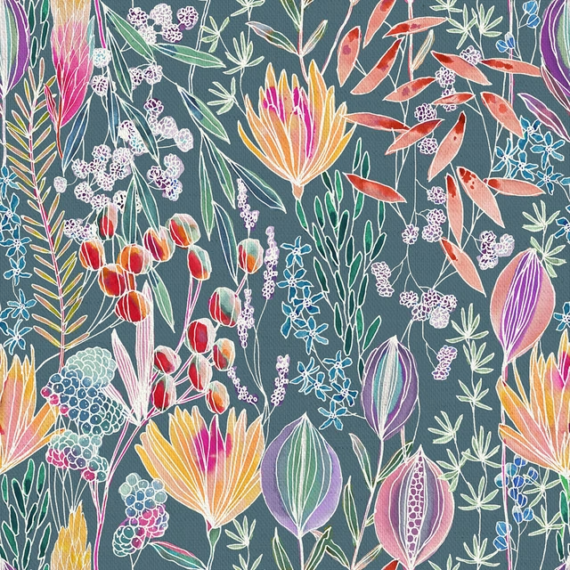
Masina Papaya
Oceania
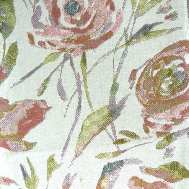
Meerwood Coral
Penningtonweaves
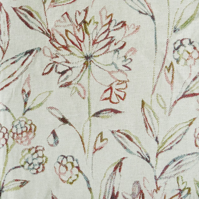
Pennington Auburn
Penningtonweaves
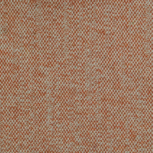
Selkirk Clementine
Selkirk
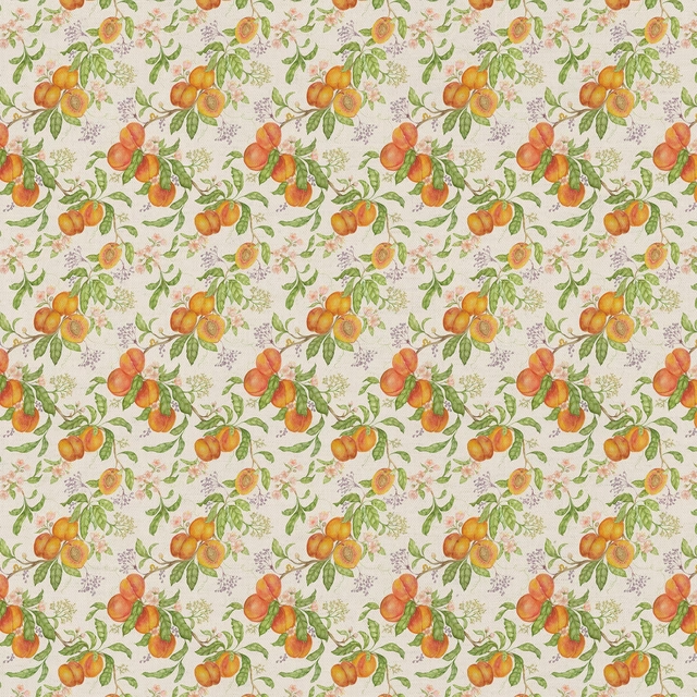
Peachharvest Cream
Springsolstice
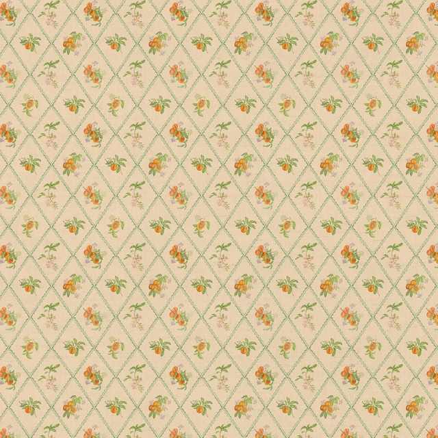
Peachtrellis Melba
Springsolstice
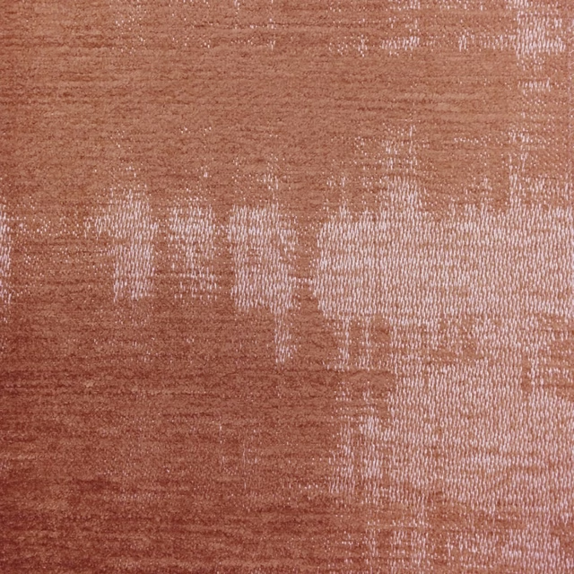
Stratos Rust
Stratos
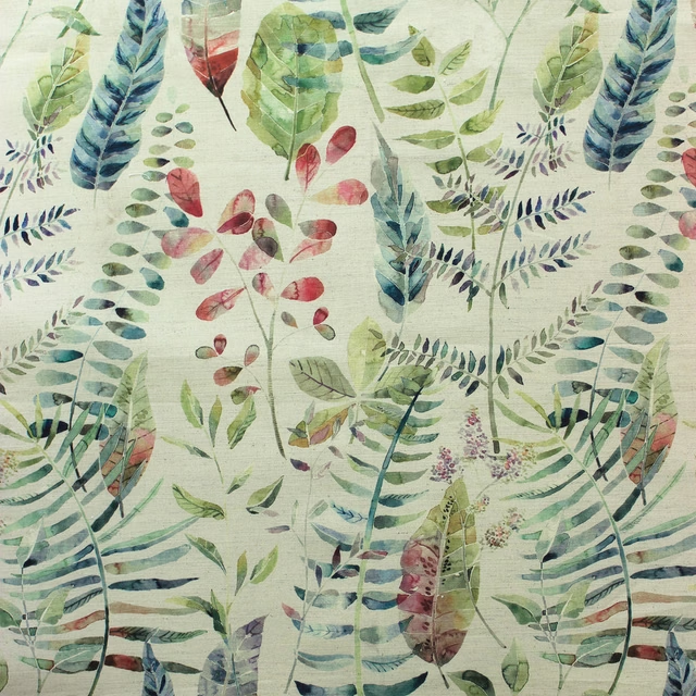
Kenton Pomegranate
Tiverton