


Tap the swatch to see it full screen. Hover it to magnify the weave. Colours on a screen are a guide, not a match, so come and feel the real cloth.
Scroll up or down to zoom in and out.
Pietra Blush/Gilver
Botanica Wallpaper WallpaperCCW0027-01
Pietra Blush/Gilver layers a warm blush-taupe ground with fine pale silver tracery, creating the impression of softly weathered stone across the wall. The close, irregular pattern shifts between open taupe areas and bright mineral-like lines.
You have used your previews for today. Send one to Simon and you can carry on.
Your board
0 fabrics
Part of the range we hold from Clarke & Clarke.
See Pietra Blush/Gilver in your own room
A photograph of the piece you want re-covered. Straight on is best, and daylight helps. It is used to make your picture and nothing else.
Looking at your room
We found things here Pietra Blush/Gilver could go on. Tap one on the photograph, or choose below.
We could not see anything to re-cover
, s
Pietra Blush/Gilver, on your
Drag to compare. AI impression, colours indicative: ask us for a cutting before you decide.
About this wallpaper
This Botanica Wallpaper colourway has a distinctly muted, warm stone tone rather than a pink-heavy blush, while the pale silver pattern gives the surface a cool, lightly reflective contrast. The organic marbling is medium in visual scale, with irregular islands and branching lines distributed across the full design. It is supplied at a 52 cm usable width and a standard length of 10.05 m, with a 64 cm vertical repeat and no horizontal repeat. At 381 gsm, the paper has a substantial specification for a decorative wallcovering.
How to use it
Pair the blush-taupe ground with chalky whites, warm greys and pale timber to keep the scheme quiet and mineral-led. In a darker room, use the pale silver tracery alongside brushed metal or soft grey upholstery so the pattern catches the available light without becoming stark.
Use this softly contrasting taupe and pale silver design to bring a refined, mineral feel to bedrooms, hallways or living spaces.
More from Botanica Wallpaper
The same book, other colourways.
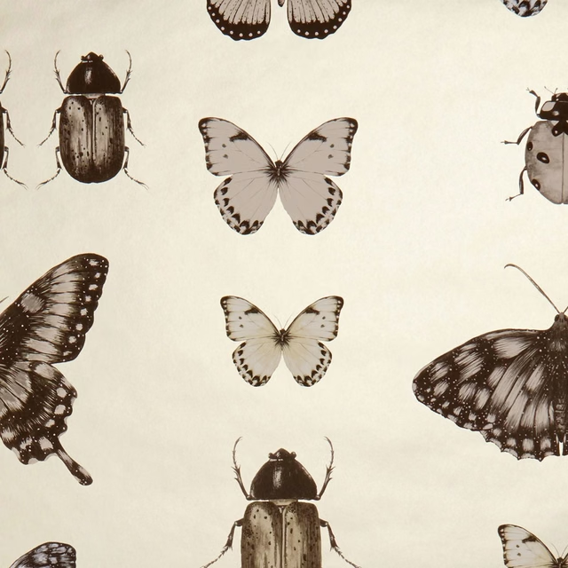
Papilio Charcoal/Gold
Botanica Wallpaper
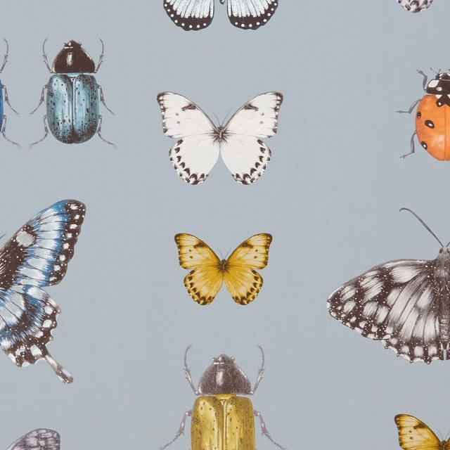
Papilio Mineral/Gilver
Botanica Wallpaper
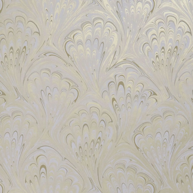
Pavone Ivory/Gold
Botanica Wallpaper
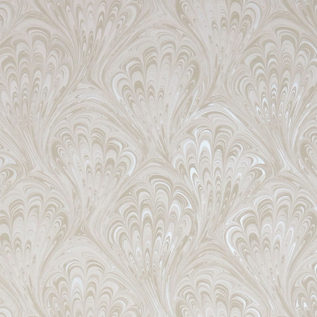
Pavone Ivory/Pearl
Botanica Wallpaper
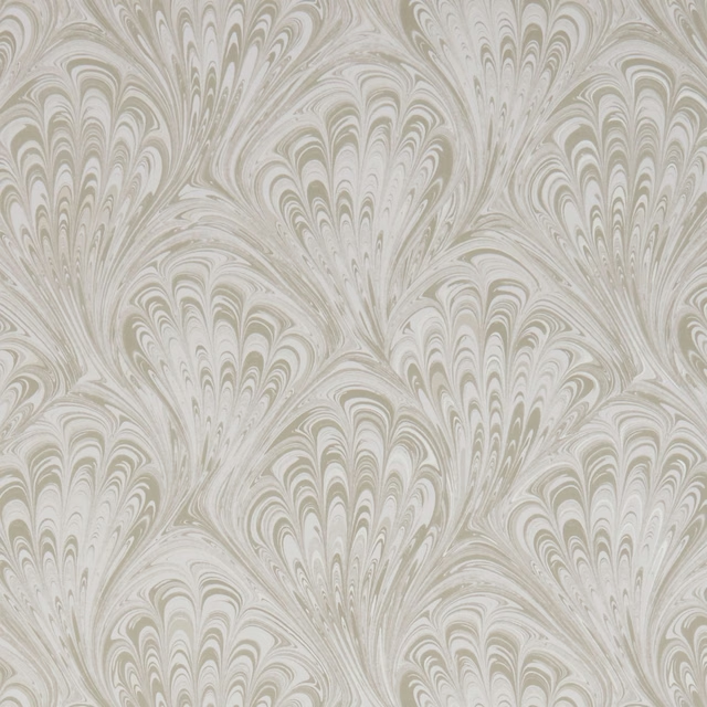
Pavone Taupe/Gilver
Botanica Wallpaper
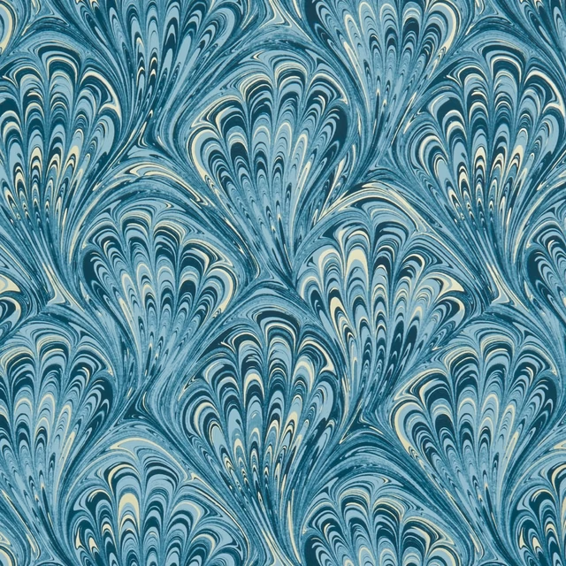
Pavone Teal/Gold
Botanica Wallpaper

Pietra Grey/Gilver
Botanica Wallpaper

Pietra Heather/Gold
Botanica Wallpaper

Pietra Ivory/Gold
Botanica Wallpaper

Pietra Mineral/Gold
Botanica Wallpaper

Pietra Teal/Gold
Botanica Wallpaper
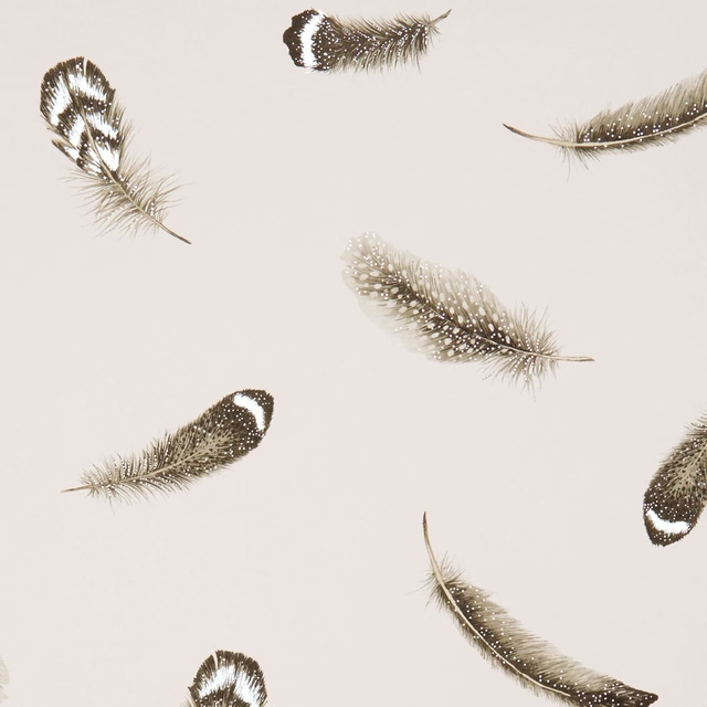
Plumis Blush/Gilver
Botanica Wallpaper
Pairs well with
A pattern needs somewhere for the eye to rest, so these are the plains and textures that sit beside Pietra Blush/Gilver without fighting it. Mixed across the houses we hold, which is the part a single supplier's book cannot do.
Wareham colour 4
Dorset

Alaska Mole
Alaska Collection

Alaska Otter
Alaska Collection

Marldon Taupe
Albeck
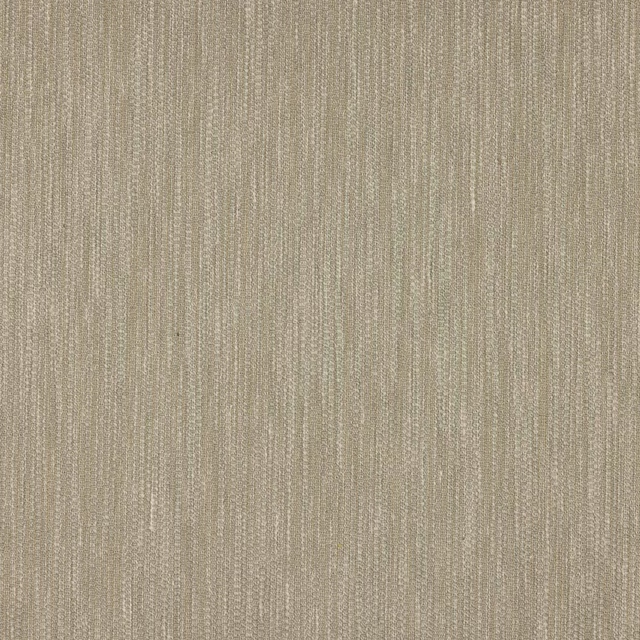
Croft Silver
Chester

Marcello Cappuccino
Contract Essentials II Fabrics

Sahara Zinc
Kalahari Fabrics
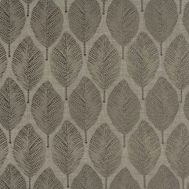
Acacia Taupe
Acacia

Alchemy Mushroom
Alchemy

Allegra Avery
Allegra

Allegra Fog
Allegra

Amalfi Cobblestone
Amalfi
Paint that goes with it
Two ways to take the room. Both colours are from houses we hold, so a pot can come off the same order as the cloth. Screens shift colour, so treat these as a direction and bring the cloth to the shelf before you buy the paint.
To sit quietly behind it
Mono
Little Greene · #c3c2b9
To stand against it
Hopper
Little Greene · #5a6e48
Other taupe fabrics
Across the houses we hold. See all 4,148.
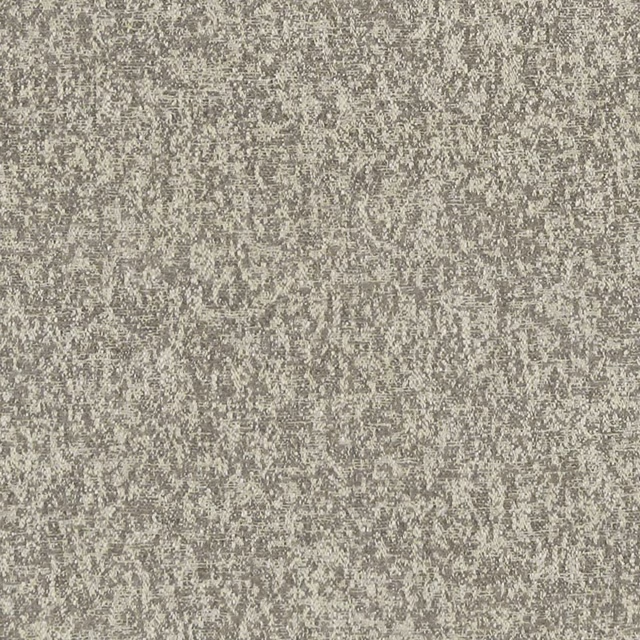
Logan Natural
Avalon
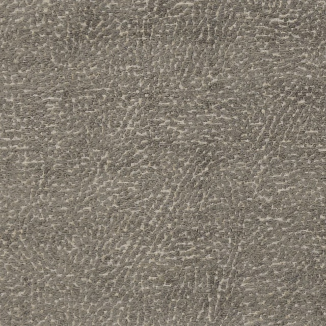
Mason Mocha
Avalon
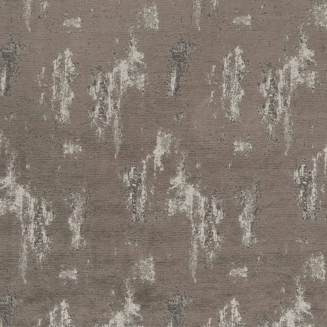
Monterrey Mocha
Avalon
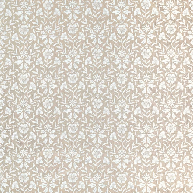
Berkeley Natural
Avebury
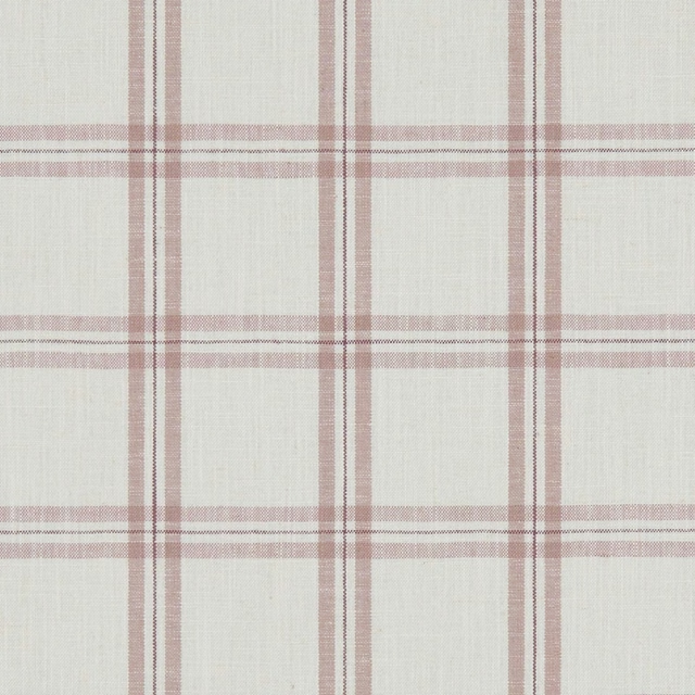
Kelmscott Heather
Avebury

Isla Taupe/Gold
Botanica Fabric
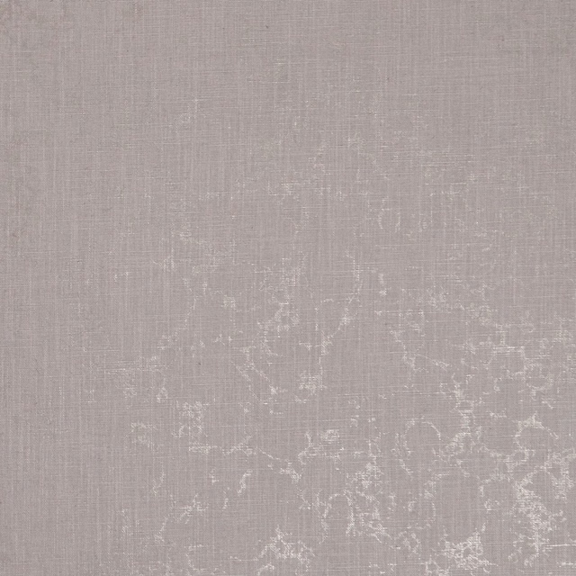
Pietra Heather/Gold
Botanica Fabric
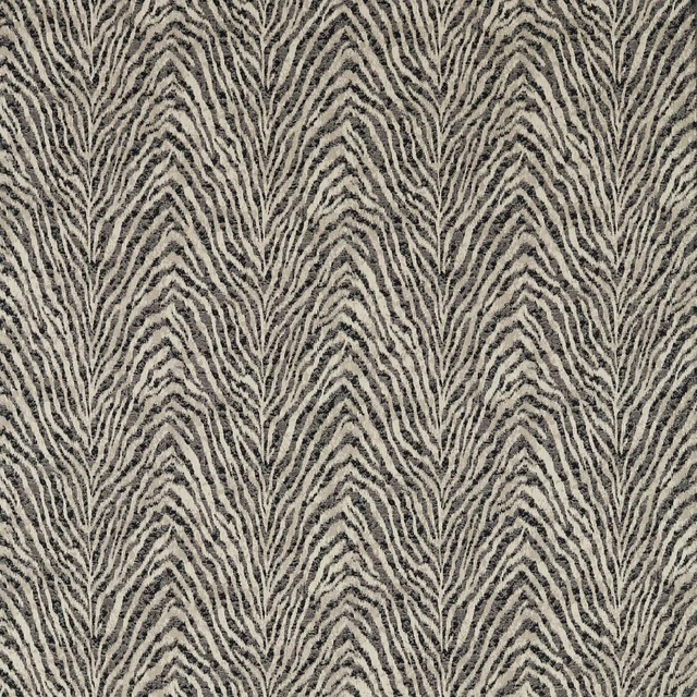
Manda Noir/Linen
Breegan Jane x Clarke and Clarke Fabric
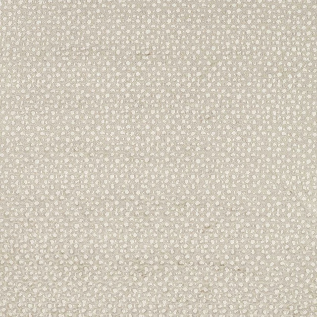
Pokot Linen
Breegan Jane x Clarke and Clarke Fabric
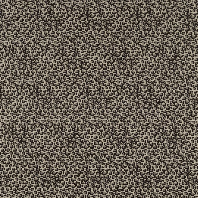
Pokot Noir
Breegan Jane x Clarke and Clarke Fabric

Serengeti Noir
Breegan Jane x Clarke and Clarke Fabric
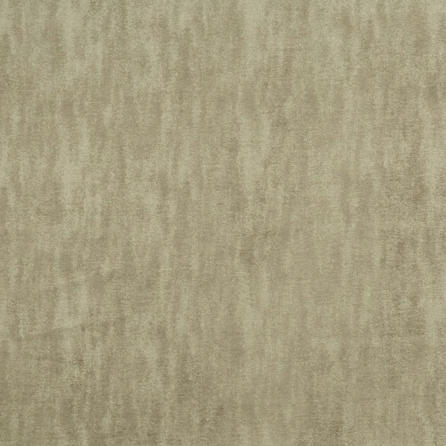
Baker Natural
Castle Garden