
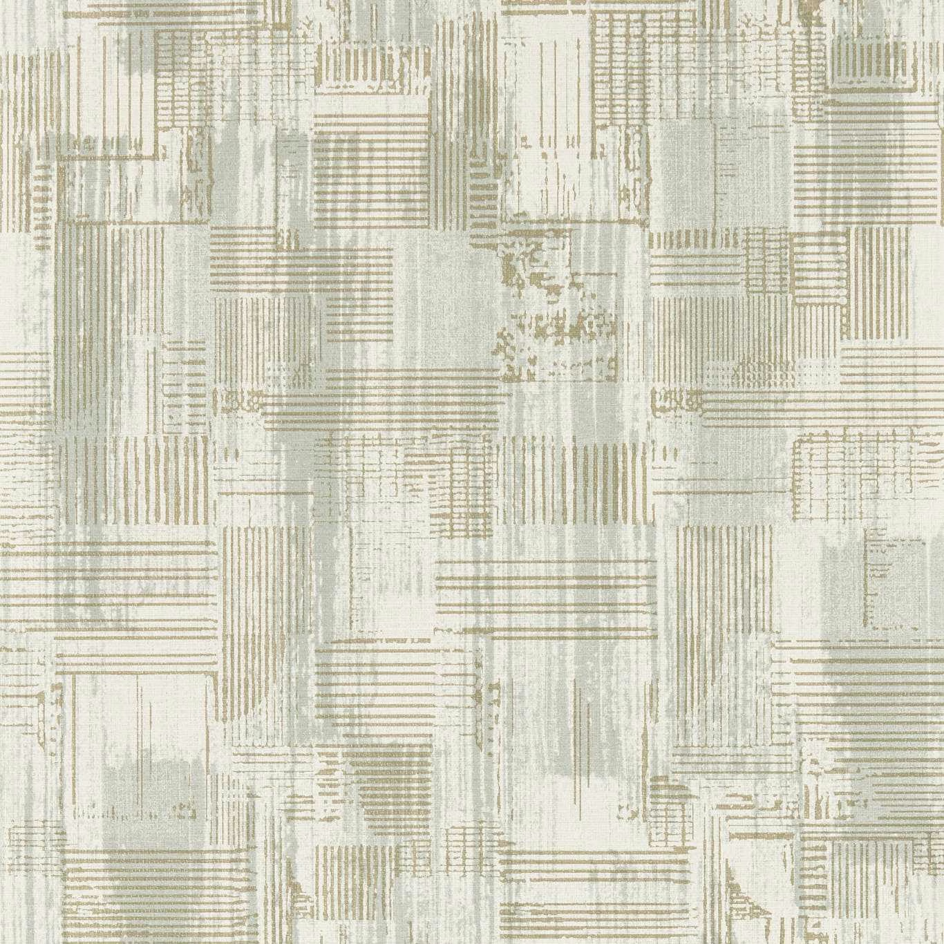

Tap the swatch to see it full screen. Hover it to magnify the weave. Colours on a screen are a guide, not a match, so come and feel the real cloth.
Scroll up or down to zoom in and out.
Kazimir Mineral
Metropolitan Wallcoverings WallpaperCCW0145-04
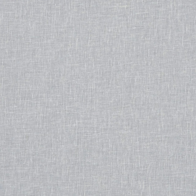
Kazimir Mineral combines a pale mineral-grey ground with a finely drawn arrangement of architectural blocks, linear grids and weathered-looking marks. Its cool, softened palette gives the pattern a light, airy presence rather than a strong graphic contrast.
You have used your previews for today. Send one to Simon and you can carry on.
Your board
0 fabrics
Part of the range we hold from Clarke & Clarke.
See Kazimir Mineral in your own room
A photograph of the piece you want re-covered. Straight on is best, and daylight helps. It is used to make your picture and nothing else.
Looking at your room
We found things here Kazimir Mineral could go on. Tap one on the photograph, or choose below.
We could not see anything to re-cover
, s
Kazimir Mineral, on your
Drag to compare. AI impression, colours indicative: ask us for a cutting before you decide.
About this wallpaper
The design is built from overlapping rectangular sections, narrow horizontal stripes and vertical strokes, with occasional distressed patches that add depth across the pale grey surface. Subtle ivory, muted taupe and grey-green undertones are visible within the mineral colourway, creating a gently layered effect as the light moves across the pattern. This wallpaper has a supplied weight of 180gsm, a 52cm usable width and a 52cm vertical pattern repeat. Each standard roll measures 10.05m, while the stated horizontal repeat is 0cm.
How to use it
Use Kazimir Mineral across a study, hallway or calm contemporary living space where its cool grey tone can sit alongside chalky whites, pale oak and soft stone. The linear blocks also work well as a refined backdrop behind simple furniture, allowing the lightly distressed detail to provide visual interest without dominating the room.
Use this softly layered mineral-grey design to bring quiet architectural detail to contemporary walls.
More from Metropolitan Wallcoverings
The same book, other colourways.
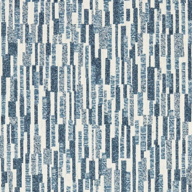
Juno Ink
Metropolitan Wallcoverings
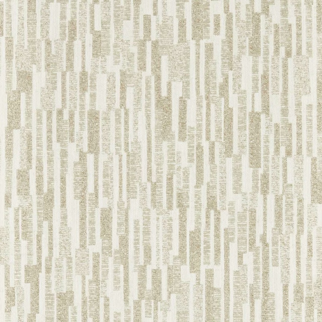
Juno Linen
Metropolitan Wallcoverings
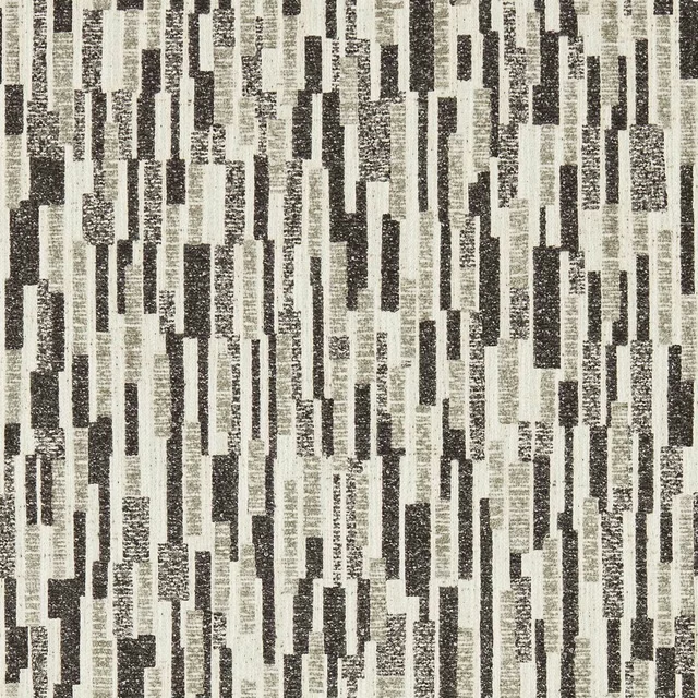
Juno Noir
Metropolitan Wallcoverings
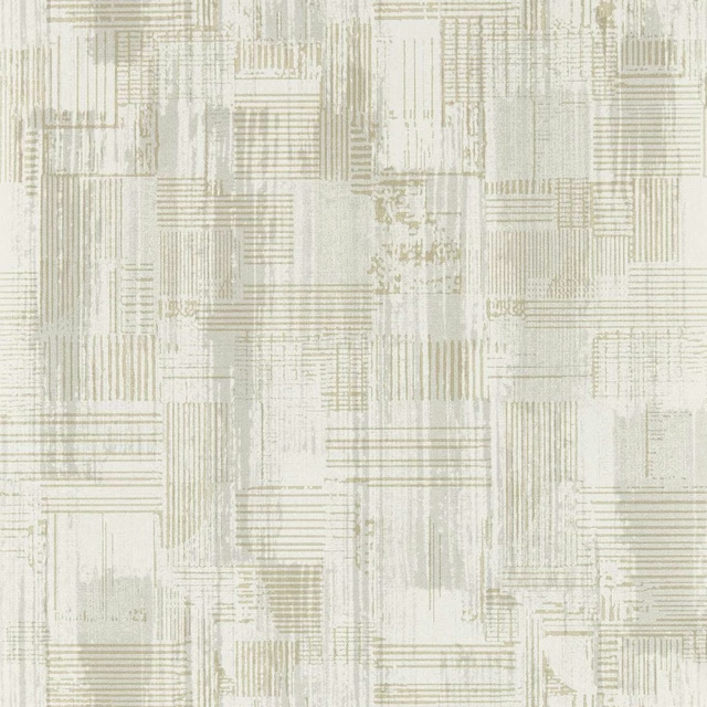
Kazimir Dove
Metropolitan Wallcoverings
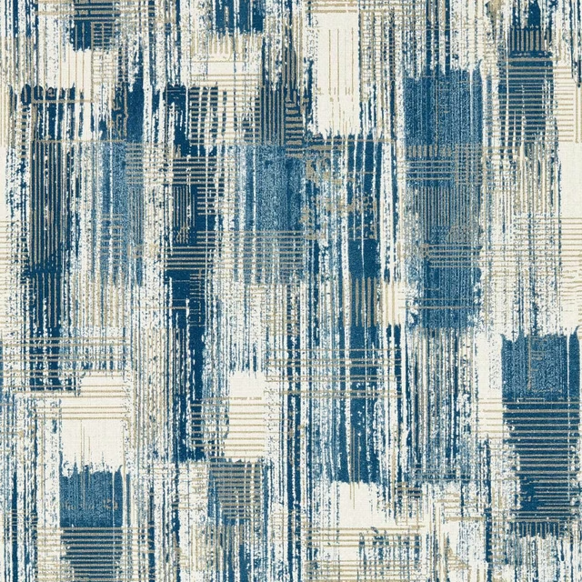
Kazimir Ink
Metropolitan Wallcoverings
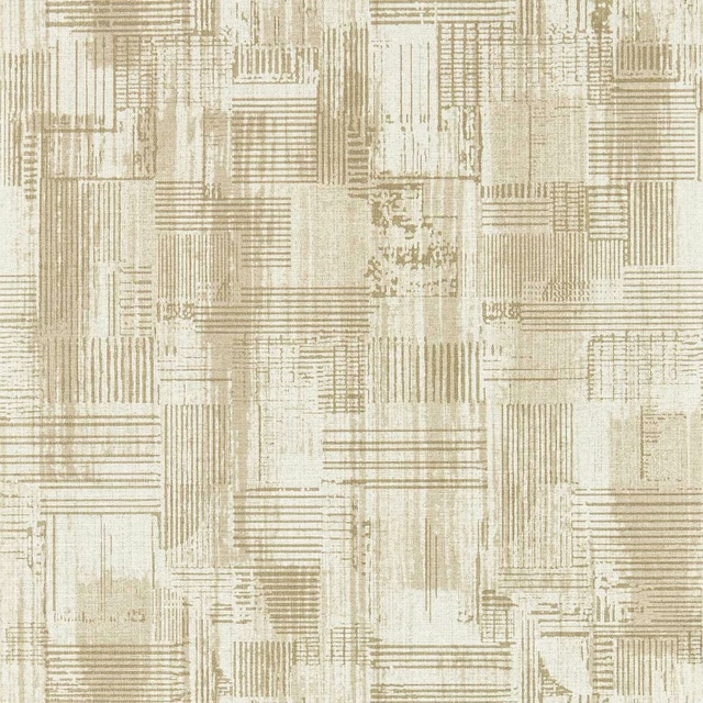
Kazimir Linen
Metropolitan Wallcoverings
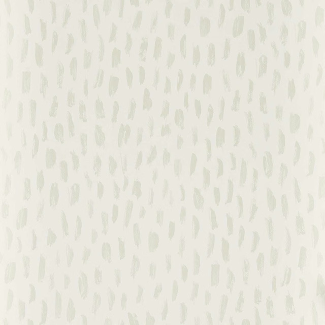
Loxley Ivory
Metropolitan Wallcoverings
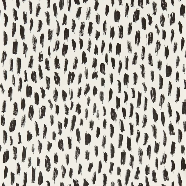
Loxley Ivory/Noir
Metropolitan Wallcoverings
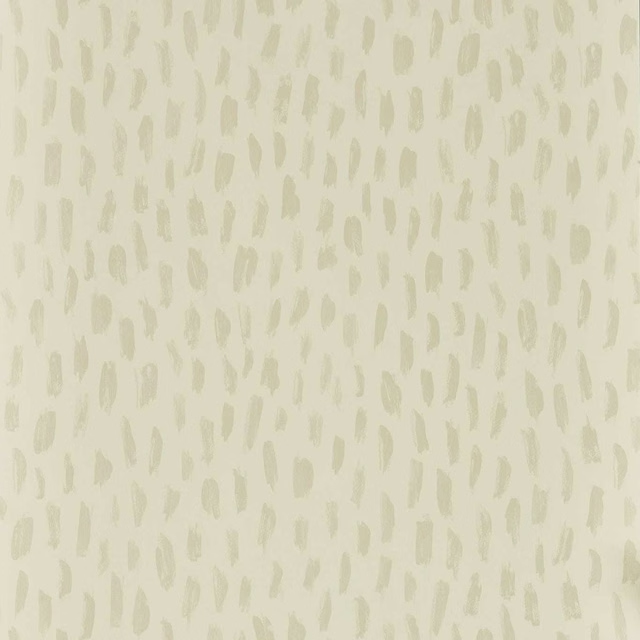
Loxley Linen
Metropolitan Wallcoverings

Loxley Mineral
Metropolitan Wallcoverings
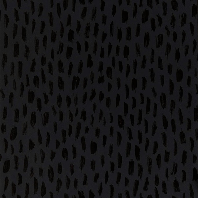
Loxley Noir
Metropolitan Wallcoverings

Loxley Nordic
Metropolitan Wallcoverings
Pairs well with
A pattern needs somewhere for the eye to rest, so these are the plains and textures that sit beside Kazimir Mineral without fighting it. Mixed across the houses we hold, which is the part a single supplier's book cannot do.

Mineral Echo
Mineral
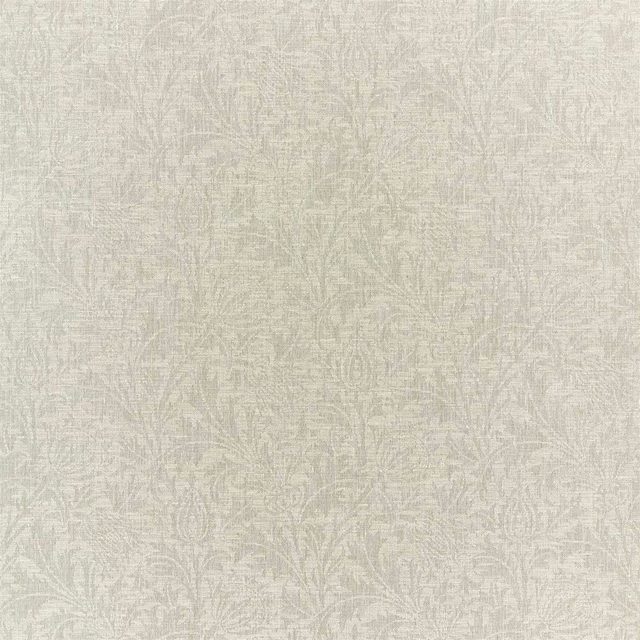
Thistle Weave Mineral
Lethaby Weaves

Helena Mineral
Melford Weaves

Alaska Dove
Alaska Collection

Alaska Fog
Alaska Collection
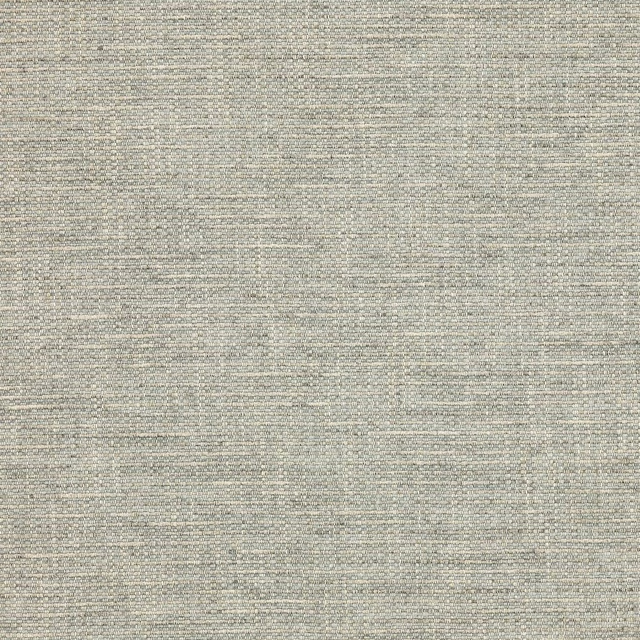
Brandon Silver
Albeck
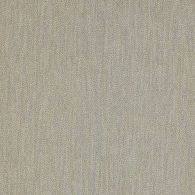
Lyncombe Silver
Albeck

Aunelle Platinum
AALTER FABRICS

Oparu Graphite
Amaya Fabrics
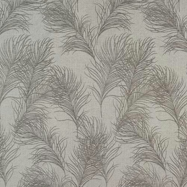
Feather Dove
Acacia
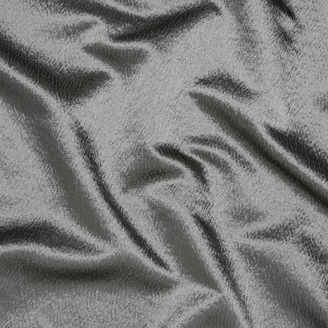
Alchemy Slate
Alchemy
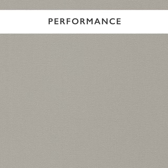
Allegra Dove
Allegra
Paint that goes with it
Two ways to take the room. Both colours are from houses we hold, so a pot can come off the same order as the cloth. Screens shift colour, so treat these as a direction and bring the cloth to the shelf before you buy the paint.
To sit quietly behind it
Paris Grey
Zoffany · #d6d3c2
To stand against it
Muddy Warren
Morris & Co. · #72655c
Other grey fabrics
Across the houses we hold. See all 7,198.
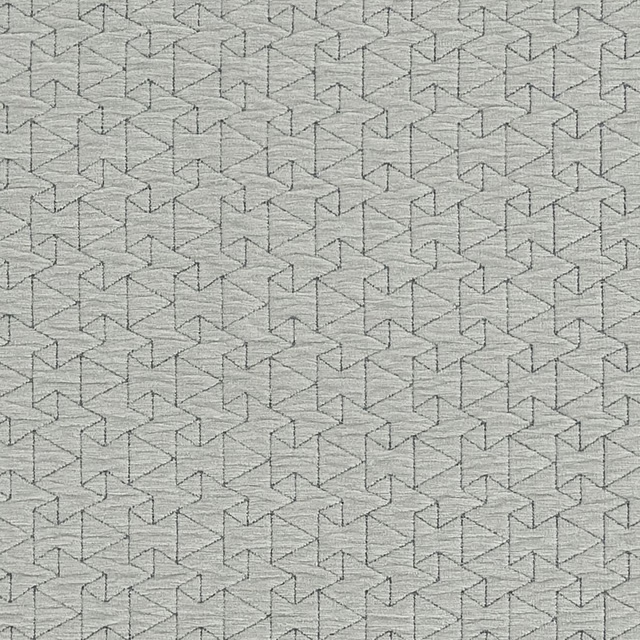
Quarzo Dove
Metalli
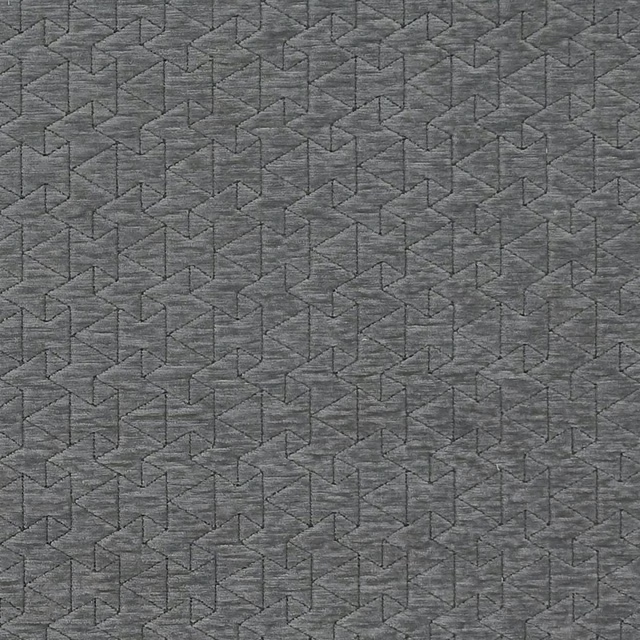
Quarzo Slate
Metalli
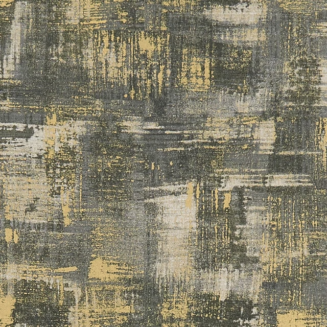
Tessellati Charcoal/Gold
Metalli
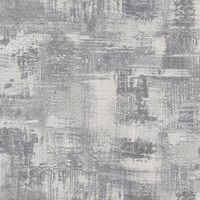
Tessellati Silver
Metalli
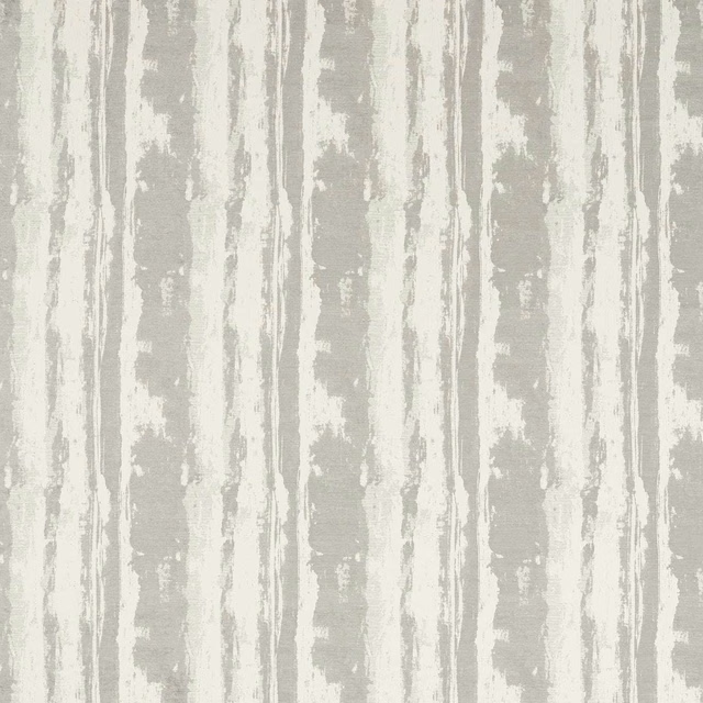
Herrera Slate
Metropolitan Fabrics
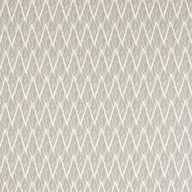
Holzer Slate
Metropolitan Fabrics
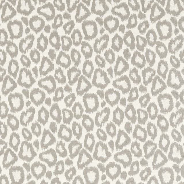
Ortega Slate
Metropolitan Fabrics
Midori Charcoal
Midori
Midori Dove
Midori
Midori Dusk
Midori
Midori Granite
Midori
Midori Mist
Midori