
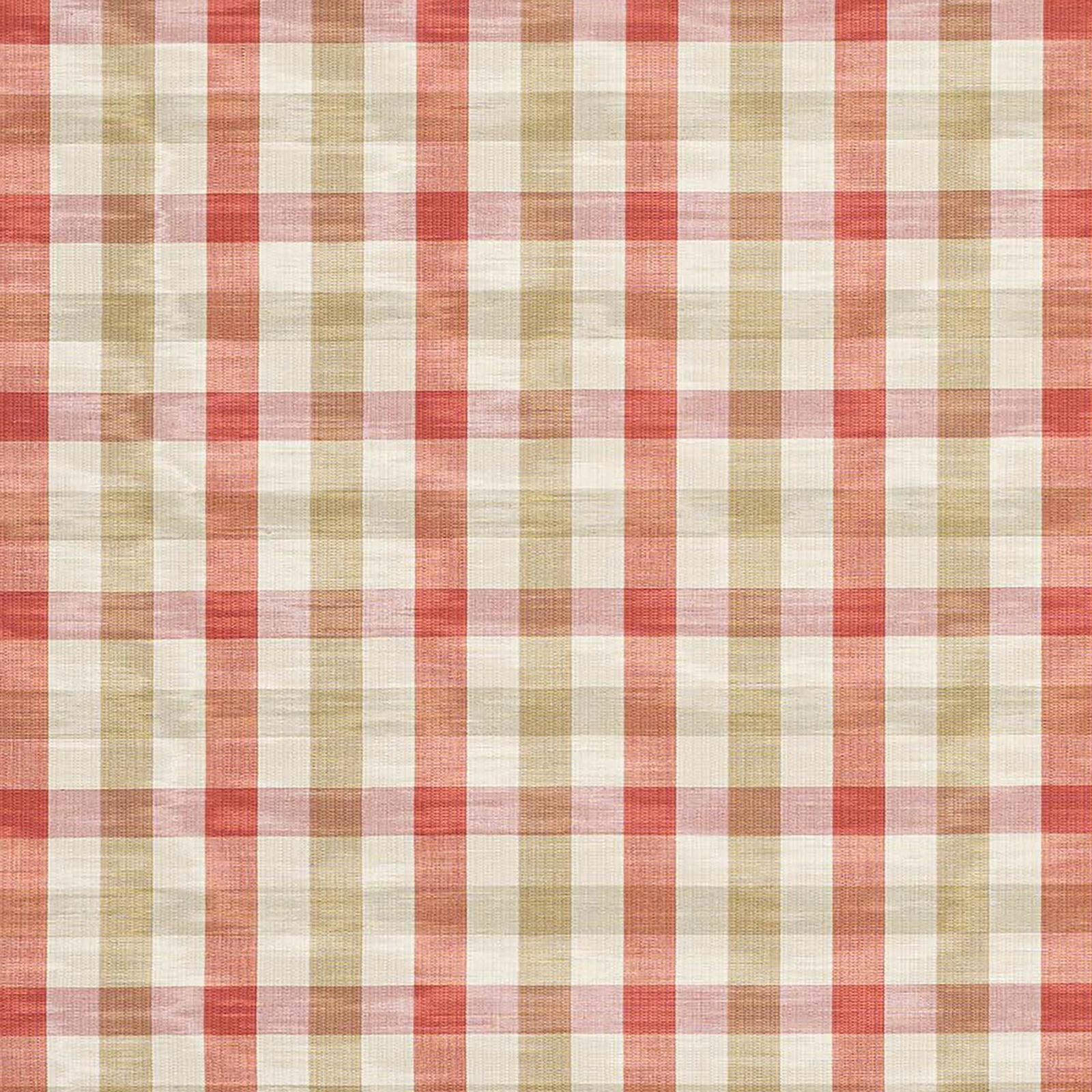

Tap the swatch to see it full screen. Hover it to magnify the weave. Colours on a screen are a guide, not a match, so come and feel the real cloth.
Scroll up or down to zoom in and out.
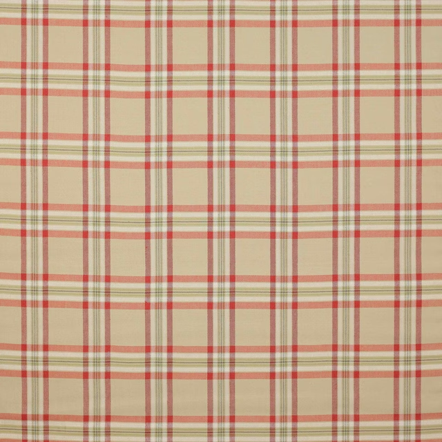
Belgrave Check Red/Sand
Eaton Checks and Stripes FabricF3001-19
Belgrave Check Red/Sand pairs a lively coral-red check with soft sand and cream ground tones, giving the swatch a breezy, sun-washed feel. The weave reads lightly textured and slightly slubby, with the red lines standing out cleanly against the paler ground.
You have used your previews for today. Send one to Simon and you can carry on.
Your board
0 fabrics
See this fabric on Colefax and Fowler's own site, then order it through us.
See Belgrave Check Red/Sand in your own room
A photograph of the piece you want re-covered. Straight on is best, and daylight helps. It is used to make your picture and nothing else.
Looking at your room
We found things here Belgrave Check Red/Sand could go on. Tap one on the photograph, or choose below.
We could not see anything to re-cover
, s
Belgrave Check Red/Sand, on your
Drag to compare. AI impression, colours indicative: ask us for a cutting before you decide.
About this fabric
This colourway from Colefax and Fowler’s Eaton Checks and Stripes collection shows a classic check softened by warm, diluted red and natural sand tones. The 82% viscose and 18% linen composition gives the cloth a fluid, lightly textured handle, while the 143cm approximate width makes it practical for a range of interior uses. The check has an approximate vertical repeat of 11cm with no horizontal repeat, creating a steady, ordered pattern that feels tailored rather than busy. In this palette the red is coral-leaning and gently muted, so the design feels fresh and nostalgic rather than harsh or saturated. The Q 8 + T 3 care code and √BM fire code should be checked against the intended application and local requirements.
How to use it
Use it to brighten country-inspired upholstery, tailored blinds or relaxed cushions where the warm red can lift oak, painted timber and neutral linens. The sand ground keeps the check feeling airy, so it works especially well in rooms with soft cream, weathered wood and faded botanical accents.
A fresh checked fabric that brings a soft, country-house warmth to cushions, blinds or loose covers.
More from Eaton Checks and Stripes
The same book, other colourways.
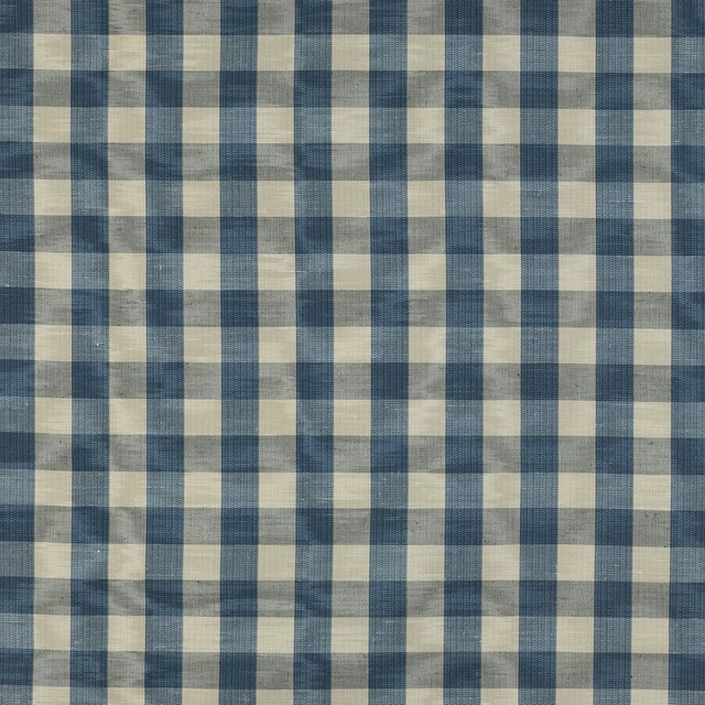
Belgrave Check Blue
Eaton Checks and Stripes
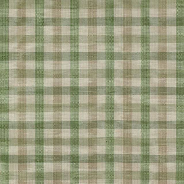
Belgrave Check Green/Beige
Eaton Checks and Stripes
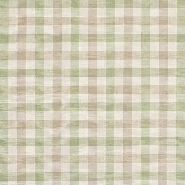
Belgrave Check Leaf/Silver
Eaton Checks and Stripes
Belgrave Check Maize
Eaton Checks and Stripes
Belgrave Check Pink/Green
Eaton Checks and Stripes
Belgrave Check Pink/Taupe
Eaton Checks and Stripes
Belgrave Check Sage/Green
Eaton Checks and Stripes
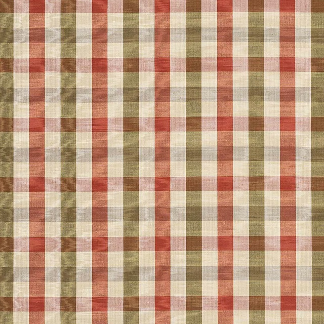
Belgrave Check Tomato/Olive
Eaton Checks and Stripes
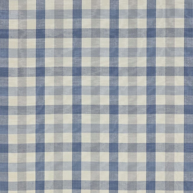
Belgrave Check Vintage Blue
Eaton Checks and Stripes
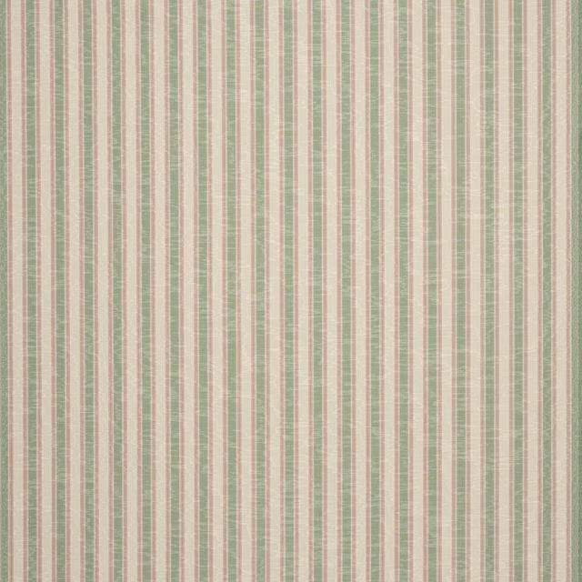
Colville Stripe Green/Pink
Eaton Checks and Stripes
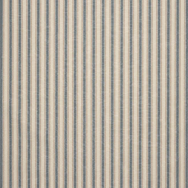
Colville Stripe Navy
Eaton Checks and Stripes
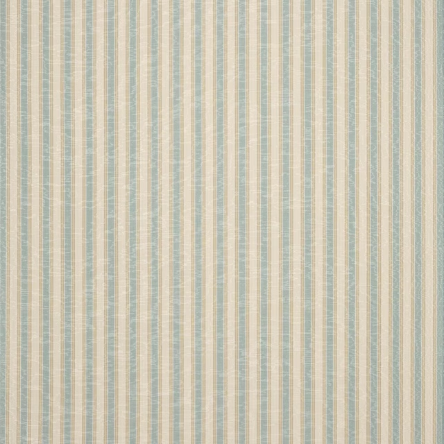
Colville Stripe Old Blue
Eaton Checks and Stripes
Pairs well with
A pattern needs somewhere for the eye to rest, so these are the plains and textures that sit beside Belgrave Check Red/Sand without fighting it. Mixed across the houses we hold, which is the part a single supplier's book cannot do.
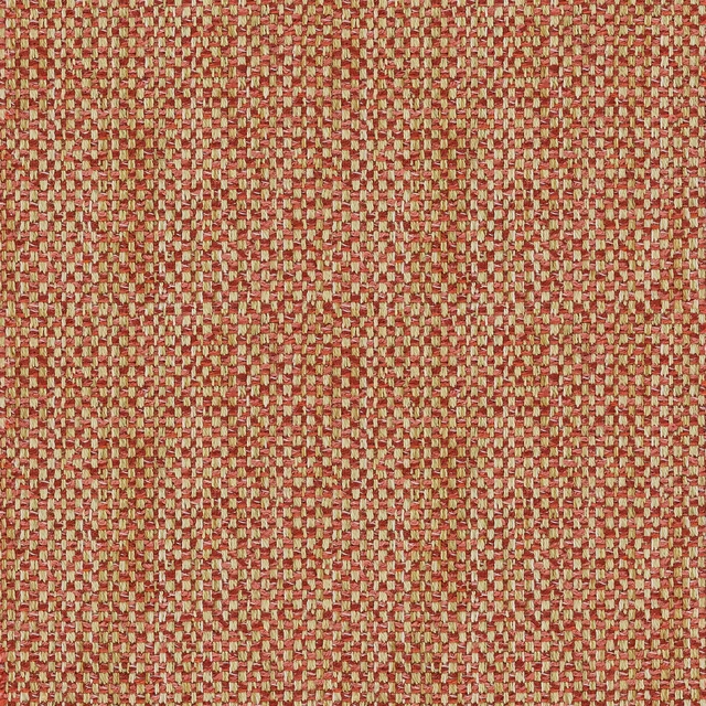
Loxley Punch
Loxley
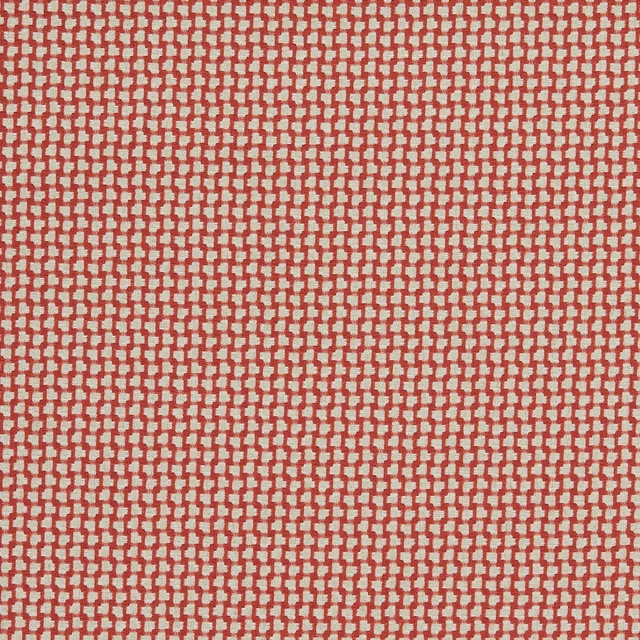
Fen Fareham Red
Orwell Weaves
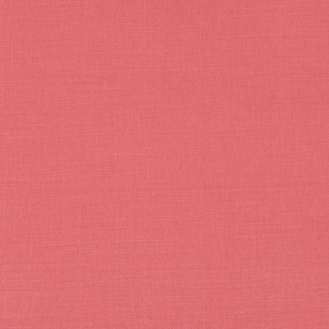
Linara Red Coral
Linara

Linara Rocoto
Linara

Shiloh Coral
Essential Weaves Vol 2
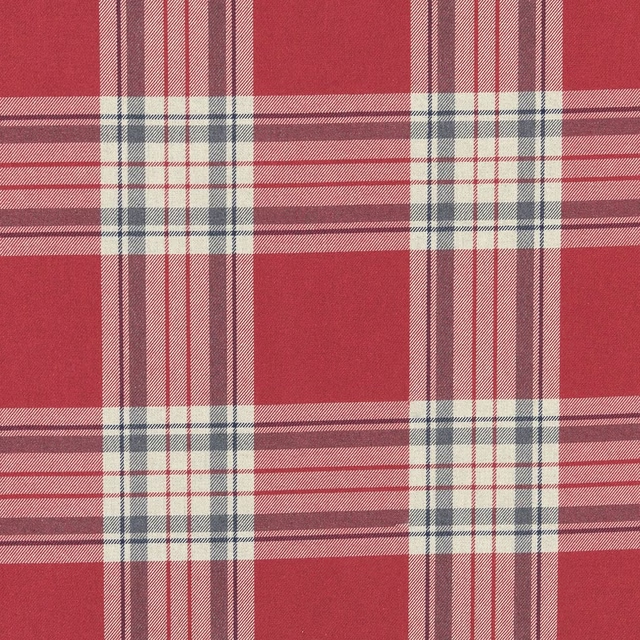
Glenmore Red
Edgeworth
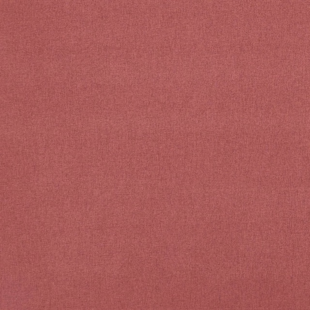
Highlander Garnet Rose
Highlander 2
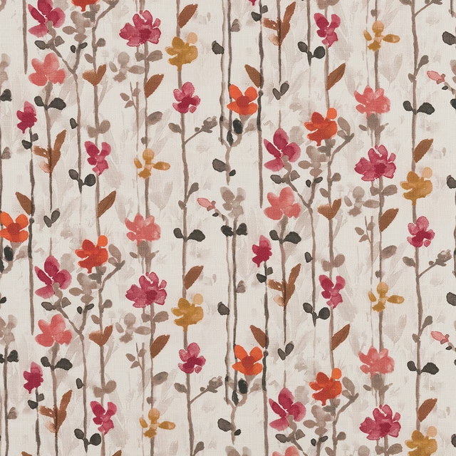
Woodland Floral Raspberry
Digital Prints
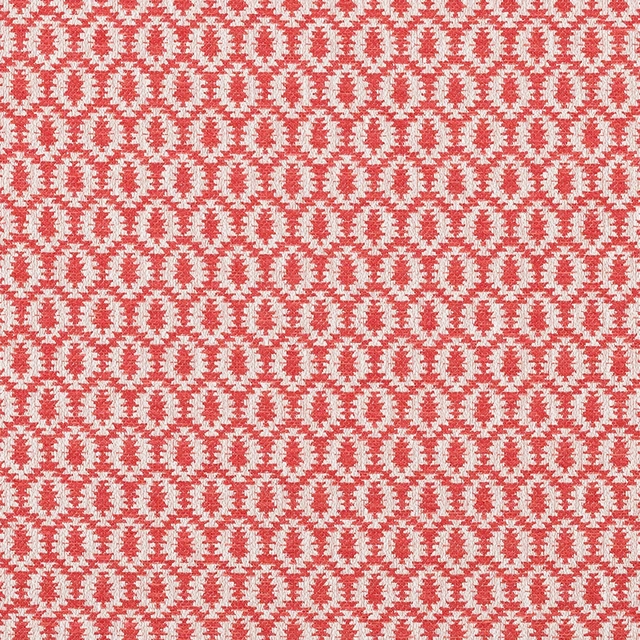
Samos Paprika
Eco -Friendly Ranges
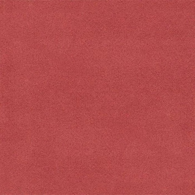
Amalfi Coral
Amalfi
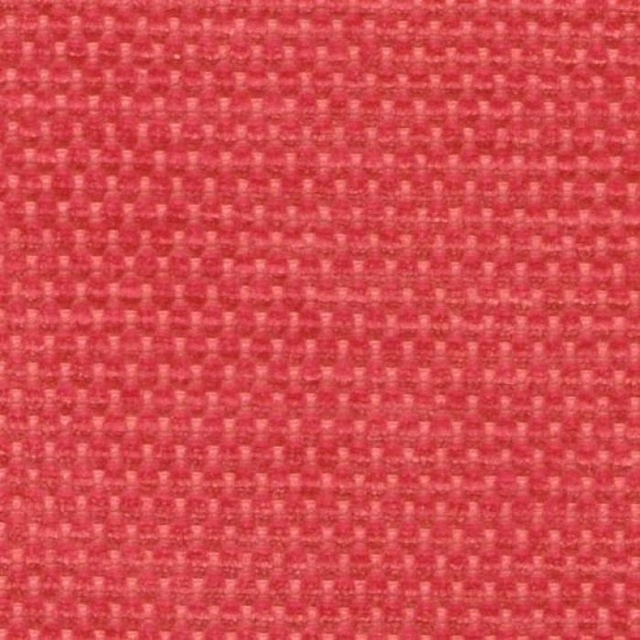
Evergreen Coral
Evergreen
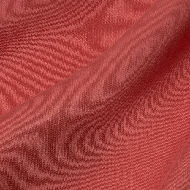
Iona Rose Madder
Iona
Paint that goes with it
Two ways to take the room. Both colours are from houses we hold, so a pot can come off the same order as the cloth. Screens shift colour, so treat these as a direction and bring the cloth to the shelf before you buy the paint.
To sit quietly behind it
Persipan
Coat Paints · #dab19f
To stand against it
Gargoyle
Zoffany · #5f5f61
Other red fabrics
Across the houses we hold. See all 2,148.
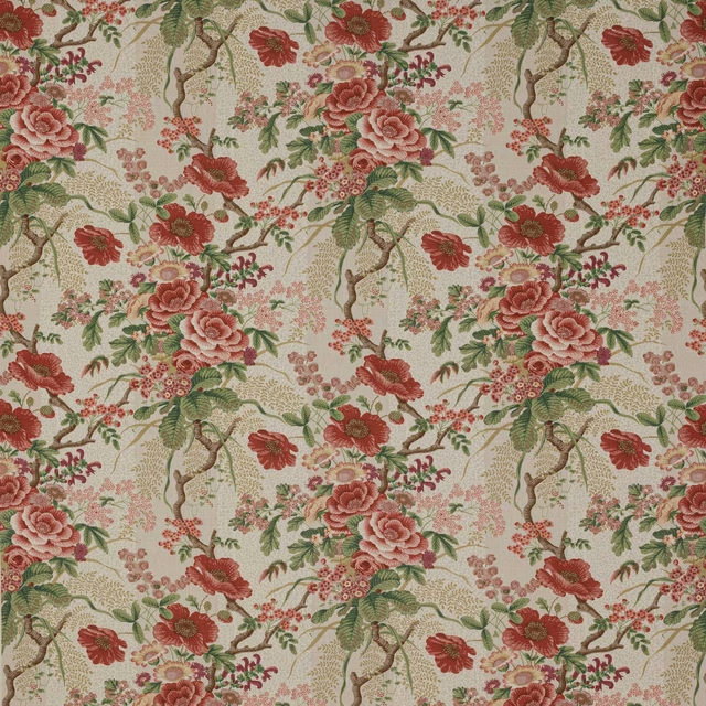
Tree Poppy Red/Forest
Cristabel
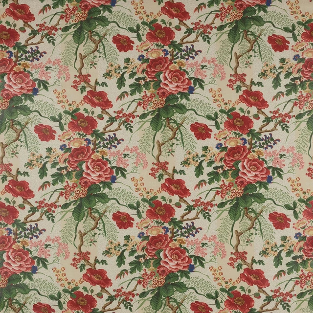
Tree Poppy Red/Green
Cristabel

Dante Red
Dante Velvet

Dante Ruby
Dante Velvet

Dante Tomato
Dante Velvet

Denbury Red/Sand
Denbury
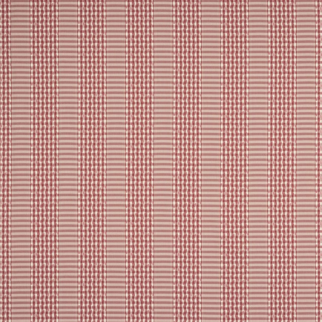
Langham Check Red
Denbury
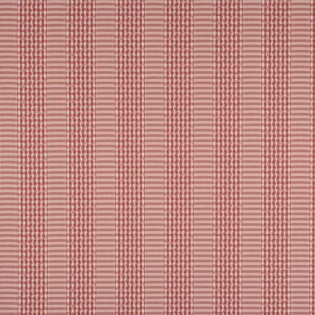
Langham Check Tomato
Denbury
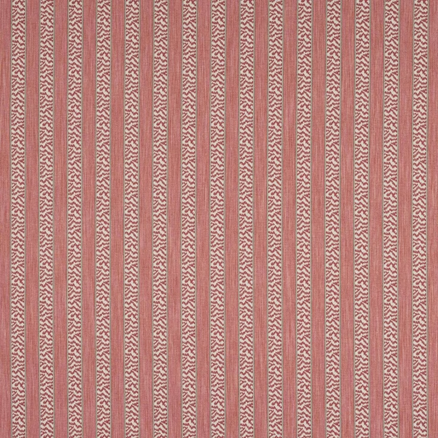
Tilney Stripe Red
Denbury

Tilney Stripe Red/Green
Denbury

Tilney Stripe Tomato/Olive
Denbury
Malone Check Red/Green
Edgar Chks & Stps