
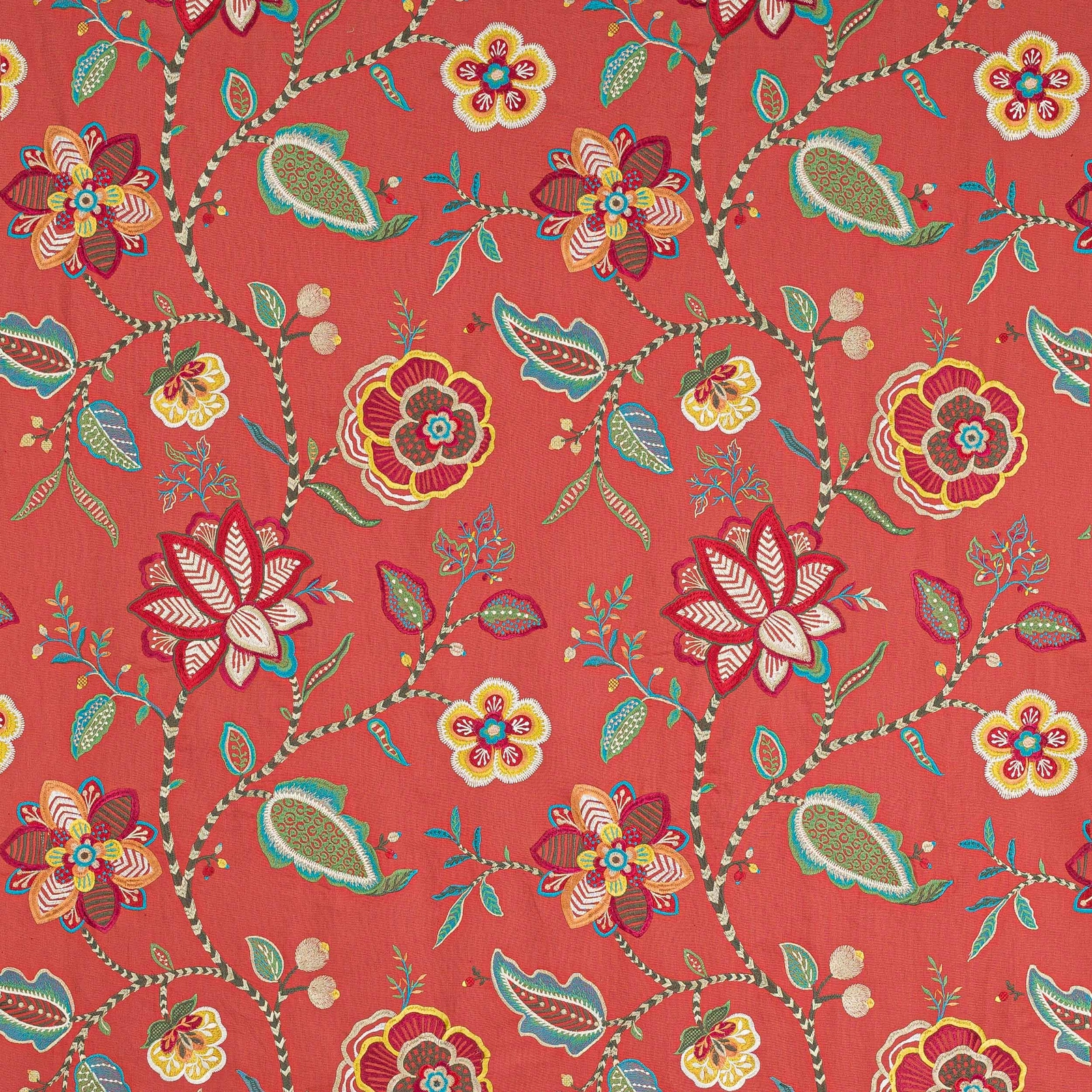

Tap the swatch to see it full screen. Hover it to magnify the weave. Colours on a screen are a guide, not a match, so come and feel the real cloth.
Scroll up or down to zoom in and out.
Havana Bright Red/Multi
Paradiso FabricJ751F-06
Havana Bright Red/Multi brings a vivid coral-red ground to the Paradiso collection, lifted by embroidered-look flowers, leafy sprigs and winding branches in jewel tones. The design feels lively and richly decorative, with the multicoloured motif standing out crisply against the warm background.
You have used your previews for today. Send one to Simon and you can carry on.
Your board
0 fabrics
See this fabric on Jane Churchill's own site, then order it through us.
See Havana Bright Red/Multi in your own room
A photograph of the piece you want re-covered. Straight on is best, and daylight helps. It is used to make your picture and nothing else.
Looking at your room
We found things here Havana Bright Red/Multi could go on. Tap one on the photograph, or choose below.
We could not see anything to re-cover
, s
Havana Bright Red/Multi, on your
Drag to compare. AI impression, colours indicative: ask us for a cutting before you decide.
About this fabric
This fabric is supplied at approximately 128cm wide and has a vertical repeat of about 77cm and a horizontal repeat of about 64cm, so the scale of the trailing botanical pattern is substantial. The composition combines 32% cotton, 28% linen, 21% polyester and 19% viscose, giving the cloth a natural-looking surface with enough body for a range of decorative uses. In this Bright Red/Multi colourway, the ground reads as a saturated coral-red rather than a dark crimson, which keeps the large flowers, leaves and winding stems feeling bright and animated. The braided-looking branches and multicoloured stitching effect add texture and movement, while the palette of turquoise, yellow, pink and mossy green gives the whole design a spirited, slightly exotic finish. Care code Q 8 + T 3 and fire code √BM are supplied for this exact fabric.
How to use it
Pair this coral-red colourway with painted wood, rattan or warm brass to echo its lively, collected feel. It works especially well on an accent chair, ottoman or full-length curtains where the bold scale and jewel-toned motif can be properly seen.
Use it for a statement chair or generous curtains where the lively coral ground and embroidered-look flowers can take centre stage.
More from Paradiso
The same book, other colourways.
Dorri Teal
Paradiso
Ezra Stripe Aqua/Lime
Paradiso
Ezra Stripe Blue
Paradiso
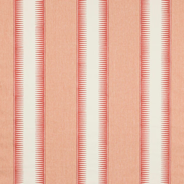
Ezra Stripe Red
Paradiso
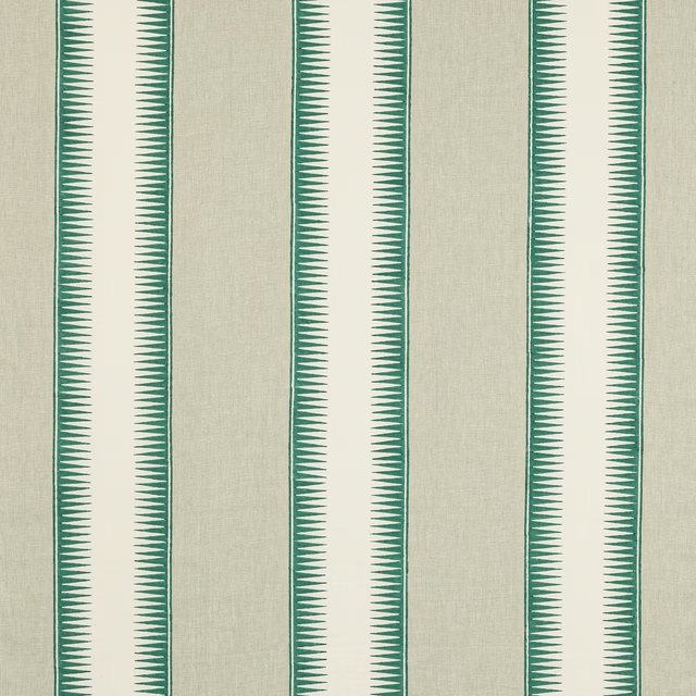
Ezra Stripe Teal
Paradiso
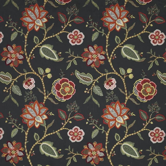
Havana Black
Paradiso
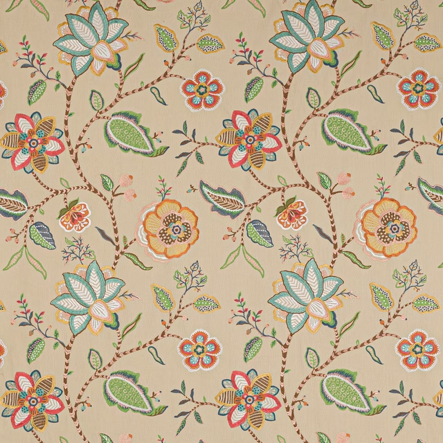
Havana Copper/Aqua
Paradiso
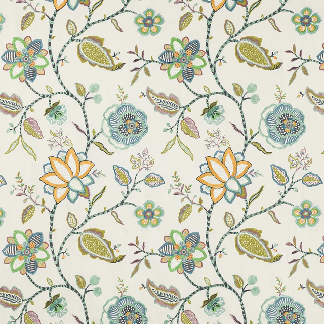
Havana Green/Blue
Paradiso
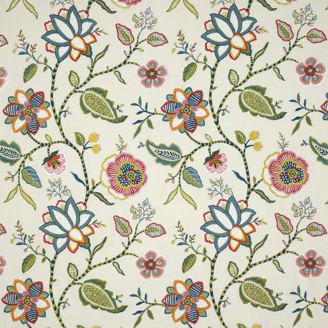
Havana Red/Blue
Paradiso
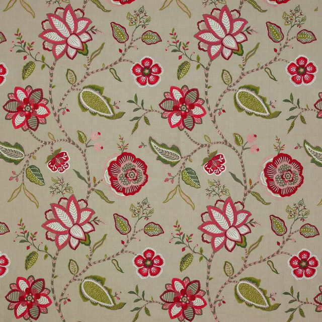
Havana Red/Green
Paradiso
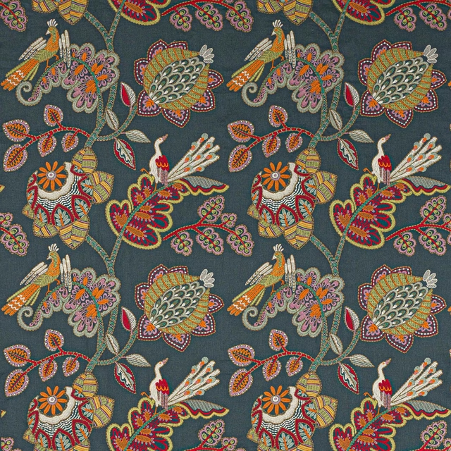
Paradiso Indigo
Paradiso
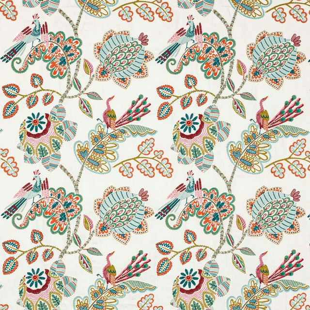
Paradiso Multi
Paradiso
Pairs well with
A pattern needs somewhere for the eye to rest, so these are the plains and textures that sit beside Havana Bright Red/Multi without fighting it. Mixed across the houses we hold, which is the part a single supplier's book cannot do.

Heritage Panama Coral
Helix
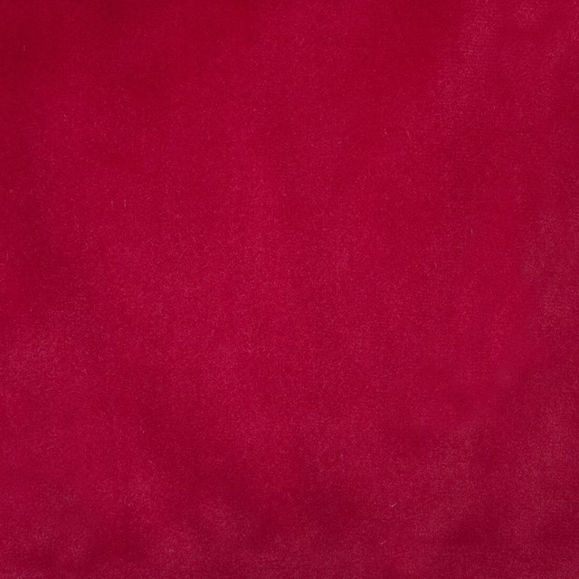
Alaska Scarlet
Alaska Collection

Alaska Wine
Alaska Collection
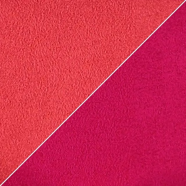
Moleskine Garance
Atelier Camargue Fabrics
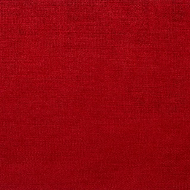
Monceau Sherry
Atelier Fabrics
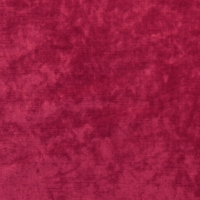
Allure Claret
Allure
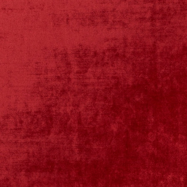
Allure Ruby
Allure

Dante Red
Dante Velvet

Dante Tomato
Dante Velvet

Ruzzini Scarlet
Ruzzini
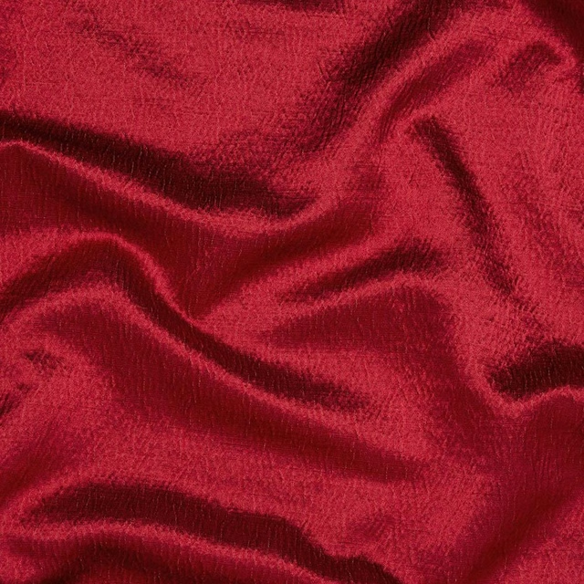
Alchemy Rosso
Alchemy

Ore Rhodonite
Defined Momentum Velvets
Paint that goes with it
Two ways to take the room. Both colours are from houses we hold, so a pot can come off the same order as the cloth. Screens shift colour, so treat these as a direction and bring the cloth to the shelf before you buy the paint.
To sit quietly behind it
Strawberry Thief
Morris & Co. · #c1625c
To stand against it
Double Pebble
Zoffany · #c0b194
Other red fabrics
Across the houses we hold. See all 2,196.
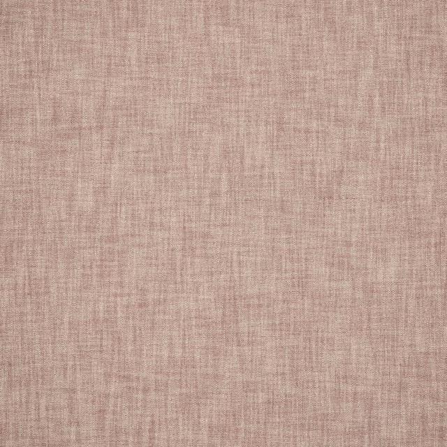
Otto Red
Otto Indoor-Outdoor
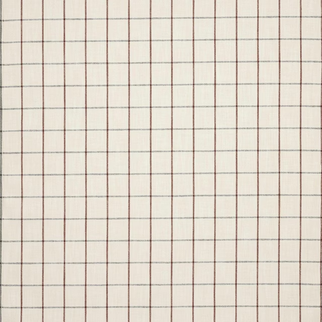
Otto Check Red
Otto Indoor-Outdoor
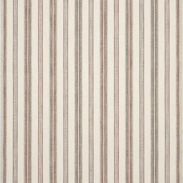
Otto Stripe Red
Otto Indoor-Outdoor
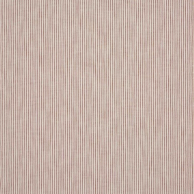
Otto Ticking Stripe Red
Otto Indoor-Outdoor
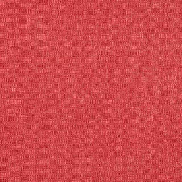
Palma Coral
Palma II
Palma Pillar Box Red
Palma II
Palma Soft Red
Palma II
Palma Tomato Red
Palma II
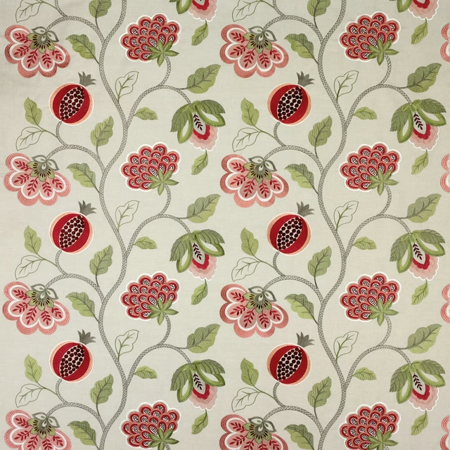
Paradise Garden Red/Linen
Paradise Garden
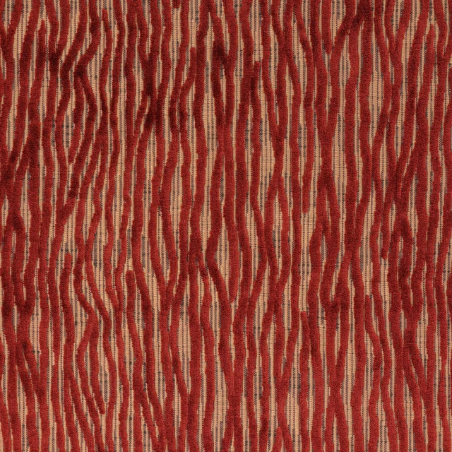
Gilda Red/Copper
Peli

Reece Red
Reece
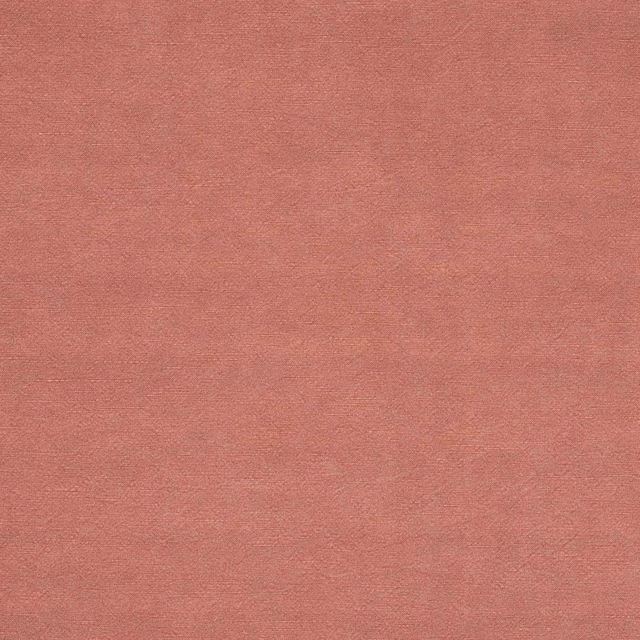
Reece Soft Red
Reece