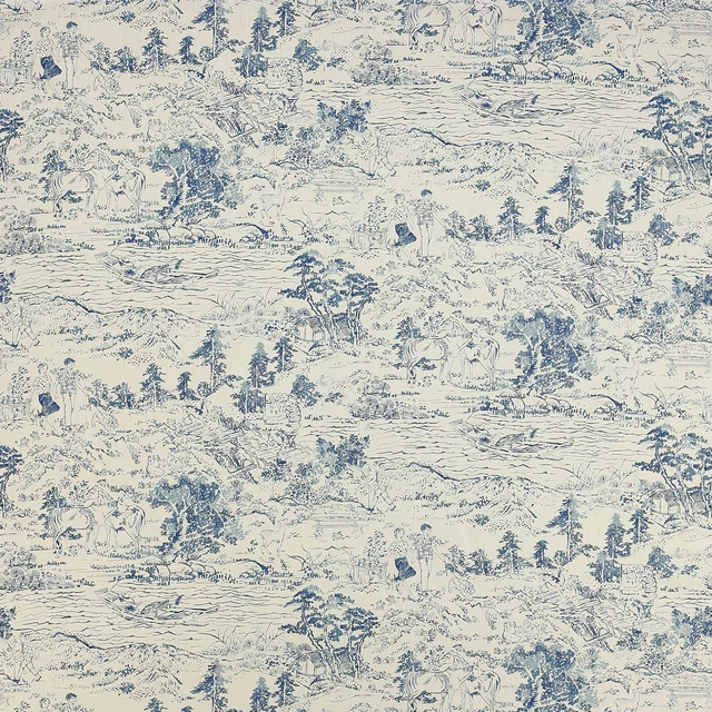


Tap the swatch to see it full screen. Hover it to magnify the weave. Colours on a screen are a guide, not a match, so come and feel the real cloth.
Scroll up or down to zoom in and out.
Clemence Blue/Aqua
Wilder FabricJ0228-03
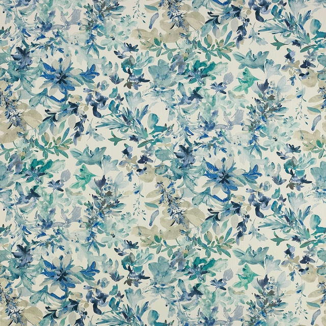
Clemence Blue/Aqua has a gentle, trailing vine pattern scattered across a warm ivory ground. The pale blue and aqua foliage keeps the design light and airy, with a soft, hand-drawn feel.
You have used your previews for today. Send one to Simon and you can carry on.
Your board
0 fabrics
See this fabric on Jane Churchill's own site, then order it through us.
See Clemence Blue/Aqua in your own room
A photograph of the piece you want re-covered. Straight on is best, and daylight helps. It is used to make your picture and nothing else.
Looking at your room
We found things here Clemence Blue/Aqua could go on. Tap one on the photograph, or choose below.
We could not see anything to re-cover
, s
Clemence Blue/Aqua, on your
Drag to compare. AI impression, colours indicative: ask us for a cutting before you decide.
About this fabric
This colourway of Wilder by Jane Churchill pairs muted aqua and powder blue leaves with cooler grey-brown stems, so the pattern reads fresh rather than bold. The print sits on a pale cream ground that gives the fabric an open, easy brightness and lets the vines breathe across the surface. With a composition of 39% Cotton, 35% Linen, 20% Viscose and 6% Polyester, and an approximate width of 128cm, it has a natural, softly textured look suited to elegant interiors. The repeat is V 58cm / H 32cm approx, which helps the winding motif create a graceful, regular rhythm.
How to use it
Use this blue-aqua colourway for curtains, blinds or relaxed loose covers where its cool-toned leaf trail can soften a room. It works particularly well with pale timber, chalky paint colours and washed-out blues or greens.
A delicate vine design that brings a fresh, airy softness to curtains or light upholstery.
More from Wilder
The same book, other colourways.

Bukhara Pink/Navy
Wilder
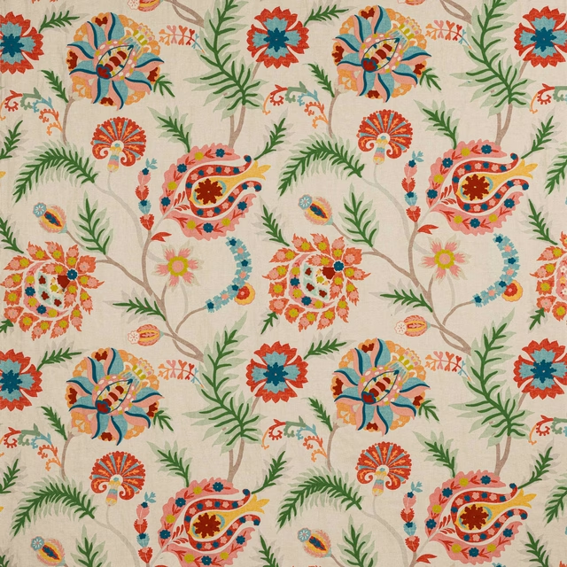
Bukhara Red
Wilder

Chiana Emerald
Wilder

Chiana Green/Blue
Wilder

Chiana Red/Green
Wilder

Chiana Teal
Wilder

Clemence Green
Wilder

Clemence Pink
Wilder

Elianna Blue
Wilder

Elianna Pink/Aqua
Wilder

Jari Aqua
Wilder

Jari Blue/Red
Wilder
Pairs well with
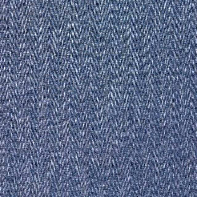
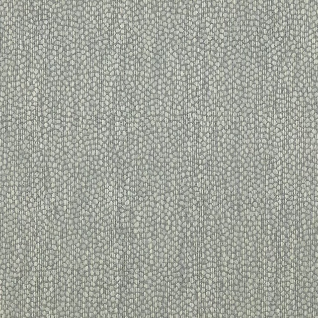
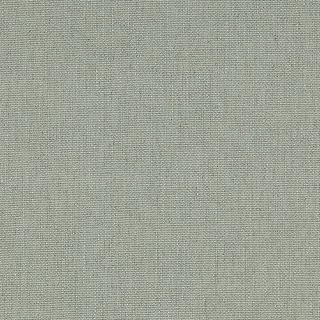
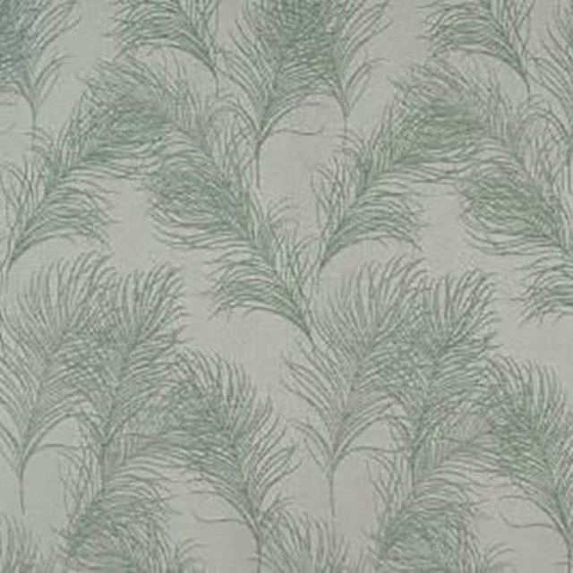
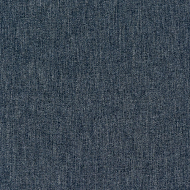
A pattern needs somewhere for the eye to rest, so these are the plains and textures that sit beside Clemence Blue/Aqua without fighting it. Mixed across the houses we hold, which is the part a single supplier's book cannot do.






Paint that goes with it
Two ways to take the room. Both colours are from houses we hold, so a pot can come off the same order as the cloth. Screens shift colour, so treat these as a direction and bring the cloth to the shelf before you buy the paint.
To sit quietly behind it
Paris Grey
Zoffany · #d6d3c2
To stand against it
King George
Coat Paints · #6d704a