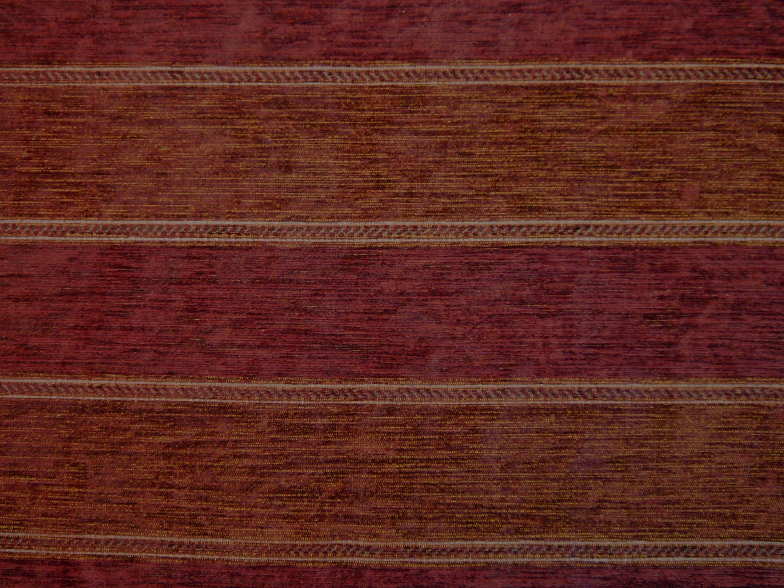
Tap the swatch to see it full screen. Hover it to magnify the weave. Colours on a screen are a guide, not a match, so come and feel the real cloth.
Scroll up or down to zoom in and out.
IMP1574
Imperiale FabricIMP1574
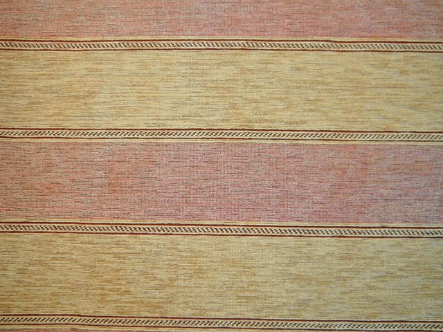
IMP1574 is a richly shaded chenille woven in deep burgundy, wine and brown tones. Its broad horizontal bands are separated by fine, braided-looking lines that give the surface a subtly structured appearance.
You have used your previews for today. Send one to Simon and you can carry on.
Your board
0 fabrics
See this fabric on Cristina Marrone's own site, then order it through us.
See IMP1574 in your own room
A photograph of the piece you want re-covered. Straight on is best, and daylight helps. It is used to make your picture and nothing else.
Looking at your room
We found things here IMP1574 could go on. Tap one on the photograph, or choose below.
We could not see anything to re-cover
, s
IMP1574, on your
Drag to compare. AI impression, colours indicative: ask us for a cutting before you decide.
About this fabric
The colourway moves between dark wine-red and warm brown, with softly varied horizontal texture that catches the light rather than appearing completely flat. Narrow decorative stripe details divide the wider bands, creating a restrained linear motif across the 138cm width. This chenille is composed of 52% acrylic and 48% polyester and is graded for domestic upholstery. Aftercare is professional; it has domestic cigarette-and-match flame retardancy and can be treated to Crib 5 contract grade.
How to use it
Use the deep burgundy-brown tone on a sofa, headboard or occasional chair in a room with aged timber, dark leather or warm neutral walls. Positioning the horizontal banding across a broad upholstered form will emphasise its calm, textural rhythm.
Use this richly toned chenille on domestic seating where its horizontal banding and softly textured surface can add depth without overpowering the room.
More from Imperiale
The same book, other colourways.
IMP1567
Imperiale
IMP1568
Imperiale
IMP1569
Imperiale
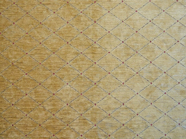
IMP1560
Imperiale
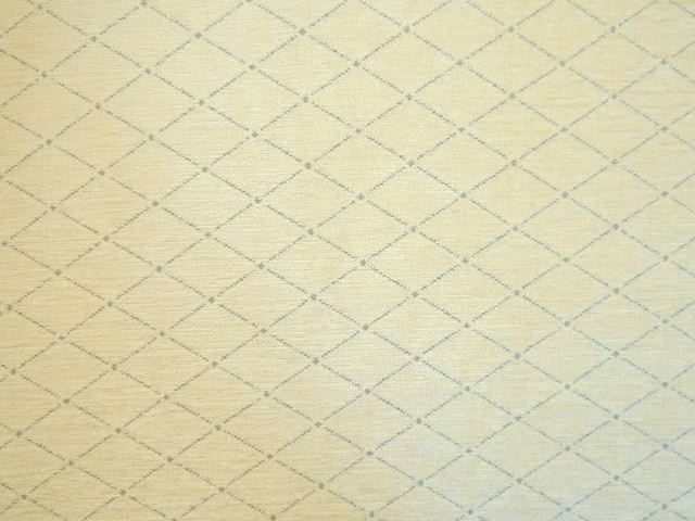
IMP1561
Imperiale
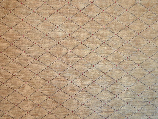
IMP1562
Imperiale
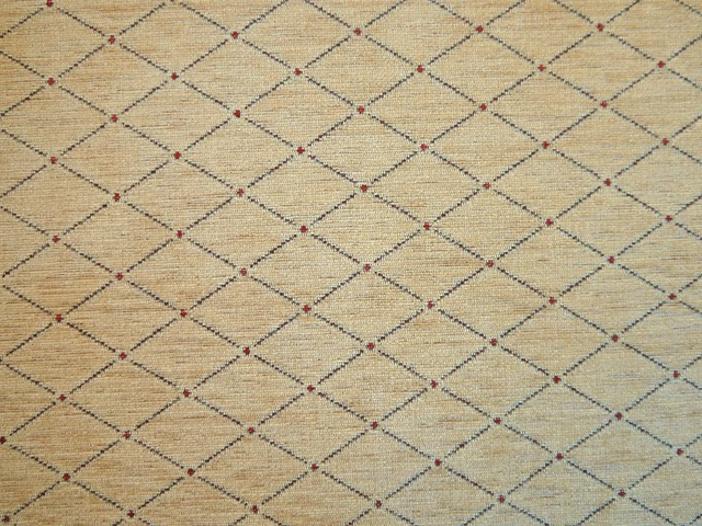
IMP1563
Imperiale
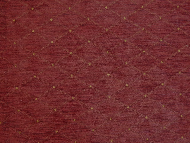
IMP1564
Imperiale
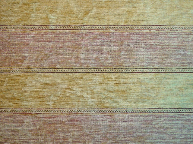
IMP1570
Imperiale
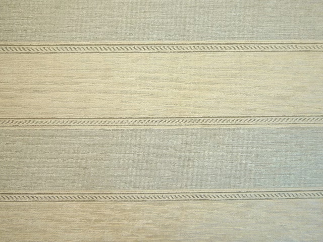
IMP1571
Imperiale
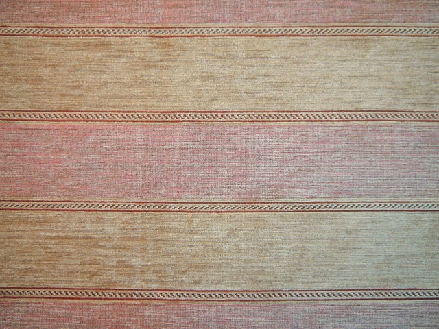
IMP1572
Imperiale
IMP1573
Imperiale
Pairs well with
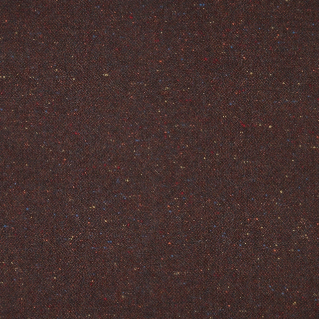
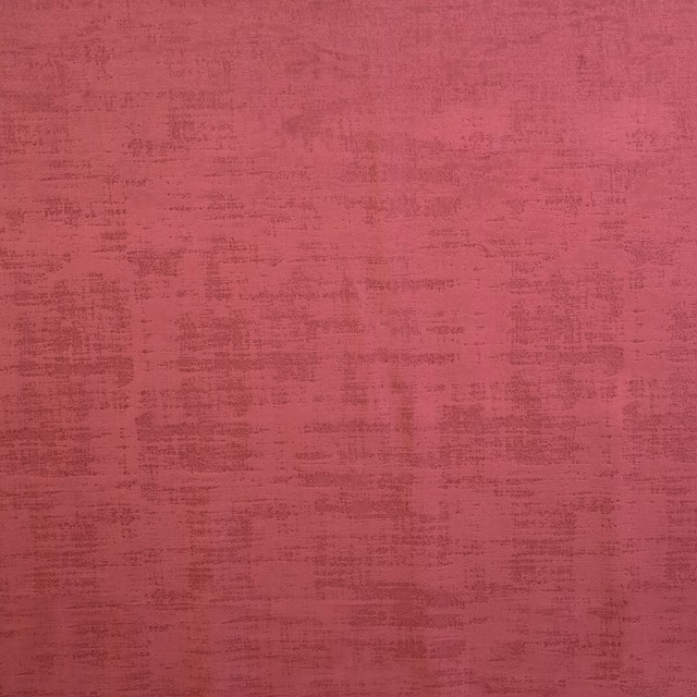
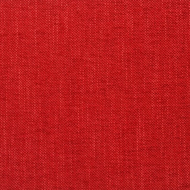
A pattern needs somewhere for the eye to rest, so these are the plains and textures that sit beside IMP1574 without fighting it. Mixed across the houses we hold, which is the part a single supplier's book cannot do.
Donegal - Burgundy
Misc

Alaska Cinnamon
Alaska Collection
Dakota Claret
Dakota Collection

Roseau Garance
Atelier Camargue Fabrics
Castiglione Garance
Atelier Fabrics
Moray Damson
Albany and Moray
Moray Raspberry
Albany and Moray
Brandon Red
Albeck
Marldon Red
Albeck
Chambord Claret
Chambord Fabrics
Cheviot Pimento
Cheviot Fabrics
Monza Raspberry
Arezzo
Paint that goes with it
Two ways to take the room. Both colours are from houses we hold, so a pot can come off the same order as the cloth. Screens shift colour, so treat these as a direction and bring the cloth to the shelf before you buy the paint.
To sit quietly behind it
Bronze Red
Little Greene · #6c2322
To stand against it
Tump
Morris & Co. · #3d5547
Other red fabrics
Across the houses we hold. See all 2,196.