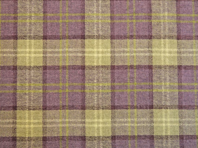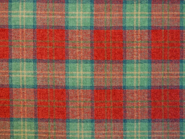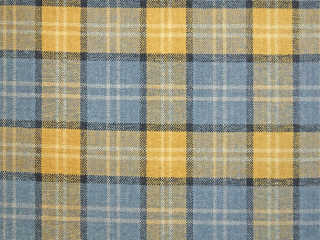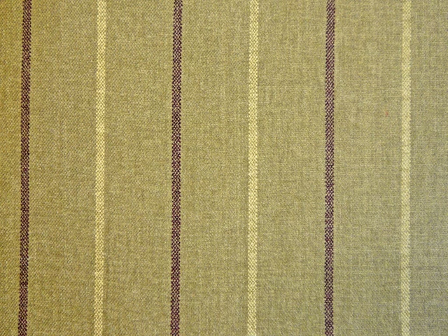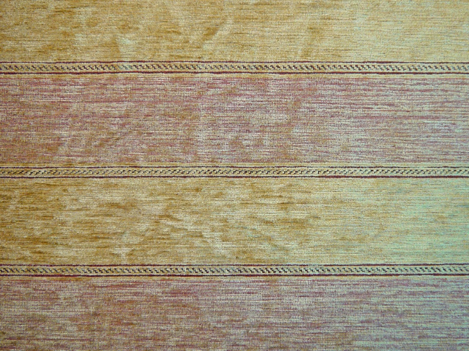
Tap the swatch to see it full screen. Hover it to magnify the weave. Colours on a screen are a guide, not a match, so come and feel the real cloth.
Scroll up or down to zoom in and out.
IMP1570
Imperiale FabricIMP1570
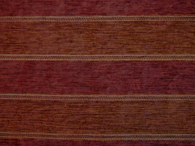
IMP1570 is a softly variegated chenille with broad horizontal bands in warm gold, dusty mauve and pale aqua. Fine dark braided lines separate the bands, giving the design a defined woven rhythm.
You have used your previews for today. Send one to Simon and you can carry on.
Your board
0 fabrics
See this fabric on Cristina Marrone's own site, then order it through us.
See IMP1570 in your own room
A photograph of the piece you want re-covered. Straight on is best, and daylight helps. It is used to make your picture and nothing else.
Looking at your room
We found things here IMP1570 could go on. Tap one on the photograph, or choose below.
We could not see anything to re-cover
, s
IMP1570, on your
Drag to compare. AI impression, colours indicative: ask us for a cutting before you decide.
About this fabric
The colourway shifts between ochre-gold, muted rose-mauve and cool aqua, with a lightly weathered surface that catches the light unevenly across the chenille pile. Narrow dark lines frame the wider bands, while subtle flecks and horizontal slubbing add depth without making the stripe feel stark. Composed of 52% acrylic and 48% polyester, this 138cm-wide fabric is graded for domestic upholstery. It has professional aftercare and is rated for domestic Cig & Match flame retardancy, with treatment available to achieve Crib 5 contract grade.
How to use it
Pair the warm gold ground with natural timber and oat-toned textiles, then pick up the dusty mauve and aqua through cushions or painted accents. The horizontal banding works especially well on occasional chairs, headboards and structured sofas where its linear detail can remain visible.
Use this softly variegated chenille to bring warm gold, dusty mauve and aqua accents to upholstered seating.
More from Imperiale
The same book, other colourways.
IMP1567
Imperiale
IMP1568
Imperiale
IMP1569
Imperiale
IMP1560
Imperiale
IMP1561
Imperiale
IMP1562
Imperiale
IMP1563
Imperiale
IMP1564
Imperiale
IMP1571
Imperiale
IMP1572
Imperiale
IMP1573
Imperiale
IMP1574
Imperiale
Pairs well with
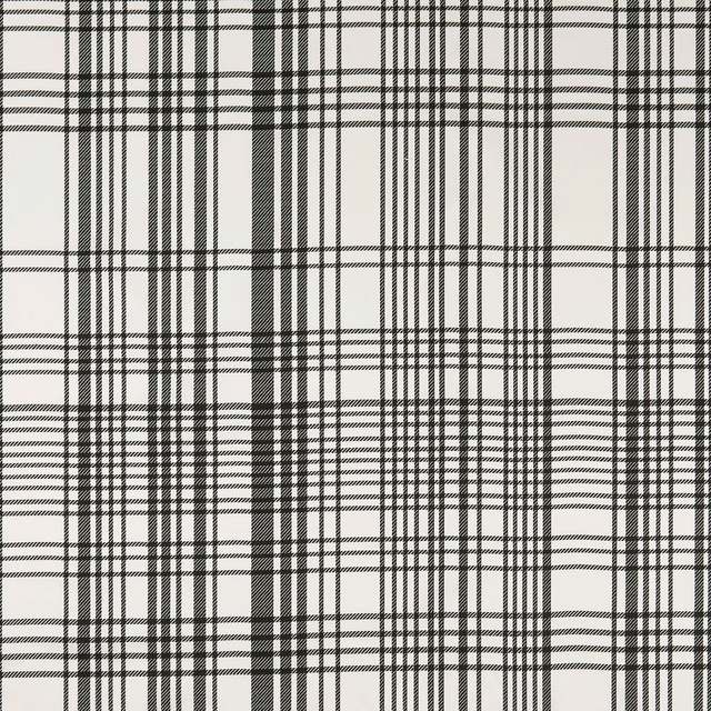
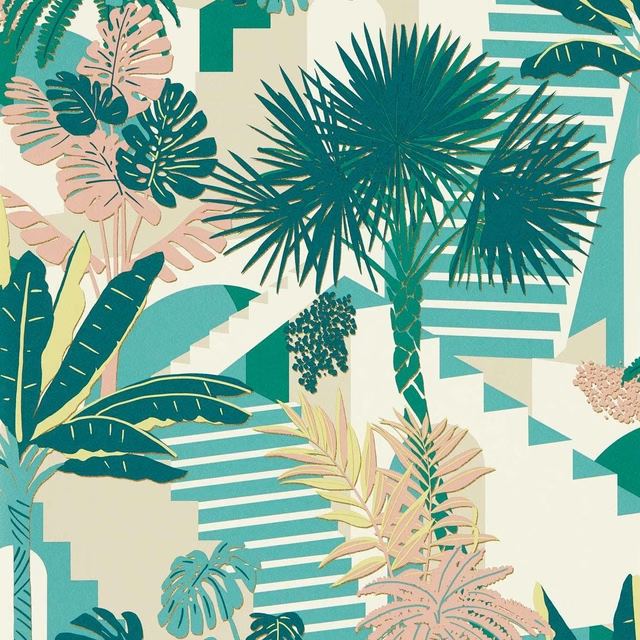
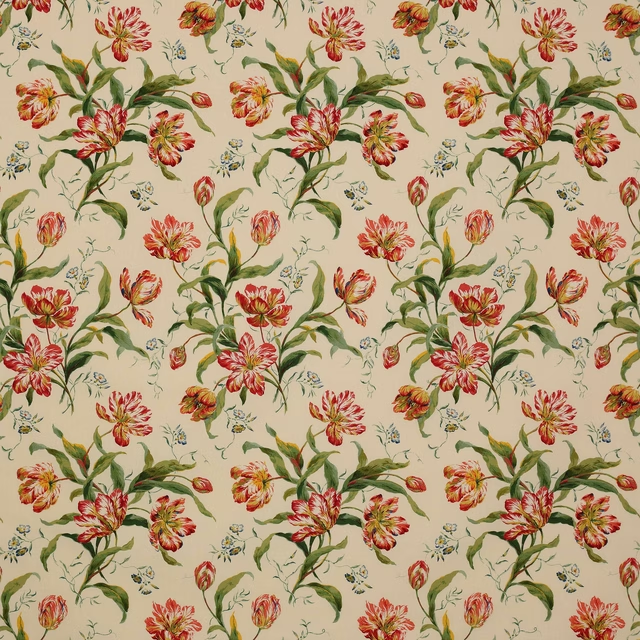
A pattern needs somewhere for the eye to rest, so these are the plains and textures that sit beside IMP1570 without fighting it. Mixed across the houses we hold, which is the part a single supplier's book cannot do.
BW1006 Black/White
Black and White
Malindi Mineral/Blush
Breegan Jane x Clarke and Clarke Wallpaper
Delft Tulips Pink/Green
C&F Classic Prints
Beal Multi
Pelham
Limosa Loganberry / Papaya / Lagoon
Amazilia Wallpapers
Celadon Marine/Plum/Zest
Atelier Fabrics
Romey Multi/Indigo
Almora Wvs
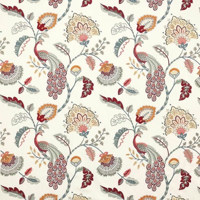
Jaipur Peacock Slate/Red
Azara
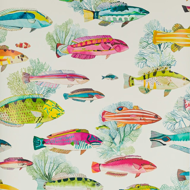
Fidji Wallpaper Corail
Papierspeints Vol 8
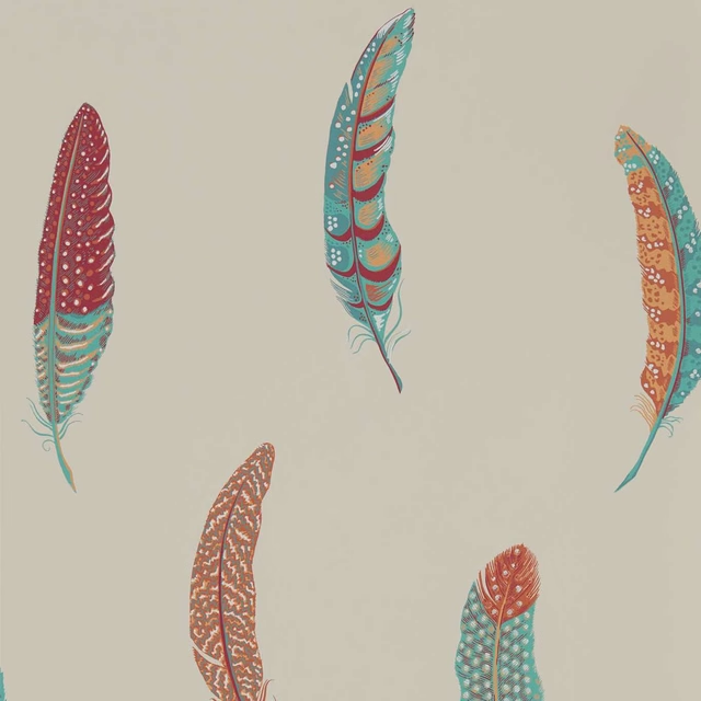
Lismore Russet
Elysian Wallpapers
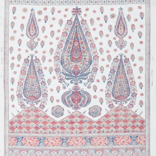
Kalamkari Panel Indigo and Madder
Limited Stock
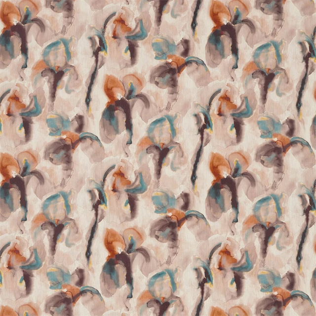
WAter Iris Peacock/Copper
Kensington Walk Fabrics
Paint that goes with it
Two ways to take the room. Both colours are from houses we hold, so a pot can come off the same order as the cloth. Screens shift colour, so treat these as a direction and bring the cloth to the shelf before you buy the paint.
To sit quietly behind it
Olive Fruit
Morris & Co. · #978c6e
To stand against it
2AM
Coat Paints · #414753
Other multi fabrics
Across the houses we hold. See all 4,069.