
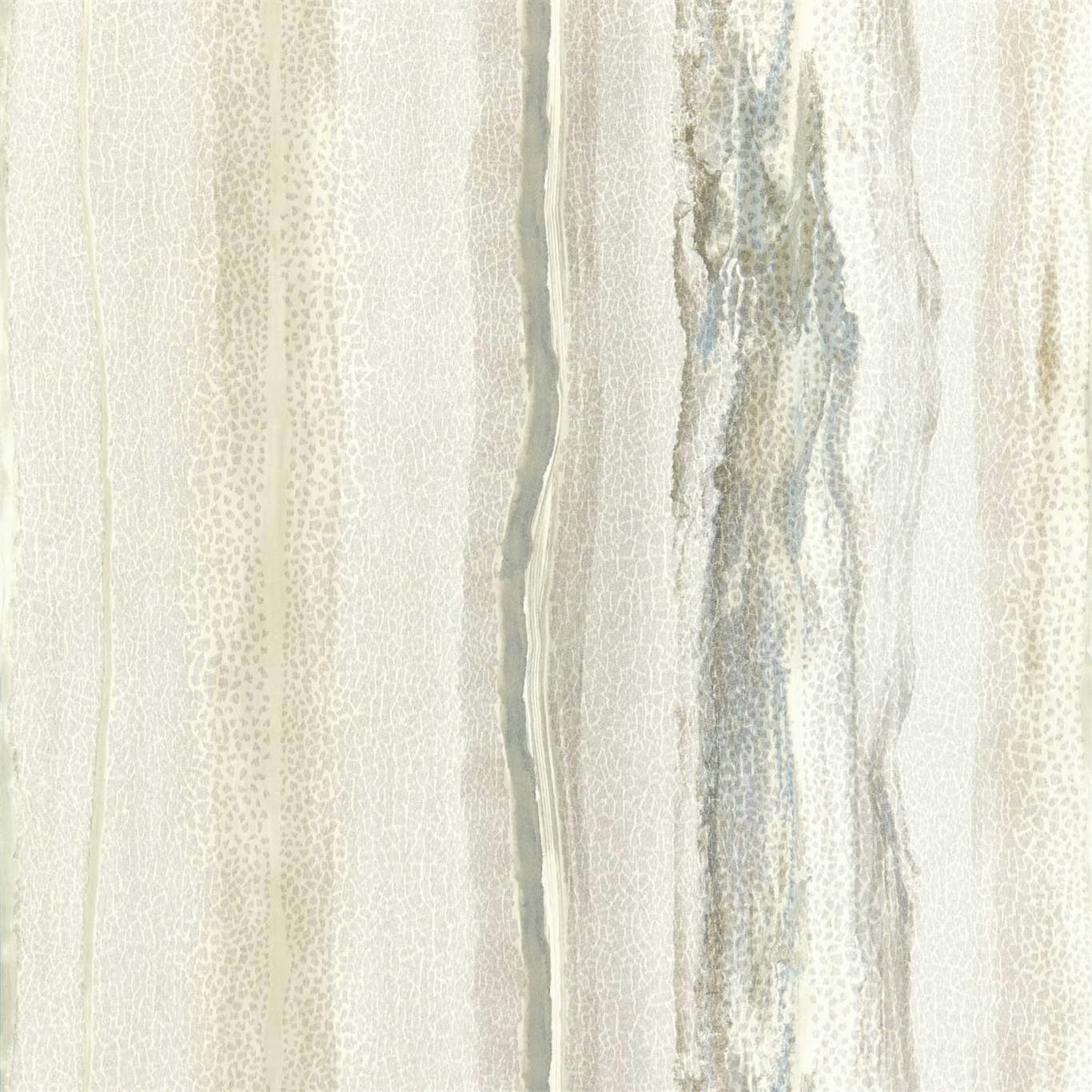

Tap the swatch to see it full screen. Hover it to magnify the weave. Colours on a screen are a guide, not a match, so come and feel the real cloth.
Scroll up or down to zoom in and out.
Vitruvius Wide Width Limestone / Concrete
Reflect 3 Wallpaper WallpaperHAW0155-01
Vitruvius Wide Width in Limestone / Concrete has a pale, cool mineral palette, with softly uneven vertical bands that shift between chalky limestone, silvery grey and deeper concrete tones. The close view reveals delicate mottling and fine, crackle-like markings within the broader striations.
You have used your previews for today. Send one to Simon and you can carry on.
Your board
0 fabrics
See this wallpaper on Harlequin's own site, then order it through us.
See Vitruvius Wide Width Limestone / Concrete in your own room
A photograph of the piece you want re-covered. Straight on is best, and daylight helps. It is used to make your picture and nothing else.
Looking at your room
We found things here Vitruvius Wide Width Limestone / Concrete could go on. Tap one on the photograph, or choose below.
We could not see anything to re-cover
, s
Vitruvius Wide Width Limestone / Concrete, on your
Drag to compare. AI impression, colours indicative: ask us for a cutting before you decide.
About this wallpaper
This wallpaper’s 64 cm vertical repeat builds a tall, irregular rhythm rather than a regular stripe, with translucent-looking grey passages alongside warmer ivory and limestone areas. The 68.6 cm useable width makes the design practical for creating continuous vertical movement, while the 334 gsm weight gives the supplied specification a substantial feel. Narrower textured lines sit beside wider cloudy bands, so the pale colourway gains depth without becoming visually heavy. Each 10.05 m standard-length roll carries the softly weathered, stone-inspired pattern through the room.
How to use it
Pair the cool limestone-grey ground with soft white, pale oak and brushed metal for a light, architectural scheme, or use it behind warm concrete and muted grey furnishings to draw out its layered mineral depth.
Use this cool, mineral-toned design to bring softly layered vertical movement to calm contemporary or transitional rooms.
More from Reflect 3 Wallpaper
The same book, other colourways.
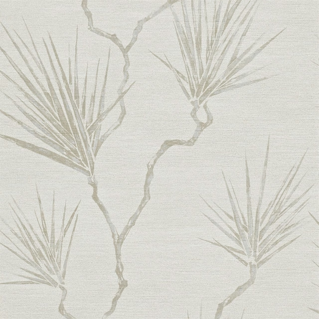
Peninsula Palm Wide Width Parchment
Reflect 3 Wallpaper
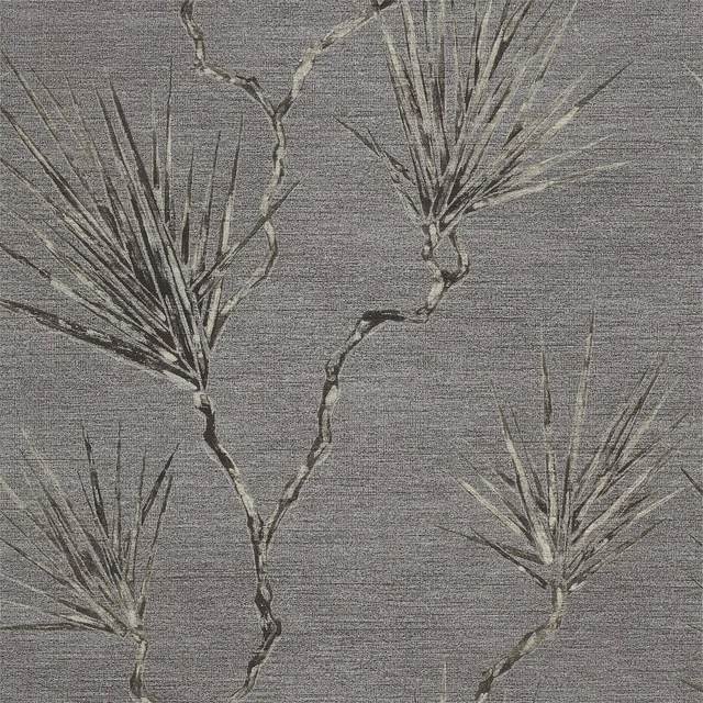
Peninsula Palm Wide Width Truffle
Reflect 3 Wallpaper

Peninsula Wide Width Parchment
Reflect 3 Wallpaper

Perlite Wide Width Opal / Gold Mineral
Reflect 3 Wallpaper
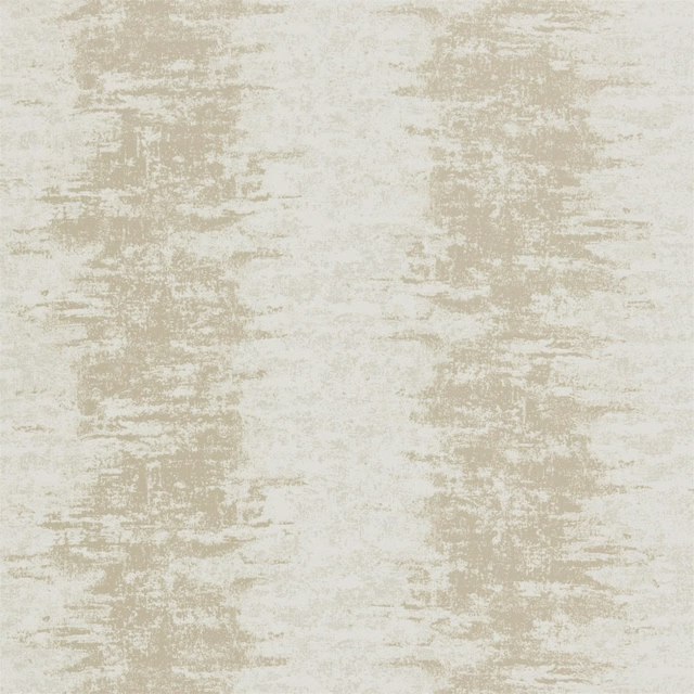
Pumice Wide Width Ecru/Cream
Reflect 3 Wallpaper
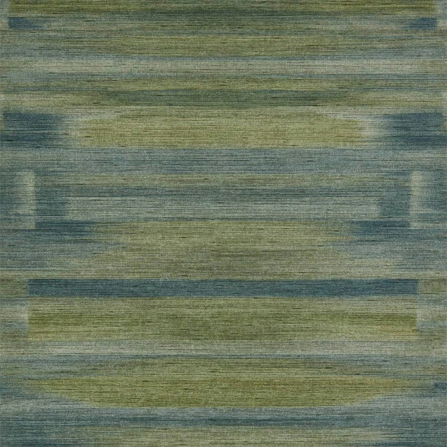
Refraction Wide Width Emerald Citrus
Reflect 3 Wallpaper
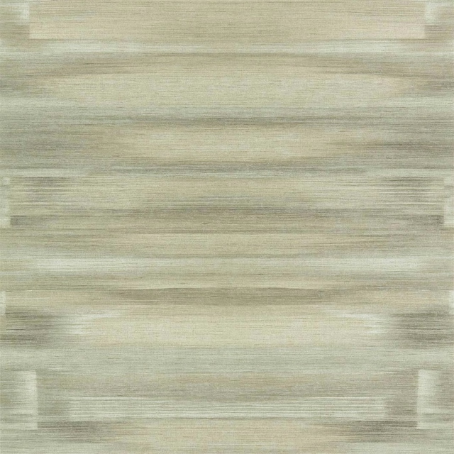
Refraction Wide Width Sandstone
Reflect 3 Wallpaper
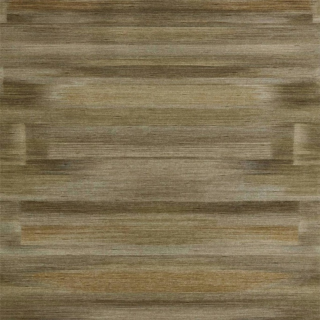
Refraction Wide Width Urban Gold
Reflect 3 Wallpaper
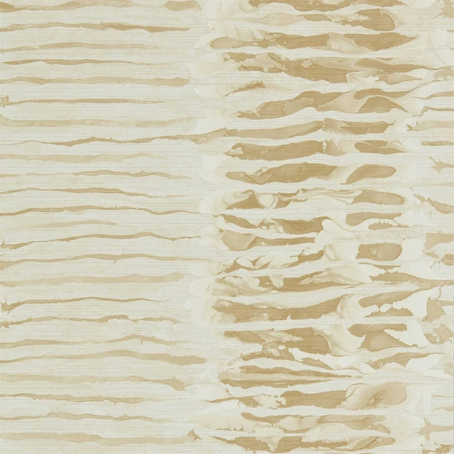
Ripple Stripe Wide Width Sandstone
Reflect 3 Wallpaper
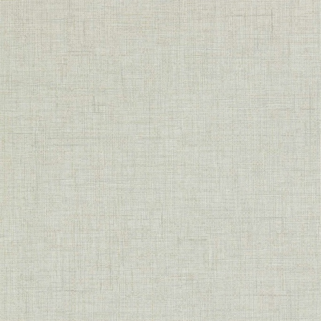
Seri Raphia Wide Width Mist
Reflect 3 Wallpaper
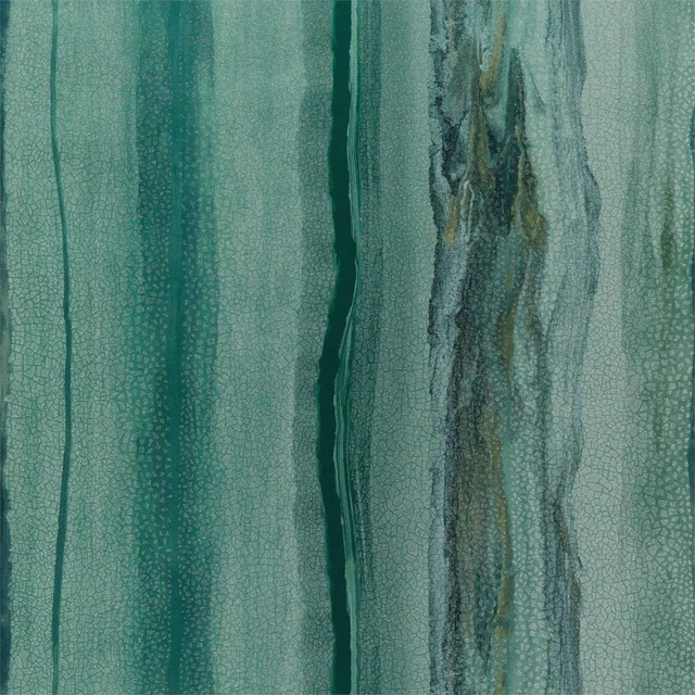
Vitruvius Wide Width Chrysocolla / Apatite
Reflect 3 Wallpaper
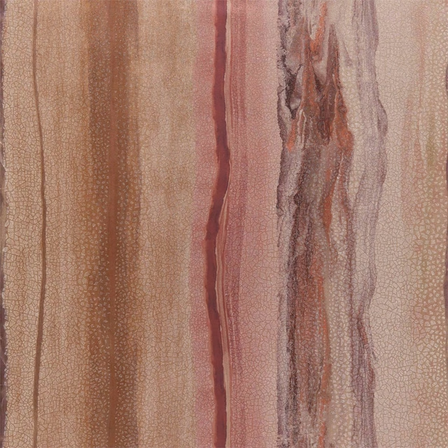
Vitruvius Wide Width Copper / Ruby
Reflect 3 Wallpaper
Pairs well with
A pattern needs somewhere for the eye to rest, so these are the plains and textures that sit beside Vitruvius Wide Width Limestone / Concrete without fighting it. Mixed across the houses we hold, which is the part a single supplier's book cannot do.

Alpha Limestone
Alpha
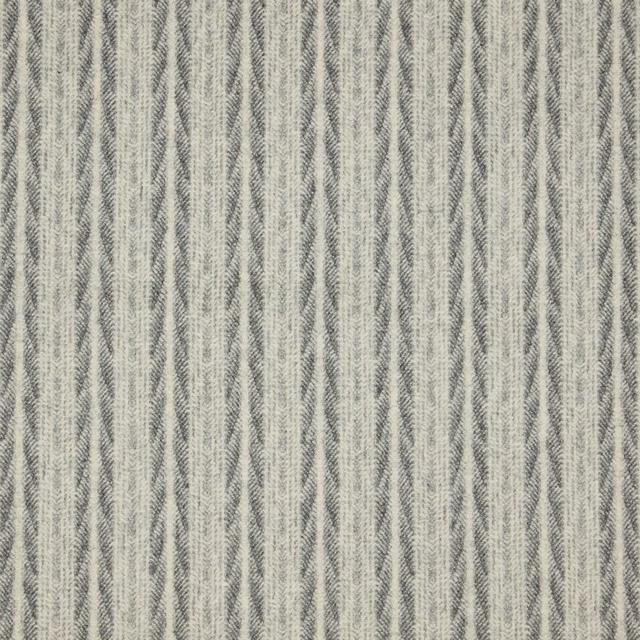
Kintail - Limestone
Misc

Alaska Dove
Alaska Collection

Alaska Fog
Alaska Collection

Albany Charcoal
Albany and Moray
Albany Dove
Albany and Moray

Brandon Silver
Albeck

Lyncombe Silver
Albeck

Aunelle Platinum
AALTER FABRICS

Oparu Graphite
Amaya Fabrics
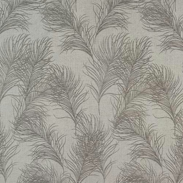
Feather Dove
Acacia
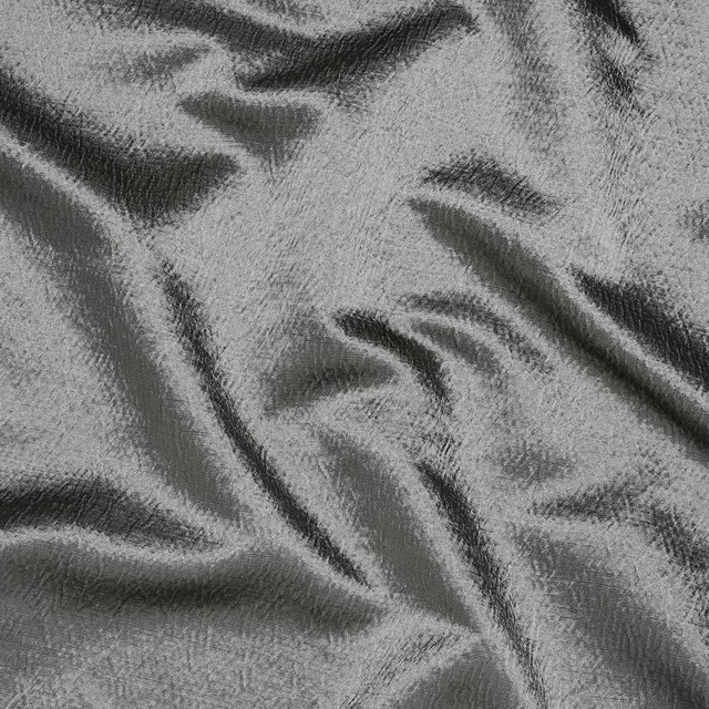
Alchemy Slate
Alchemy
Paint that goes with it
Two ways to take the room. Both colours are from houses we hold, so a pot can come off the same order as the cloth. Screens shift colour, so treat these as a direction and bring the cloth to the shelf before you buy the paint.
To sit quietly behind it
Portland Stone - Light
Little Greene · #e4e2d5
To stand against it
Grape
Zoffany · #857371
Other grey fabrics
Across the houses we hold. See all 7,198.
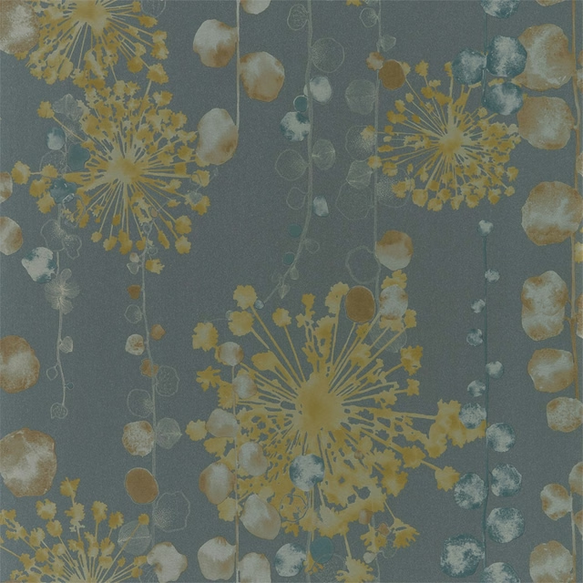
Moku Wide Width Graphite/Mustard
Purity Wallcovering Edit
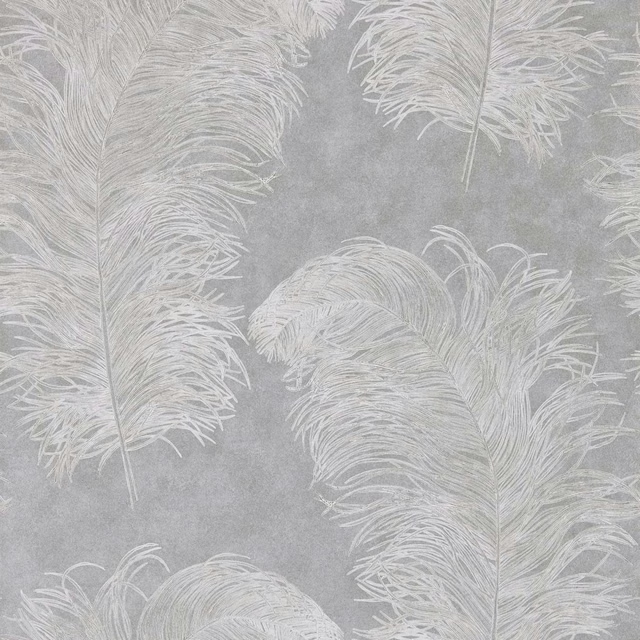
Operetta Wide Width Slate
Purity Wallcovering Edit

Florence Mist
Purity Wallpapers

Mirabella Willow
Purity Wallpapers
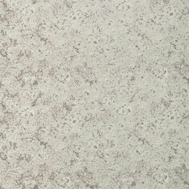
Aconite Steel/Chalk
Reflect Fabrics

Convex Steel/Copper
Reflect Fabrics
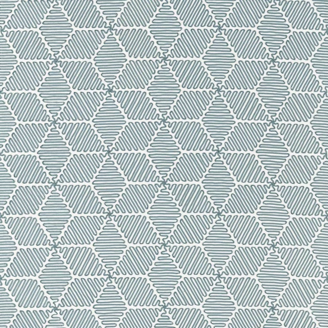
Cupola Slate
Reflect Fabrics

Koto Dove/Moonstone
Reflect Fabrics
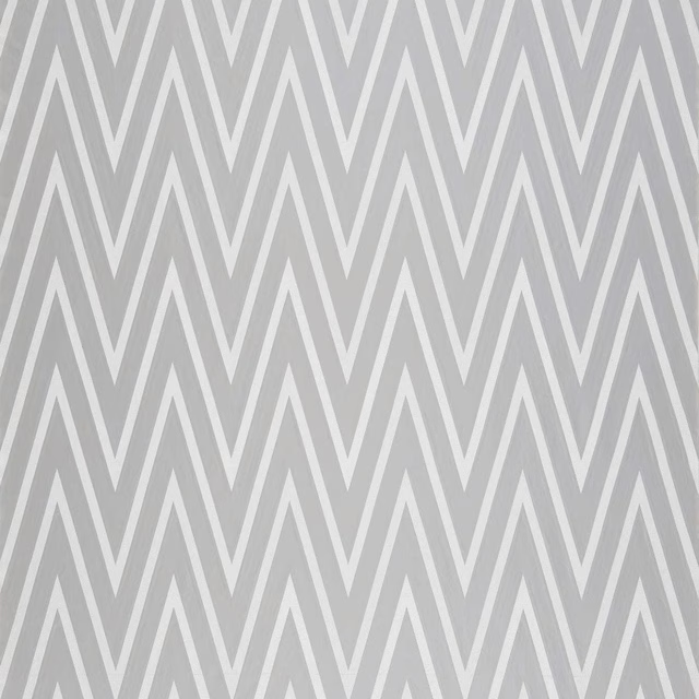
Moriko Steel
Reflect Fabrics
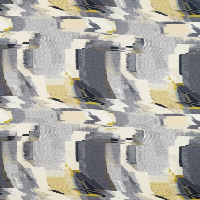
Perspective Charcoal/Gold
Reflect Fabrics

Tanabe Charcoal
Reflect Fabrics
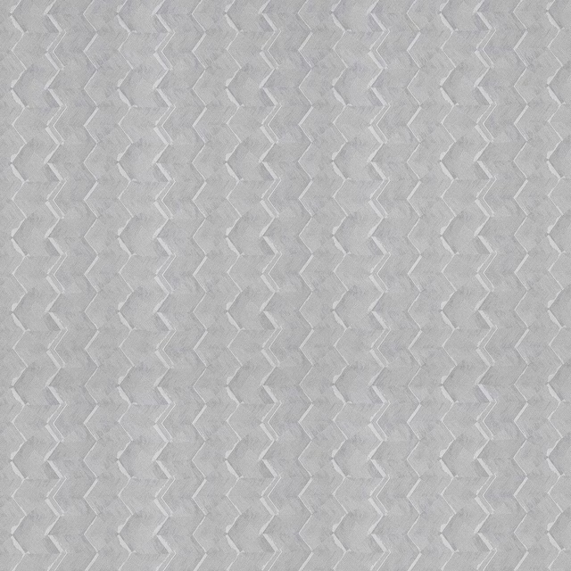
Tanabe Silver
Reflect Fabrics