
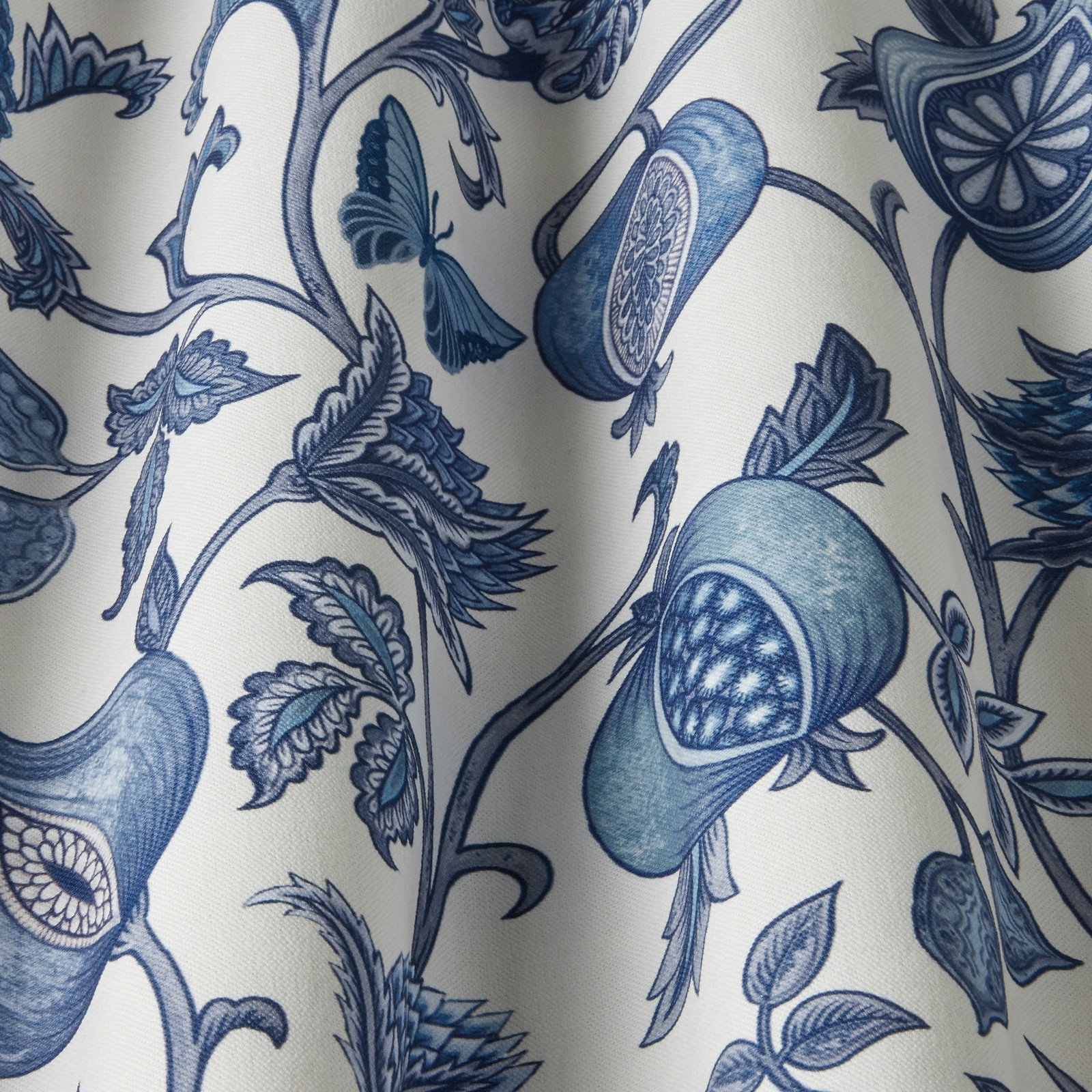

Tap the swatch to see it full screen. Hover it to magnify the weave. Colours on a screen are a guide, not a match, so come and feel the real cloth.
Scroll up or down to zoom in and out.
Verini Saltillo Sapphire Wavy
SS25 Images - Verini & Rewilding Fabric
Verini Saltillo Sapphire Wavy pairs a creamy ground with flowing sapphire-blue botanical forms and sinuous trailing stems. The design feels crisp and decorative, with the blue tones standing out sharply against the pale background.
You have used your previews for today. Send one to Simon and you can carry on.
Your board
0 fabrics
See this fabric on iliv's own site, then order it through us.
See Verini Saltillo Sapphire Wavy in your own room
A photograph of the piece you want re-covered. Straight on is best, and daylight helps. It is used to make your picture and nothing else.
Looking at your room
We found things here Verini Saltillo Sapphire Wavy could go on. Tap one on the photograph, or choose below.
We could not see anything to re-cover
, s
Verini Saltillo Sapphire Wavy, on your
Drag to compare. AI impression, colours indicative: ask us for a cutting before you decide.
About this fabric
Woven in a 59% polyester, 24% cotton, 13% viscose and 3% linen blend, this fabric has a usable width of 142cm and a Martindale of 20,000, making it suitable for general domestic upholstery as well as drapery and accessories. The print shows a large-scale, winding botanical motif in layered sapphire and indigo blues, with lighter washed sections that give the pattern depth and a slightly painterly finish. On the image, the ground reads as a warm ivory rather than a stark white, which softens the contrast and keeps the overall look elegant rather than hard-edged. It is treatable for FR drapery and upholstery, offering added flexibility for schemes that need coordinated soft furnishings.
How to use it
Use this colourway on an accent chair, roman blind or statement curtains where the saturated blue motif can sit against natural woods, chalky paint shades or brushed brass. Its cooler sapphire notes make it especially effective in schemes that need pattern without heaviness.
A fresh sapphire print that brings crisp contrast and a tailored feel to relaxed rooms.
More from SS25 Images - Verini & Rewilding
The same book, other colourways.
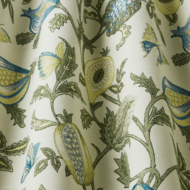
Verini Primavera Teal Wavy
SS25 Images - Verini & Rewilding
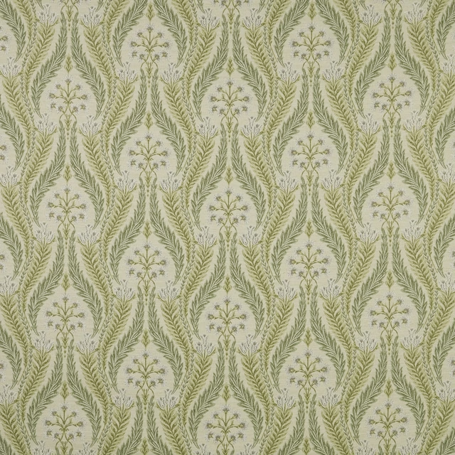
Verini Sage Flat
SS25 Images - Verini & Rewilding
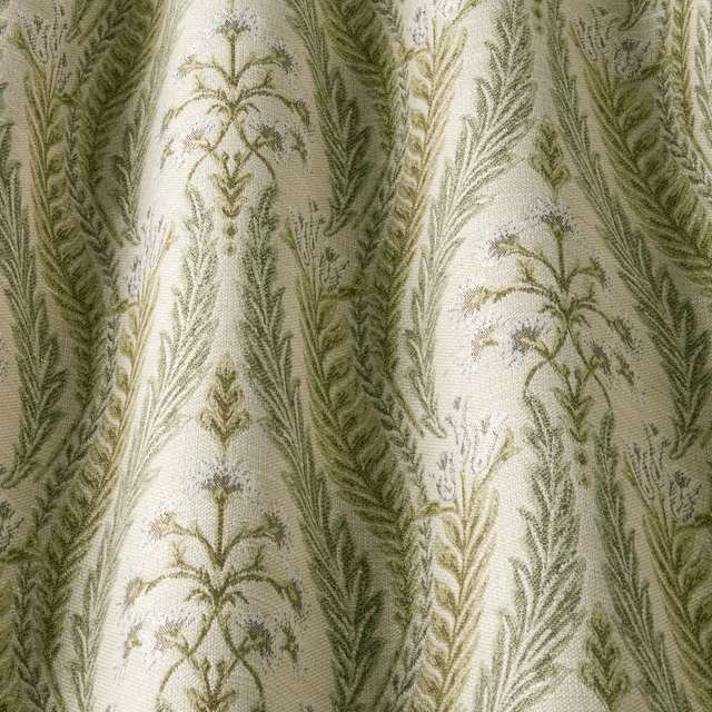
Verini Sage Wavy
SS25 Images - Verini & Rewilding
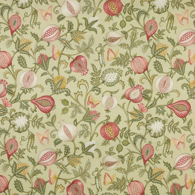
Verini Saltillo Sage Flat
SS25 Images - Verini & Rewilding
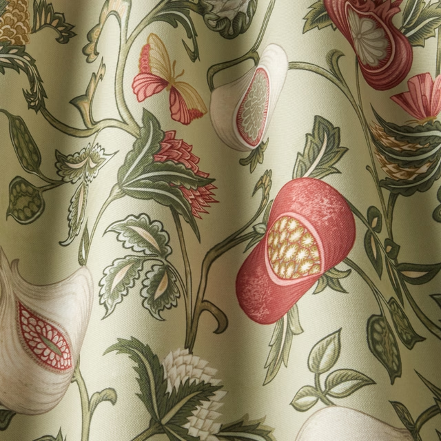
Verini Saltillo Sage Wavy
SS25 Images - Verini & Rewilding
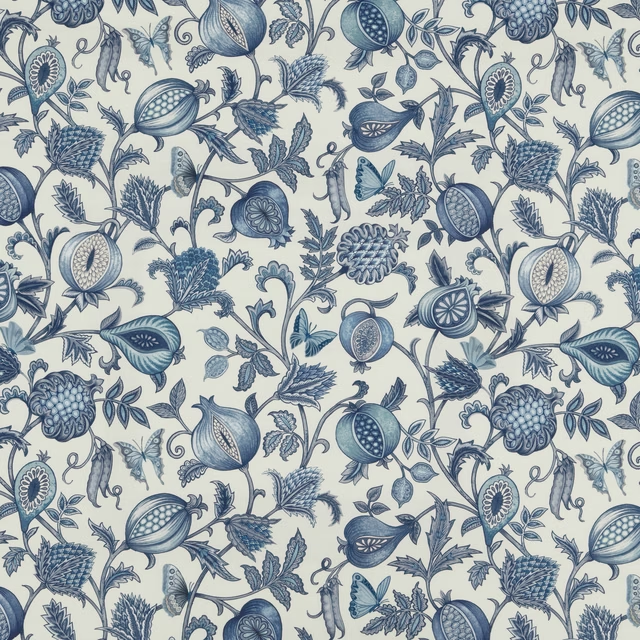
Verini Saltillo Sapphire Flat
SS25 Images - Verini & Rewilding
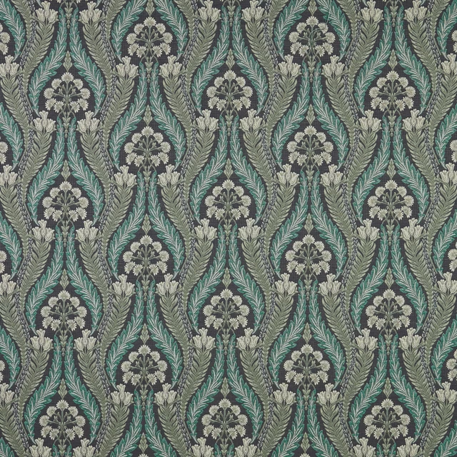
Verini Sapphire Flat
SS25 Images - Verini & Rewilding
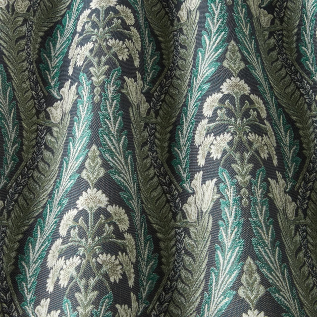
Verini Sapphire Wavy
SS25 Images - Verini & Rewilding
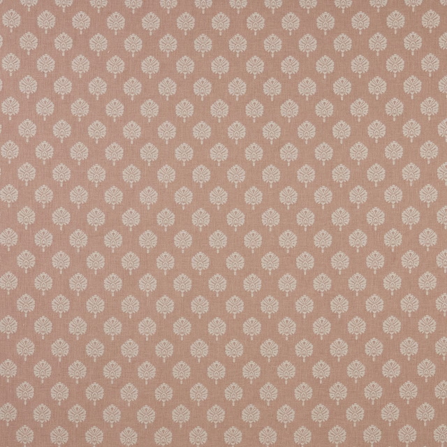
Verini Segoa Blush Flat
SS25 Images - Verini & Rewilding
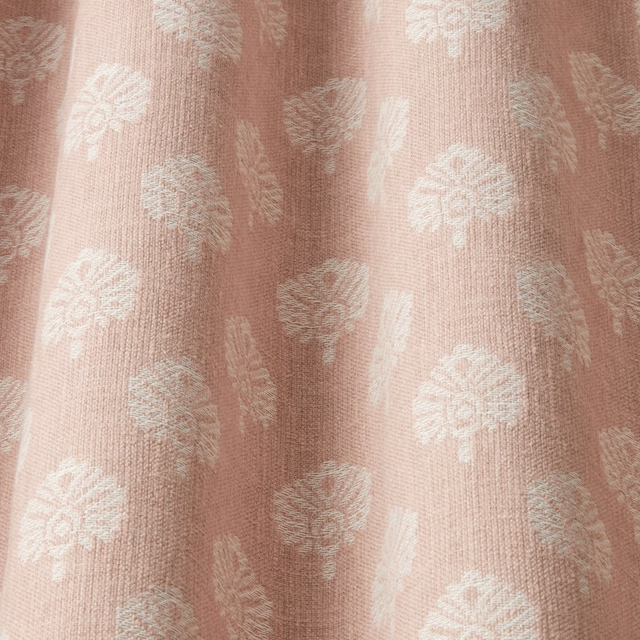
Verini Segoa Blush Wavy
SS25 Images - Verini & Rewilding
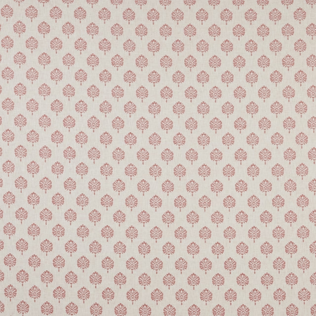
Verini Segoa Dark Coral Flat
SS25 Images - Verini & Rewilding
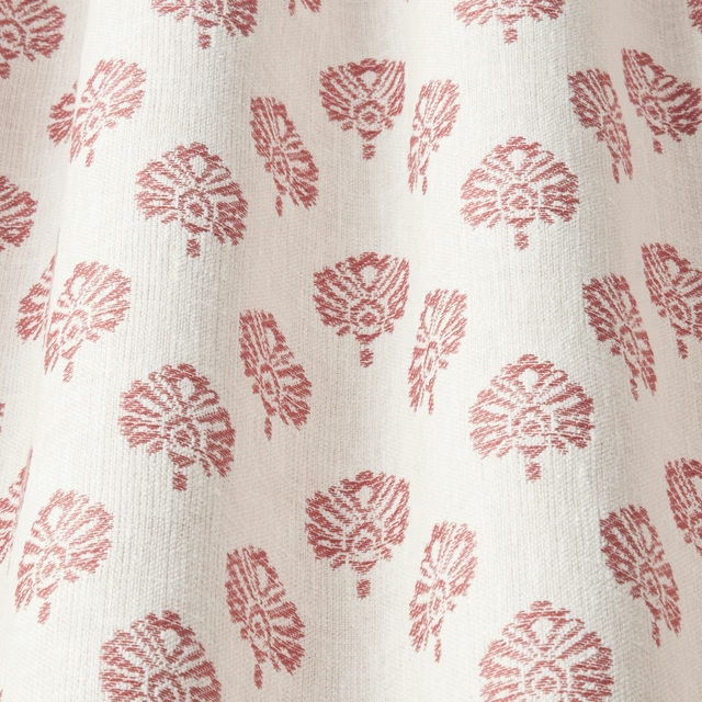
Verini Segoa Dark Coral Wavy
SS25 Images - Verini & Rewilding
Pairs well with
A pattern needs somewhere for the eye to rest, so these are the plains and textures that sit beside Verini Saltillo Sapphire Wavy without fighting it. Mixed across the houses we hold, which is the part a single supplier's book cannot do.

Alaska Navy
Alaska Collection

Alaska Powder Blue
Alaska Collection

Beaux-Arts Nuit
Atelier Fabrics

Albany Duckegg
Albany and Moray

Albany Midnight
Albany and Moray

Brandon Aqua
Albeck
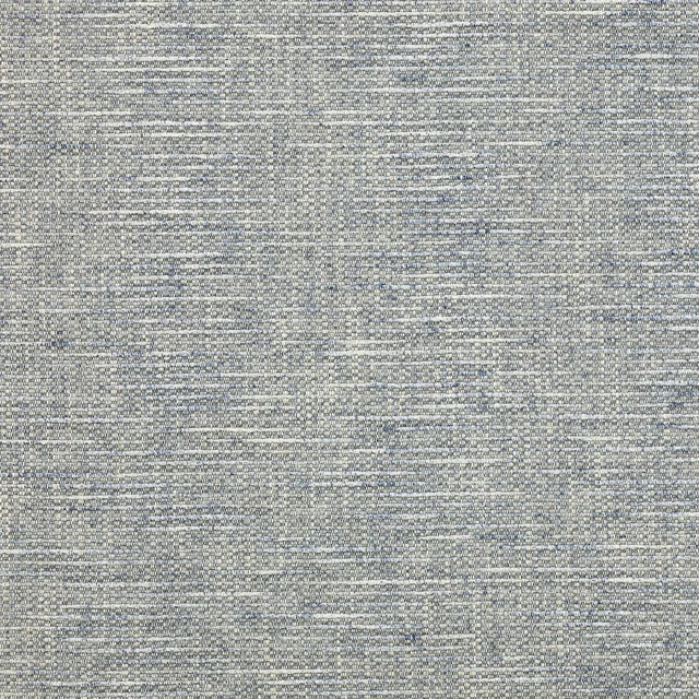
Brandon Blue
Albeck

Kalutara Indigo
Ampara Fabrics

Brera Filato Marine
Brera Filato Fabrics
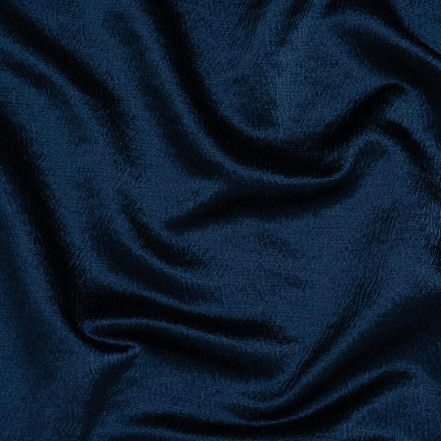
Alchemy Indigo
Alchemy
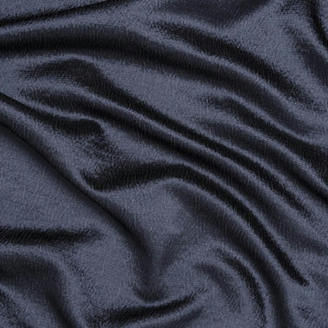
Alchemy Navy
Alchemy

Allegra Atlantic
Allegra
Paint that goes with it
Two ways to take the room. Both colours are from houses we hold, so a pot can come off the same order as the cloth. Screens shift colour, so treat these as a direction and bring the cloth to the shelf before you buy the paint.
To sit quietly behind it
Taylor's Grey
Zoffany · #778087
To stand against it
Carmen Light
Sanderson · #a7565d
Other blue fabrics
Across the houses we hold. See all 7,566.
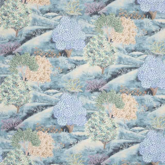
Botanical Archive Bloomfield Indigo
SS26 Images - Botanical Archive, Terrana & Hartland
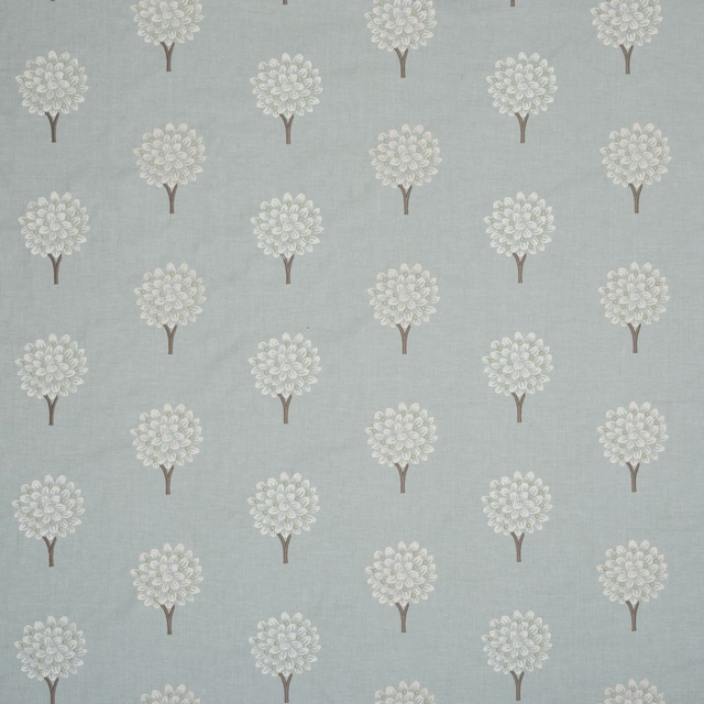
Botanical Archive Briarwood Aqua
SS26 Images - Botanical Archive, Terrana & Hartland
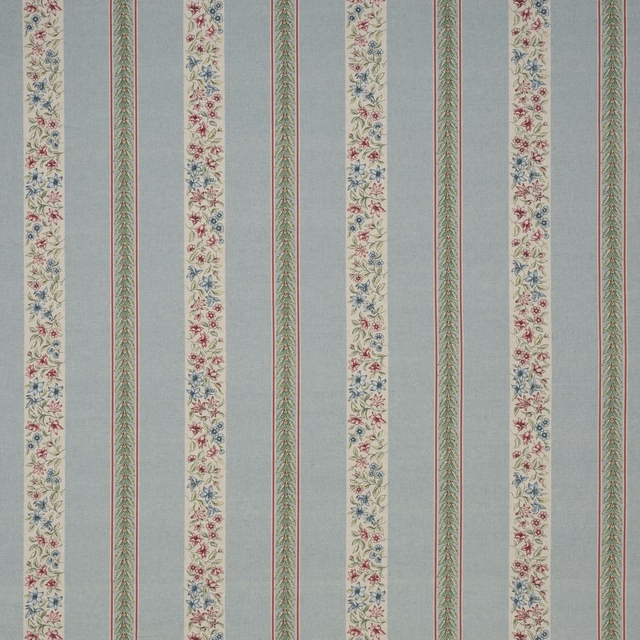
Botanical Archive Clementine Chintz
SS26 Images - Botanical Archive, Terrana & Hartland
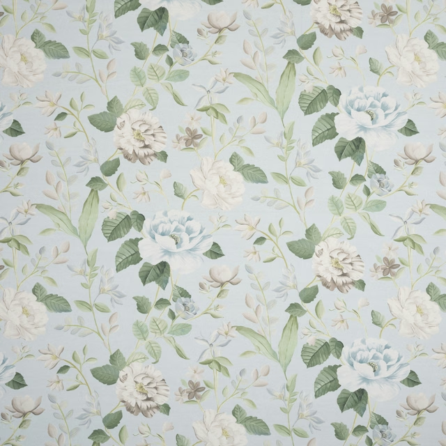
Botanical Archive Fleury Aqua
SS26 Images - Botanical Archive, Terrana & Hartland
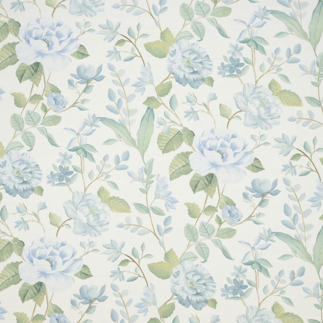
Botanical Archive Fleury Bluestone
SS26 Images - Botanical Archive, Terrana & Hartland

Botanical Archive Glenhaven Aqua
SS26 Images - Botanical Archive, Terrana & Hartland
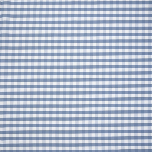
Botanical Archive Glenhaven Bluestone
SS26 Images - Botanical Archive, Terrana & Hartland
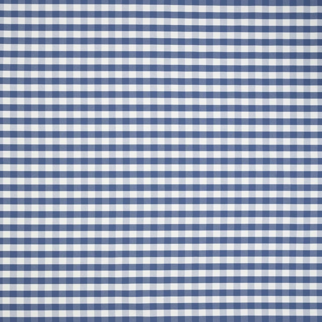
Botanical Archive Glenhaven Indigo
SS26 Images - Botanical Archive, Terrana & Hartland
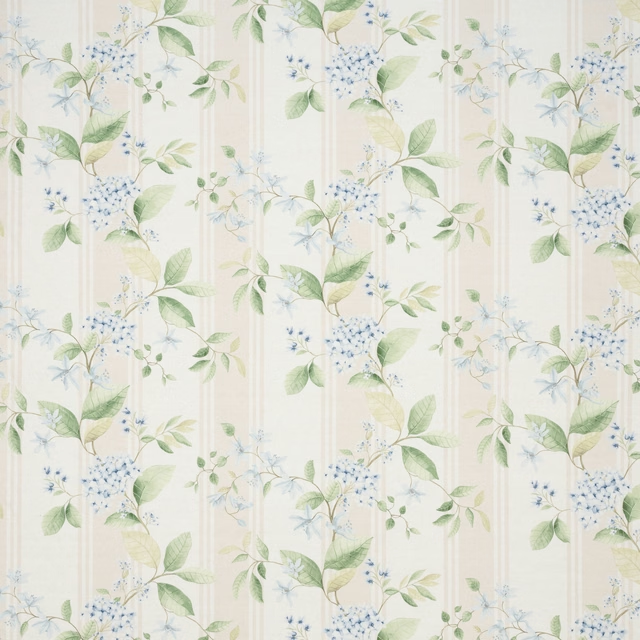
Botanical Archive Hydrangea Bluestone
SS26 Images - Botanical Archive, Terrana & Hartland
Botanical Archive Meadowvale Bluestone
SS26 Images - Botanical Archive, Terrana & Hartland
Botanical Archive Rosetto Bluestone
SS26 Images - Botanical Archive, Terrana & Hartland

Hartland Hayle Indigo
SS26 Images - Botanical Archive, Terrana & Hartland