
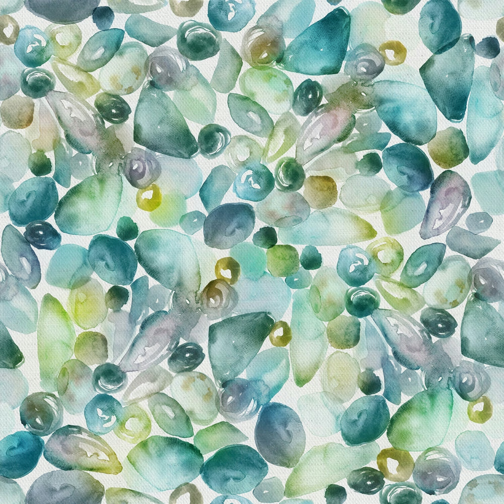

Tap the swatch to see it full screen. Hover it to magnify the weave. Colours on a screen are a guide, not a match, so come and feel the real cloth.
Scroll up or down to zoom in and out.
Pebbles Kelpie
Riviera Fabricpebbles/fa1/kel
Pebbles Kelpie reads like a scatter of sea-worn stones in cool, translucent greens, blue-greens and misty grey tones. The overall effect is airy and watery, with the white ground keeping the colourway bright rather than heavy.
You have used your previews for today. Send one to Simon and you can carry on.
Your board
0 fabrics
Part of the range we hold from Voyage Maison.
See Pebbles Kelpie in your own room
A photograph of the piece you want re-covered. Straight on is best, and daylight helps. It is used to make your picture and nothing else.
Looking at your room
We found things here Pebbles Kelpie could go on. Tap one on the photograph, or choose below.
We could not see anything to re-cover
, s
Pebbles Kelpie, on your
Drag to compare. AI impression, colours indicative: ask us for a cutting before you decide.
About this fabric
This Riviera fabric is 100% cotton and has a usable width of 136cm, with a larger 68cm horizontal and vertical repeat that suits statement curtain drops and lined blinds. The printed pebble forms are washed in soft aqua, sage, teal and pale grey, giving the design a fresh, coastal feel rather than a dense, earthy one. At 230gsm it has enough body for soft furnishings while still reading as a lighter decorative textile, and it is dry clean only with a cool iron finish. The pale ground and translucent colour washes make this colourway feel crisp and calm, with the greens shifting cooler in natural light.
How to use it
Use Pebbles Kelpie where you want colour without weight: it works especially well on relaxed curtains, Roman blinds and cushions in pale timber or white-painted rooms. The cool sea-glass palette pairs neatly with chalky neutrals, soft blues and brushed metal finishes.
The cool, watery greens suit light curtains or a fresh statement blind.
More from Riviera
The same book, other colourways.
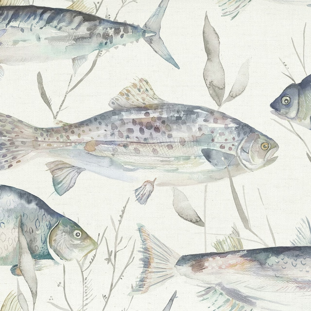
Iveswaters Slate
Riviera
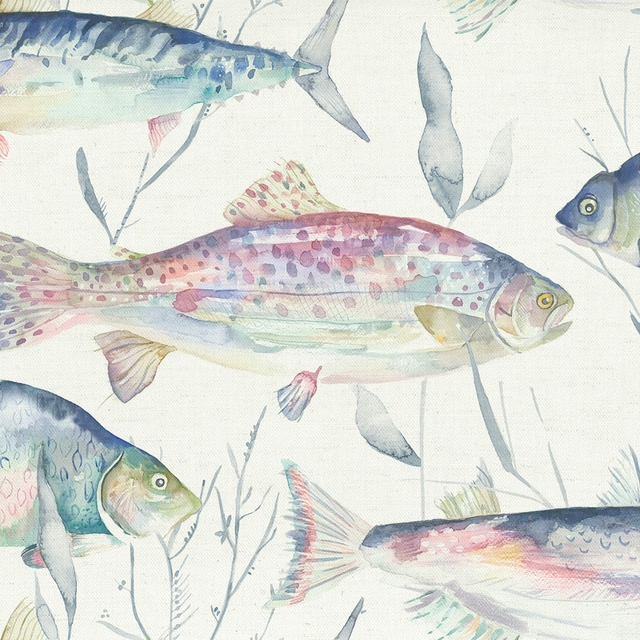
Iveswaters Abalone
Riviera
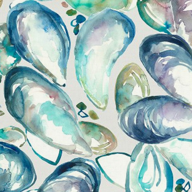
Musselshells Marine
Riviera
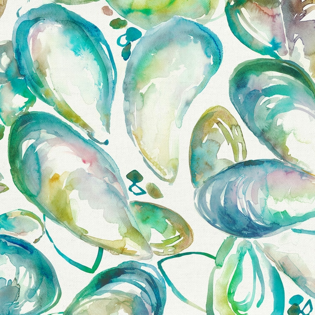
Musselshells Kelpie
Riviera
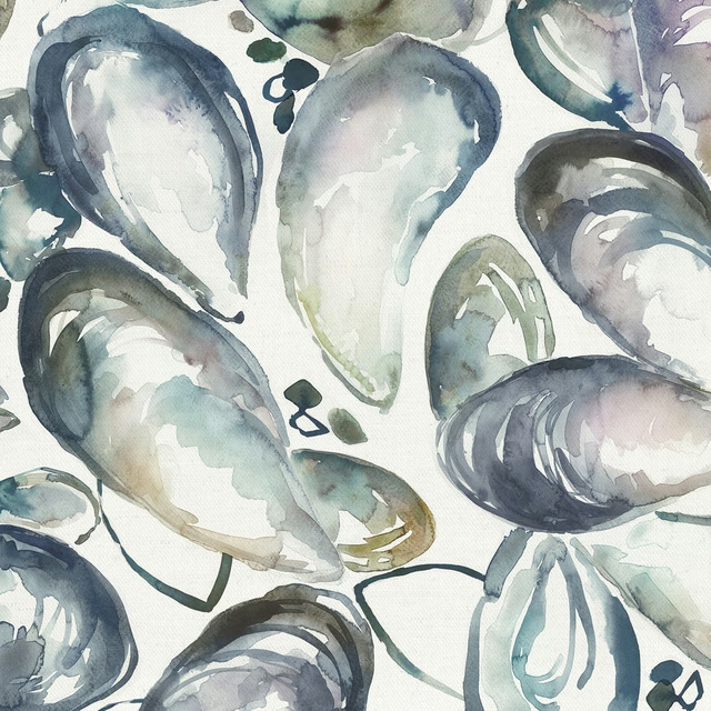
Musselshells Slate
Riviera
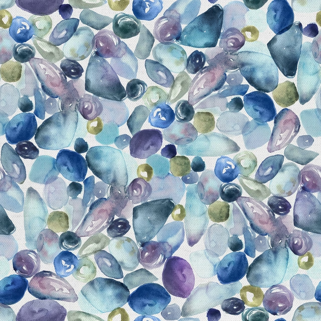
Pebbles Marine
Riviera
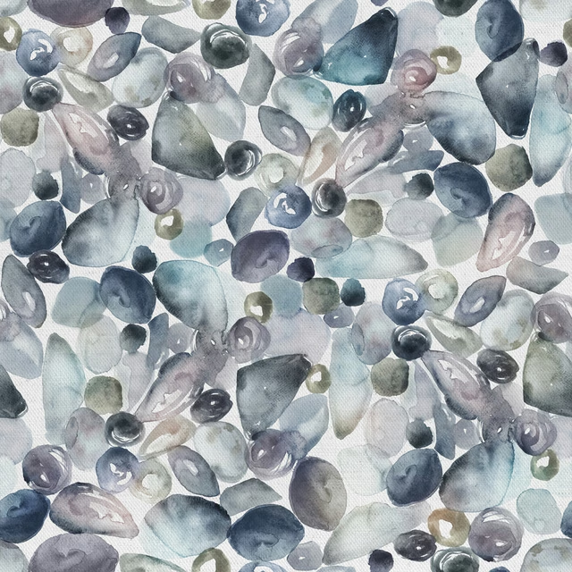
Pebbles Slate
Riviera
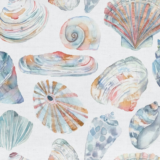
Rockpool Cobalt
Riviera
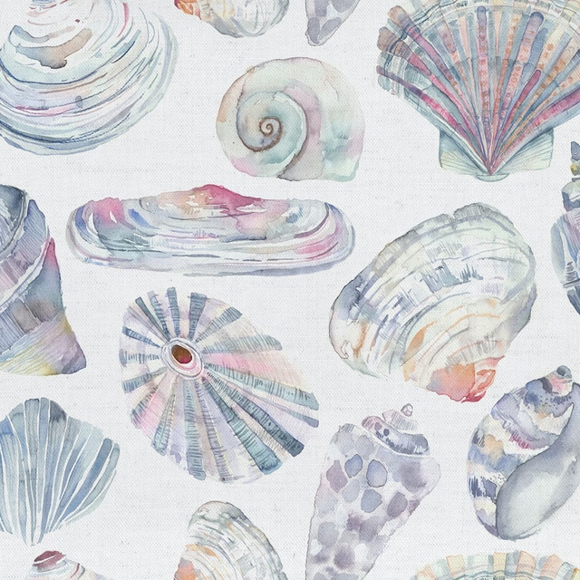
Rockpool Abalone
Riviera
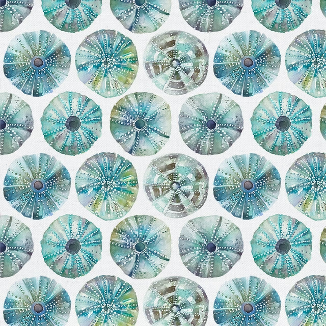
Seaurchin Kelpie
Riviera
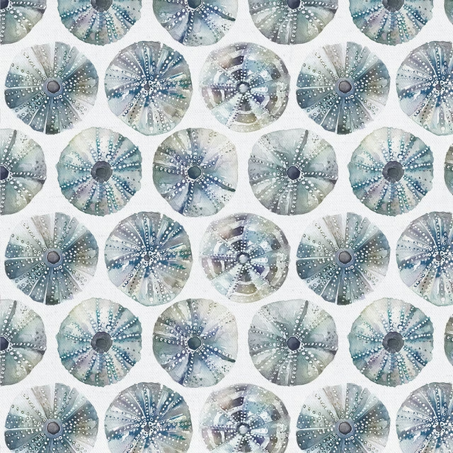
Seaurchin Slate
Riviera
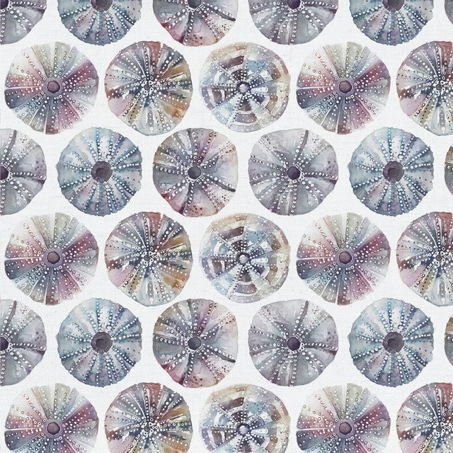
Seaurchin Abalone
Riviera
Pairs well with
A pattern needs somewhere for the eye to rest, so these are the plains and textures that sit beside Pebbles Kelpie without fighting it. Mixed across the houses we hold, which is the part a single supplier's book cannot do.
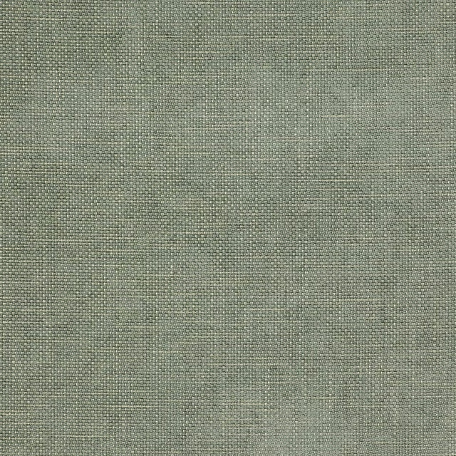
Stratford Sea Green
Roscoe

Reece Sea Green
Reece

Pacific Dove
Atlantic Collection
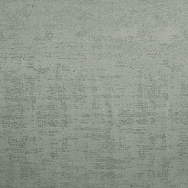
Dakota Willow
Dakota Collection
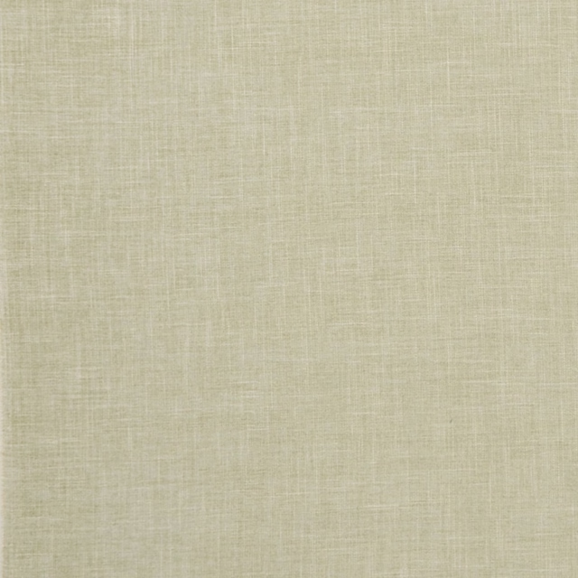
Albany Sage
Albany and Moray
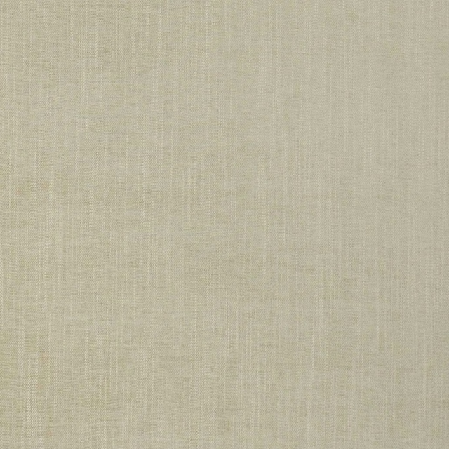
Moray Sage
Albany and Moray

Brandon Celadon
Albeck
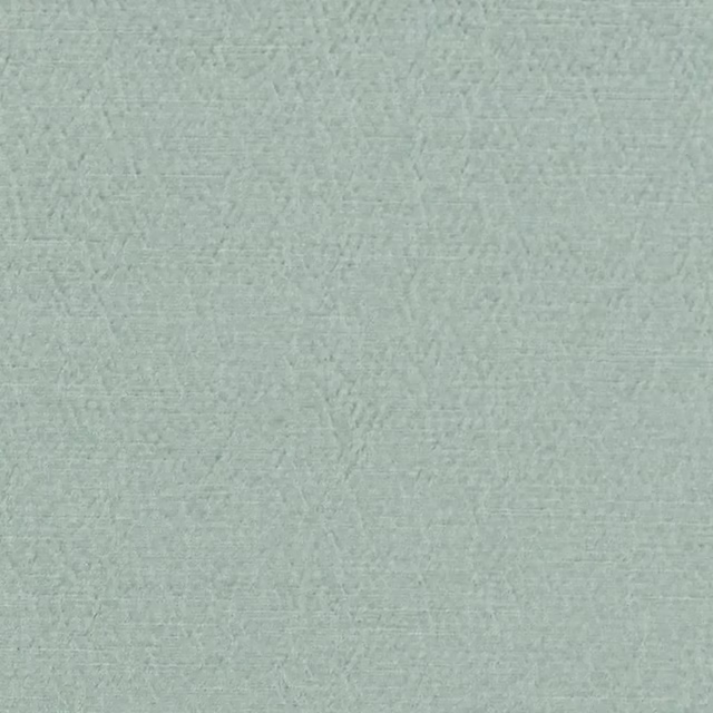
Anshu Sky
Anshu Fabrics
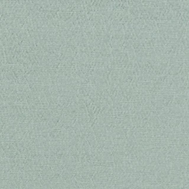
Anshu Alta Sky
Anshu Fabrics
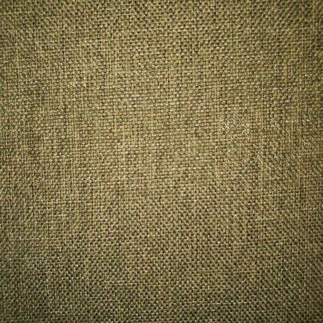
Arran FR Sage
Alderney
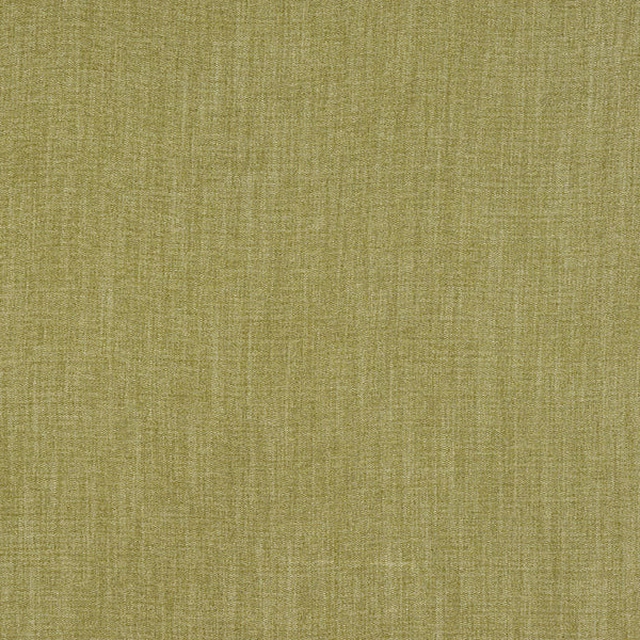
Monza Pampas
Arezzo
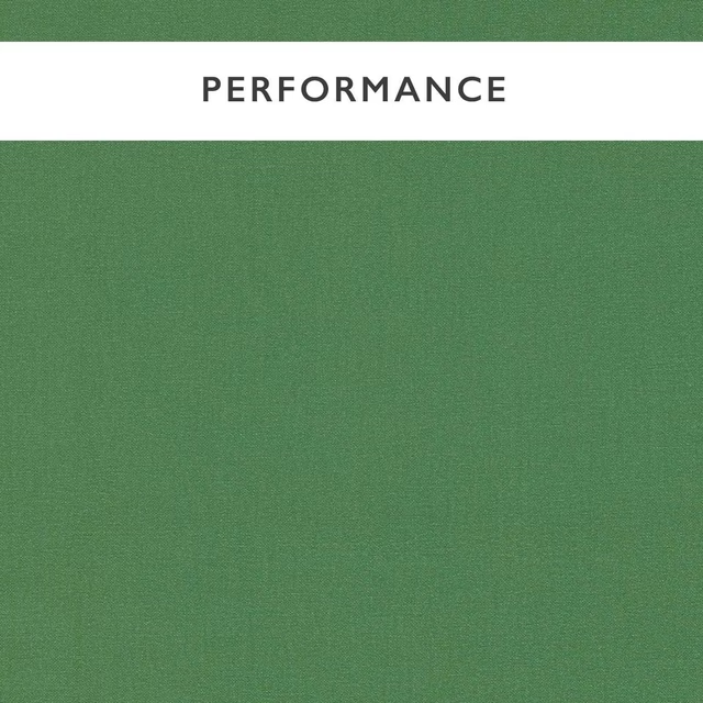
Allegra Nettle
Allegra
Paint that goes with it
Two ways to take the room. Both colours are from houses we hold, so a pot can come off the same order as the cloth. Screens shift colour, so treat these as a direction and bring the cloth to the shelf before you buy the paint.
To sit quietly behind it
Mumingtons Stem
Morris & Co. · #9eb0a2
To stand against it
Vermeer Yellow
Zoffany · #ddc379
Other green fabrics
Across the houses we hold. See all 4,855.
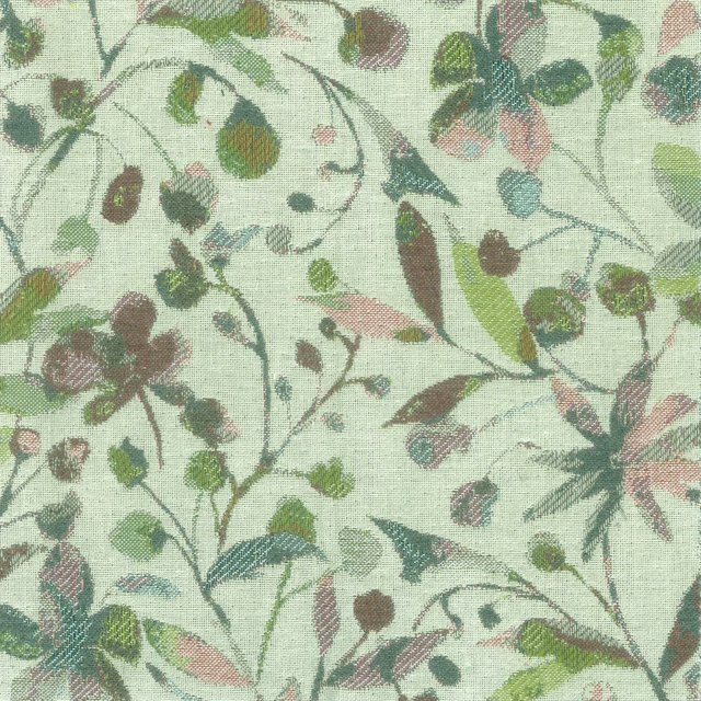
Mercia Blush
Penningtonweaves
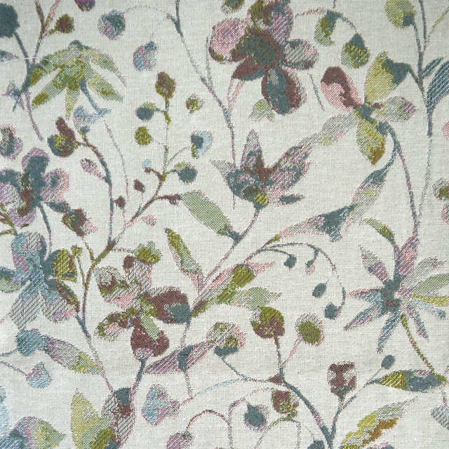
Rydal Blush
Penningtonweaves
Rithani Pistachio
Rithani
Selkirk Lemongrass
Selkirk
Bellmeadow Oasis
Springsolstice
Pearharvest Hazel
Springsolstice
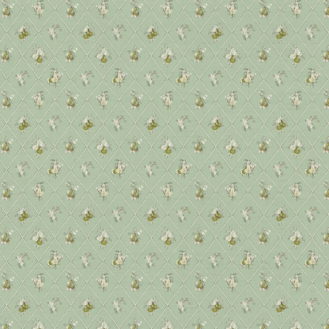
Peartrellis Verdure
Springsolstice
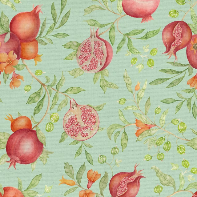
Pomegranategrove Oasis
Springsolstice
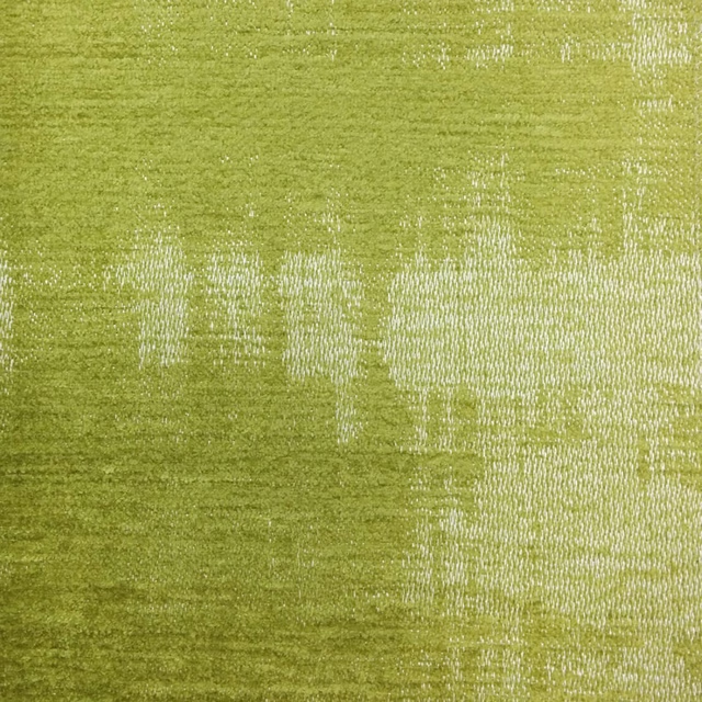
Stratos Peridot
Stratos
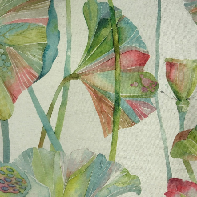
Cheriton Pomegranate
Tiverton
Colyford Pomegranate
Tiverton
Danbury Pomegranate
Tiverton