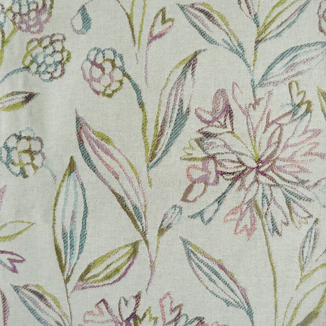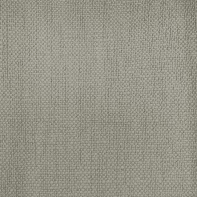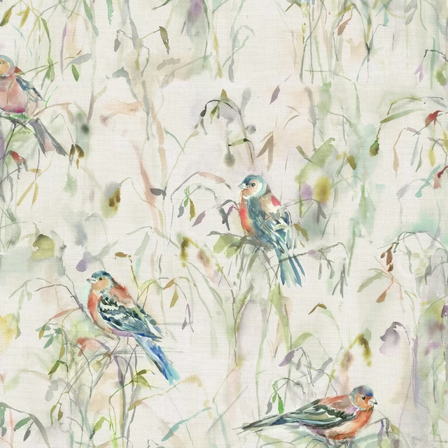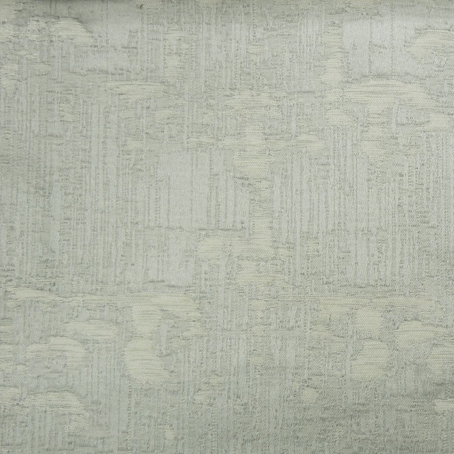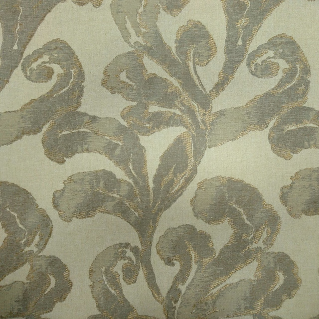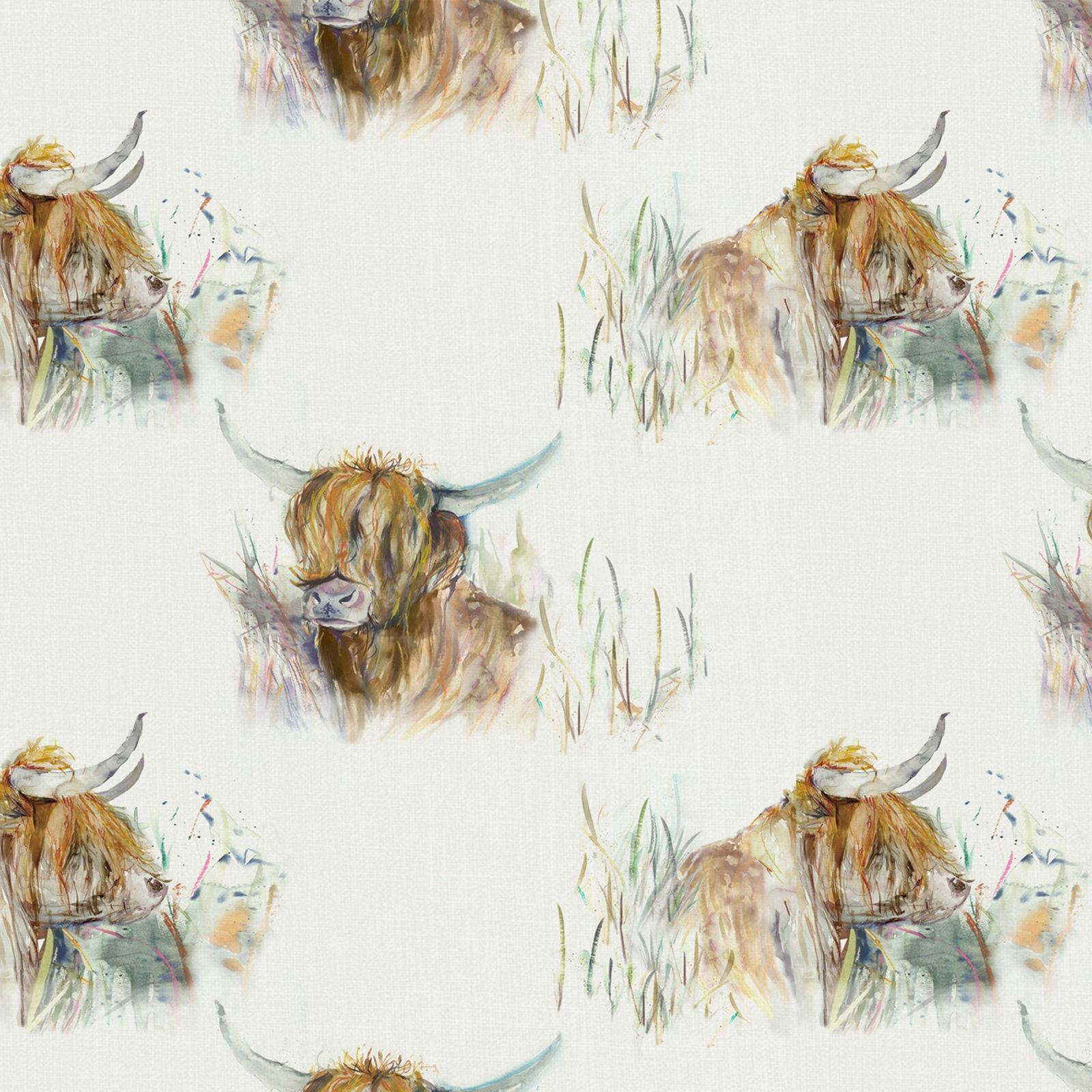

Tap the swatch to see it full screen. Hover it to magnify the weave. Colours on a screen are a guide, not a match, so come and feel the real cloth.
Scroll up or down to zoom in and out.
Highlandcoo Natural
Voyagecountry Fabrichighlan/oc2/mul
Highlandcoo Natural pairs a soft cream ground with loose, painterly Highland cows in warm russet, taupe and muted grey tones. The design feels airy and rustic, with plenty of quiet space around the motif.
You have used your previews for today. Send one to Simon and you can carry on.
Your board
0 fabrics
Part of the range we hold from Voyage Maison.
See Highlandcoo Natural in your own room
A photograph of the piece you want re-covered. Straight on is best, and daylight helps. It is used to make your picture and nothing else.
Looking at your room
We found things here Highlandcoo Natural could go on. Tap one on the photograph, or choose below.
We could not see anything to re-cover
, s
Highlandcoo Natural, on your
Drag to compare. AI impression, colours indicative: ask us for a cutting before you decide.
About this fabric
This fabric is made from 80% cotton and 20% polyester, with a resin finish that is water resistant and complies with Oeko-Tex, GRS, ZDHC and REACH regulations. The swatch shows a pale cream base that keeps the large-scale Highland cow motif looking fresh rather than heavy, while the brushy strokes of ochre, brown, grey-green and a little dusky blue add movement and character. Its usable width is 138cm, with a 140cm width and a horizontal repeat of 28 and vertical repeat of 20.67, which helps the illustrated animals read clearly across larger surfaces. It is machine washable at 30 degrees max, should be dried flat and ironed on the reverse, and it is not fire retardant. The overall effect is soft, countryside-inspired and slightly whimsical, with the cream ground making the design feel lighter than a deeper colourway would.
How to use it
This cream colourway works well in relaxed country interiors where you want the Highland cow artwork to stand out without overpowering the room. Use it on cushions, loose covers or occasional upholstery alongside timber, linen and muted green accents.
Use it for a fresh country look that keeps the playful Highland cow motif feeling light and airy.
More from Voyagecountry
The same book, other colourways.
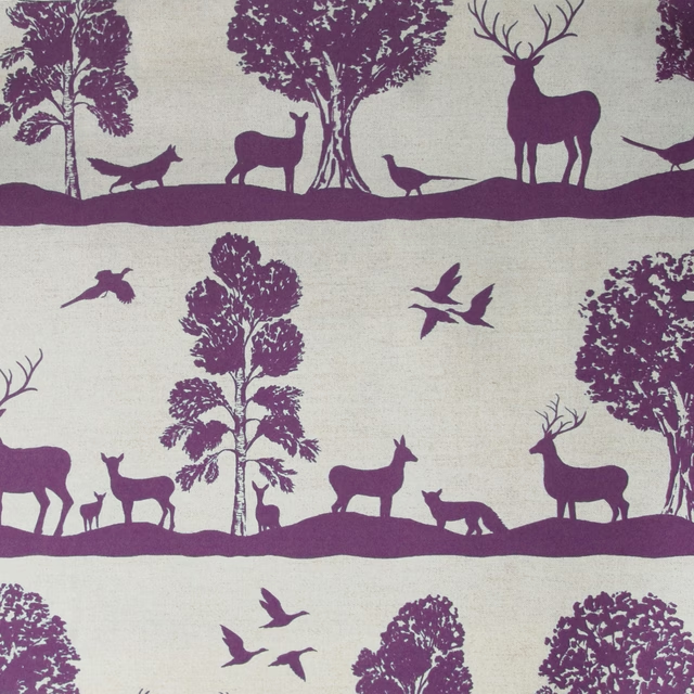
Cairngorms Damson
Voyagecountry
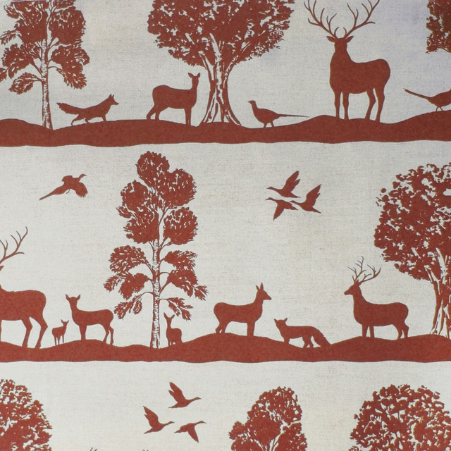
Cairngorms Paprika
Voyagecountry
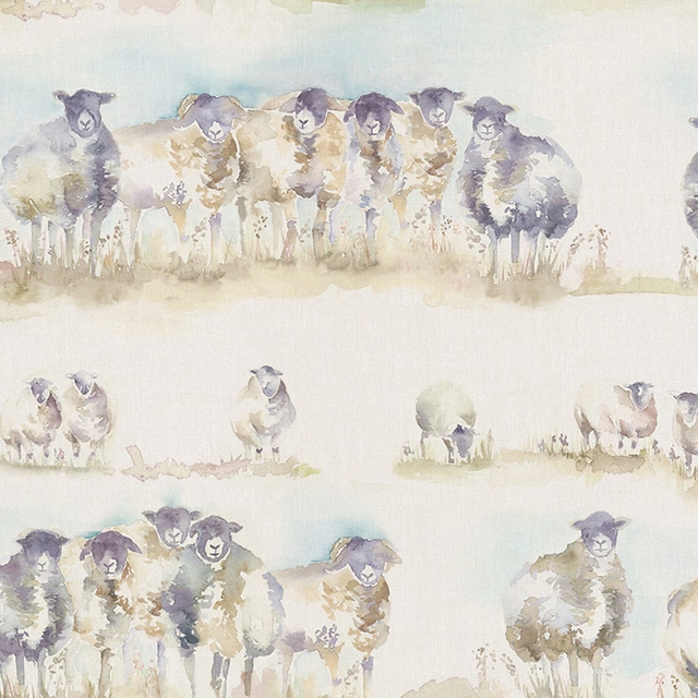
Comeby cream
Voyagecountry
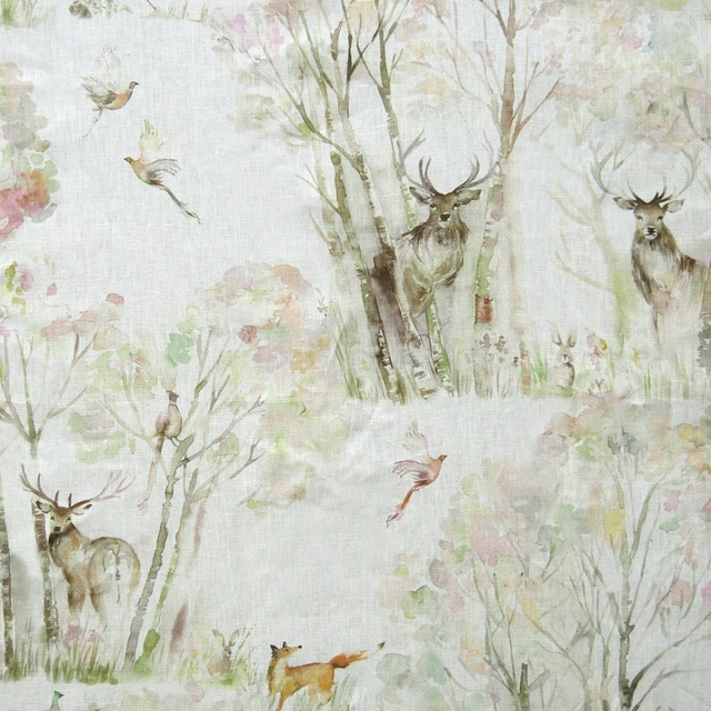
Enchantedforest cream
Voyagecountry
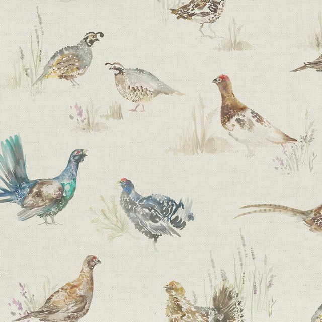
Gamebirds cream
Voyagecountry
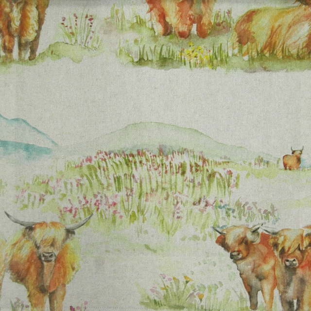
Highlandcattle cream
Voyagecountry
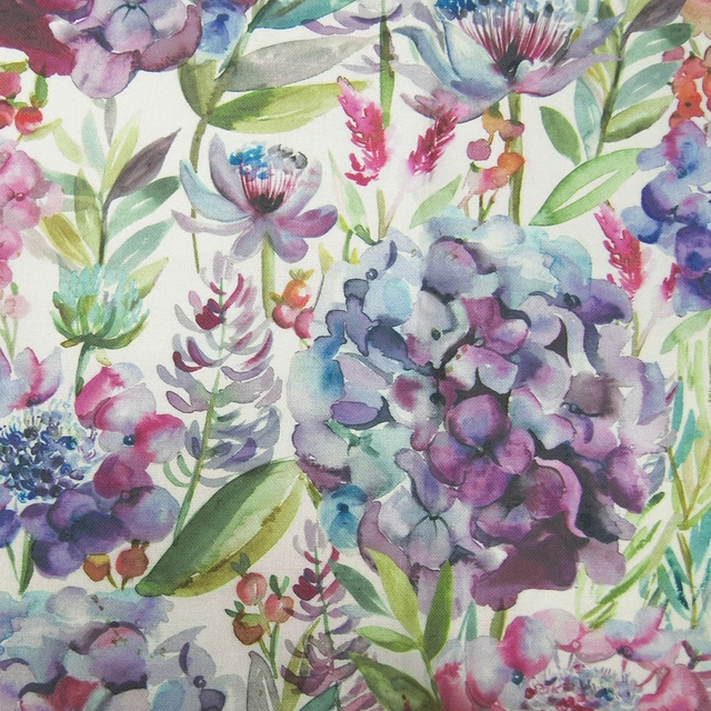
Hydrangea Grape
Voyagecountry
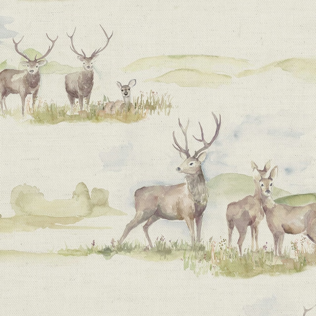
Moorlandstag multi
Voyagecountry
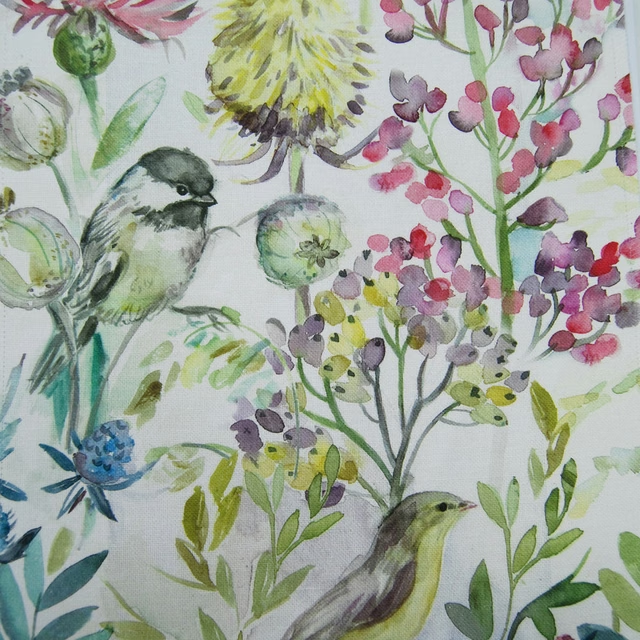
Morningchorus Cream
Voyagecountry
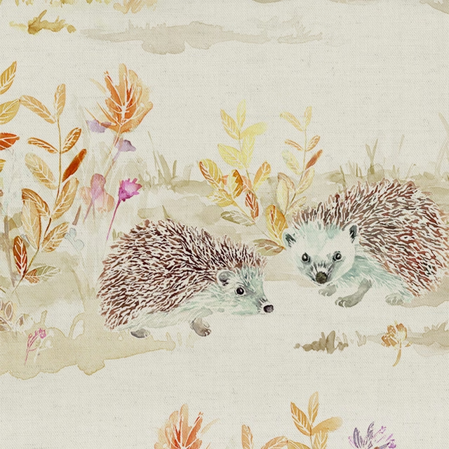
Mrandmrshedgehog Linen
Voyagecountry
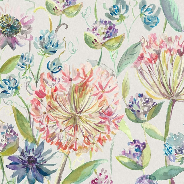
Pompomfloral Cream
Voyagecountry
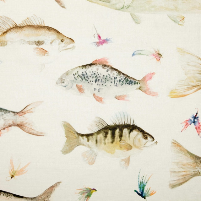
Riverfish Cream
Voyagecountry
Pairs well with
A pattern needs somewhere for the eye to rest, so these are the plains and textures that sit beside Highlandcoo Natural without fighting it. Mixed across the houses we hold, which is the part a single supplier's book cannot do.
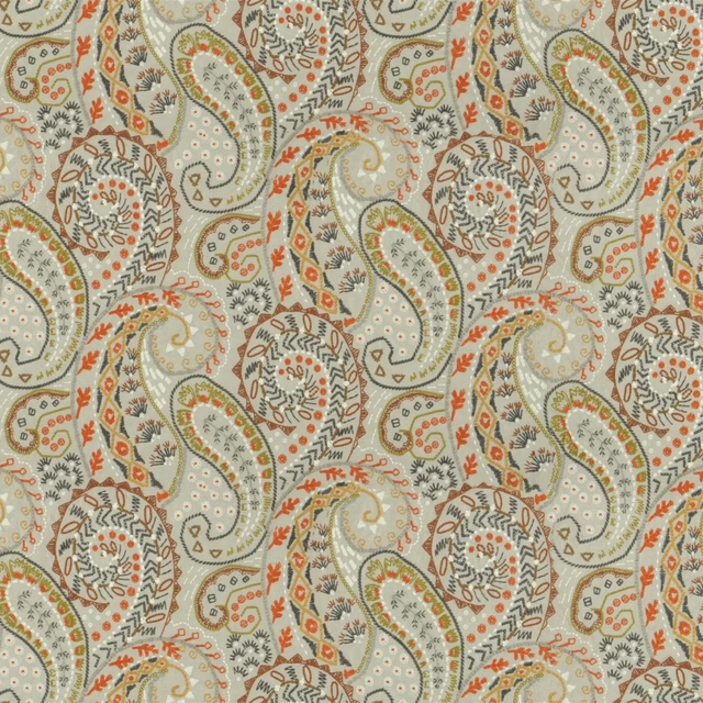
Palenque Sienna
Palenque Fabrics

Alaska Cream
Alaska Collection
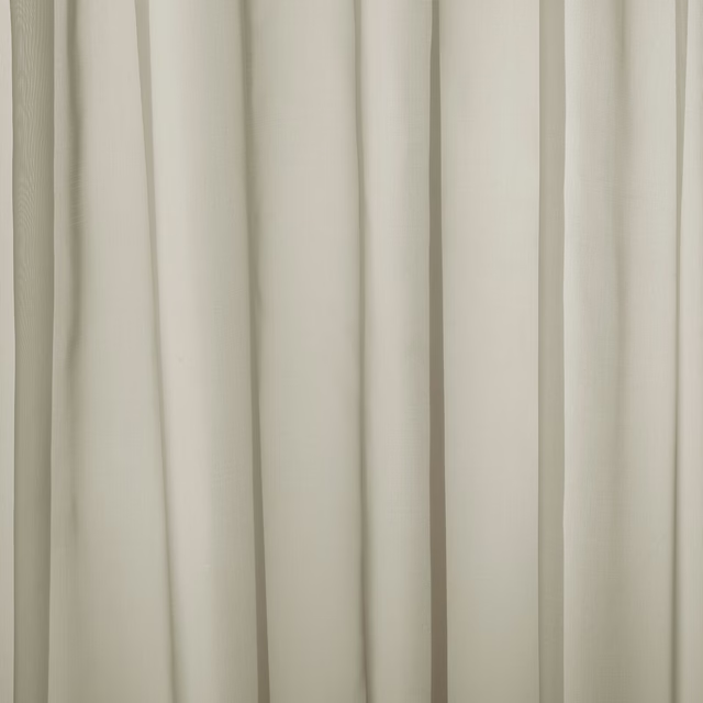
Baltic Linen
Atlantic Collection

Alvar Birch
Alvar 2

Alvar Cream
Alvar 2

Marldon Parchment
Albeck
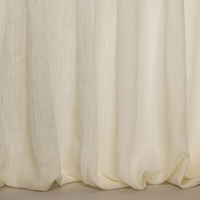
Stroma Ivory
Avril
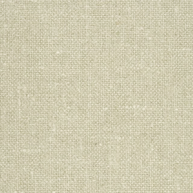
Aalter Flax
AALTER FABRICS

Chimay Zinc
AALTER FABRICS
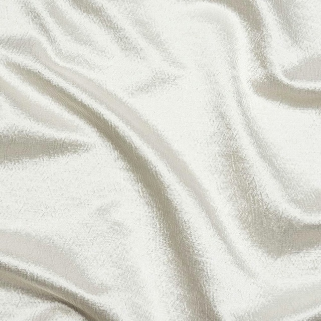
Alchemy Ivory
Alchemy
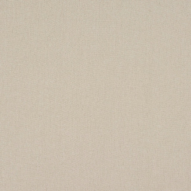
Monza Natural
Arezzo
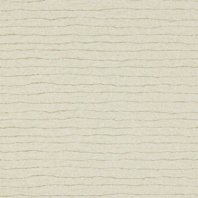
Nisiros Limestone
Anthology 06
Paint that goes with it
Two ways to take the room. Both colours are from houses we hold, so a pot can come off the same order as the cloth. Screens shift colour, so treat these as a direction and bring the cloth to the shelf before you buy the paint.
To sit quietly behind it
French Grey - Mid
Little Greene · #d6d6ca
To stand against it
Sussex Rush
Morris & Co. · #a37d4e
Other cream fabrics
Across the houses we hold. See all 4,572.