


Tap the swatch to see it full screen. Hover it to magnify the weave. Colours on a screen are a guide, not a match, so come and feel the real cloth.
Scroll up or down to zoom in and out.
Matterhorn
2026 Paint PaintSAP1085-74
Matterhorn is Sanderson’s soft, pale neutral in the 2026 Paint range. It sits close to white, but with enough warmth to keep it from feeling stark.
You have used your previews for today. Send one to Simon and you can carry on.
Your board
0 fabrics
See this colour on Sanderson's own site, then order it through us.
See Matterhorn in your own room
A photograph of the piece you want re-covered. Straight on is best, and daylight helps. It is used to make your picture and nothing else.
Looking at your room
We found things here Matterhorn could go on. Tap one on the photograph, or choose below.
We could not see anything to re-cover
, s
Matterhorn, on your
Drag to compare. AI impression, colours indicative: ask us for a cutting before you decide.
About this colour
At #F0ECE0, Matterhorn reads as a gentle cream-beige with a calm, understated warmth. It lifts light well on the wall, so it can make a room feel brighter without turning sharp or cold. In north-facing rooms it will look more muted and slightly softer, with the beige note becoming more noticeable. In south-facing light it warms up further and can take on a smoother, sunlit cream appearance. It sits easily beside natural oak, painted joinery in deeper neutrals, and upholstery in stone, flax, olive or faded blue.
How to use it
Use it in sitting rooms, hallways or bedrooms where you want a pale wall colour that stays welcoming. It works well with timber skirting, relaxed painted woodwork and upholstered furniture in linen, checked wool or muted patterned cloths.
On a wall, Matterhorn gives a quiet pale warmth that stays easy to live with.
More from 2026 Paint
The same book, other colourways.

Silver Frost
2026 Paint

Horizon Grey
2026 Paint

Grey Birch
2026 Paint

Starling
2026 Paint

English Lilac
2026 Paint

Artichoke
2026 Paint

Green Grotto
2026 Paint

Cameo White
2026 Paint

Whitby Blue
2026 Paint

Turtledove
2026 Paint

Marble White
2026 Paint

Greige Light
2026 Paint
Pairs well with
Matterhorn is a wall colour, so these are the cloths that sit against it: one of them on the curtains, the paint behind. Mixed across the houses we hold, which is the part a single supplier's book cannot do.

Benson Linen
Elliot
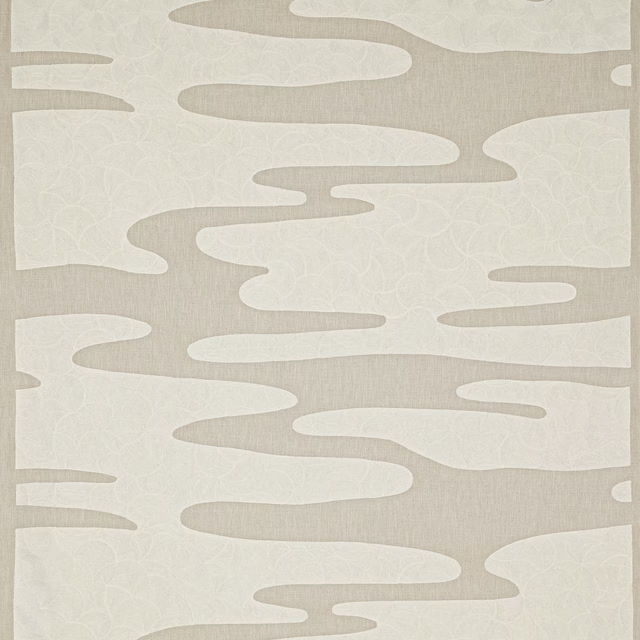
Honami Linen
Kyoto
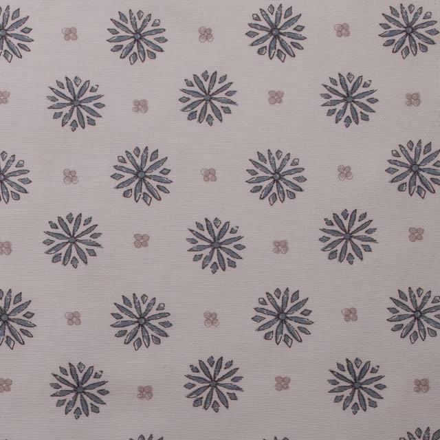
Daisy Dove
Cotton Prints Collection

Cubik Natural
Misc
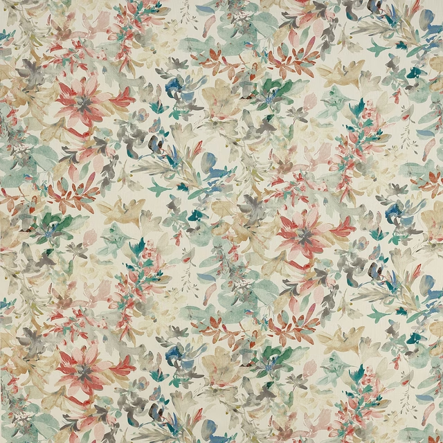
Sibella Neutral
Vita
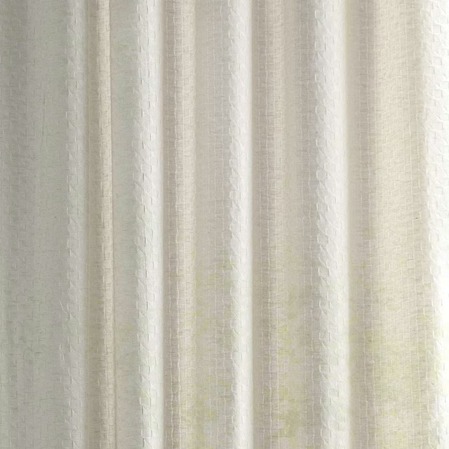
Adrift Sunsoaked
Sheers
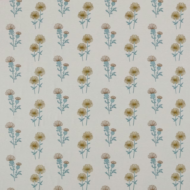
Lismore Citrus
Belvoir Collection
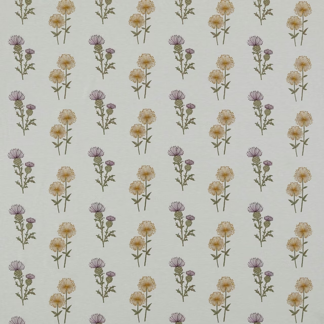
Lismore Heather
Belvoir Collection

Bibury Ivory
Avebury
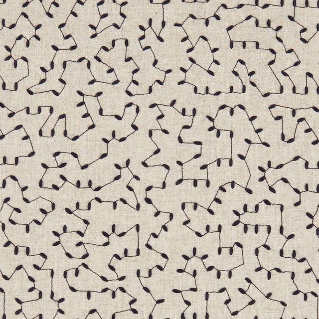
Bibury Midnight
Avebury
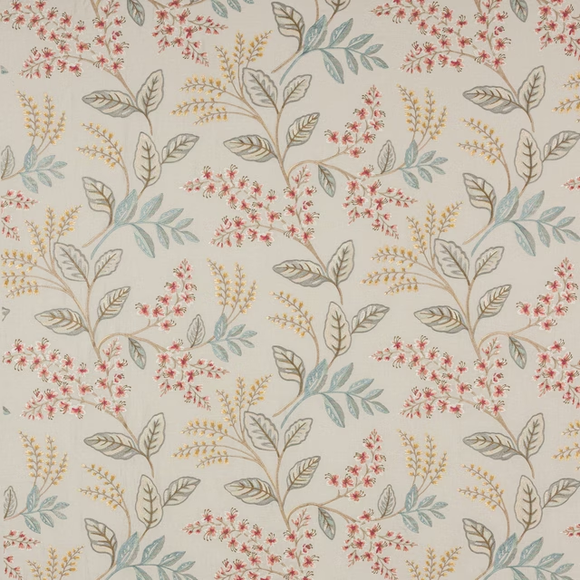
Fairlight Pink/Old Blue
Ashdown
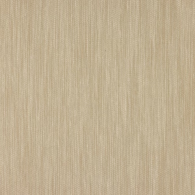
Croft Cream
Chester
Other cream fabrics
Across the houses we hold. See all 4,281.
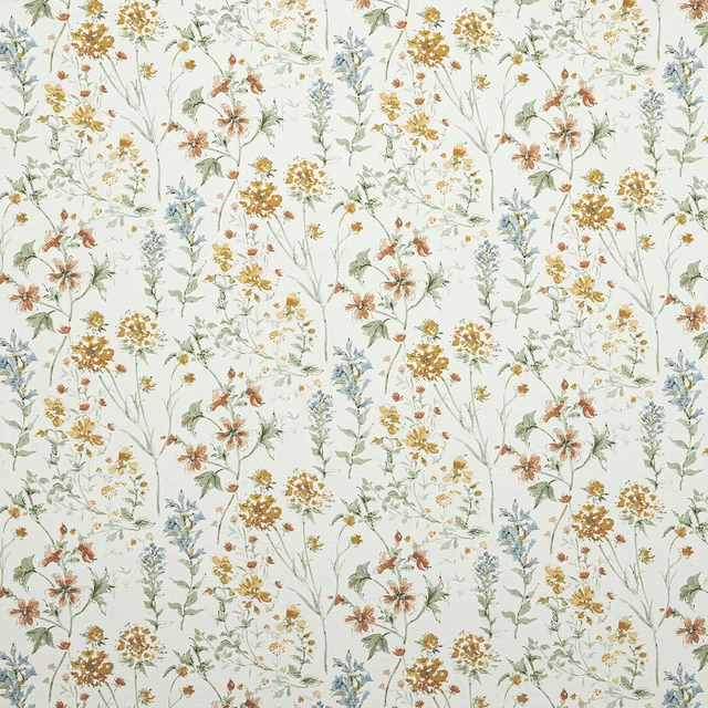
Wild Meadow Pale Gold
70th Anniversary Collection
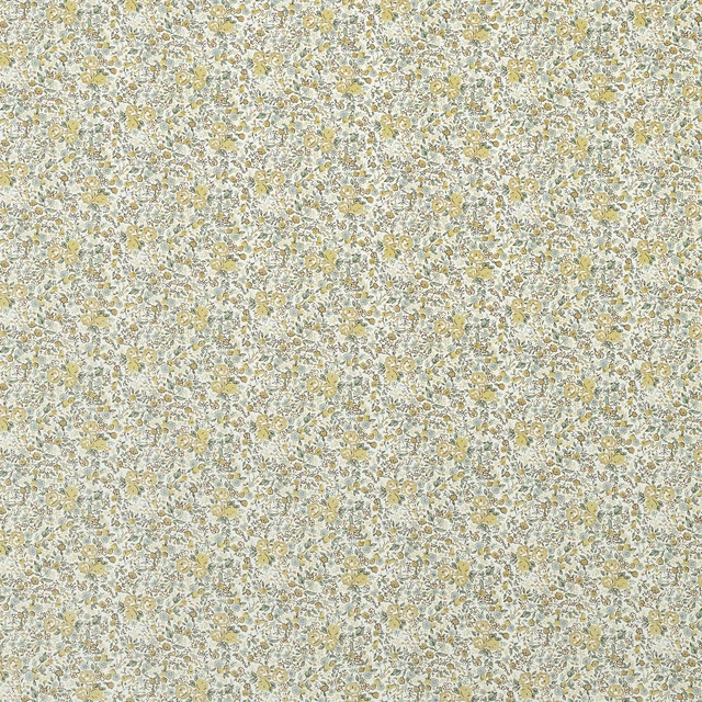
Rowena Pale Gold
70th Anniversary Collection
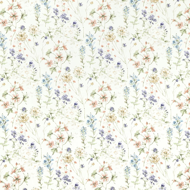
Wild Meadow Chalk Pink
70th Anniversary Collection
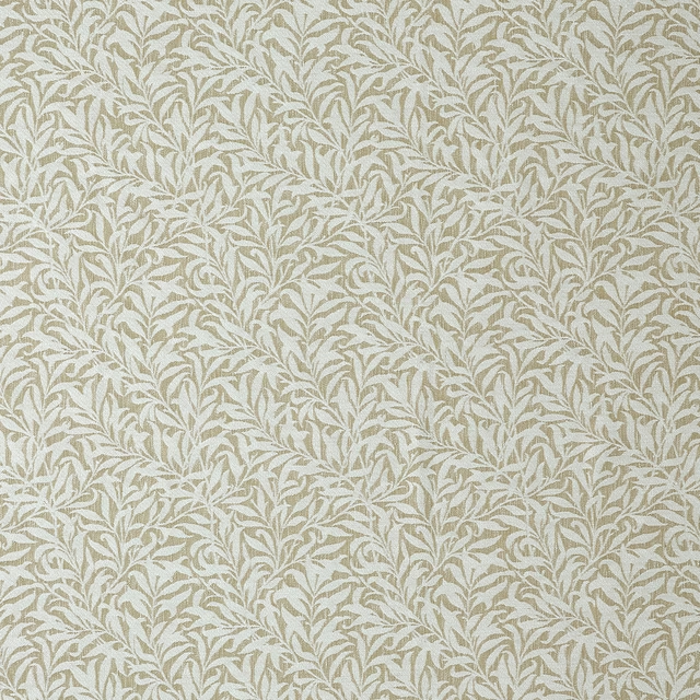
Willow Bough Woven Barley
Dovecote Vol I & II
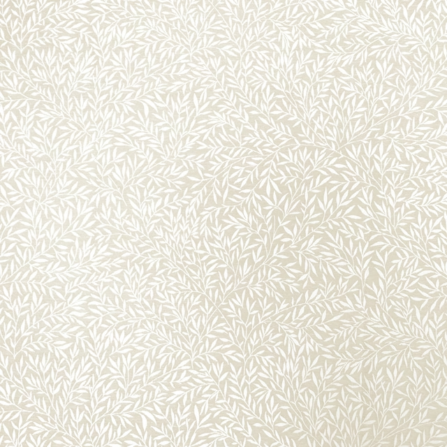
Lily Leaf Woven Oat
Dovecote Vol I & II
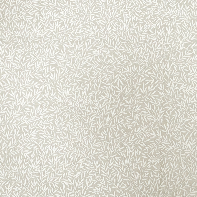
Lily Leaf Woven Linen
Dovecote Vol I & II
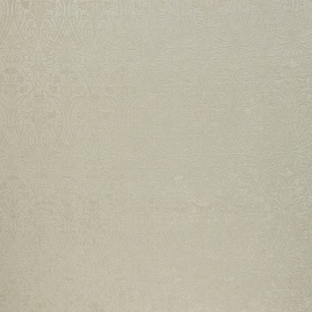
Tiverton Ivory
Tiverton

The Firms White
Neutral

Powdered chalk
Neutral

Pearwood
Neutral

Fired Biscuit
Neutral

Ernest White
Neutral