
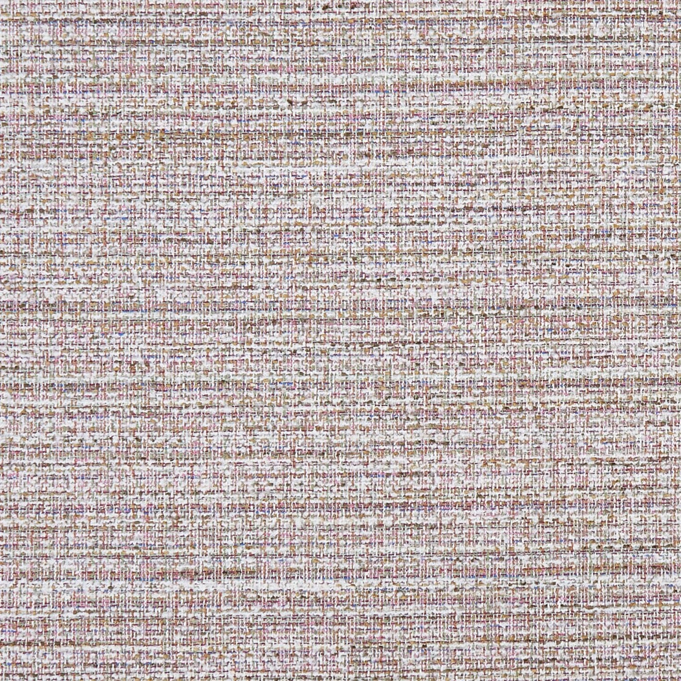

Tap the swatch to see it full screen. Hover it to magnify the weave. Colours on a screen are a guide, not a match, so come and feel the real cloth.
Scroll up or down to zoom in and out.
Pierre Pastel
Mode FabricCCF0449-04
Pierre Pastel is a softly coloured, densely woven textile with an ivory-led ground and fine pastel threads running through its surface. Blush, lilac and powder-blue accents give the weave a quietly nuanced appearance rather than a strong decorative pattern.
You have used your previews for today. Send one to Simon and you can carry on.
Your board
0 fabrics
Part of the range we hold from Clarke & Clarke.
See Pierre Pastel in your own room
A photograph of the piece you want re-covered. Straight on is best, and daylight helps. It is used to make your picture and nothing else.
Looking at your room
We found things here Pierre Pastel could go on. Tap one on the photograph, or choose below.
We could not see anything to re-cover
, s
Pierre Pastel, on your
Drag to compare. AI impression, colours indicative: ask us for a cutting before you decide.
About this fabric
The close-set construction forms a fine crosshatched texture, with uneven horizontal lines that shift gently between ivory, blush pink, muted mauve and powder blue. Its pale, cool-leaning colour balance gives the fabric an airy look, while the interlaced threads add enough depth to prevent the surface feeling flat. With a 468 gsm weight and 137 cm usable width, it is a substantial choice for upholstery. The fabric has a zero-centimetre vertical and horizontal pattern repeat, so the textured weave can be positioned without matching a motif.
How to use it
Pair Pierre Pastel with chalky whites, pale timber and soft grey upholstery for a light, calm scheme, or use it to soften deeper mauve and blue accents. Its blush-and-blue flecks are especially effective on a structured chair or sofa where the tactile weave can be seen up close.
Use this soft pastel weave to bring subtle colour and tactile depth to upholstered seating.
More from Mode
The same book, other colourways.
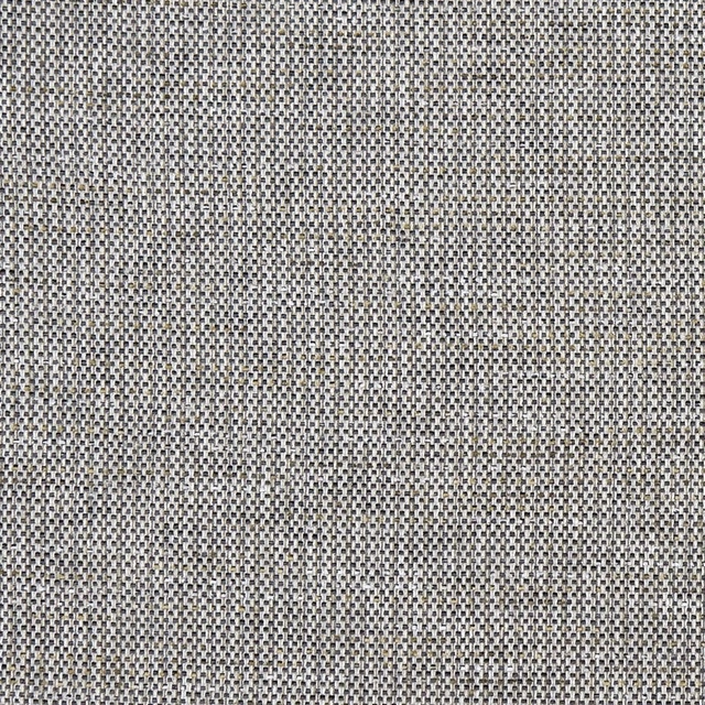
Louis Charcoal
Mode
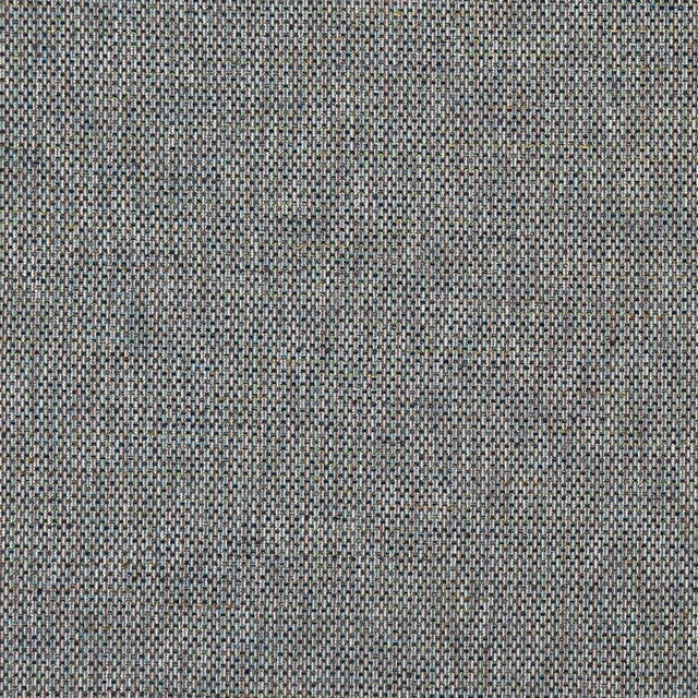
Louis Peacock
Mode
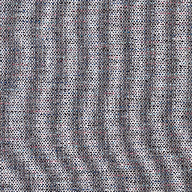
Louis Twilight
Mode
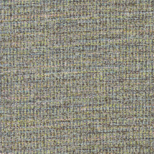
Pierre Autumn
Mode
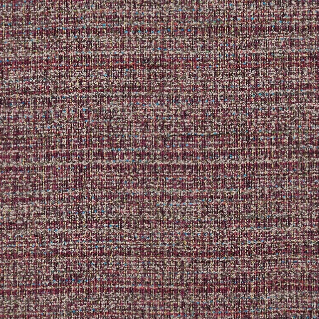
Pierre Berry
Mode
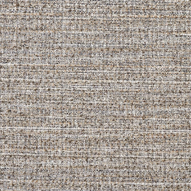
Pierre Charcoal
Mode
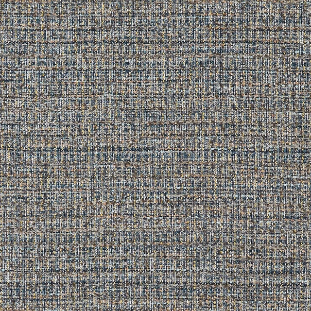
Pierre Peacock/Chartreuse
Mode
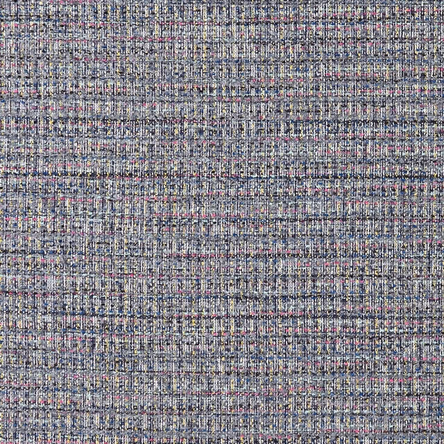
Pierre Twilight
Mode
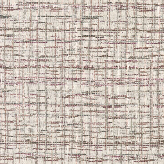
Renee Pastel
Mode
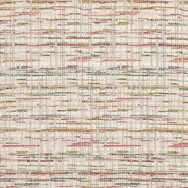
Renee Summer
Mode
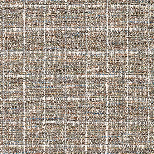
Sezane Autumn
Mode
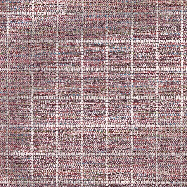
Sezane Berry
Mode
Pairs well with
Pierre Pastel is a quiet cloth, so it carries a pattern beside it: one of these on the curtains and this on the chair. Mixed across the houses we hold, which is the part a single supplier's book cannot do.
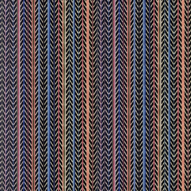
Jaipur Stripe Azur
Lacroix Stravaganza Fabrics
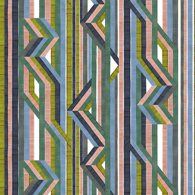
Reflets Sur Le Rhone Vert Riziere
Pêle-Mêle Fabric & Wallpaper
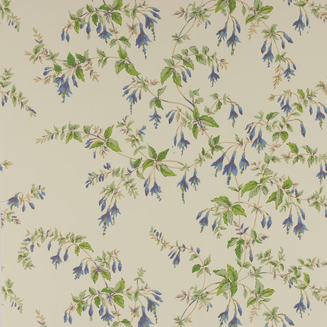
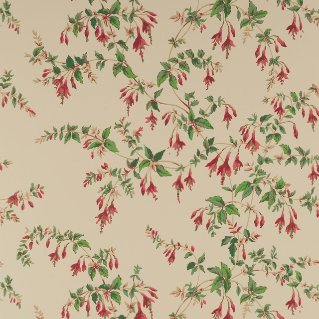
Fuchsia Wallpaper Blue/Leaf
Ashdown Wallpaper
Fuchsia Wallpaper Red/Forest
Ashdown Wallpaper
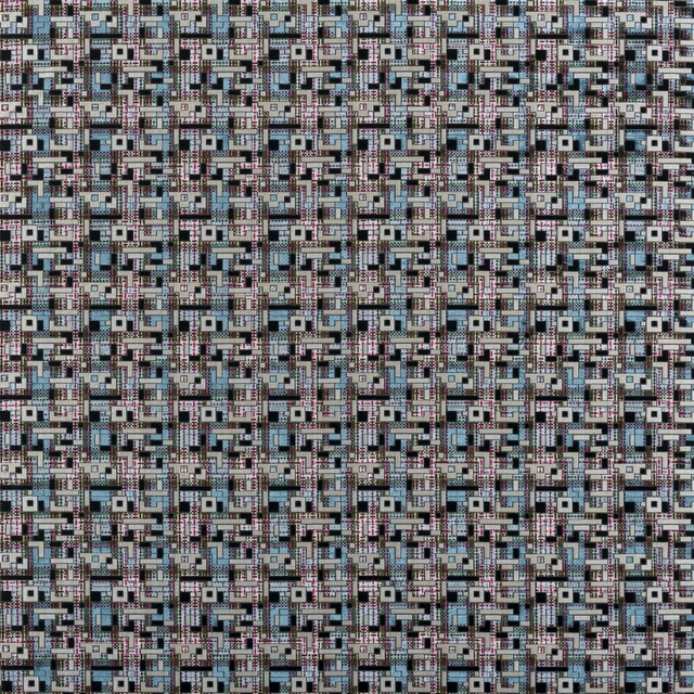
Marquina Delft
Casablanca Fabrics
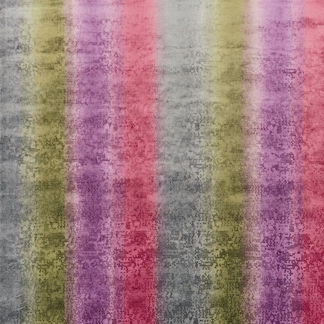
Santafiora Berry
Casablanca Fabrics
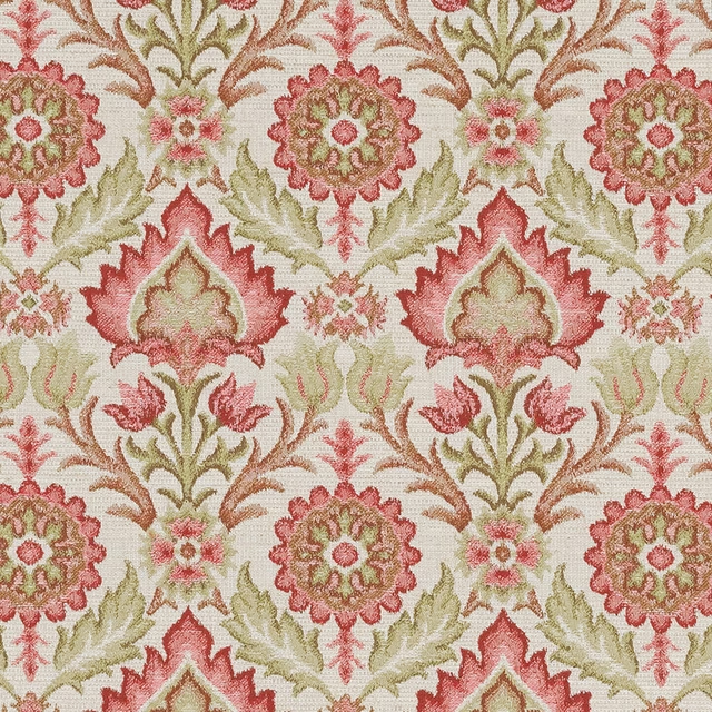
Aragon Chinz
Eco -Friendly Ranges
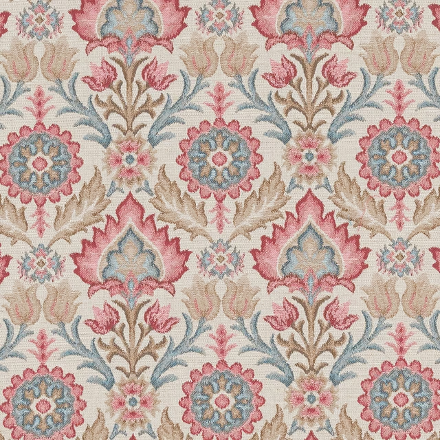
Aragon Rosso
Eco -Friendly Ranges
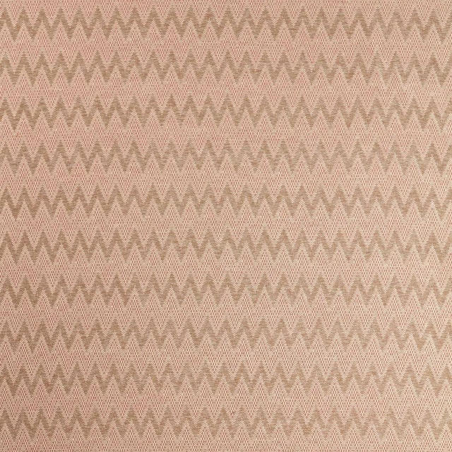
Akari Oat/Blush
Akari Weaves
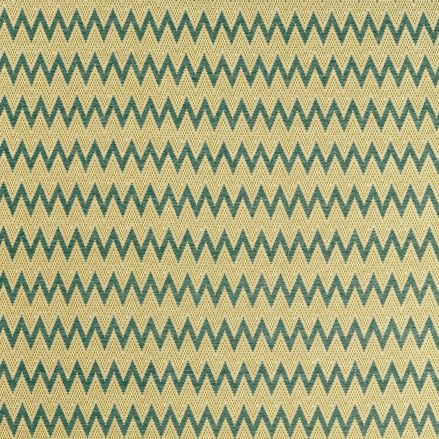
Akari Pine/Straw
Akari Weaves
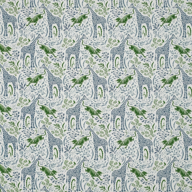
Sylvan Blue/Green
Shalimar
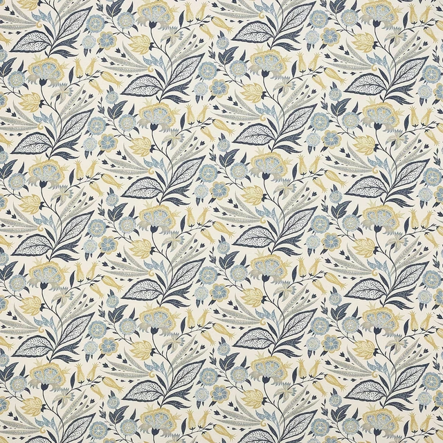
Amber Indigo/Yellow
Azara
Paint that goes with it
Two ways to take the room. Both colours are from houses we hold, so a pot can come off the same order as the cloth. Screens shift colour, so treat these as a direction and bring the cloth to the shelf before you buy the paint.
To sit quietly behind it
Starling
Sanderson · #b9b0a9
To stand against it
Newby Green
Sanderson · #425564
Other multi fabrics
Across the houses we hold. See all 4,069.
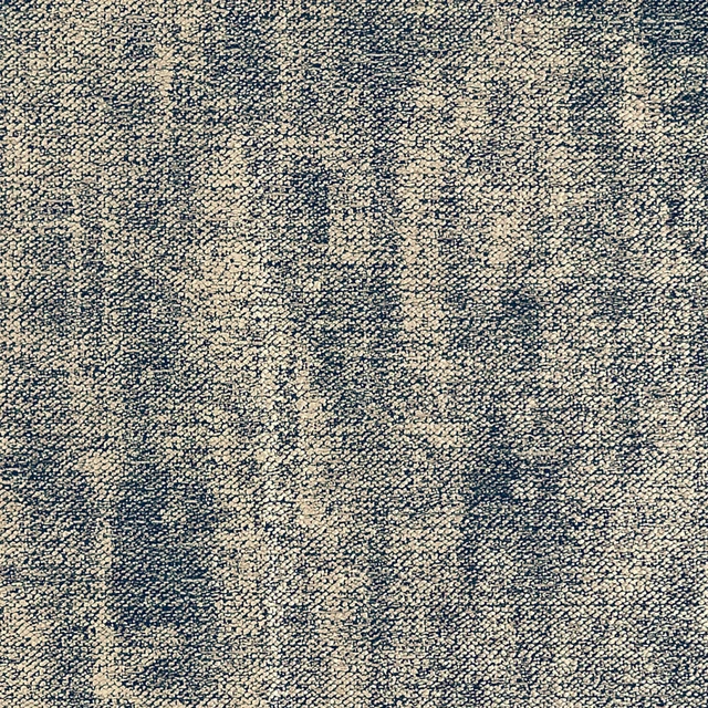
Oro Midnight/Gold
Metalli
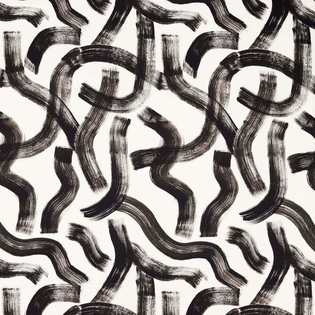
Malevich Noir
Metropolitan Fabrics
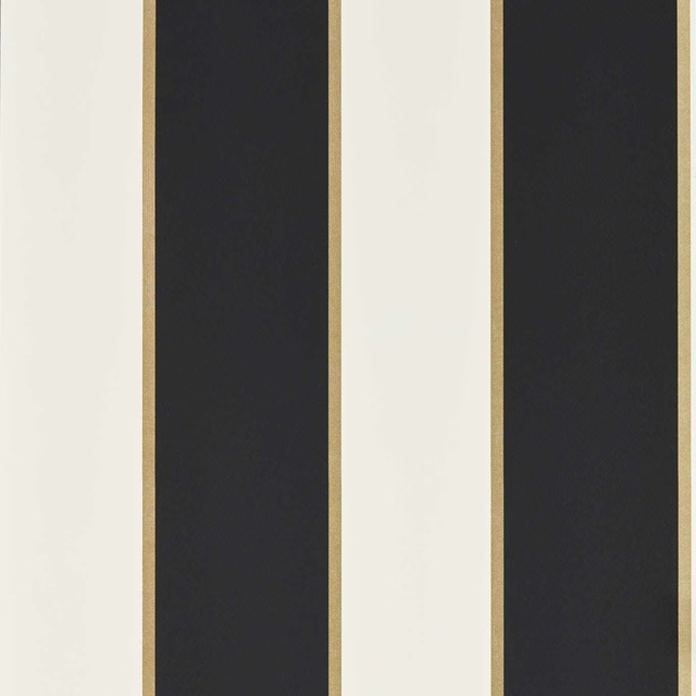
Cosmopolis Noir
Metropolitan Wallcoverings
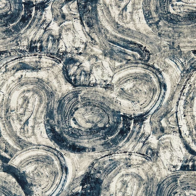
Hatoum Ink
Metropolitan Wallcoverings
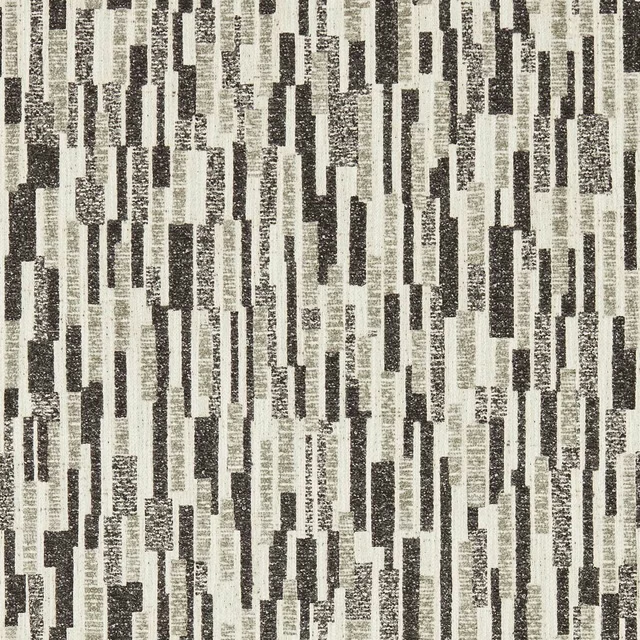
Juno Noir
Metropolitan Wallcoverings
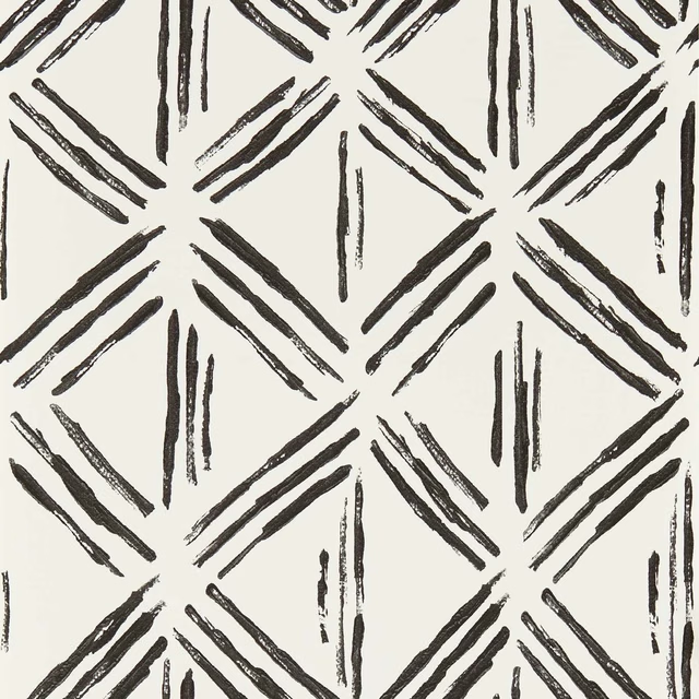
Murakami Noir
Metropolitan Wallcoverings
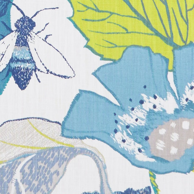
Lotus Apple/Denim
Oriental Garden
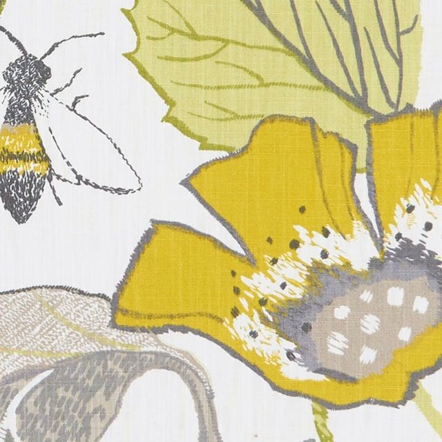
Lotus Chartreuse/Charcoal
Oriental Garden
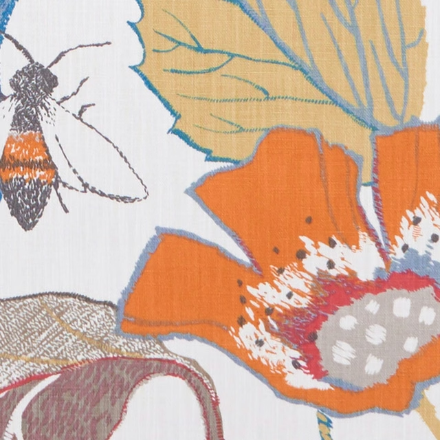
Lotus Spice
Oriental Garden
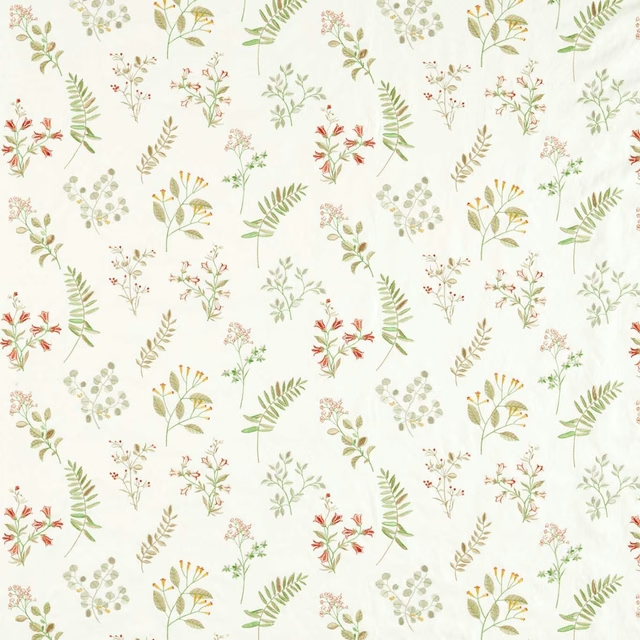
Brigitte Spice
Pavilion
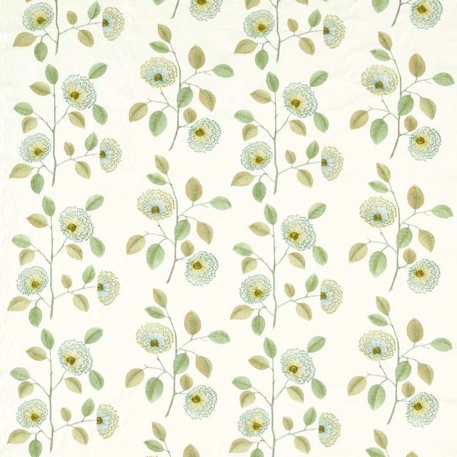
Monique Apple/Mineral
Pavilion
Monique Summer
Pavilion