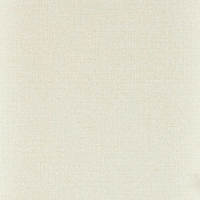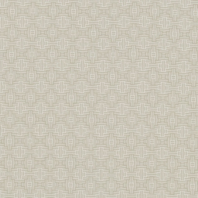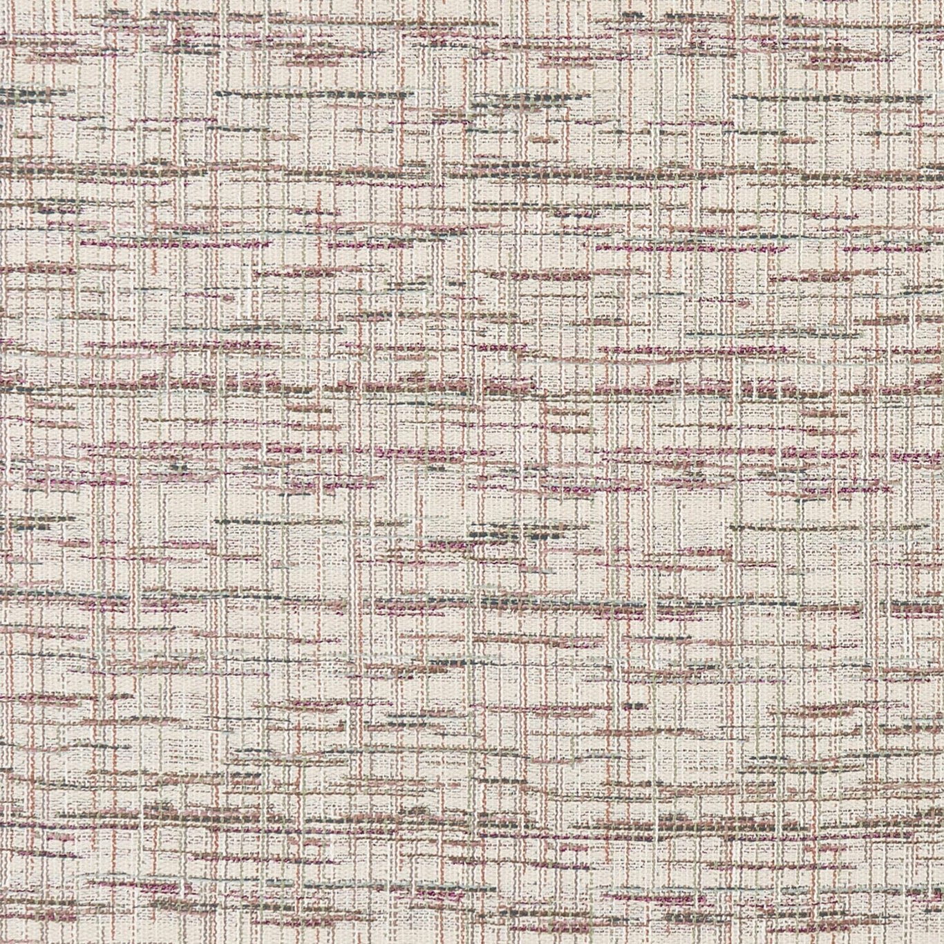

Tap the swatch to see it full screen. Hover it to magnify the weave. Colours on a screen are a guide, not a match, so come and feel the real cloth.
Scroll up or down to zoom in and out.
Renee Pastel
Mode FabricCCF0450-01
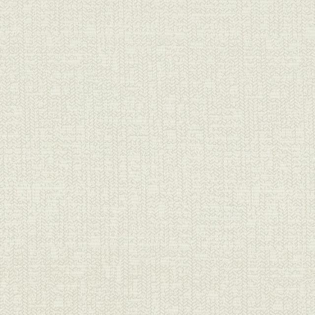
Renee Pastel is an ivory-toned woven fabric crossed with fine, irregular lines in dusty blush, taupe and soft grey. The lightly broken check has a tactile, textile-led character, with the pastel colour accents kept muted rather than bright.
You have used your previews for today. Send one to Simon and you can carry on.
Your board
0 fabrics
Part of the range we hold from Clarke & Clarke.
See Renee Pastel in your own room
A photograph of the piece you want re-covered. Straight on is best, and daylight helps. It is used to make your picture and nothing else.
Looking at your room
We found things here Renee Pastel could go on. Tap one on the photograph, or choose below.
We could not see anything to re-cover
, s
Renee Pastel, on your
Drag to compare. AI impression, colours indicative: ask us for a cutting before you decide.
About this fabric
The 468gsm weight gives Renee Pastel a substantial presence for upholstery, and the close woven surface is visibly defined by both vertical and horizontal threads. Its 138cm usable width is paired with an 86cm vertical pattern repeat and a 34.5cm horizontal repeat, creating a gently shifting linear check across the cloth. Against the warm ivory ground, blush-pink traces add a restrained rosy note while taupe and grey lines provide definition without making the design feel stark. The uneven spacing and softened edges give this colourway a considered, handcrafted look rather than a rigid geometric finish.
How to use it
Use Renee Pastel on a reading chair, sofa or upholstered headboard where its ivory base can brighten the room and the dusty blush and taupe lines can be echoed in cushions, painted wood or warm neutral walls.
Its substantial 468gsm woven construction suits upholstered seating, while the softened pastel lines keep the look approachable.
More from Mode
The same book, other colourways.
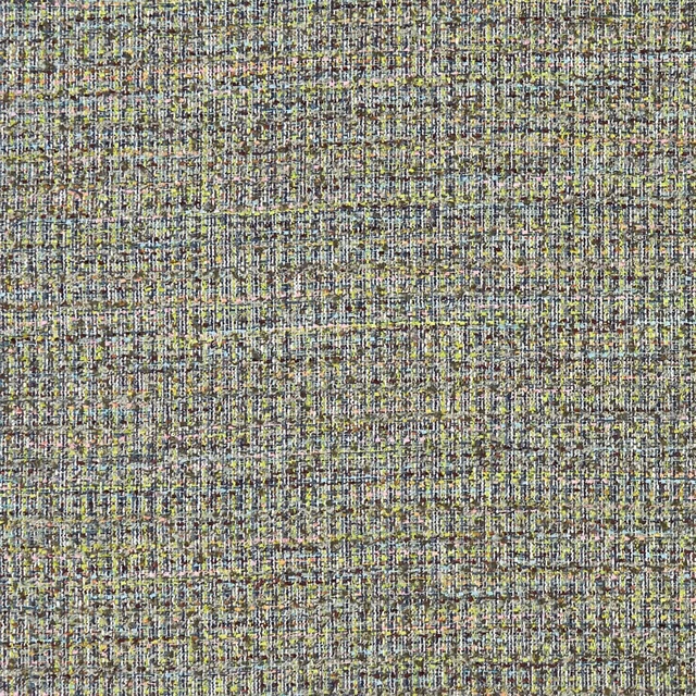
Pierre Autumn
Mode
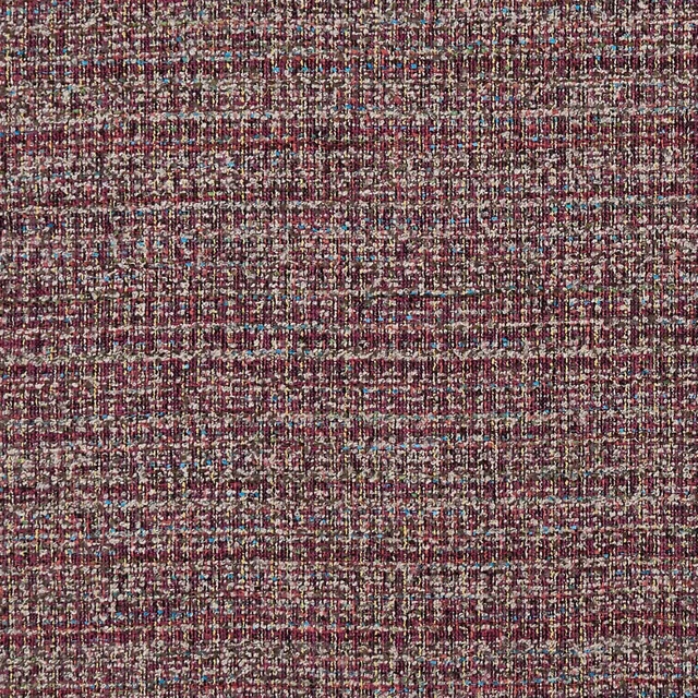
Pierre Berry
Mode
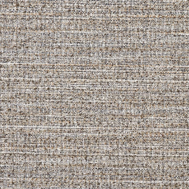
Pierre Charcoal
Mode
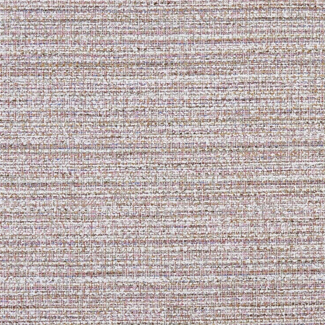
Pierre Pastel
Mode
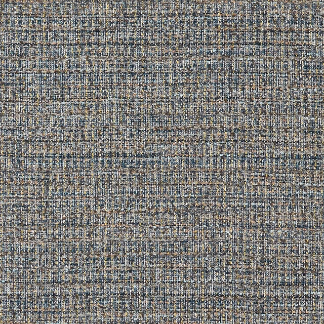
Pierre Peacock/Chartreuse
Mode
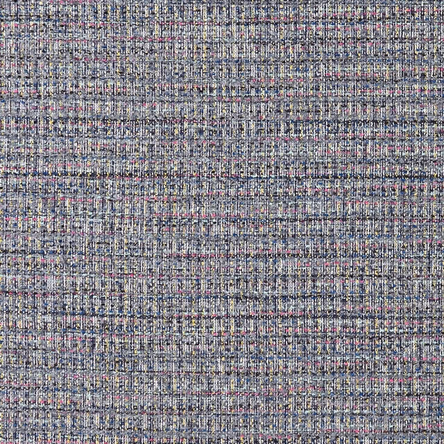
Pierre Twilight
Mode
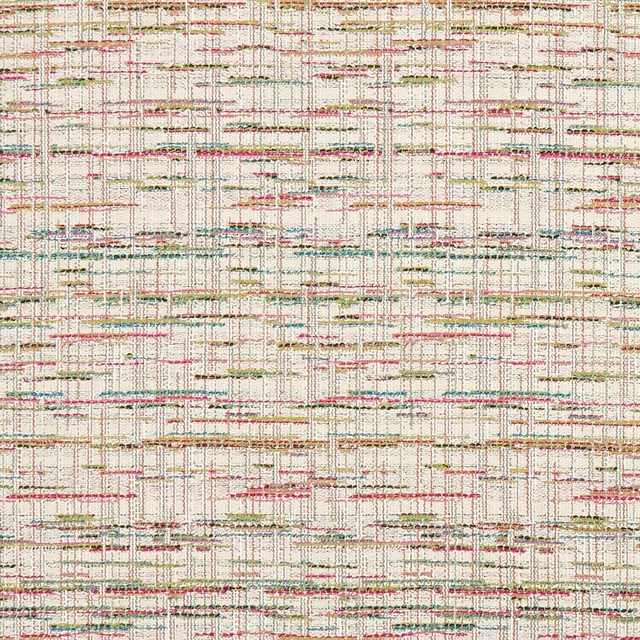
Renee Summer
Mode
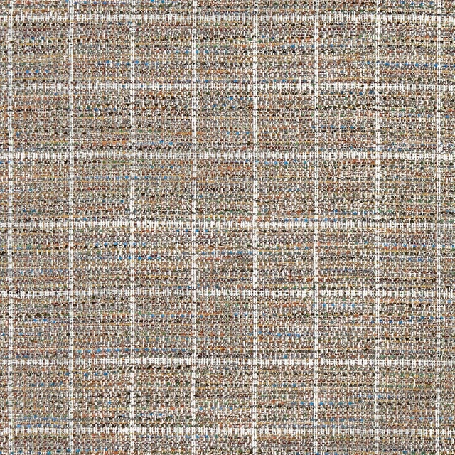
Sezane Autumn
Mode
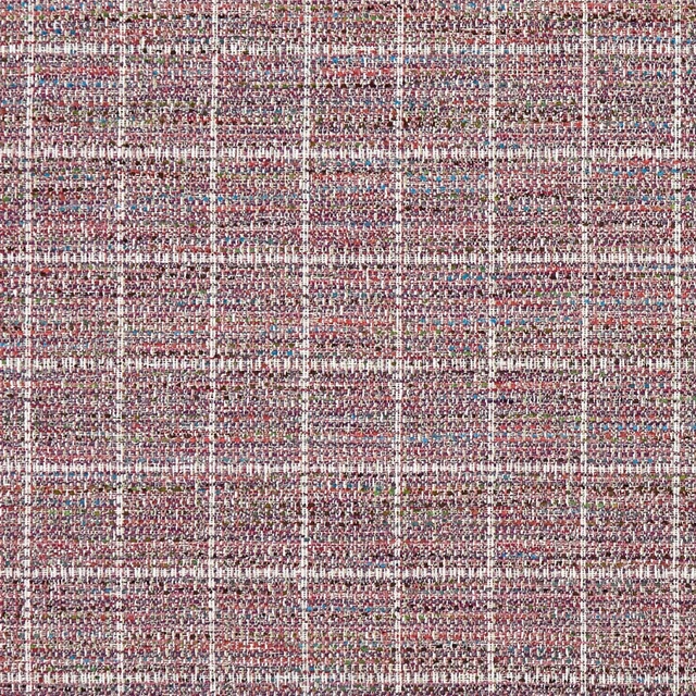
Sezane Berry
Mode
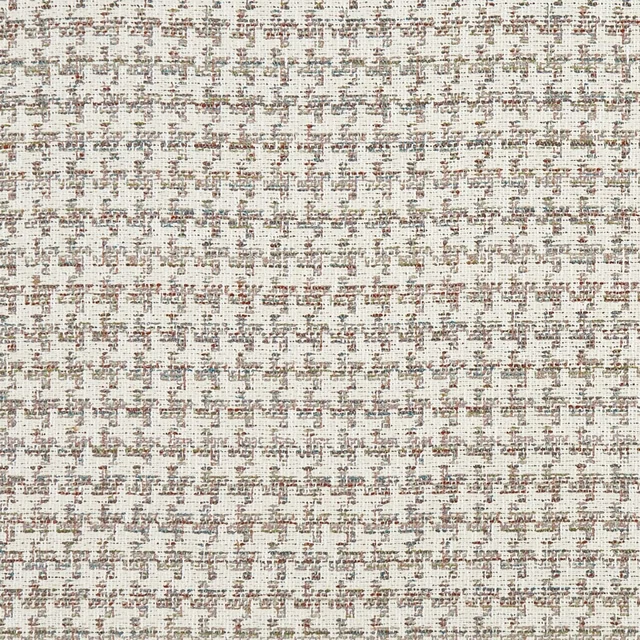
Yves Autumn
Mode
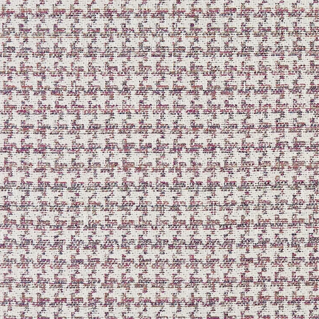
Yves Berry
Mode
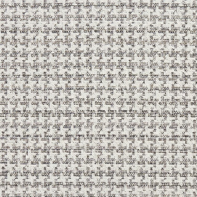
Yves Charcoal
Mode
Pairs well with
A pattern needs somewhere for the eye to rest, so these are the plains and textures that sit beside Renee Pastel without fighting it. Mixed across the houses we hold, which is the part a single supplier's book cannot do.

Alaska Oyster
Alaska Collection
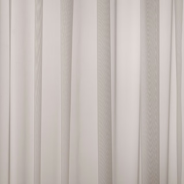
Baltic Shell
Atlantic Collection
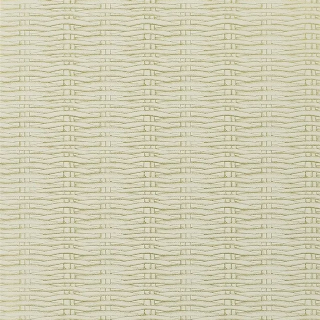
Barbade Or Wallpaper
Nouveaux Mondes WALLPAPER
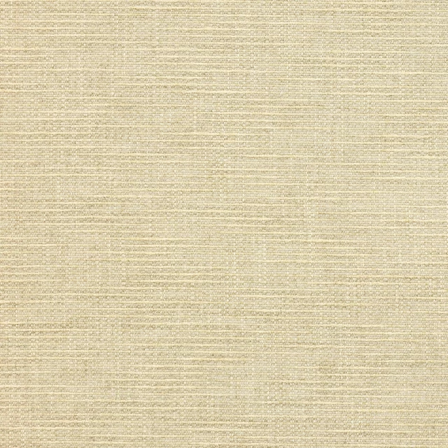
Brandon Sand
Albeck
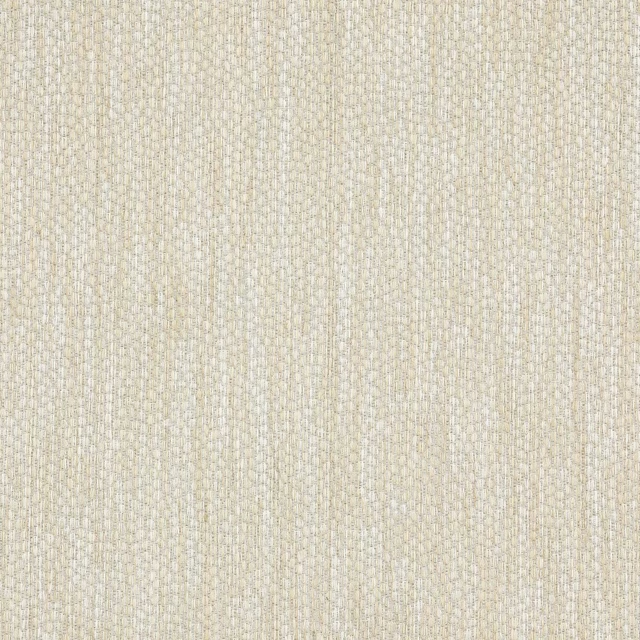
Lyncombe Moonstone
Albeck
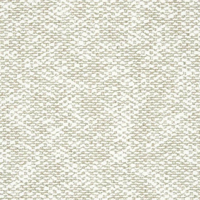
Genval Gesso
AALTER FABRICS
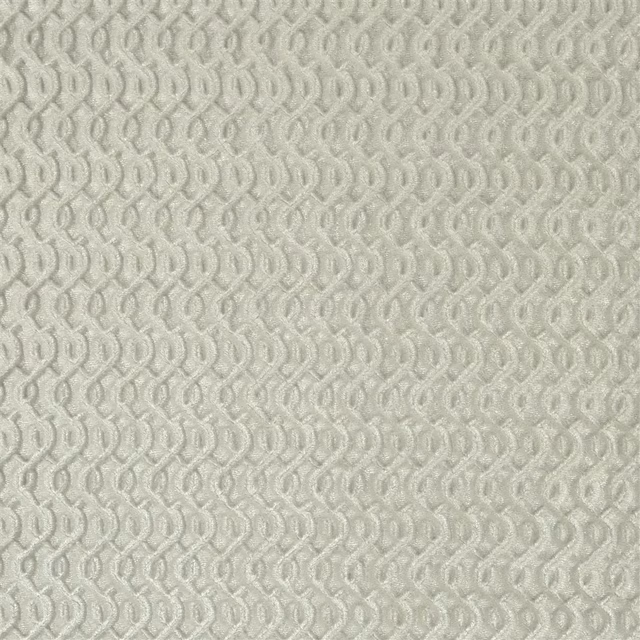
Stanmer Mist
Cassan Fabrics

Bordeaux Plain Natural
Eco -Friendly Ranges
Forte FR Cream
Forte FR
Allegra Parchment
Allegra
Allegra Parsnip
Allegra

Amalfi Dove
Amalfi
Paint that goes with it
Two ways to take the room. Both colours are from houses we hold, so a pot can come off the same order as the cloth. Screens shift colour, so treat these as a direction and bring the cloth to the shelf before you buy the paint.
To sit quietly behind it
Half Smoked Pearl
Zoffany · #c3bab3
To stand against it
Victorian Purple
Zoffany · #5a595f
Other cream fabrics
Across the houses we hold. See all 4,572.