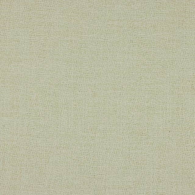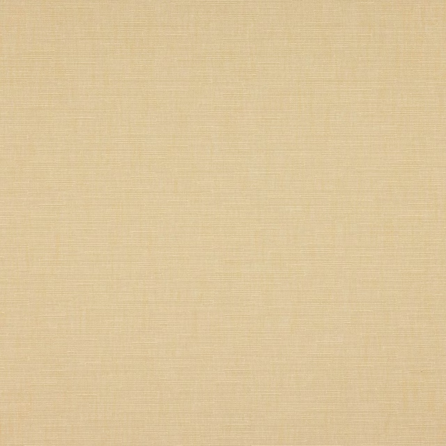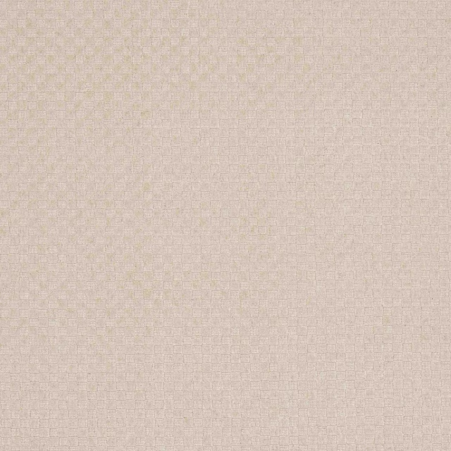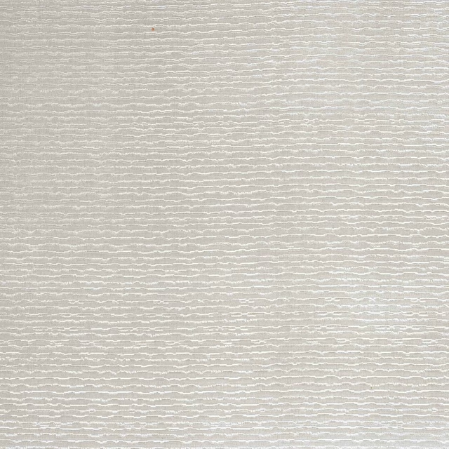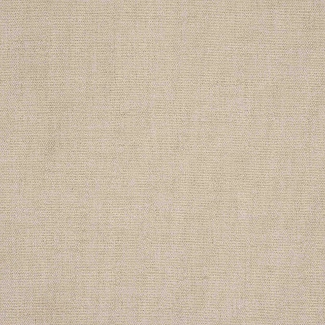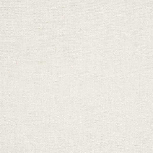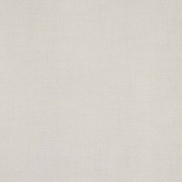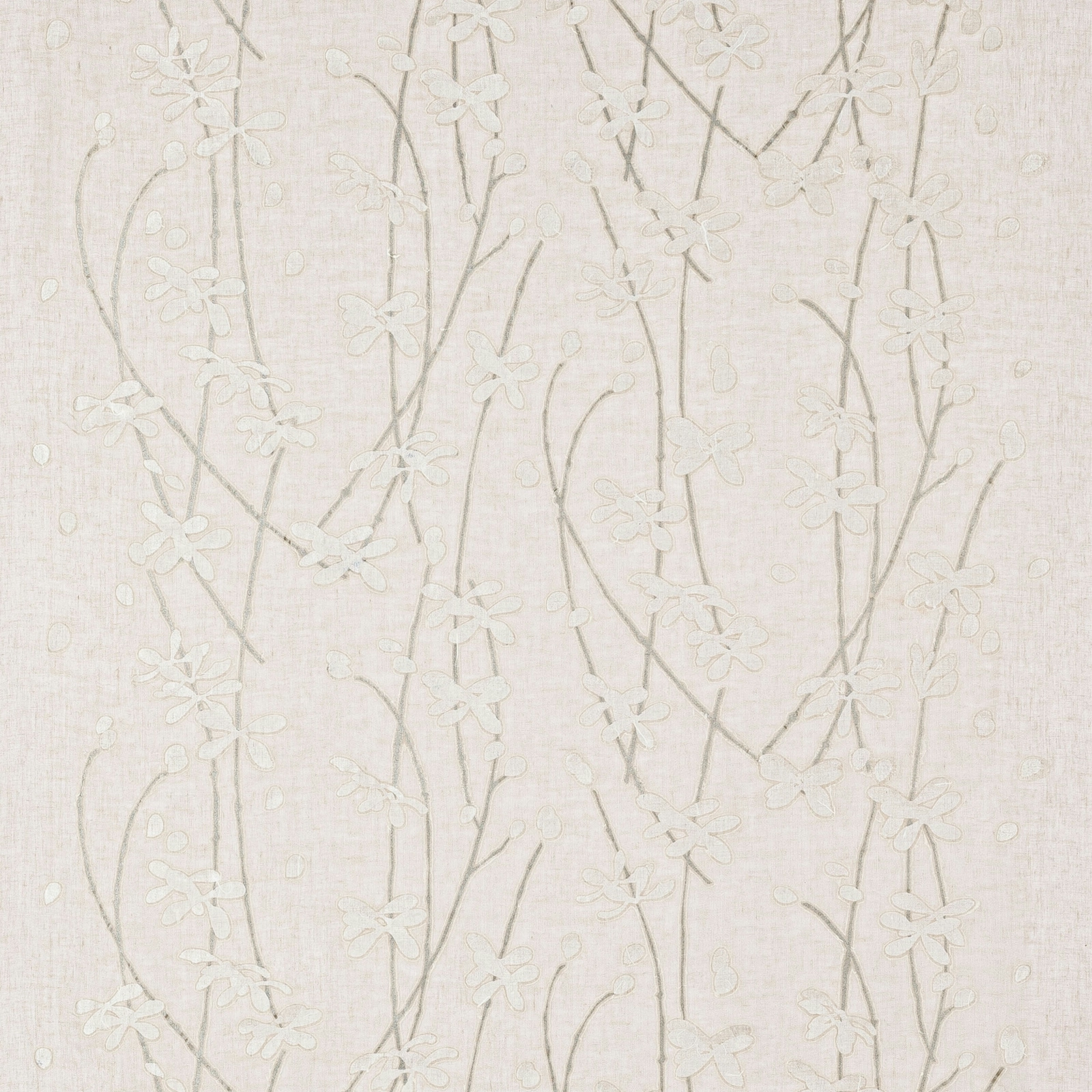

Tap the swatch to see it full screen. Hover it to magnify the weave. Colours on a screen are a guide, not a match, so come and feel the real cloth.
Scroll up or down to zoom in and out.
Washi Clay
Timo FabricL9430-01
Washi Clay has a pale, paper-soft look, with slender trailing stems and small blossoms drifting across a warm cream ground. The design feels light and quietly textured, with the motif sitting gently rather than sharply against the cloth.
You have used your previews for today. Send one to Simon and you can carry on.
Your board
0 fabrics
See this fabric on Larsen's own site, then order it through us.
See Washi Clay in your own room
A photograph of the piece you want re-covered. Straight on is best, and daylight helps. It is used to make your picture and nothing else.
Looking at your room
We found things here Washi Clay could go on. Tap one on the photograph, or choose below.
We could not see anything to re-cover
, s
Washi Clay, on your
Drag to compare. AI impression, colours indicative: ask us for a cutting before you decide.
About this fabric
This colourway of Timo by Larsen reads as a soft clay-tinted cream, with the floral trails appearing in a slightly deeper muted beige that keeps the pattern subtle. The fabric is composed of 73% Linen and 27% Paper, which helps explain the dry, gently fibrous surface visible in the swatch. At approximately 100cm wide with a V 60cm / H 100cm repeat, it is a considered decorative textile rather than a plain cloth, and the pattern has enough openness to let the ground remain dominant. Fire code Z is supplied for this fabric. The overall effect is calm and airy, with just enough contrast to give the embroidered-looking motif definition without hard edges.
How to use it
Use it where a room needs softness rather than contrast: alongside pale oak, limewashed walls, and chalky neutrals it will feel serene and tailored. The warm cream base also works well with natural linen upholstery and brushed metal accents.
An airy cream ground with a delicate, trailing motif that suits quiet layering.
More from Timo
The same book, other colourways.
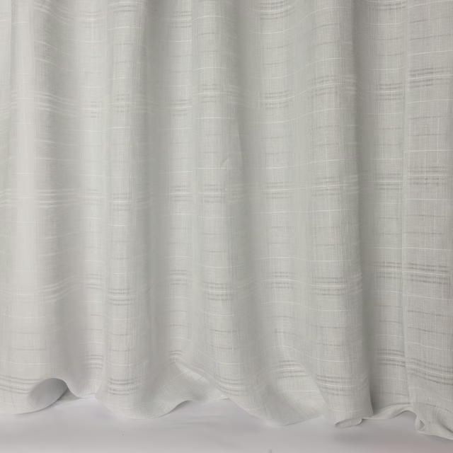
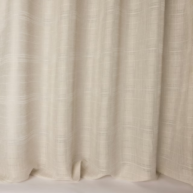
Taiga Ice Blue
Timo
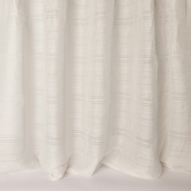
Taiga Linen
Timo
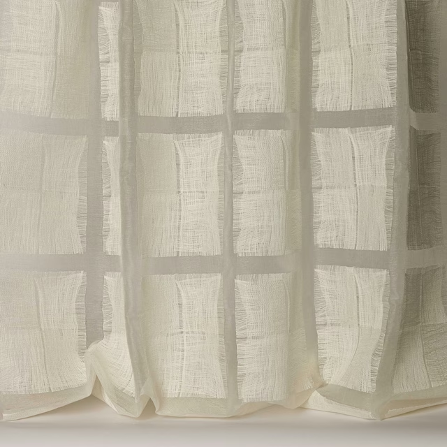
Taiga Snow
Timo
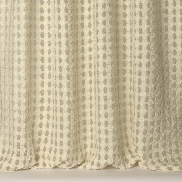
Tanabe White
Timo
Tendo Clay
Timo
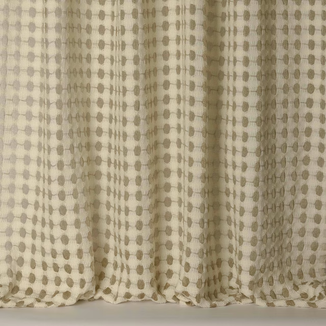
Tendo Gold
Timo
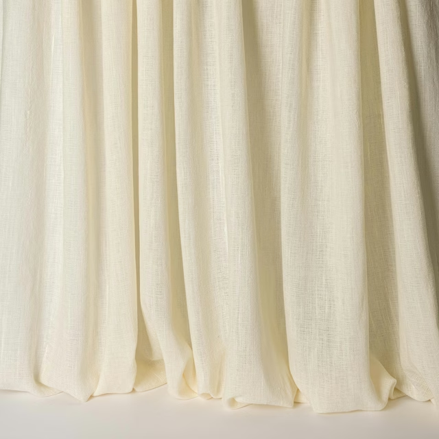
Timo Bone
Timo
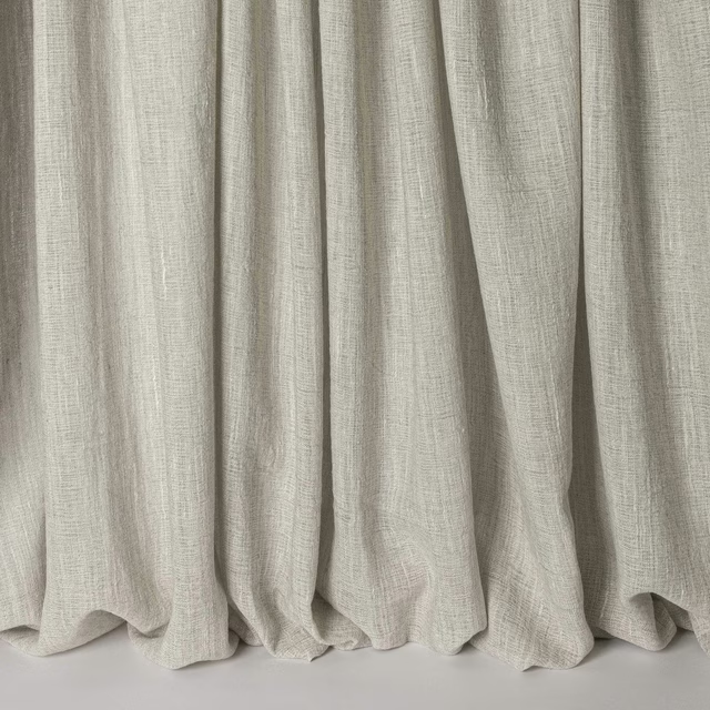
Timo Grey
Timo
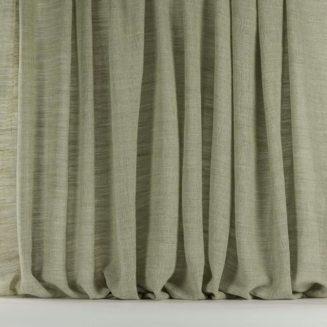
Timo Gull
Timo
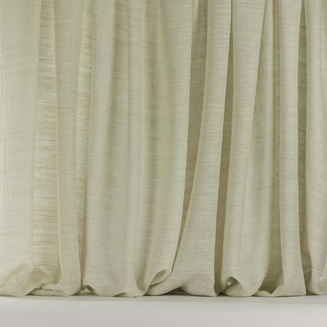
Timo Pearl
Timo
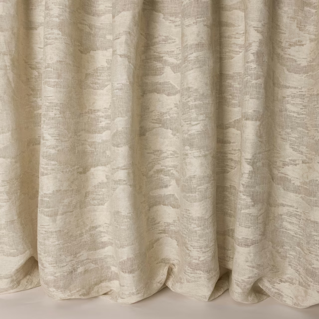
Zen Clay
Timo
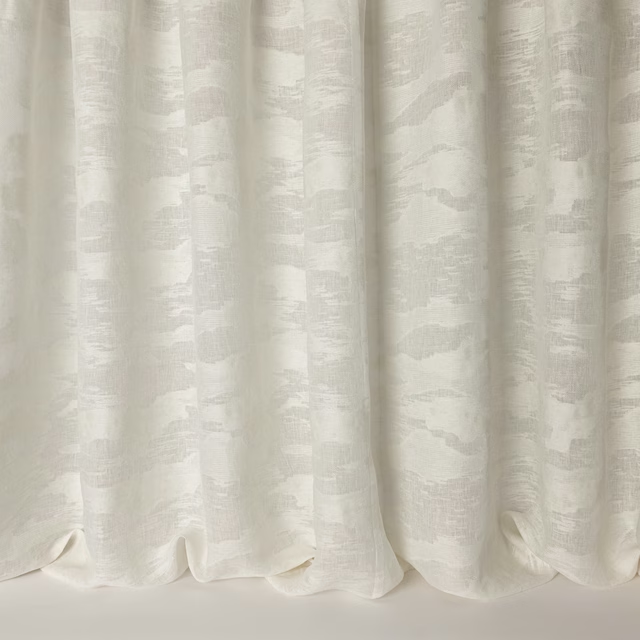
Zen Ivory
Timo
Pairs well with
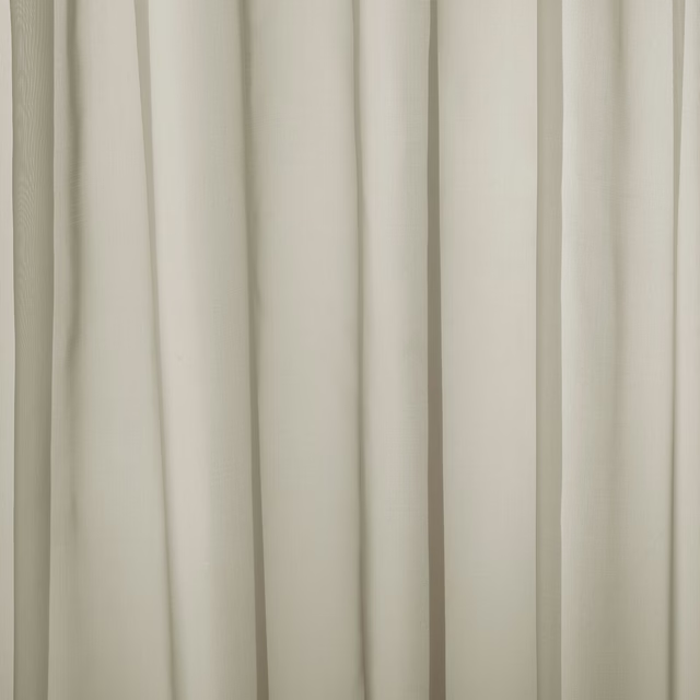
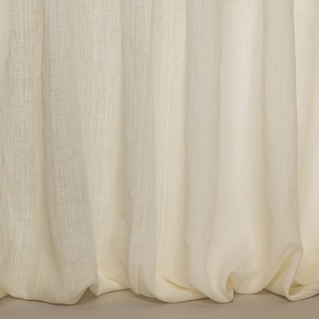
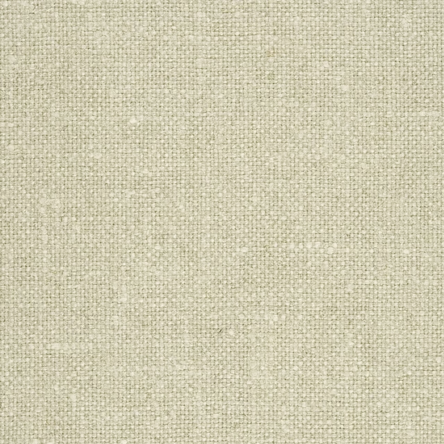
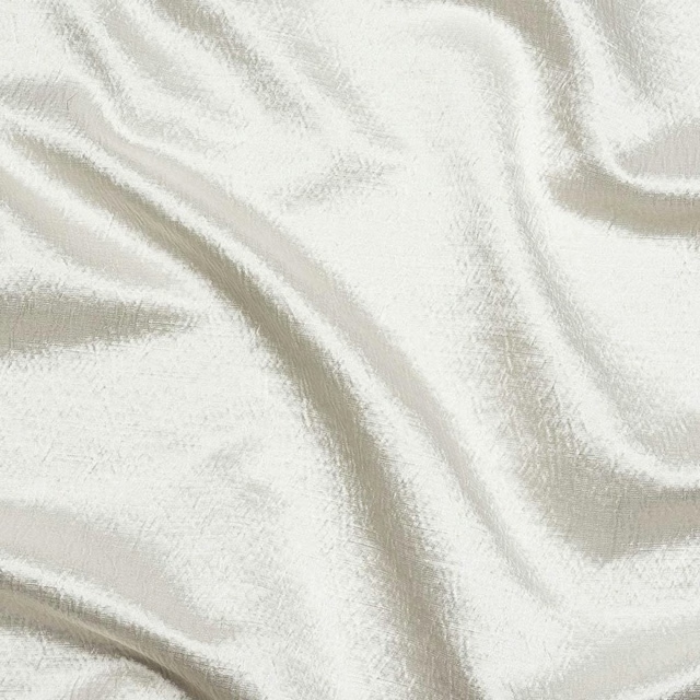
A pattern needs somewhere for the eye to rest, so these are the plains and textures that sit beside Washi Clay without fighting it. Mixed across the houses we hold, which is the part a single supplier's book cannot do.
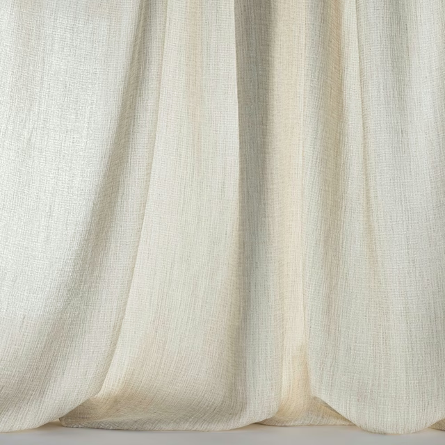






Paint that goes with it
Two ways to take the room. Both colours are from houses we hold, so a pot can come off the same order as the cloth. Screens shift colour, so treat these as a direction and bring the cloth to the shelf before you buy the paint.
To sit quietly behind it
Jojo's White
Coat Paints · #e2dcd6
To stand against it
Chasm
Sanderson · #64797c
Other cream fabrics
Across the houses we hold. See all 4,572.