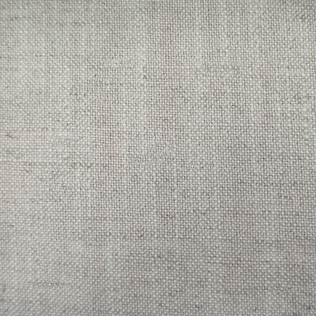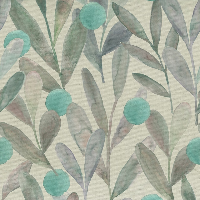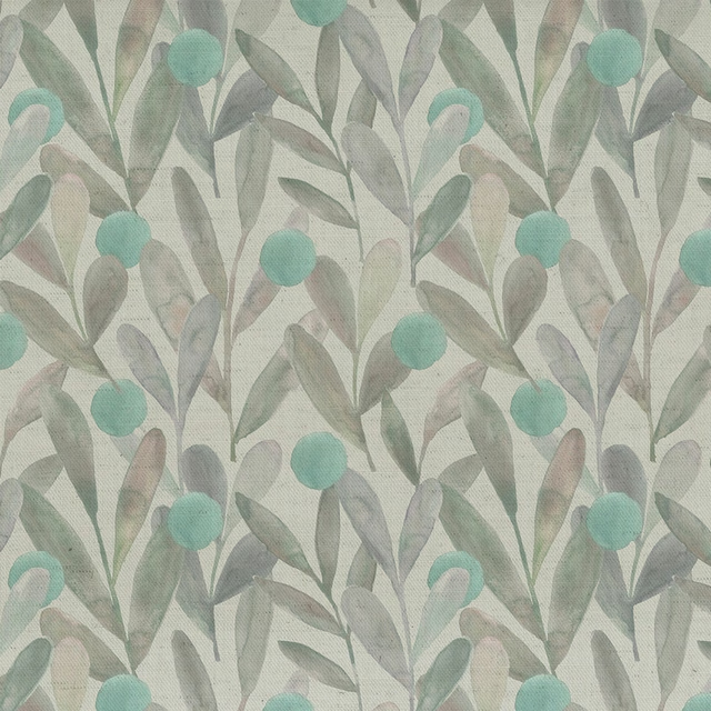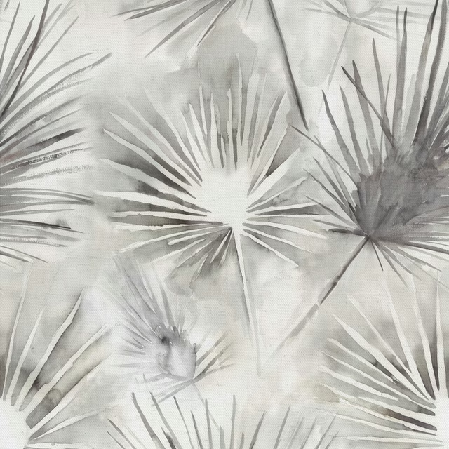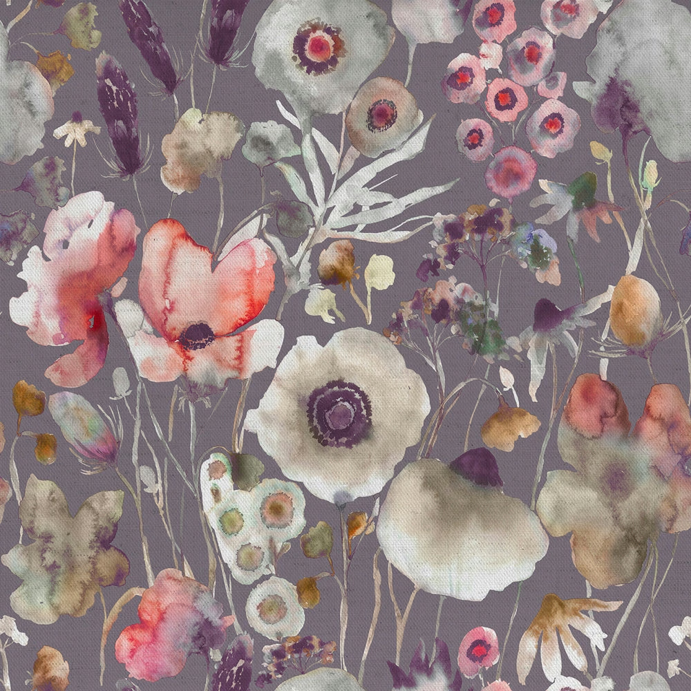

Tap the swatch to see it full screen. Hover it to magnify the weave. Colours on a screen are a guide, not a match, so come and feel the real cloth.
Scroll up or down to zoom in and out.
Hibbertia Boysenberry Grape Cream
Hibbertiameadows Fabrichibbert/fa1/boy
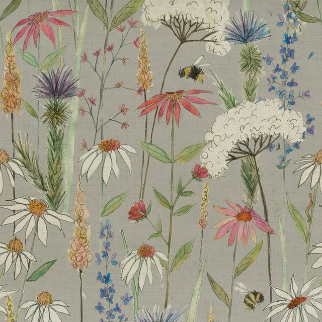
Hibbertia Boysenberry Grape Cream pairs a soft mauve-grey ground with loosely painted wildflowers in blush, cream, plum and faded gold. The result is expressive and atmospheric, with the floral motifs floating gently across the cloth.
You have used your previews for today. Send one to Simon and you can carry on.
Your board
0 fabrics
Part of the range we hold from Voyage Maison.
See Hibbertia Boysenberry Grape Cream in your own room
A photograph of the piece you want re-covered. Straight on is best, and daylight helps. It is used to make your picture and nothing else.
Looking at your room
We found things here Hibbertia Boysenberry Grape Cream could go on. Tap one on the photograph, or choose below.
We could not see anything to re-cover
, s
Hibbertia Boysenberry Grape Cream, on your
Drag to compare. AI impression, colours indicative: ask us for a cutting before you decide.
About this fabric
This Voyage Maison fabric is composed of 95% cotton and 5% linen, with a usable width of 136cm and a weight of 230gsm, making it well suited to curtains, blinds and soft furnishings. The large floral repeat of 68cm by 67.8cm gives the design a generous, mural-like rhythm, while the grey ground keeps the overall effect calm. In this colourway, the blooms read as washed rose, chalk white, soft lilac and muted berry tones, with the painterly edges standing out clearly against the cooler ground. The texture visible in the swatch feels lightly woven and softly matte, which suits the relaxed, romantic character of the print. Dry clean only; cool iron.
How to use it
Use Hibbertia Boysenberry Grape Cream for full-length curtains or Roman blinds where the muted lilac-grey base can balance warmer woods and pale painted finishes. It also works well in a room that needs gentle pattern without strong contrast.
The muted mauve-grey ground lets the painterly blooms feel airy and romantic rather than overly bright.
More from Hibbertiameadows
The same book, other colourways.
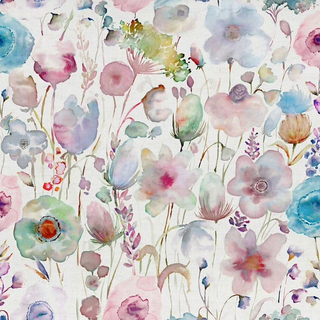
Gospiana Apricot Cream
Hibbertiameadows
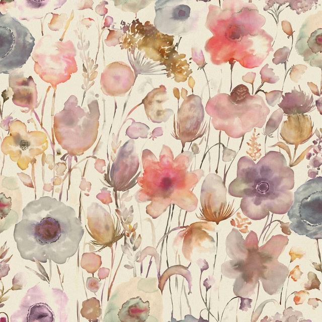
Gospiana Boysenberry
Hibbertiameadows
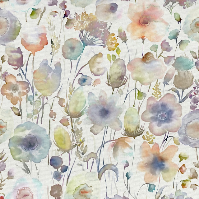
Gospiana purple
Hibbertiameadows
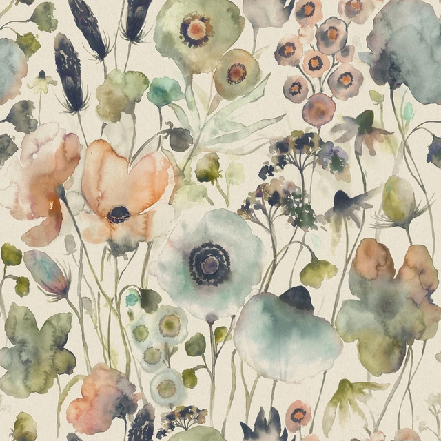
Hibbertia Coral Cloud Cream
Hibbertiameadows
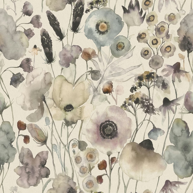
Hibbertia Haze
Hibbertiameadows
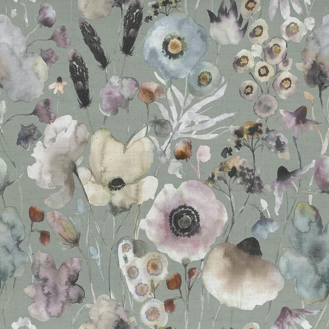
Hibbertia Haze Sage
Hibbertiameadows
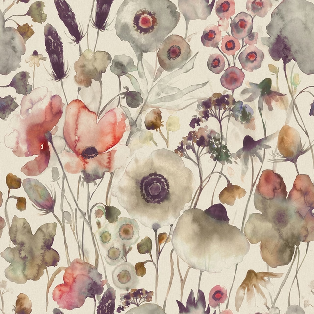
Hibbertia Boysenberry Cream
Hibbertiameadows
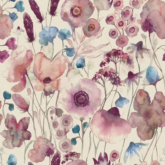
Hibbertia Fuchsia Cream
Hibbertiameadows
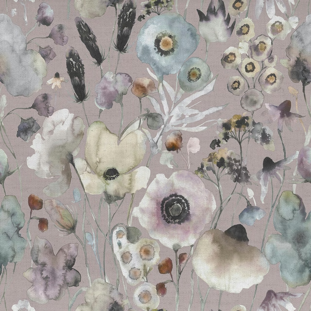
Hibbertia Haze Lavender
Hibbertiameadows
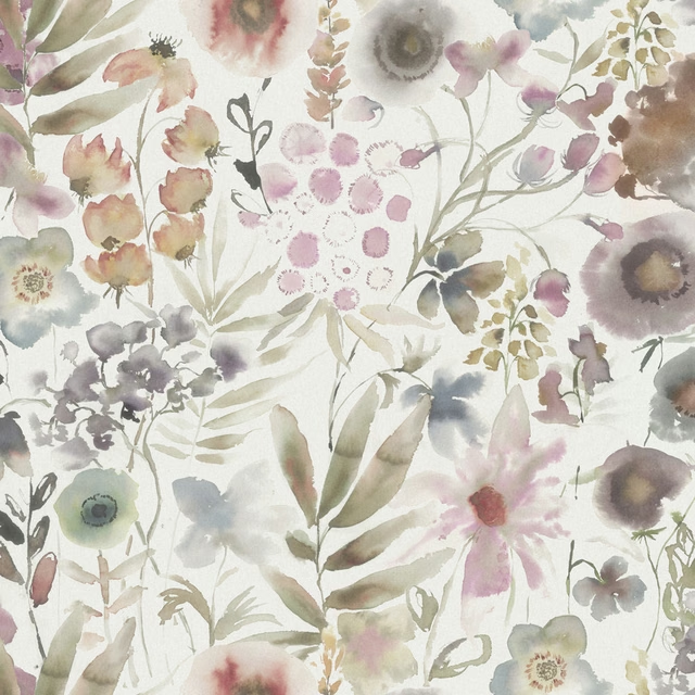
Lomondra Ironstone Cream
Hibbertiameadows
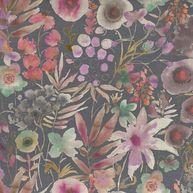
Lomondra Apricot Navy
Hibbertiameadows
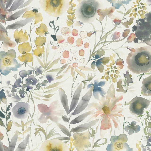
Lomondra Harvest Cream
Hibbertiameadows
Pairs well with
A pattern needs somewhere for the eye to rest, so these are the plains and textures that sit beside Hibbertia Boysenberry Grape Cream without fighting it. Mixed across the houses we hold, which is the part a single supplier's book cannot do.

Levant Drift
Damaris

Alvar Dove
Alvar 2

Alvar Mist
Alvar 2

Foss Ash Grey
Foss Linen II

Foss Dove
Foss Linen II

Filigrana Cloud
Boratti WALLPAPER

Cadenza Silver
Cadenza Fabrics
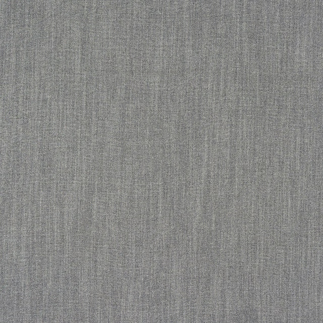
Monza Soft Grey
Arezzo
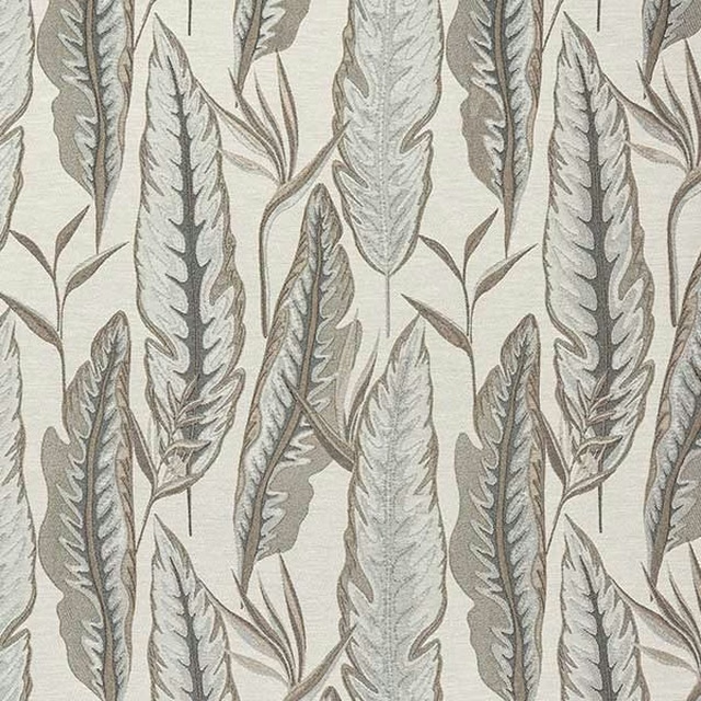
Brodsworth Dove
Brodsworth
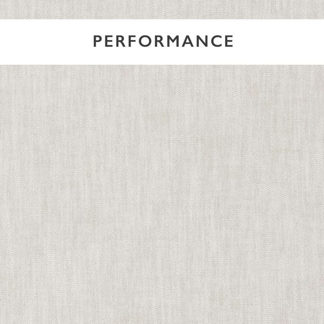
Mineral Mist
Mineral
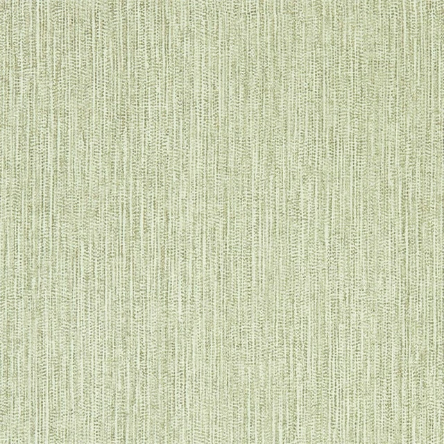
Zela Oyster
Momentum Wallcoverings Volume 6
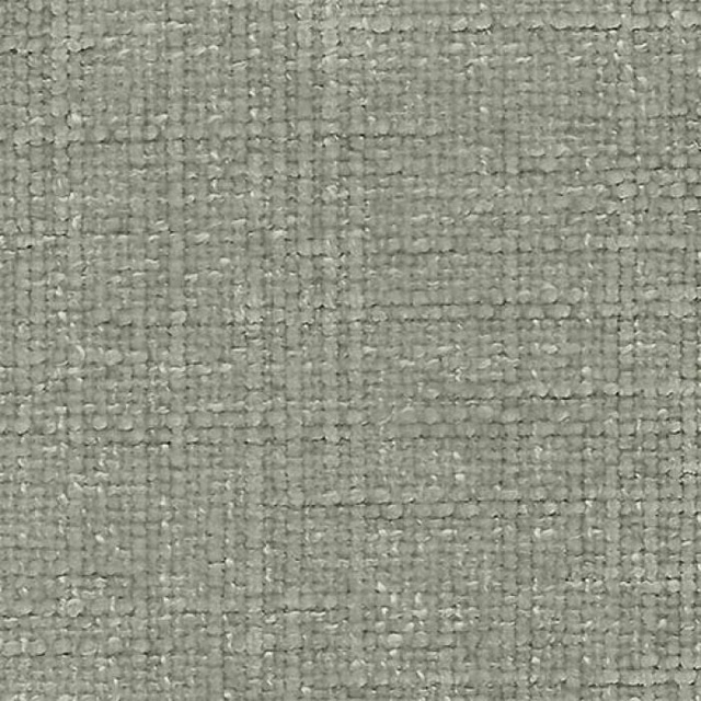
Bohemian Stone
Bohemian
Paint that goes with it
Two ways to take the room. Both colours are from houses we hold, so a pot can come off the same order as the cloth. Screens shift colour, so treat these as a direction and bring the cloth to the shelf before you buy the paint.
To sit quietly behind it
Pheasant
Zoffany · #908780
To stand against it
Milk
Zoffany · #f6f2e6
Other grey fabrics
Across the houses we hold. See all 7,198.