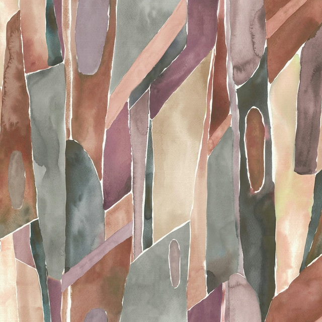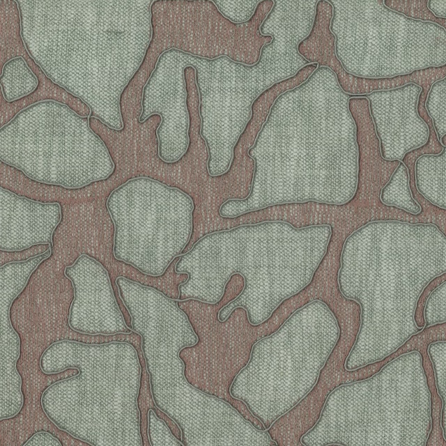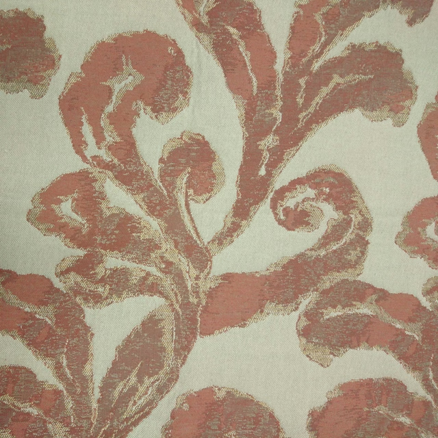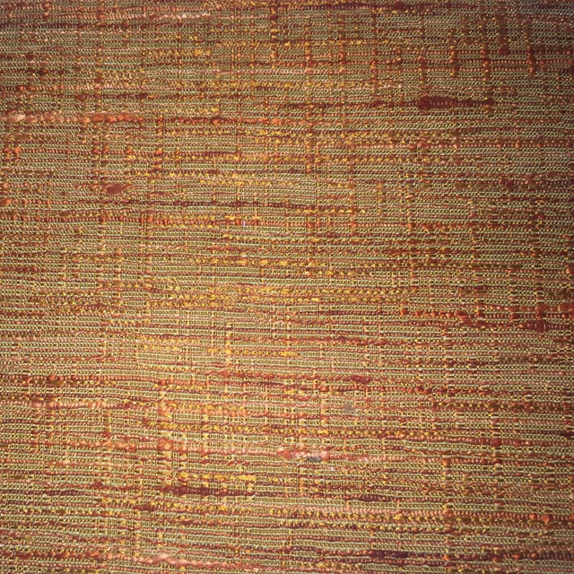

Tap the swatch to see it full screen. Hover it to magnify the weave. Colours on a screen are a guide, not a match, so come and feel the real cloth.
Scroll up or down to zoom in and out.
Primrose Apricot
Woodlandtales Fabricprimros/fa1/apr
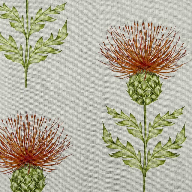
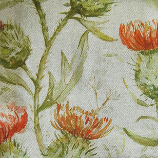
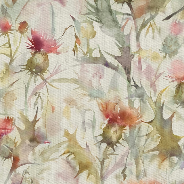
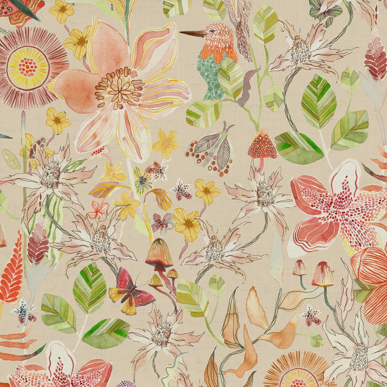
Primrose Apricot brings the Woodlandtales design to life in a warm, softly glowing apricot palette. The large-scale botanicals feel airy and painterly against the pale ground, with the orange notes lending the print a gentle warmth rather than a strong, saturated hit.
You have used your previews for today. Send one to Simon and you can carry on.
Your board
0 fabrics
Part of the range we hold from Voyage Maison.
See Primrose Apricot in your own room
A photograph of the piece you want re-covered. Straight on is best, and daylight helps. It is used to make your picture and nothing else.
Looking at your room
We found things here Primrose Apricot could go on. Tap one on the photograph, or choose below.
We could not see anything to re-cover
, s
Primrose Apricot, on your
Drag to compare. AI impression, colours indicative: ask us for a cutting before you decide.
About this fabric
This fabric is woven in 95% cotton and 5% linen, giving the surface a natural, lightly textured handle that suits the hand-drawn look of the pattern. The 140cm width makes it practical for a range of interior projects, while the 45.67cm horizontal and vertical repeat supports the generous floral-and-foliage layout seen here. In this Primrose Apricot colourway, the orange appears softened and sun-warmed, balanced by blush, leaf green and pale cream details rather than pushed into a bright citrus tone. Dry clean only care, cool ironing and the no-bleach, no-softener guidance help preserve the clarity of the print and the fabric’s fresh finish.
How to use it
Use it where you want a light, uplifting botanical that still feels composed, such as relaxed curtains, statement cushions or a feature chair. Its apricot warmth sits especially well with pale woods, chalky neutrals and muted green accents.
A cheerful botanical with warm apricot tones that softens well in casual interiors.
More from Woodlandtales
The same book, other colourways.
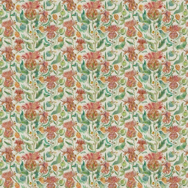
Fairytalebristles Marigold
Woodlandtales
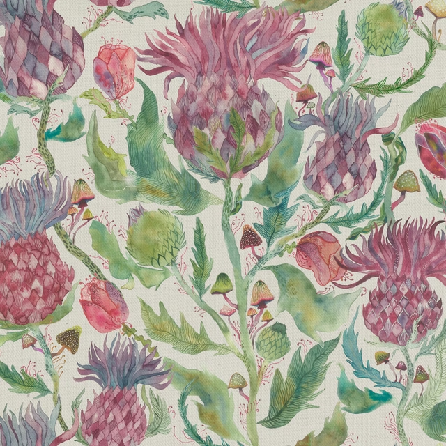
Fairytalebristles Dawn
Woodlandtales
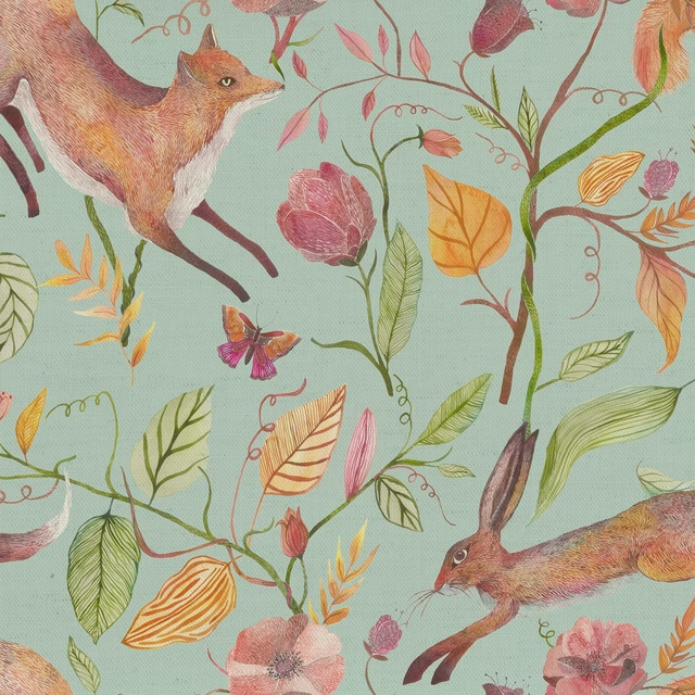
Leapingintothefauna Duck Egg Blue
Woodlandtales
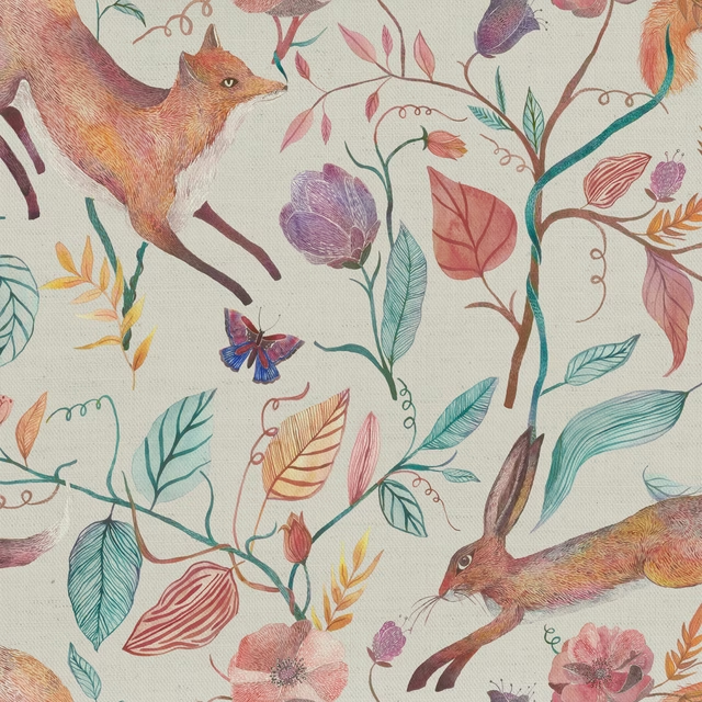
Leapingintothefauna Dawn
Woodlandtales
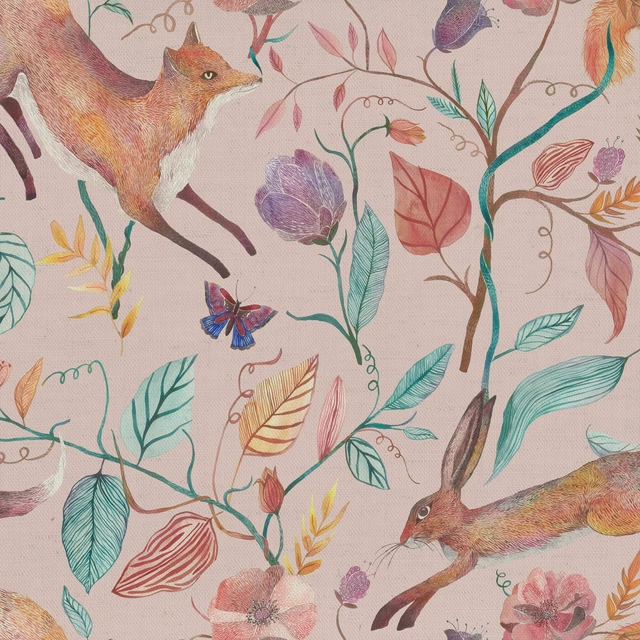
Leapingintothefauna Blush
Woodlandtales
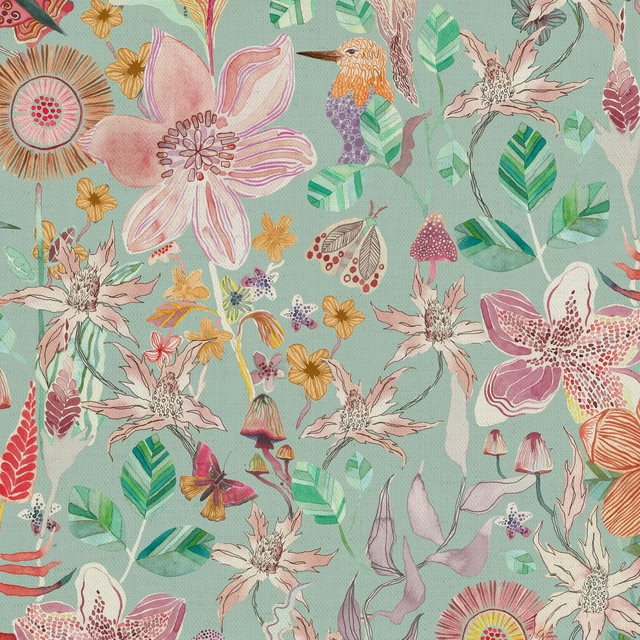
Primrose Duck Egg Blue
Woodlandtales
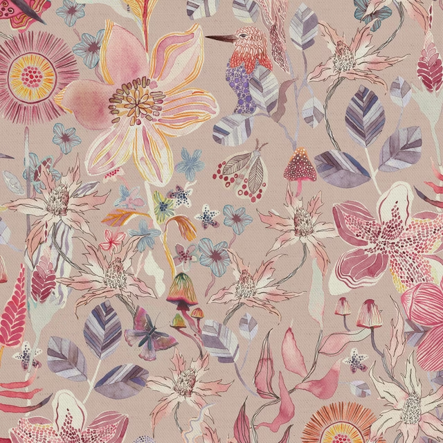
Primrose Blush
Woodlandtales
Whimsicaltale Willow
Woodlandtales
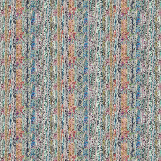
Whimsicaltale Dawn
Woodlandtales
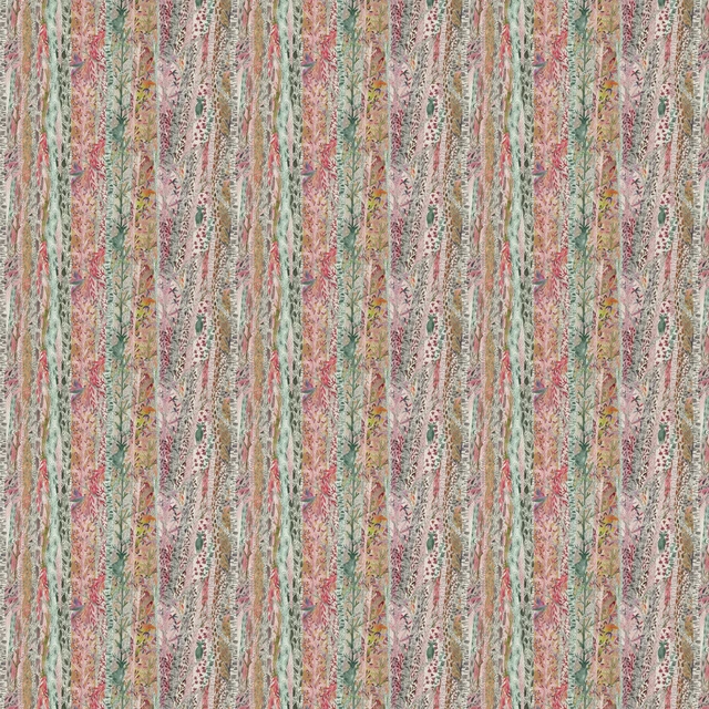
Whimsicaltale Blush
Woodlandtales
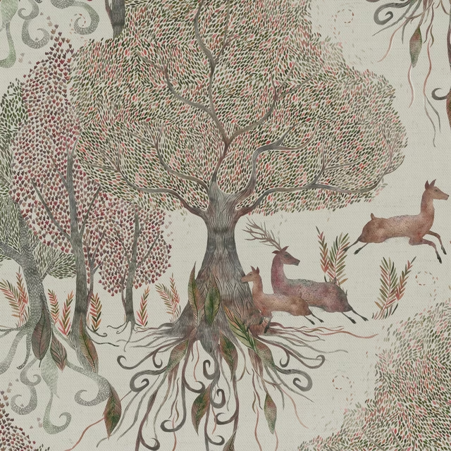
Willowwoods Stone
Woodlandtales
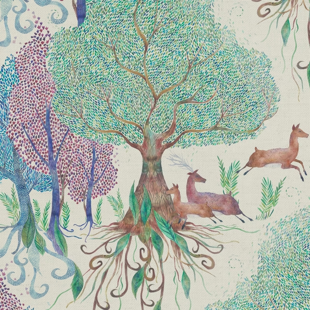
Willowwoods Dawn
Woodlandtales
Pairs well with
A pattern needs somewhere for the eye to rest, so these are the plains and textures that sit beside Primrose Apricot without fighting it. Mixed across the houses we hold, which is the part a single supplier's book cannot do.

Emile Orange
Emile II

Vito Abricot
VITO
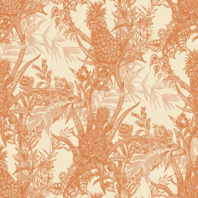
Pineapple Wallpaper Oranges on Cream
Pineapple
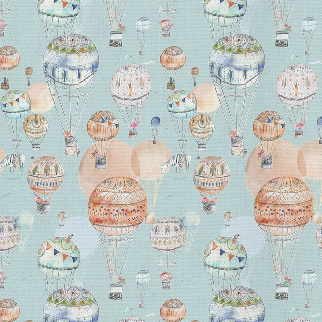
Upandaway Cloud
Imaginations

Dakota Saffron
Dakota Collection

Arezzo Papaya
Portofino Collection

Amalfi Coral
Amalfi

Amalfi Pumpkin
Amalfi
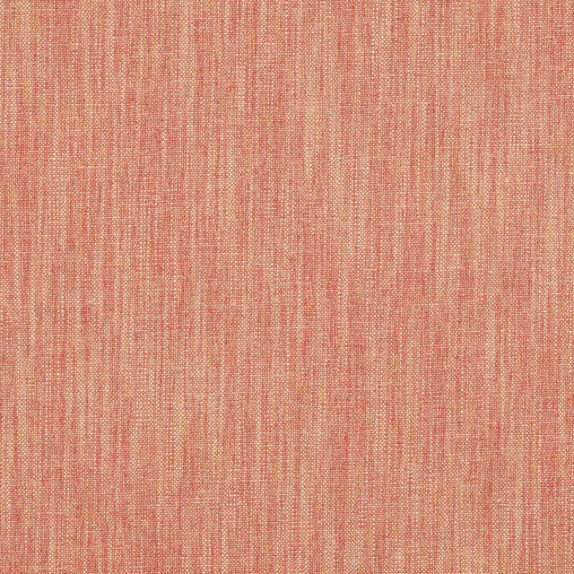
Carnforth Copper
Tarn
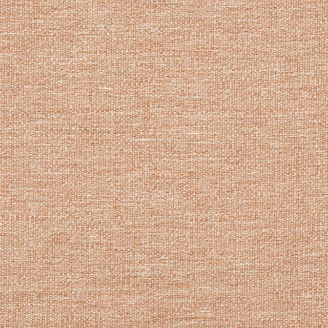
Kellen Sienna
Tarn
Kensington Cinnamon
Brodsworth
Chelsea Burnt Orange
Eco -Friendly Ranges
Paint that goes with it
Two ways to take the room. Both colours are from houses we hold, so a pot can come off the same order as the cloth. Screens shift colour, so treat these as a direction and bring the cloth to the shelf before you buy the paint.
To sit quietly behind it
Manilla
Zoffany · #c6b291
To stand against it
Webbs Blue
Morris & Co. · #5a6e77
Other orange fabrics
Across the houses we hold. See all 784.