
Tap the swatch to see it full screen. Hover it to magnify the weave. Colours on a screen are a guide, not a match, so come and feel the real cloth.
Scroll up or down to zoom in and out.
Carrara Ink
Carrara Fabric
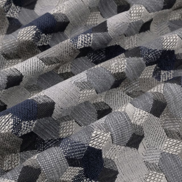
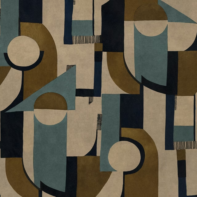
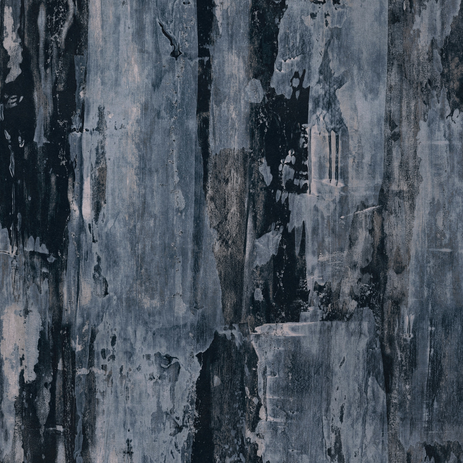
Carrara Ink shows a painterly, abstract surface in deep slate blue, charcoal and softened grey. The design reads as layered and atmospheric, with bold vertical movement and worn-in texture.
You have used your previews for today. Send one to Simon and you can carry on.
Your board
0 fabrics
See this fabric on Warwick's own site, then order it through us.
See Carrara Ink in your own room
A photograph of the piece you want re-covered. Straight on is best, and daylight helps. It is used to make your picture and nothing else.
Looking at your room
We found things here Carrara Ink could go on. Tap one on the photograph, or choose below.
We could not see anything to re-cover
, s
Carrara Ink, on your
Drag to compare. AI impression, colours indicative: ask us for a cutting before you decide.
About this fabric
This colourway has a cool, ink-dark ground broken by misty blue-grey veining and lighter chalky patches, giving the fabric a brushed, almost weathered look. The abstract pattern is large in scale, with a 68.5 cm horizontal and vertical repeat that supports the full dramatic sweep seen across the swatch. Woven in 100% polyester and specified for curtaining and upholstery, it offers a practical 137 cm width and a 60,000+ Martindale rub test for heavier use. Its finish feels smart rather than glossy, with the darker areas creating depth while the paler strokes lift the overall look.
How to use it
Use Carrara Ink for structured upholstery, statement cushions or full-length curtains where the blue-black ground can anchor a room. It pairs well with pale plaster tones, smoked oak and brushed metal for a refined, contemporary scheme.
A moody blue-grey statement that works well on tailored upholstery or dramatic curtains.
Pairs well with
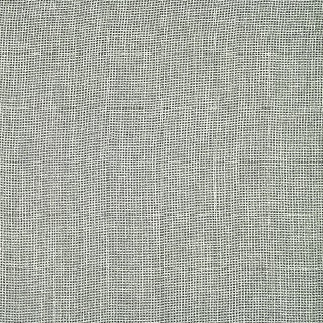
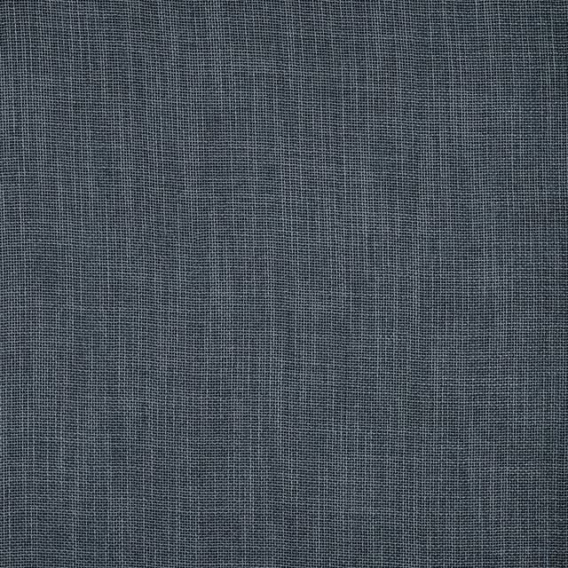
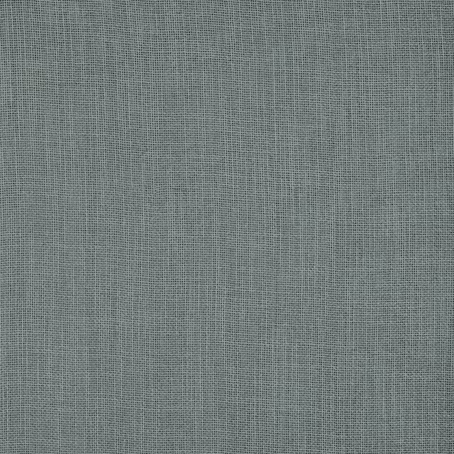
A pattern needs somewhere for the eye to rest, so these are the plains and textures that sit beside Carrara Ink without fighting it. Mixed across the houses we hold, which is the part a single supplier's book cannot do.

Alaska Navy
Alaska Collection

Alaska Powder Blue
Alaska Collection

Beaux-Arts Nuit
Atelier Fabrics
Albany Duckegg
Albany and Moray
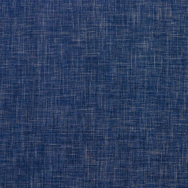
Albany Midnight
Albany and Moray
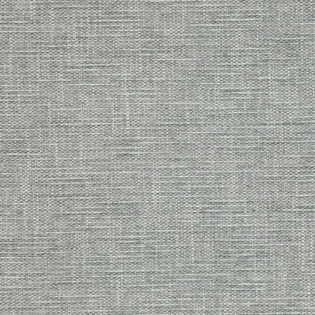
Brandon Aqua
Albeck
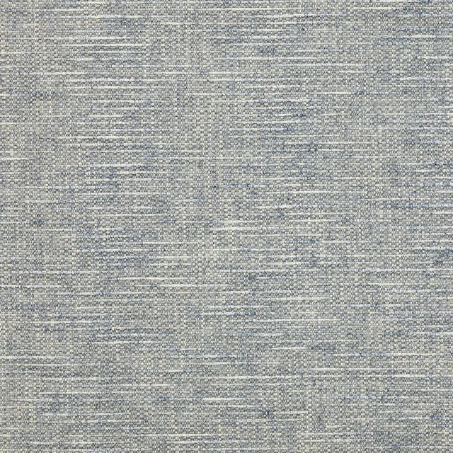
Brandon Blue
Albeck
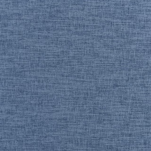
Kalutara Indigo
Ampara Fabrics
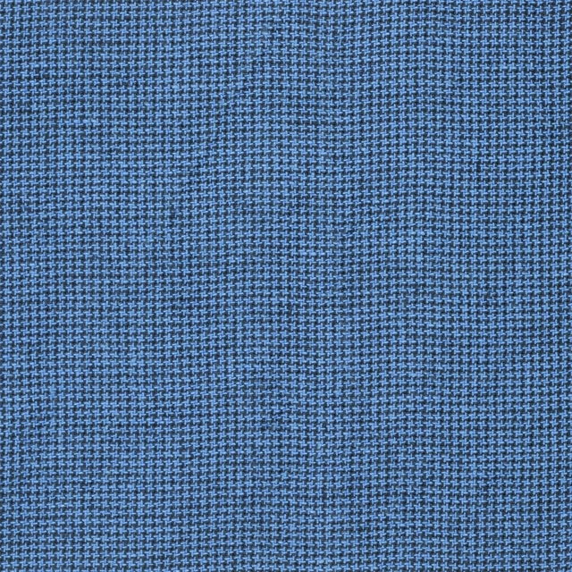
Brera Filato Marine
Brera Filato Fabrics
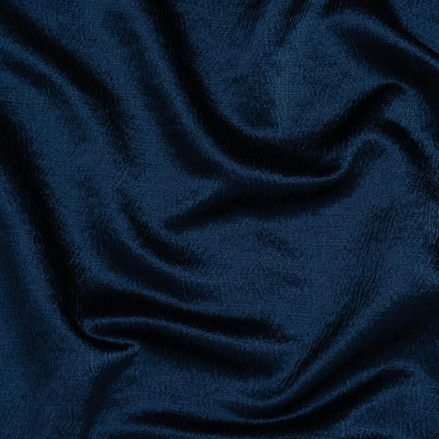
Alchemy Indigo
Alchemy
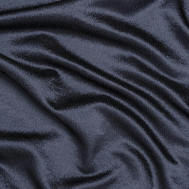
Alchemy Navy
Alchemy
Allegra Atlantic
Allegra
Paint that goes with it
Two ways to take the room. Both colours are from houses we hold, so a pot can come off the same order as the cloth. Screens shift colour, so treat these as a direction and bring the cloth to the shelf before you buy the paint.
To sit quietly behind it
Inky Fingers
Morris & Co. · #48525c
To stand against it
Normandy Grey
Little Greene · #a0a07d
Other blue fabrics
Across the houses we hold. See all 7,566.