
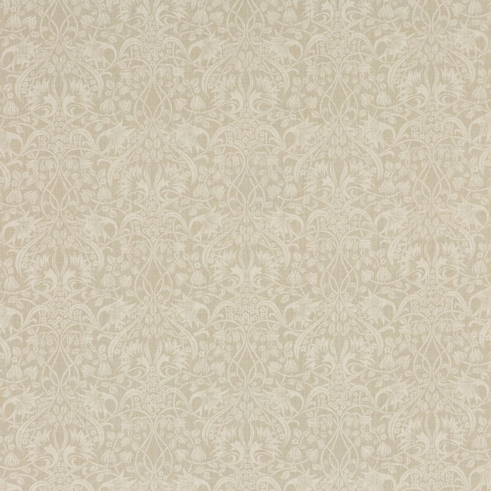
Tap the swatch to see it full screen. Hover it to magnify the weave. Colours on a screen are a guide, not a match, so come and feel the real cloth.
Scroll up or down to zoom in and out.
Fritillerie Warm Grey
Originals V FabricBP10620.5
Fritillerie Warm Grey presents a softly blended greige ground covered with delicate, pale scrolling flowers, leaves and curling stems. Its low-contrast palette gives the intricate pattern a quiet, chalky appearance.
Your board
0 fabrics
See this fabric on GP & J Baker's own site, then order it through us.
About this fabric
The warm grey colourway leans towards taupe, with ivory-grey ornament that catches the light gently rather than creating a sharp contrast. The fine floral repeat measures 34 cm vertically by 33 cm horizontally, creating a continuous decorative surface of curling foliage and stylised blooms. Woven from 85% viscose and 15% linen, the fabric is 137 cm wide and is suitable for curtains, loose upholstery, fixed upholstery and bedspreads. A 45,000 Martindale rub test supports its use on upholstered pieces as well as softer window treatments.
How to use it
Use this warm greige colourway to soften a tailored sofa or headboard, or make full curtains where its pale floral tracery can read as a subtle layered pattern. Pair it with chalky whites, oatmeal, mushroom and aged wood for a calm, quietly traditional room.
A softly tonal floral textile that brings warm grey depth to curtains, upholstery and bedspreads.
More from Originals V
The same book, other colourways.
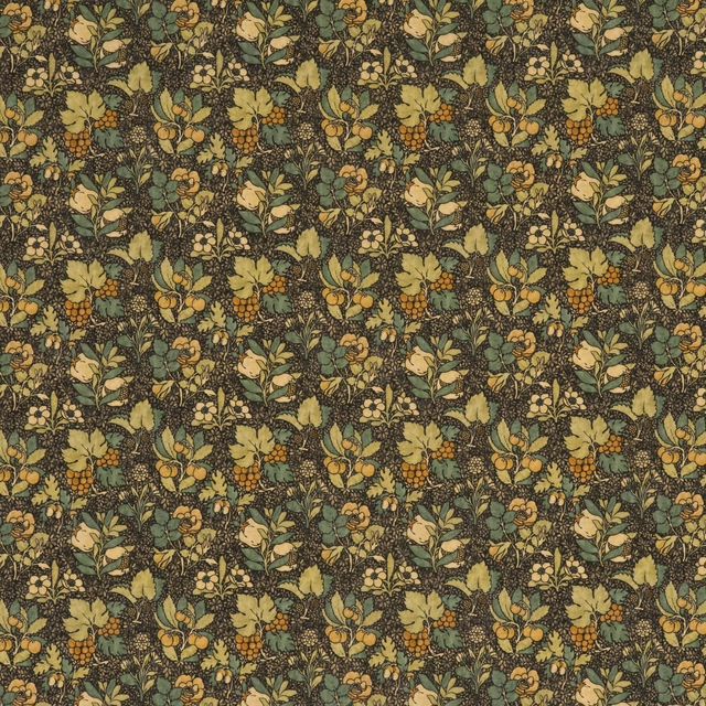
Meadow Fruit Charcoal/Green
Originals V
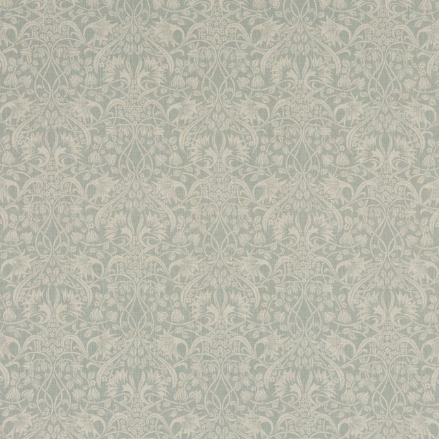
Fritillerie Aqua
Originals V
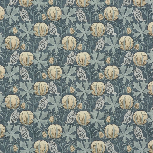
Pumpkins Indigo
Originals V
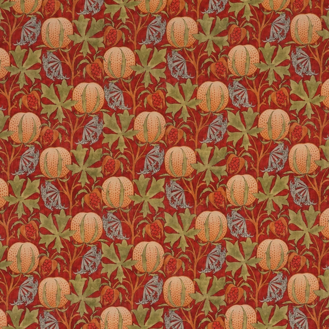
Pumpkins Red/Green
Originals V
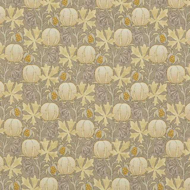
Pumpkins Grey/Ochre
Originals V
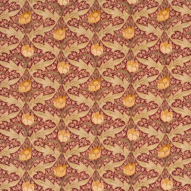
Tulip & Jasmine Red/Ochre
Originals V
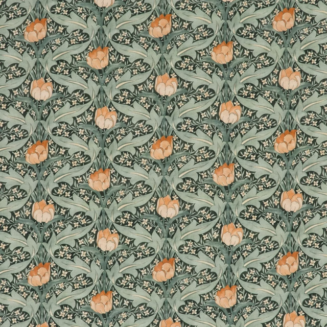
Tulip & Jasmine Teal
Originals V
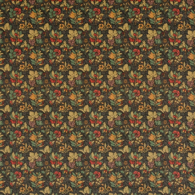
Meadow Fruit Velvet Cinder/Multi
Originals V
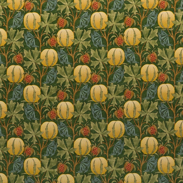
Pumpkins Velvet Green/Terracotta
Originals V
Pairs well with
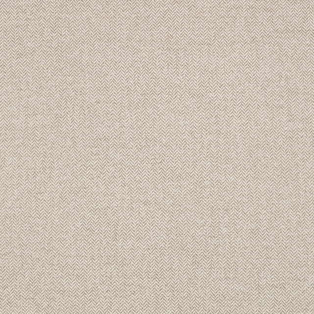
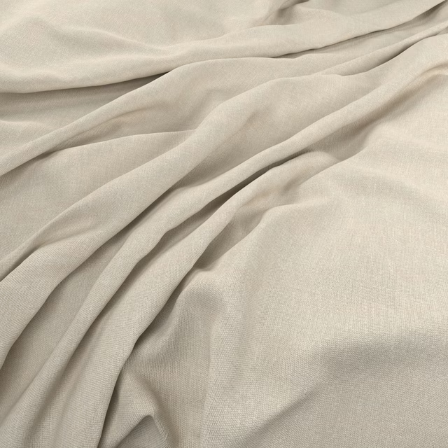
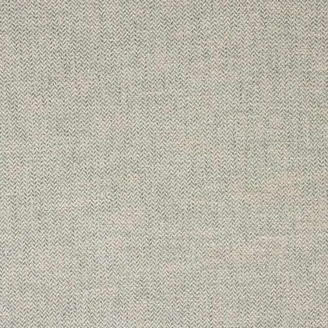
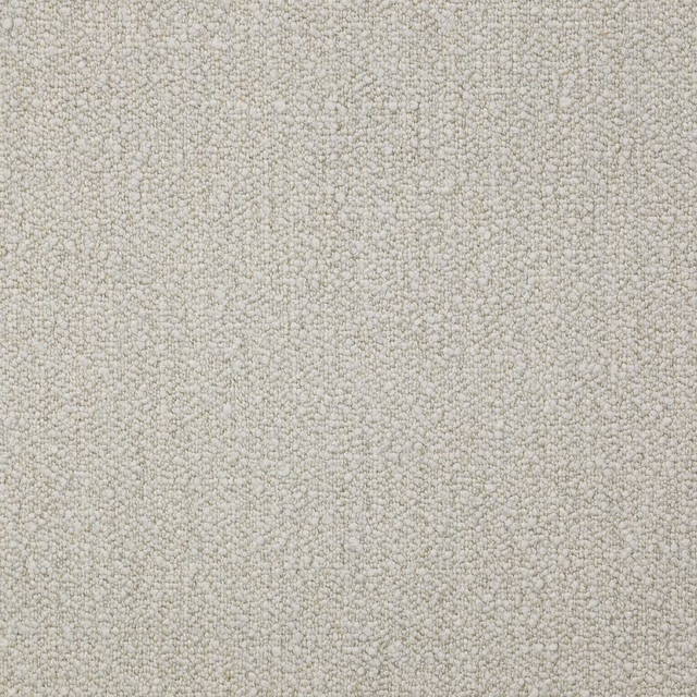
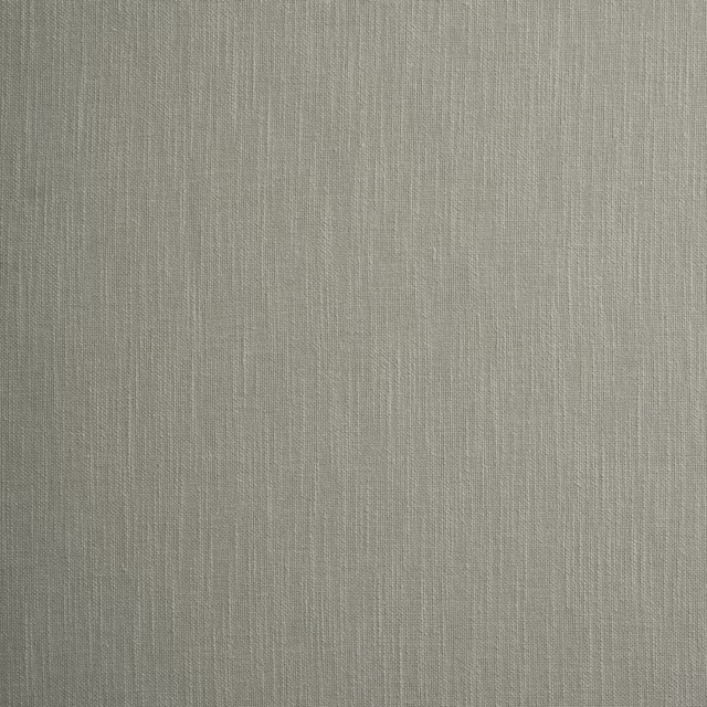
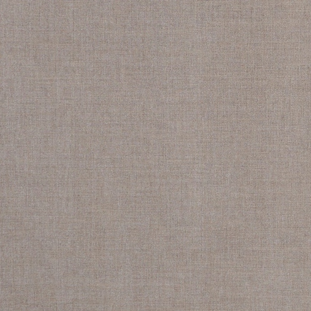
A pattern needs somewhere for the eye to rest, so these are the plains and textures that sit beside Fritillerie Warm Grey without fighting it. Mixed across the houses we hold, which is the part a single supplier's book cannot do.
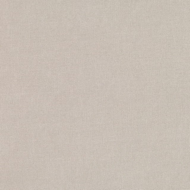
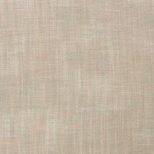



Paint that goes with it
Two ways to take the room. Both colours are from houses we hold, so a pot can come off the same order as the cloth. Screens shift colour, so treat these as a direction and bring the cloth to the shelf before you buy the paint.
To sit quietly behind it
And Breathe
Coat Paints · #cbc5b1
To stand against it
Tivoli
Little Greene · #5c8ea9
Other taupe fabrics
Across the houses we hold. See all 4,249.
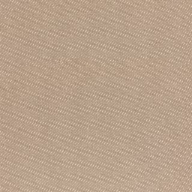
Astell Mink
Essential Colour III - Neutral
Drayton Mink
Essential Colour III - Neutral
Clarence Deflt
Essential Colour III - Colour
Clarence Azure
Essential Colour III - Colour
Clarence Aqua
Essential Colour III - Colour
Fitzroy Mink
Essential Colour III - Neutral
Bray Mole
Essential Colour III - Neutral
Bray Dove
Essential Colour III - Neutral
Chester Espresso
Essential Colour III - Neutral
Elysten Charcoal
Essential Colour III - Neutral
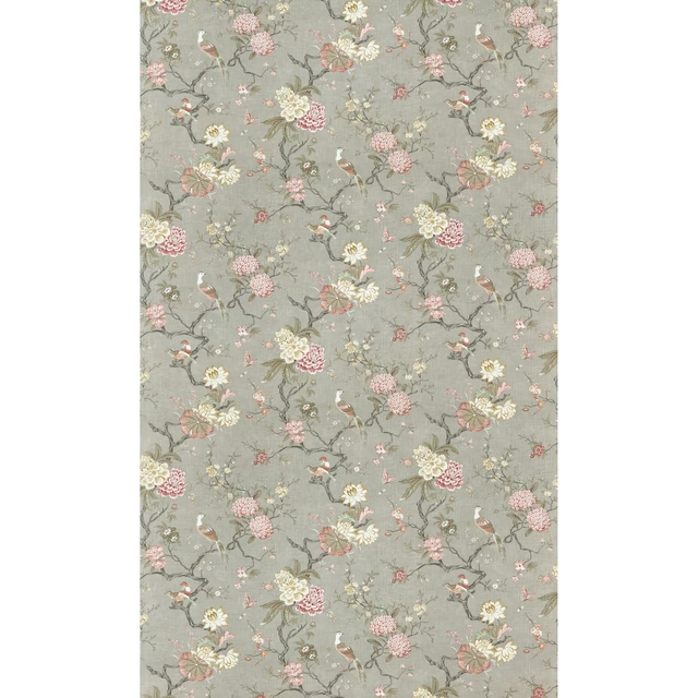
Oriental Bird Signature Mole
Signature Prints
Moreton Trellis Stone
Signature Prints