

Tap the swatch to see it full screen. Hover it to magnify the weave. Colours on a screen are a guide, not a match, so come and feel the real cloth.
Scroll up or down to zoom in and out.
Clarence Aqua
Essential Colour III - Colour FabricBF11185.725
Clarence Aqua presents as a warm taupe-beige rather than a strong blue, with a finely textured surface that gives the plain colour quiet visual depth. Its closely woven appearance reads smart and understated in the swatch.
Your board
0 fabrics
See this fabric on GP & J Baker's own site, then order it through us.
About this fabric
The fabric has a very fine, even micro-weave, with tiny diagonal lines creating a softly tactile surface rather than a visible motif. Its warm beige-taupe tone is muted and versatile, catching the light gently across the close texture. Woven from 44% cotton, 38% viscose, 10% linen and 8% polyester, it is 140 cm (55") wide. With a 27,000 Martindale rub test and usage listed for curtains, loose upholstery, fixed upholstery and bedspreads, it offers broad scope across a scheme.
How to use it
Use Clarence Aqua to bring a calm, warm taupe note to tailored seating or relaxed loose covers, then repeat the same understated tone in curtains or a bedspread. Its fine texture works especially well where a plain fabric needs more depth without a bold pattern.
The warm taupe-beige tone and fine woven texture suit tailored upholstery, curtains and coordinated bedspreads.
More from Essential Colour III - Colour
The same book, other colourways.

Drayton Teal
Essential Colour III - Colour

Drayton Indigo
Essential Colour III - Colour

Drayton Sage
Essential Colour III - Colour

Clarence Soft Red
Essential Colour III - Colour

Clarence Deflt
Essential Colour III - Colour

Clarence Azure
Essential Colour III - Colour

Clarence Green
Essential Colour III - Colour
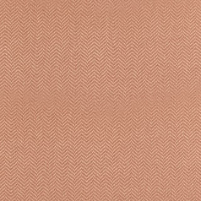
Fitzroy Soft Red
Essential Colour III - Colour

Fitzroy Ochre
Essential Colour III - Colour

Bray Chestnut
Essential Colour III - Colour

Bray Indigo
Essential Colour III - Colour

Bray Olive
Essential Colour III - Colour
Pairs well with
Clarence Aqua is a quiet cloth, so it carries a pattern beside it: one of these on the curtains and this on the chair. Mixed across the houses we hold, which is the part a single supplier's book cannot do.
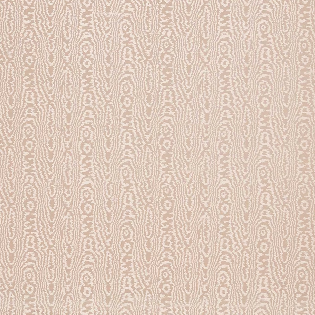
Elsworthy Dusk
Harlequin x Henry Holland Moire
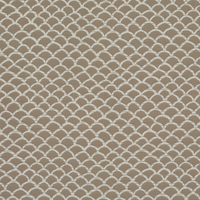
Arbour Mineral
Gardyne
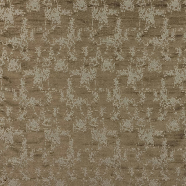
Lanius Taupe
Gustav
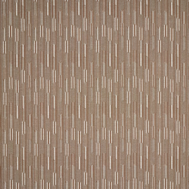
Massi Wood
Asti
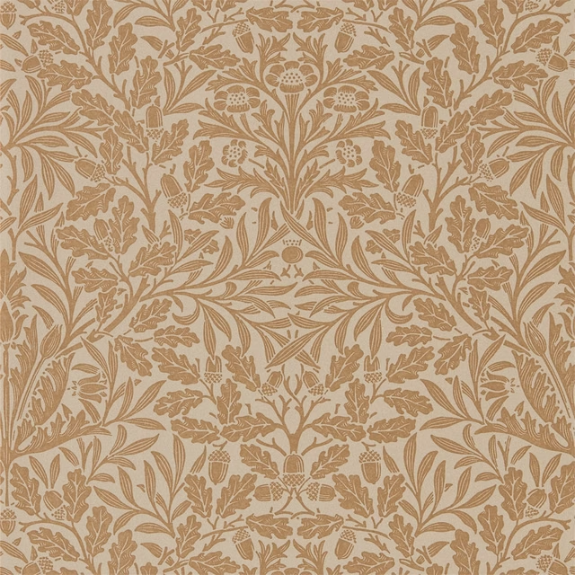
Pure Acorn Gilver/Copper
Morris Pure Wallpapers
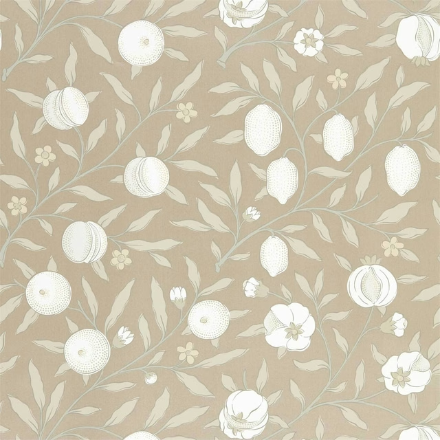
Pure Fruit Gilver
Pure Morris North Wallpapers
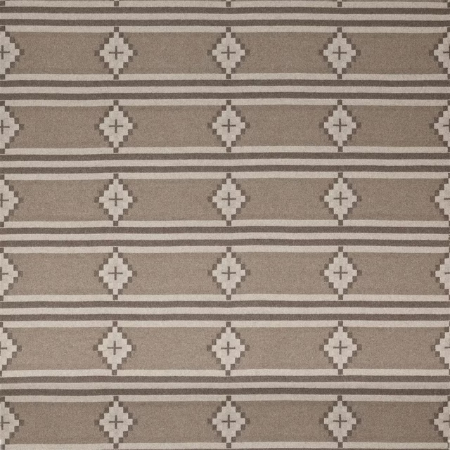
Heather Natural
Canyon Road Fabrics
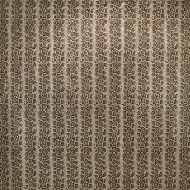
Baniya Snakeskin Pewter
Neutral Book Fabrics
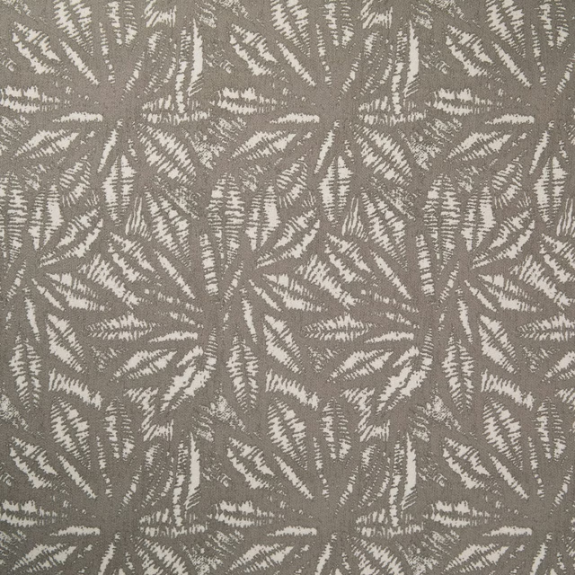
Longwood Code
Barnard FR Recycled with EcoPerform+
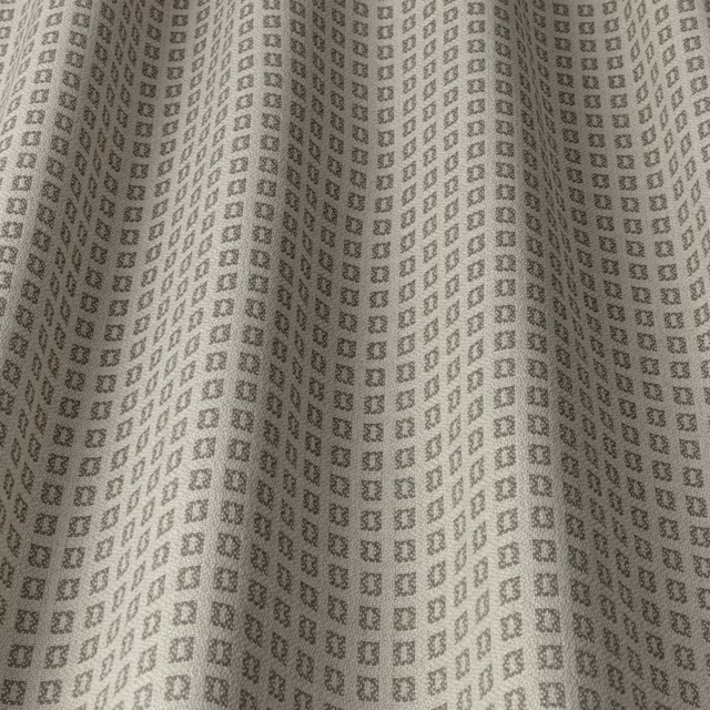
CALI Taupe 2
Nalina
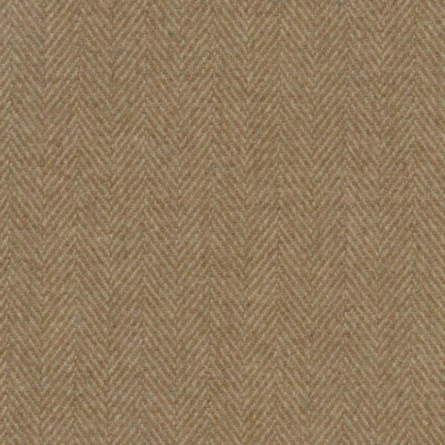
Craigie Hill Harvest
Craigie Hill
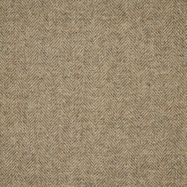
1796/KD47
Misc
Paint that goes with it
Two ways to take the room. Both colours are from houses we hold, so a pot can come off the same order as the cloth. Screens shift colour, so treat these as a direction and bring the cloth to the shelf before you buy the paint.
To sit quietly behind it
Rolling Fog - Dark
Little Greene · #b1a48a
To stand against it
Papavera
Sanderson · #e2c15a
Other taupe fabrics
Across the houses we hold. See all 4,249.

Tetbury Velvet Dove
Tetbury Velvet

Tetbury Velvet Woodsmoke
Tetbury Velvet

Astell Mocha
Essential Colour III - Neutral

Astell Mink
Essential Colour III - Neutral

Drayton Mink
Essential Colour III - Neutral

Fitzroy Mink
Essential Colour III - Neutral
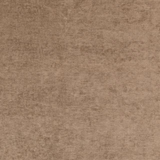
Bray Mole
Essential Colour III - Neutral

Bray Dove
Essential Colour III - Neutral

Chester Espresso
Essential Colour III - Neutral
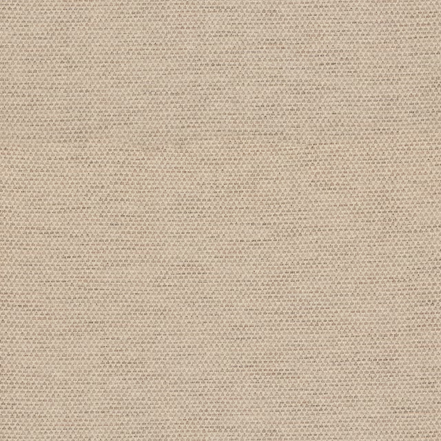
Elysten Charcoal
Essential Colour III - Neutral
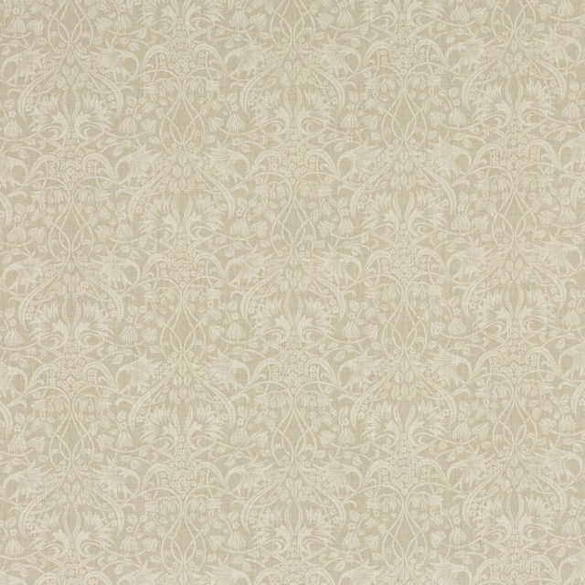
Fritillerie Warm Grey
Originals V
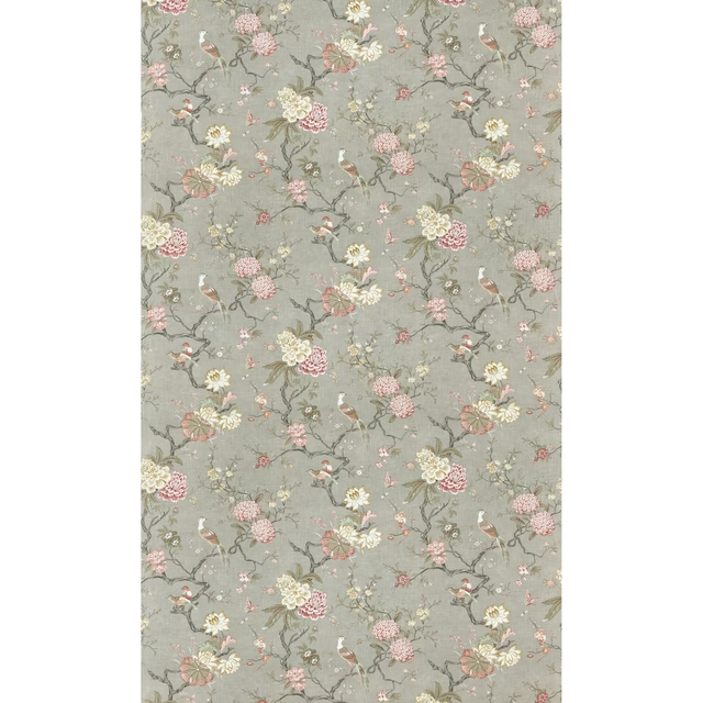
Oriental Bird Signature Mole
Signature Prints