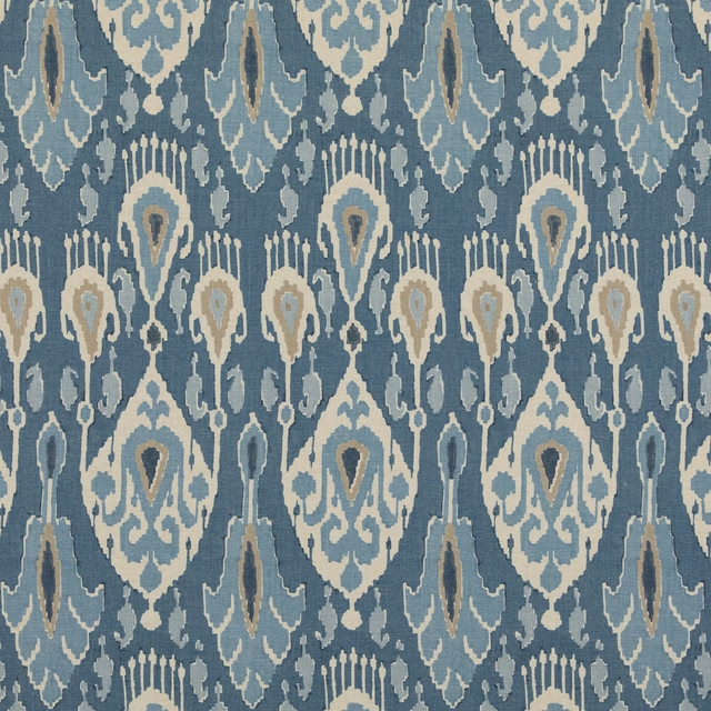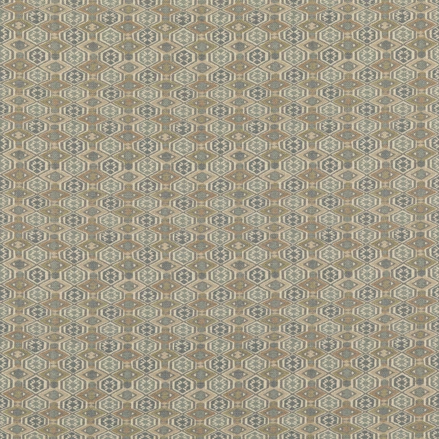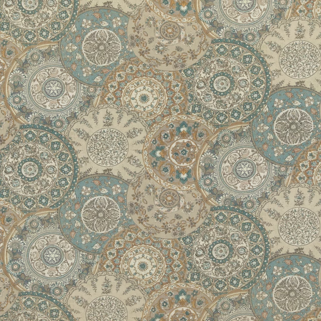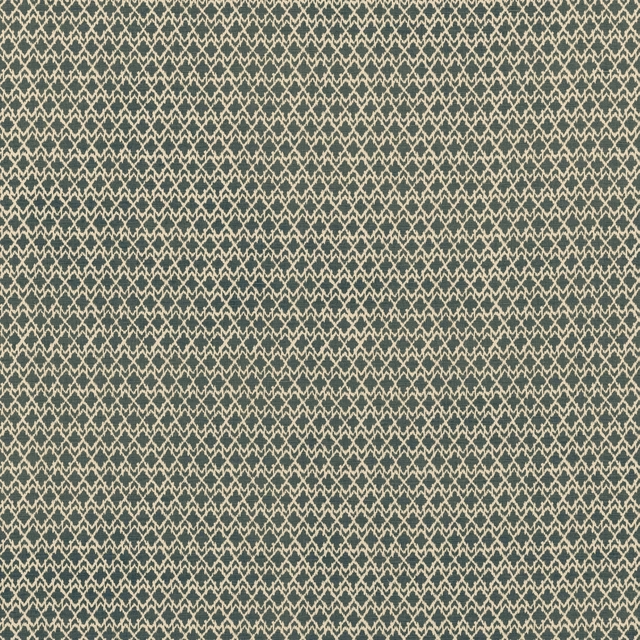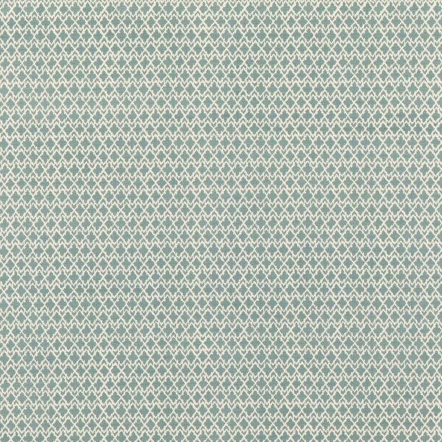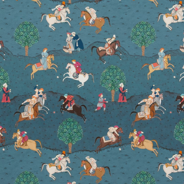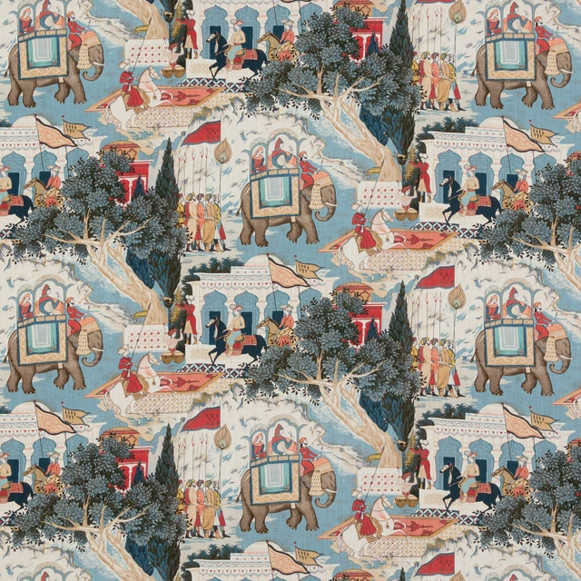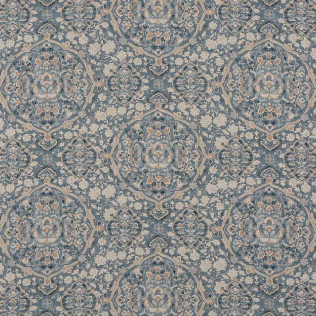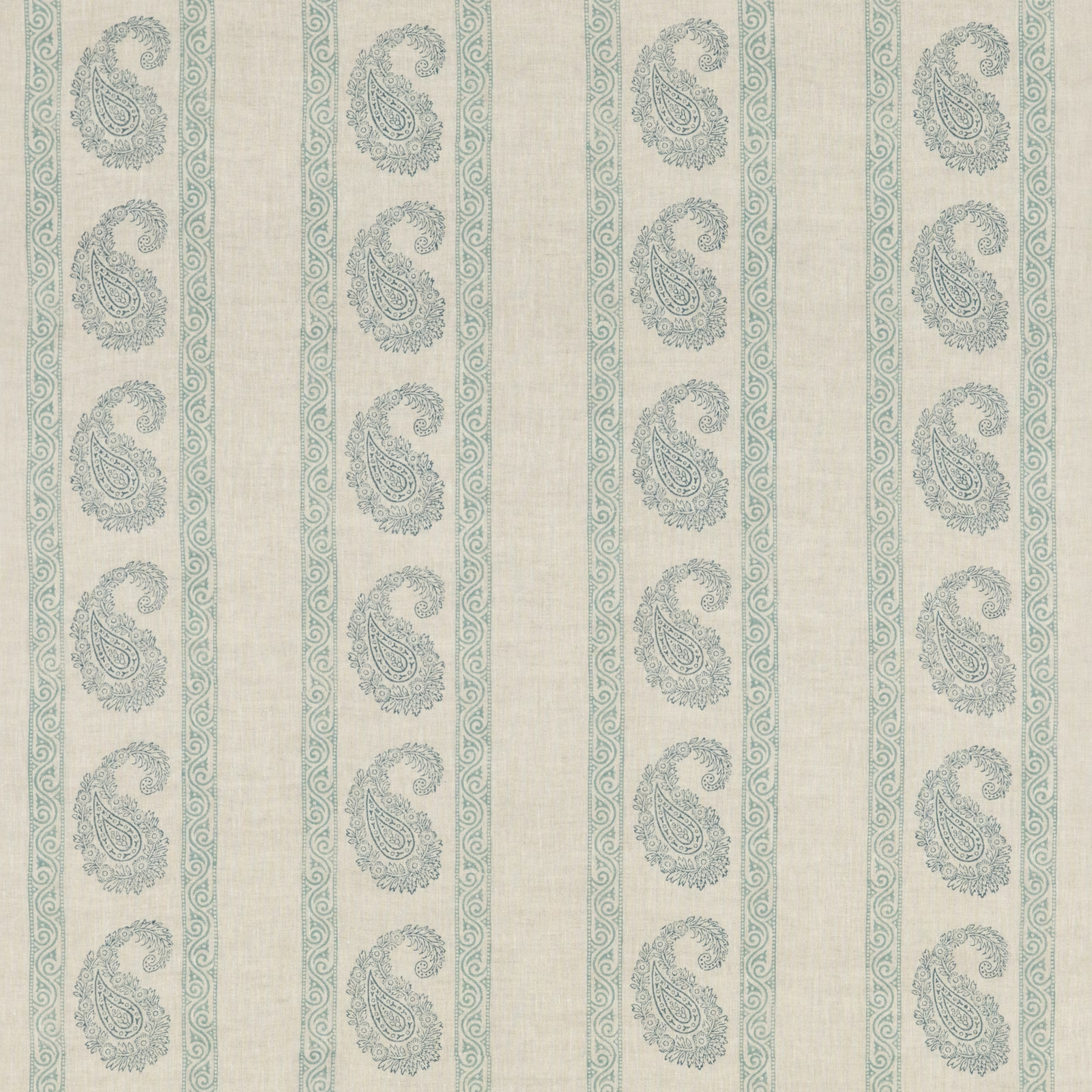
Tap the swatch to see it full screen. Hover it to magnify the weave. Colours on a screen are a guide, not a match, so come and feel the real cloth.
Scroll up or down to zoom in and out.
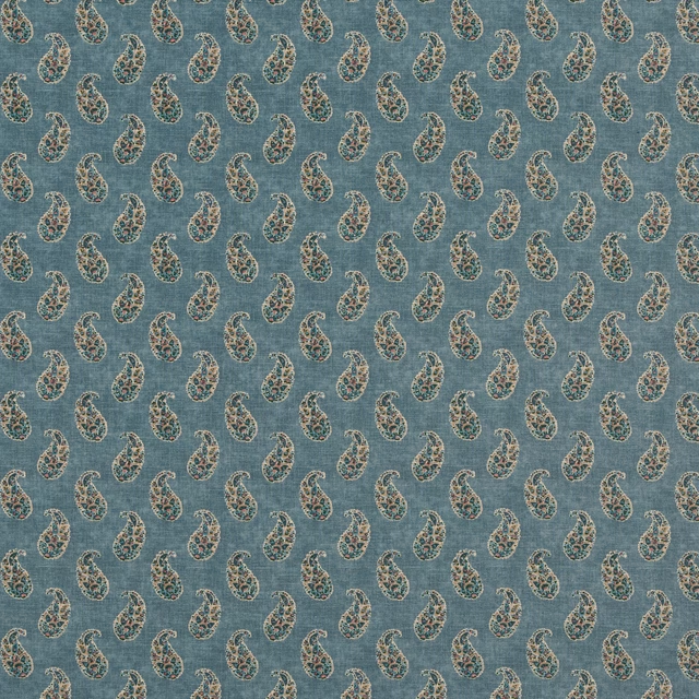
Vintage Paisley Blue
Portobello FabricBP10919.1
Vintage Paisley Blue combines a softly weathered blue-grey paisley with delicate scrolling borders on a warm ivory linen ground. Its evenly spaced vertical layout gives the detailed pattern a calm, orderly rhythm.
Your board
0 fabrics
See this fabric on GP & J Baker's own site, then order it through us.
About this fabric
The paisleys have a cool, muted blue-grey tone, with fine ornamental outlines that read gently against the pale cream background rather than appearing strongly contrasted. Narrow scrolling bands separate the paisley columns, creating a striped vertical effect across the cloth. Woven in 100% linen, the visible surface has a natural, lightly irregular texture that suits the fabric’s relaxed vintage character. At 138 cm wide, with a 14 cm vertical repeat and 23 cm horizontal repeat, it is specified for curtains, loose upholstery, fixed upholstery and bedspreads.
How to use it
Use this cool blue-grey and ivory colourway for relaxed curtains or a loose-upholstered chair, balancing its ornamental pattern with pale painted finishes and natural timber. The vertical borders can also bring gentle structure to a bedspread or upholstered headboard.
Pair the cool blue-grey paisleys with chalky whites, natural wood and soft neutral upholstery.
More from Portobello
The same book, other colourways.
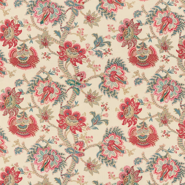
Kingham Red/ Blue
Portobello
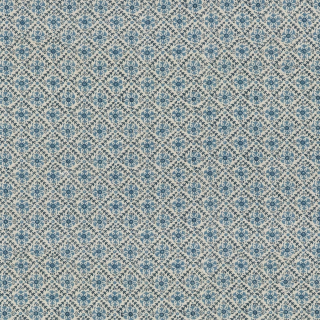
Camden Trellis Blue
Portobello
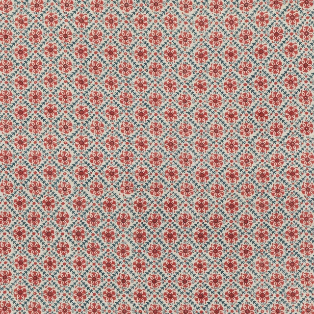
Camden Trellis Red/ Blue
Portobello
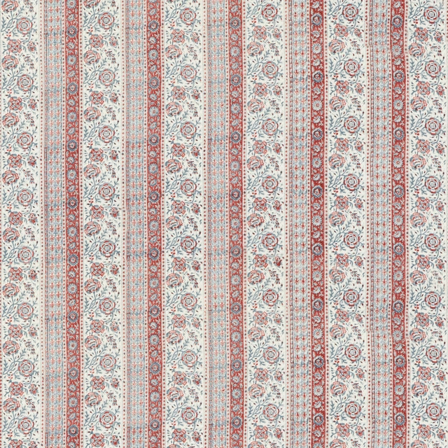
Tillington Red/ Blue
Portobello
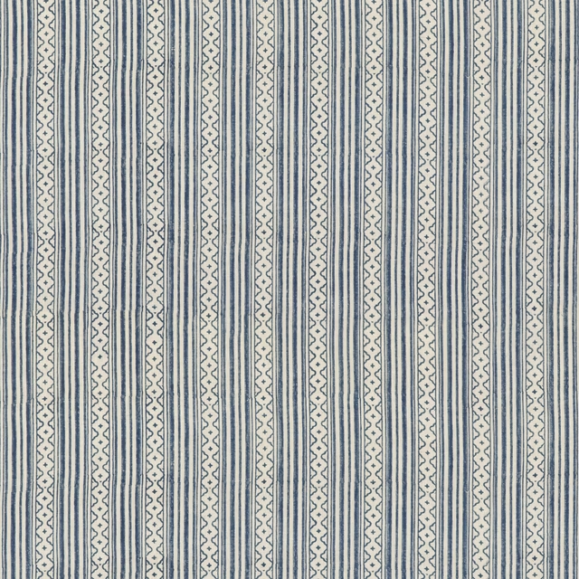
Ebury Stripe Blue
Portobello
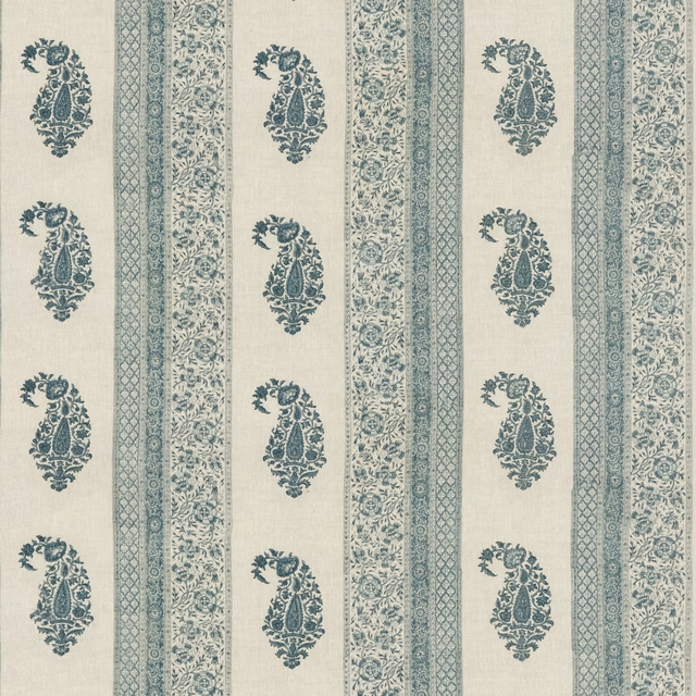
Portobello Blue
Portobello
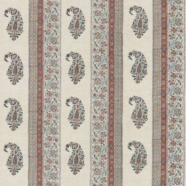
Portobello Red/Blue
Portobello
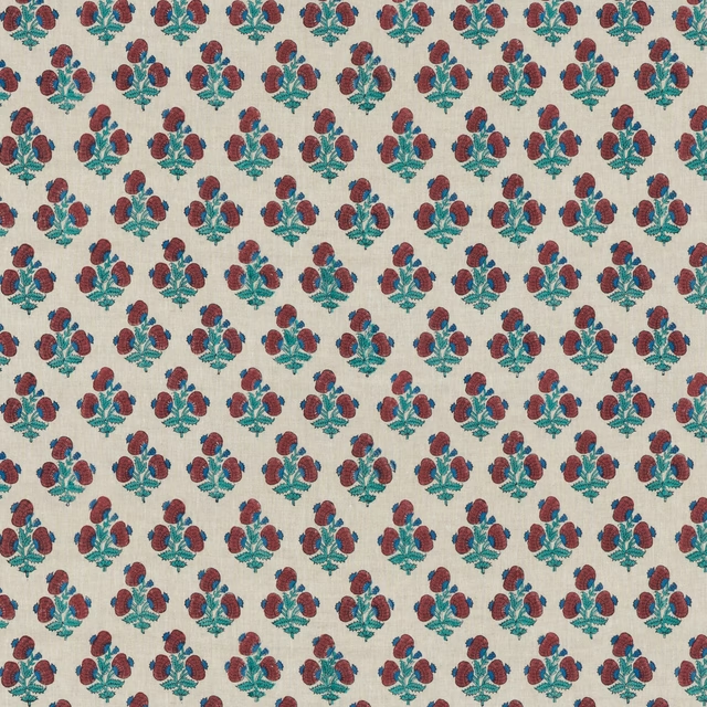
Jaipur Poppy Red/Blue
Portobello
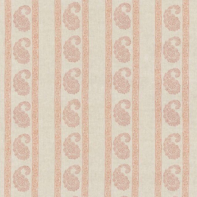
Vintage Paisley Red
Portobello
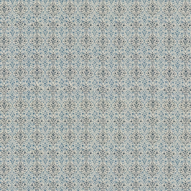
Arabesque Blue
Portobello

Tetbury Stripe Blue
Portobello
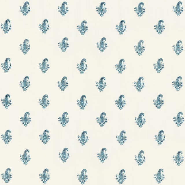
Pimlico Indigo
Portobello
Pairs well with
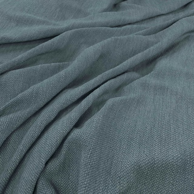
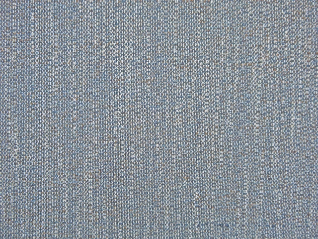
A pattern needs somewhere for the eye to rest, so these are the plains and textures that sit beside Vintage Paisley Blue without fighting it. Mixed across the houses we hold, which is the part a single supplier's book cannot do.

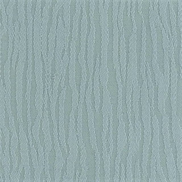




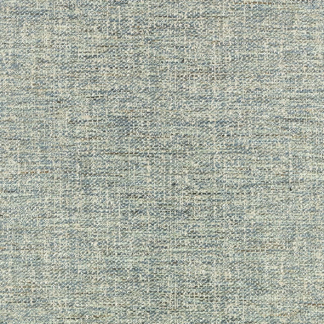
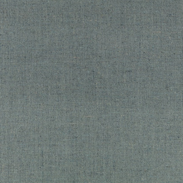

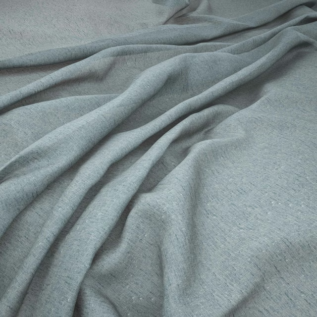
Paint that goes with it
Two ways to take the room. Both colours are from houses we hold, so a pot can come off the same order as the cloth. Screens shift colour, so treat these as a direction and bring the cloth to the shelf before you buy the paint.
To sit quietly behind it
Slaked Lime - Dark
Little Greene · #cdcabc
To stand against it
Spanked
Coat Paints · #a36a56
Other blue fabrics
Across the houses we hold. See all 7,610.