
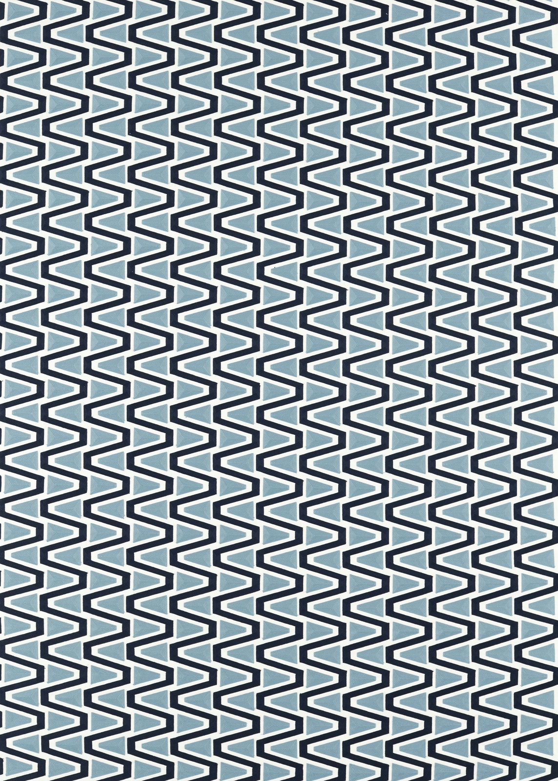

Tap the swatch to see it full screen. Hover it to magnify the weave. Colours on a screen are a guide, not a match, so come and feel the real cloth.
Scroll up or down to zoom in and out.
Perception Japanese Ink/Sky
Colour 2 Fabrics FabricHAF0458-02
Perception Japanese Ink/Sky from Harlequin’s Colour 2 Fabrics collection combines deep Japanese ink blue with pale sky blue in a tightly ordered, angular pattern. The high-contrast geometry reads crisp and graphic across the swatch.
You have used your previews for today. Send one to Simon and you can carry on.
Your board
0 fabrics
See this fabric on Harlequin's own site, then order it through us.
See Perception Japanese Ink/Sky in your own room
A photograph of the piece you want re-covered. Straight on is best, and daylight helps. It is used to make your picture and nothing else.
Looking at your room
We found things here Perception Japanese Ink/Sky could go on. Tap one on the photograph, or choose below.
We could not see anything to re-cover
, s
Perception Japanese Ink/Sky, on your
Drag to compare. AI impression, colours indicative: ask us for a cutting before you decide.
About this fabric
The design is formed from closely spaced, interlocking zigzag lines, with dark ink-blue outlines framing cooler sky-blue sections and a light ground. This colourway has a distinctly cool, clean character: the deep blue adds definition while the paler blue keeps the repeated pattern visually open. At 403 gsm and 106 threads per cm, it has the substantial presence expected of a hard-wearing upholstery textile. The fabric has a 136 cm usable width, a 30 m standard length and a pattern repeat of 10.5 cm horizontally by 11.7 cm vertically.
How to use it
Pair the ink-and-sky colourway with pale timber, white-painted furniture or cool grey upholstery to emphasise its graphic clarity. Its compact repeat suits dining chairs, occasional seating and other tailored upholstery where the angular rhythm can be clearly seen.
Use this crisp ink-and-sky geometric on occasional chairs, dining seats or a tailored upholstered statement piece.
More from Colour 2 Fabrics
The same book, other colourways.
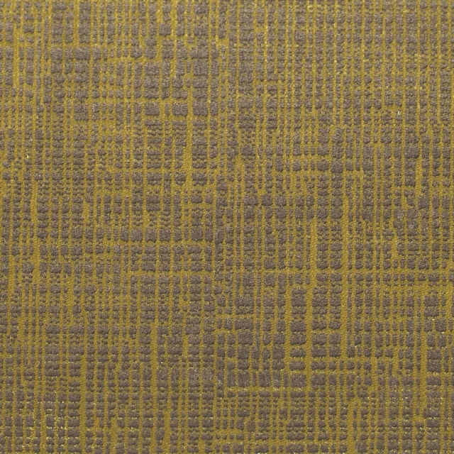
Osamu Mustard
Colour 2 Fabrics
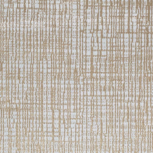
Osamu Oatmeal
Colour 2 Fabrics
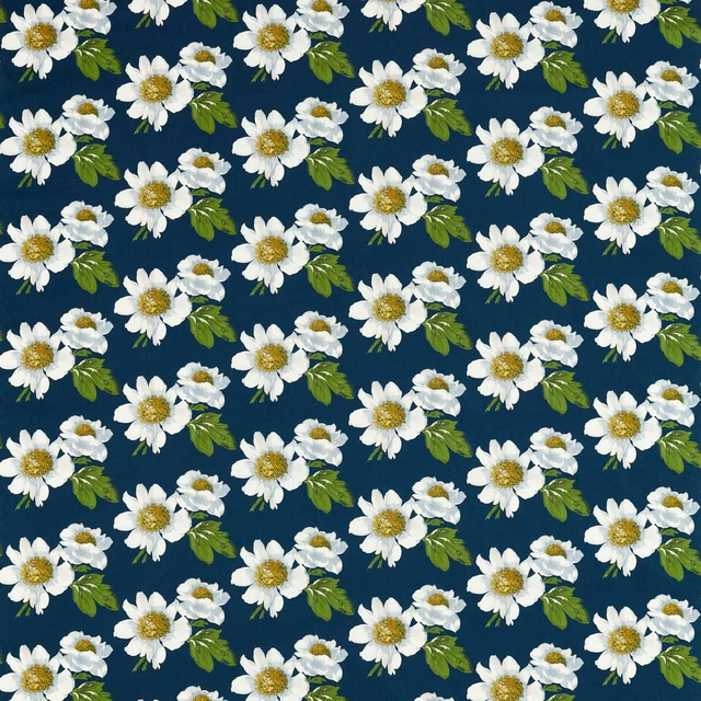
Paeonia Azurite/Meadow/Nectar
Colour 2 Fabrics
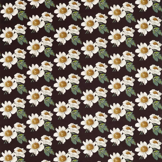
Paeonia Black Earth/Fig Leaf/Nectar
Colour 2 Fabrics
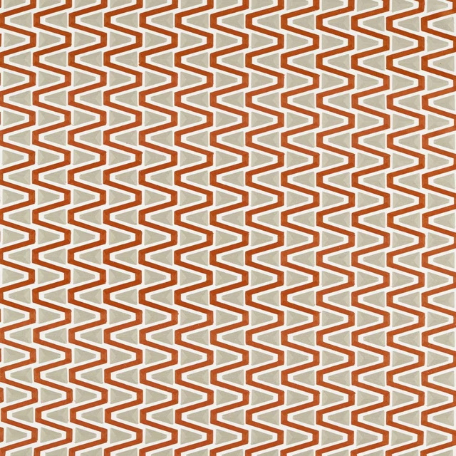
Perception Brazilian Rosewood/Shiitake
Colour 2 Fabrics
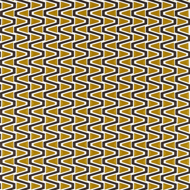
Perception Dijon/Black Earth
Colour 2 Fabrics
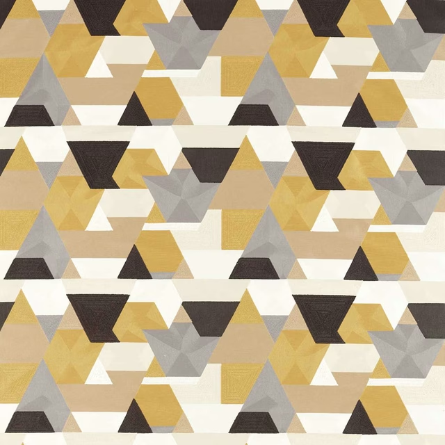
Popova Dijon/Incense/Origami
Colour 2 Fabrics
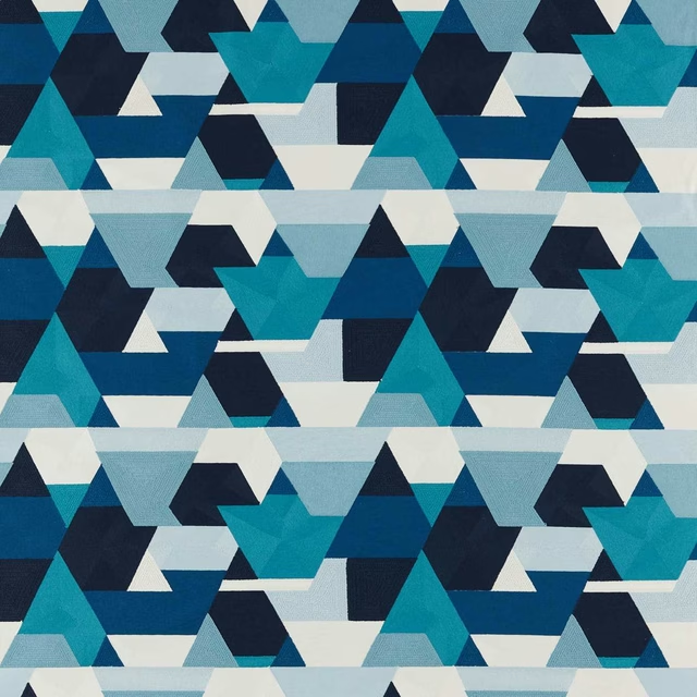
Popova Onsen/Japanese Ink
Colour 2 Fabrics

Popova Sea Glass/Forest/Ink
Colour 2 Fabrics
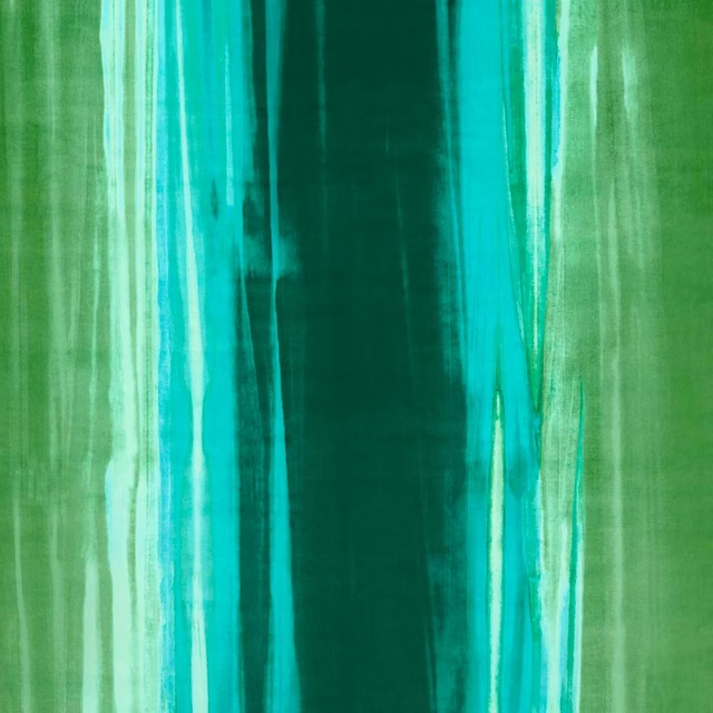
Rewilded Velvet Emerald/Azurite/Palm
Colour 2 Fabrics
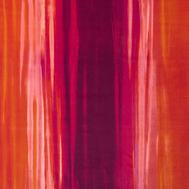
Rewilded Velvet Fig/Pomegranate/Tangerine
Colour 2 Fabrics
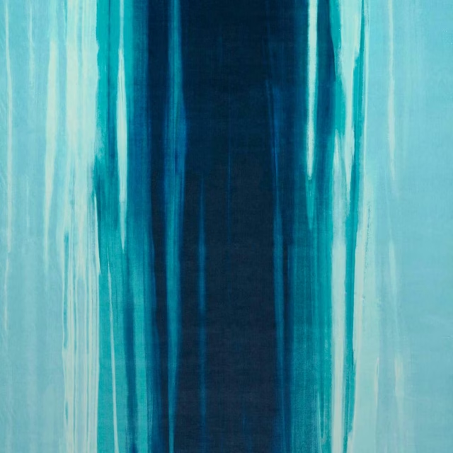
Rewilded Velvet Wild Water/Lagoon/Sky
Colour 2 Fabrics
Pairs well with
A pattern needs somewhere for the eye to rest, so these are the plains and textures that sit beside Perception Japanese Ink/Sky without fighting it. Mixed across the houses we hold, which is the part a single supplier's book cannot do.

Alaska Navy
Alaska Collection

Alaska Powder Blue
Alaska Collection

Beaux-Arts Nuit
Atelier Fabrics
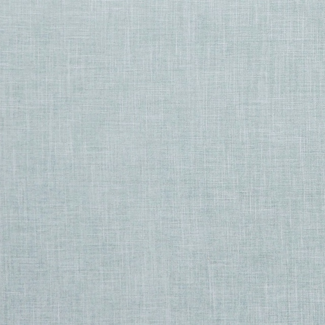
Albany Duckegg
Albany and Moray
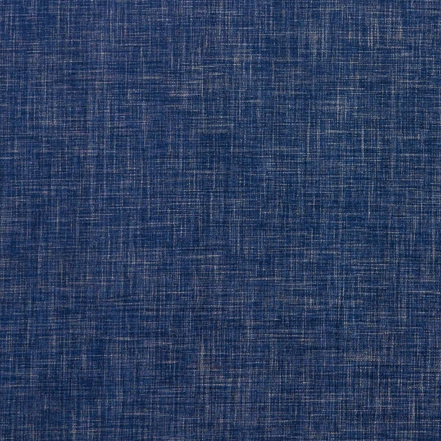
Albany Midnight
Albany and Moray
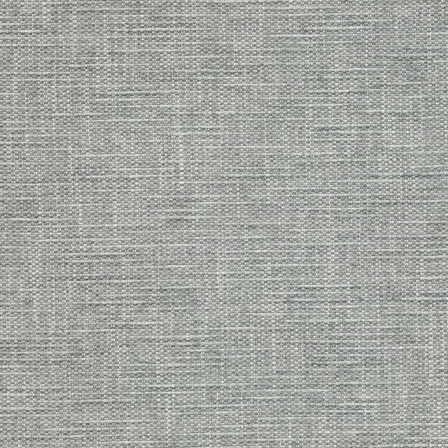
Brandon Aqua
Albeck
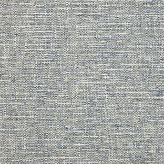
Brandon Blue
Albeck
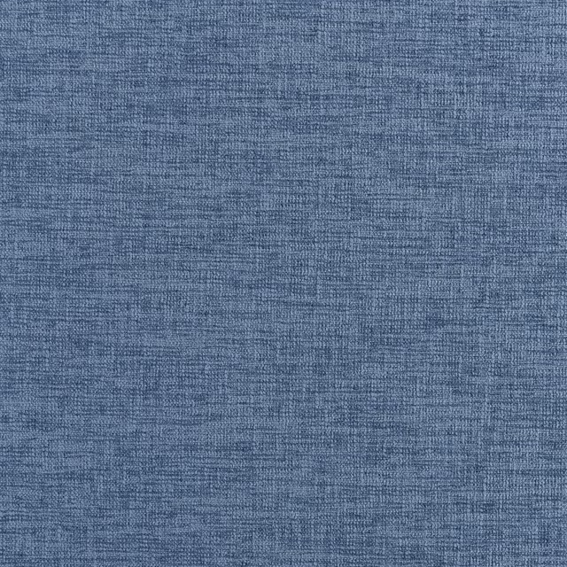
Kalutara Indigo
Ampara Fabrics
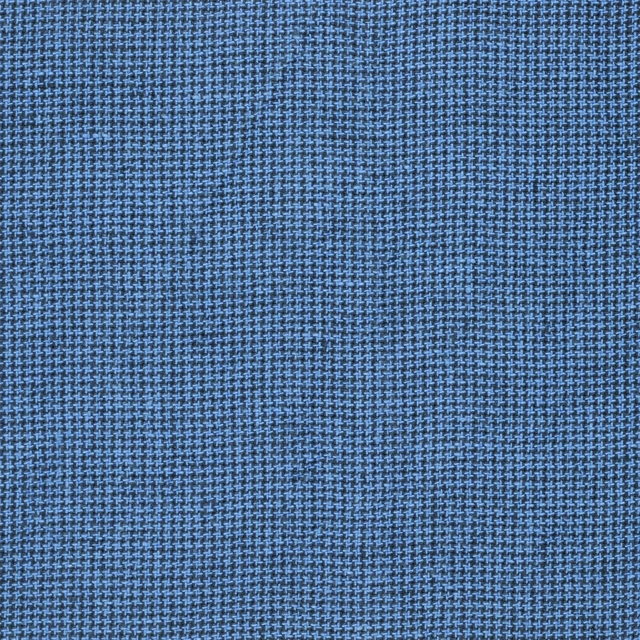
Brera Filato Marine
Brera Filato Fabrics
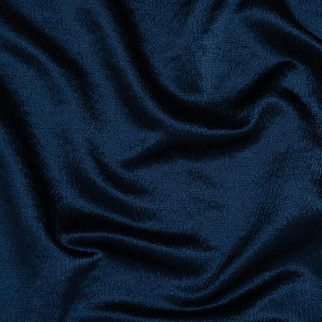
Alchemy Indigo
Alchemy
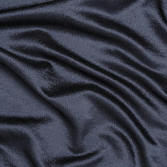
Alchemy Navy
Alchemy

Amalfi Cadet
Amalfi
Paint that goes with it
Two ways to take the room. Both colours are from houses we hold, so a pot can come off the same order as the cloth. Screens shift colour, so treat these as a direction and bring the cloth to the shelf before you buy the paint.
To sit quietly behind it
Double Quartz Grey
Zoffany · #979ea6
To stand against it
Apple
Little Greene · #cbc687
Other blue fabrics
Across the houses we hold. See all 7,566.
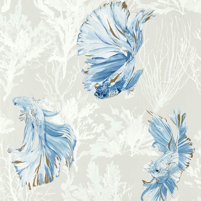
Halfmoon Stillness/Indigo
Colour 1 Wallpapers
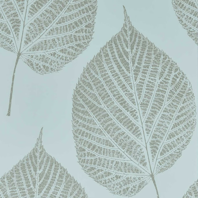
Leaf Sky/Gilver
Colour 1 Wallpapers
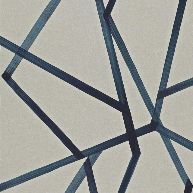
Sumi Wide Width Linen/Indigo
Colour 1 Wallpapers
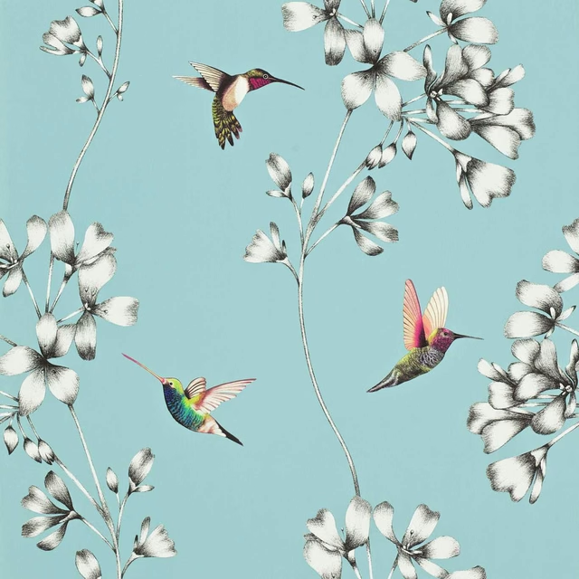
Amazilia Wide Width Sky
Colour 2 Wallpapers
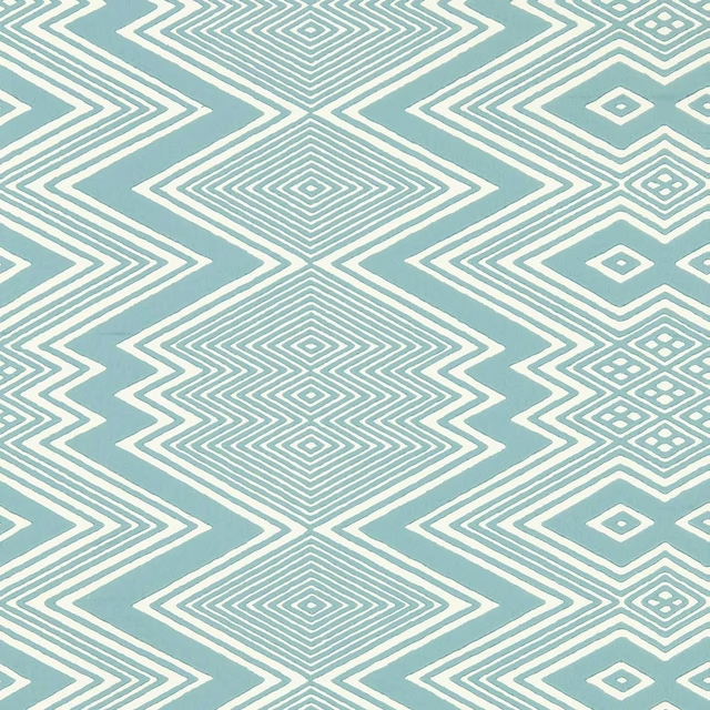
Ankara Sky/Awakening
Colour 2 Wallpapers
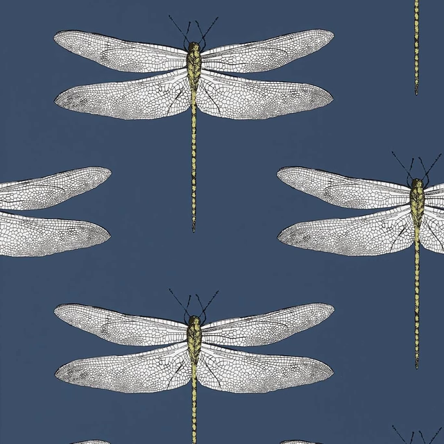
Demoiselle Ink/Chartreuse
Colour 2 Wallpapers
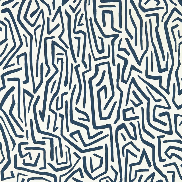
Melodic Wide Width Japanese Ink/Origami
Colour 2 Wallpapers
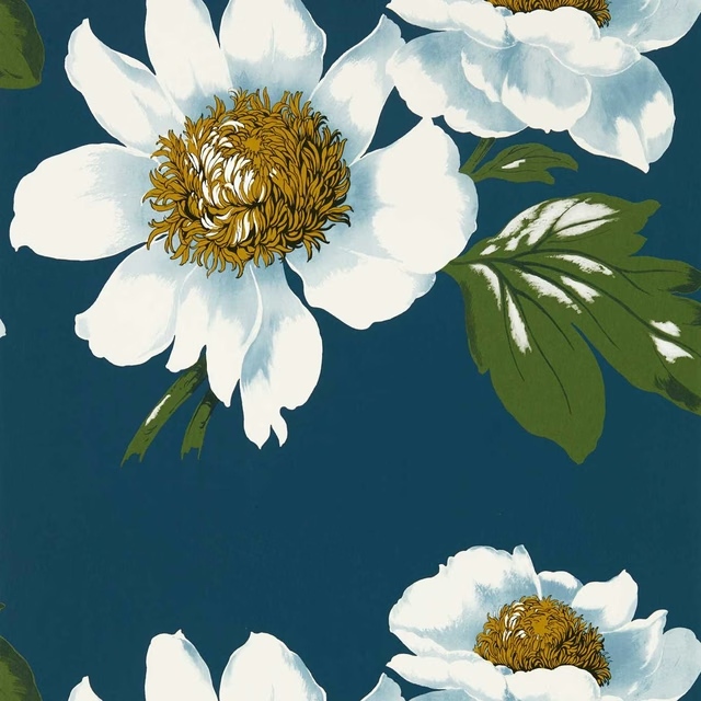
Paeonia Wide Width Azurite/Meadow/Nectar
Colour 2 Wallpapers
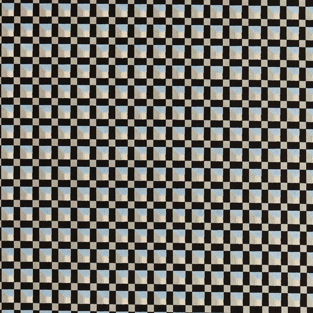
Blocks Cornflower/Black Earth
Colour 3 Fabrics
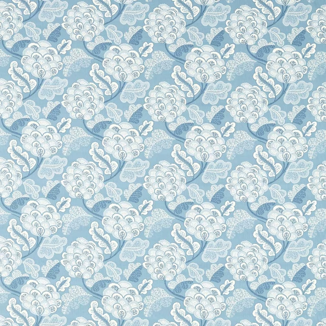
Flourish Celestial/First Light
Colour 3 Fabrics
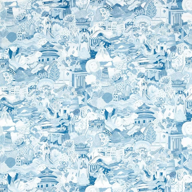
Journey of Discovery Wild Water/Exhale
Colour 3 Fabrics
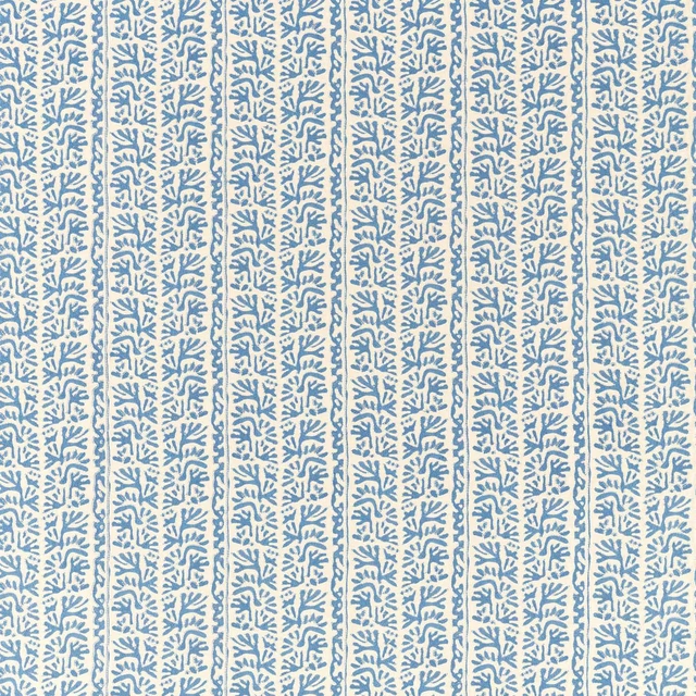
Khorol Cornflower/Incense
Colour 3 Fabrics