
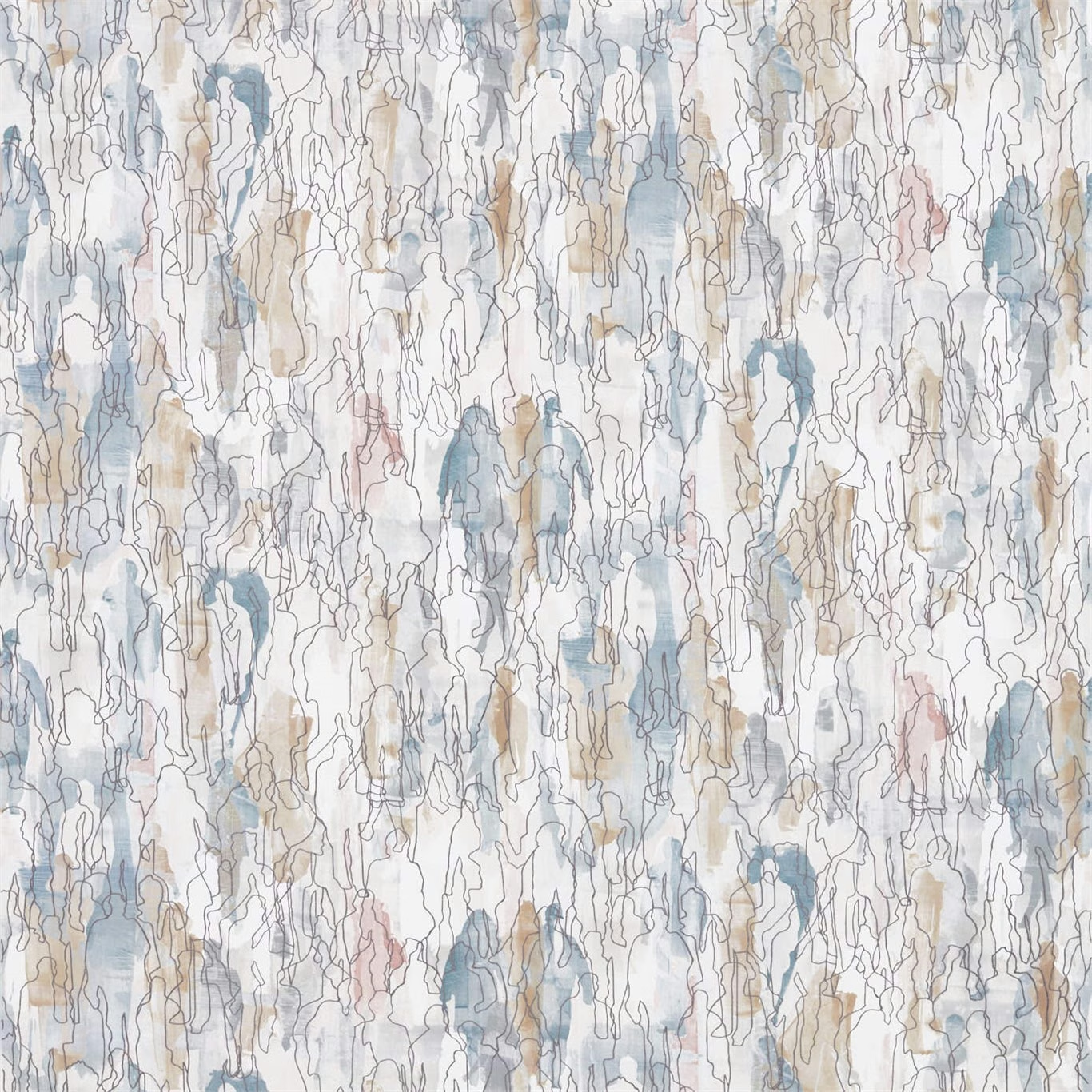

Tap the swatch to see it full screen. Hover it to magnify the weave. Colours on a screen are a guide, not a match, so come and feel the real cloth.
Scroll up or down to zoom in and out.
Multitude Seaglass/Chalk
Entity Edit FabricHAF0227-03
The house has discontinued this one. We are keeping the page so the link still works, but we can no longer order it. There are alternatives below, and if you have a cutting or a photograph we will help you match it.
Multitude Seaglass/Chalk from Harlequin’s Entity Edit collection layers pale seaglass blue, chalk white and soft taupe across a densely drawn abstract design. Fine, irregular outlined forms run vertically through the colourway, with occasional muted blush accents adding warmth.
Your board
0 fabrics
See this fabric on Harlequin's own site, then order it through us.
About this fabric
This 305gsm fabric has a useable width of 137cm and a listed thread count of 129 threads per cm, giving the cloth a substantial mid-weight specification suited to both upholstery and drapery. The pattern repeat measures 46.7cm vertically and 137cm horizontally, creating a continuous full-width composition of watery blue shapes, chalky open areas and slim taupe linework. Its cool seaglass tones remain soft rather than saturated, while the pale ground lets the layered outlines and translucent-looking colour patches stay clearly visible. A standard length of 35m is supplied for larger-scale interior projects.
How to use it
Pair this cool seaglass and chalk colourway with warm ivory, pale timber and brushed nickel for a light, coastal-modern scheme. Use the taupe and restrained blush details to connect it with natural beige upholstery or softly coloured accessories.
Use this cool seaglass, chalk and taupe colourway to bring gentle movement to upholstery, curtains or cushions.
More from Entity Edit
The same book, other colourways.
Entity Brick/Denim
Entity Edit
Entity Emerald/Ochre
Entity Edit
Estrato Denim/Nude/Sky
Entity Edit
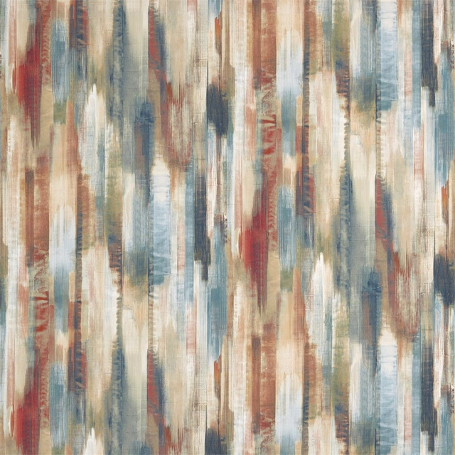
Estrato Rust/Ruby/Nordic Blue
Entity Edit
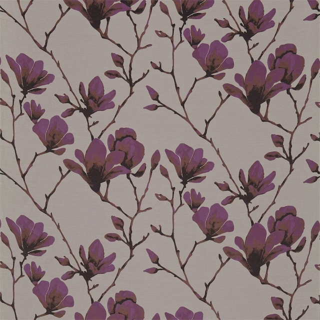
Lotus Bronze/Magenta
Entity Edit
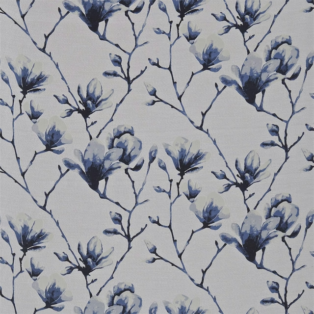
Lotus Indigo/Silver
Entity Edit
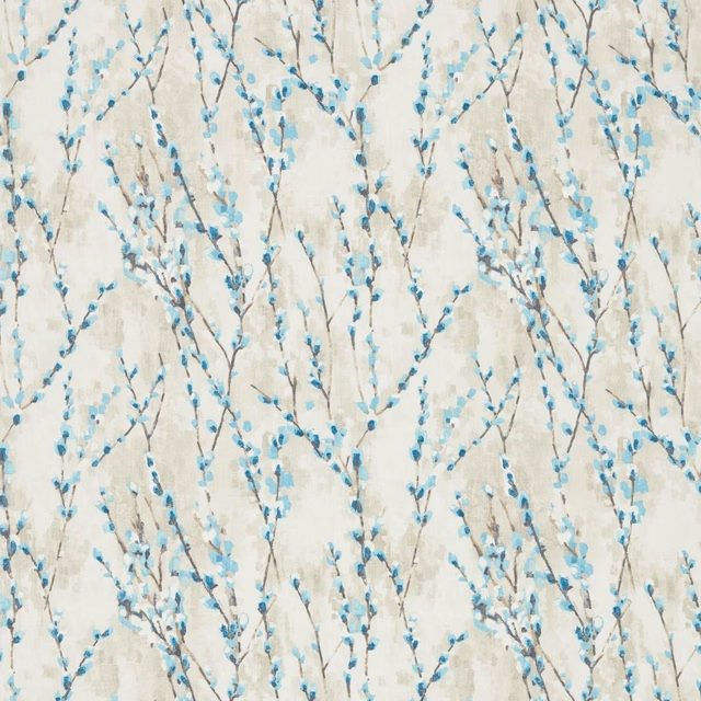
Salice Marine
Entity Edit
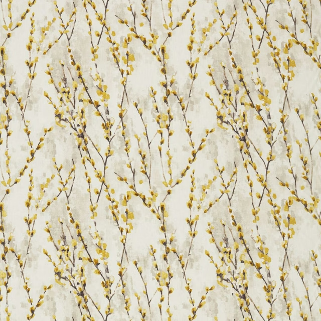
Salice Mustard
Entity Edit
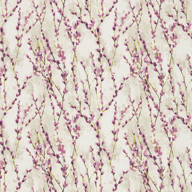
Salice Plum
Entity Edit
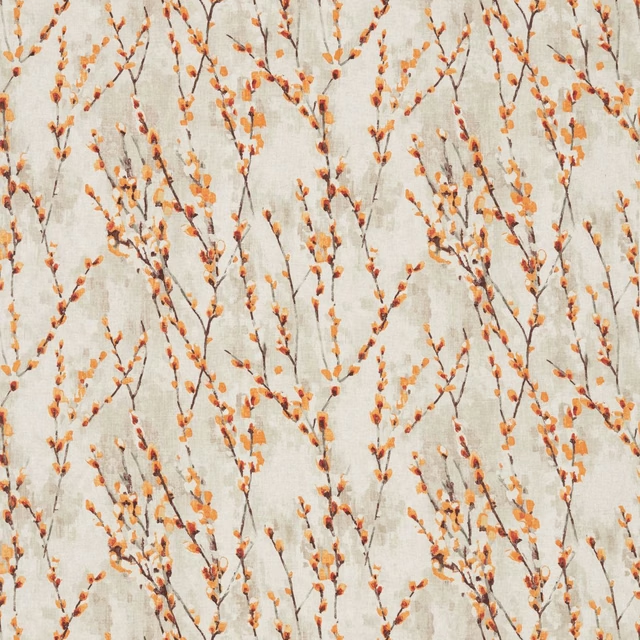
Salice Tangerine
Entity Edit
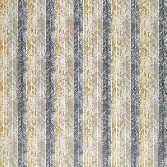
Walchia Charcoal / Mocha / Brass
Entity Edit
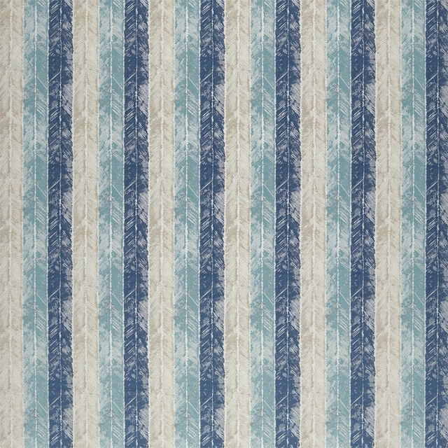
Walchia Indigo / Sky / Shell
Entity Edit
Pairs well with
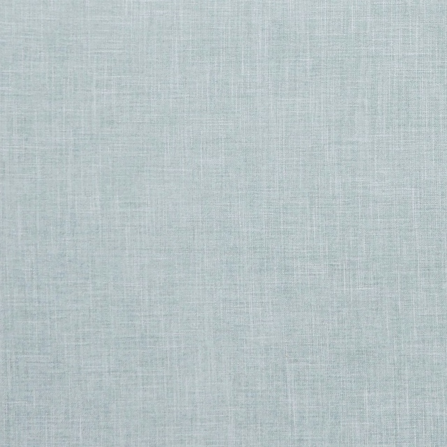
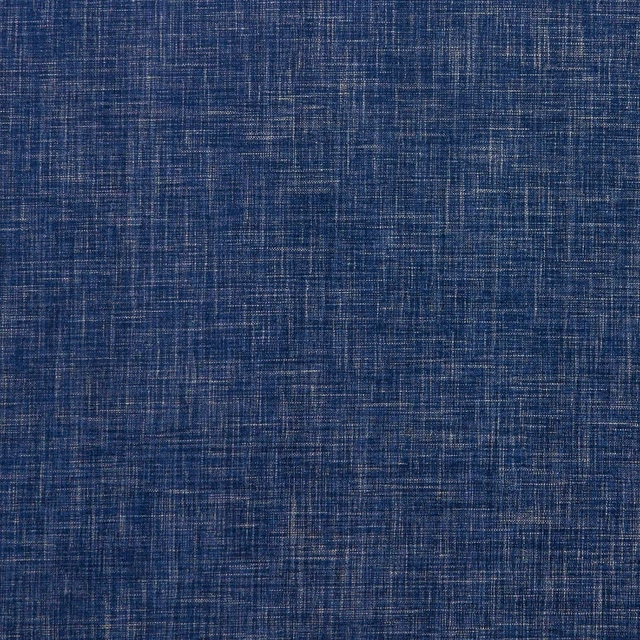
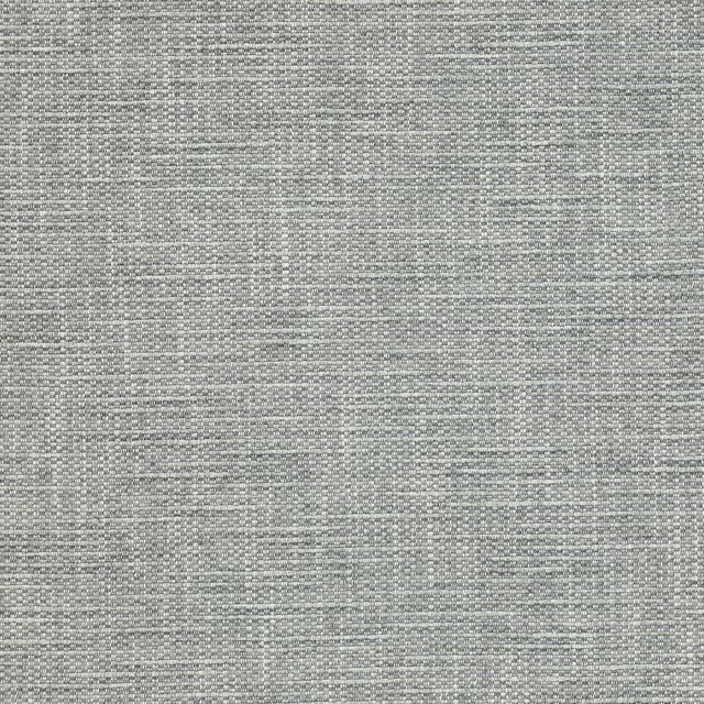
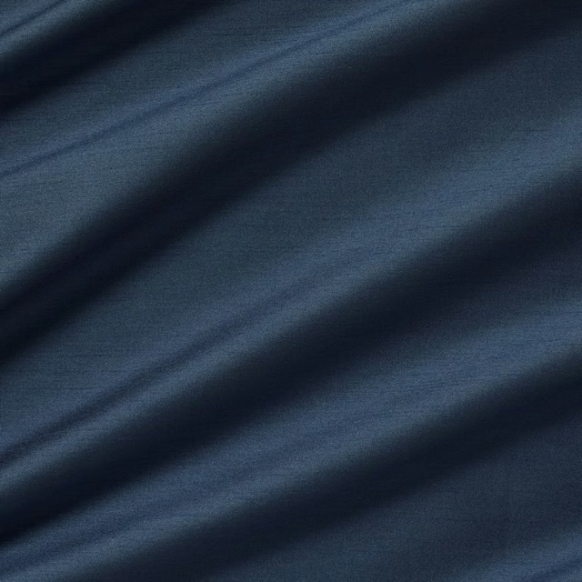
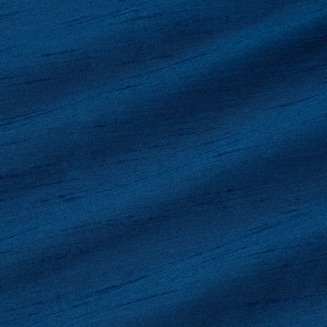
A pattern needs somewhere for the eye to rest, so these are the plains and textures that sit beside Multitude Seaglass/Chalk without fighting it. Mixed across the houses we hold, which is the part a single supplier's book cannot do.


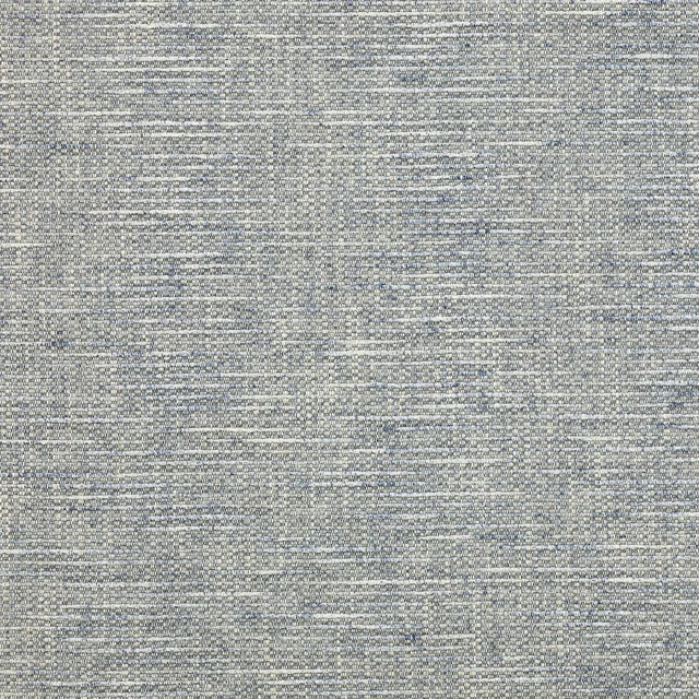
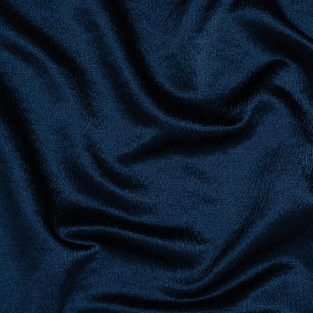
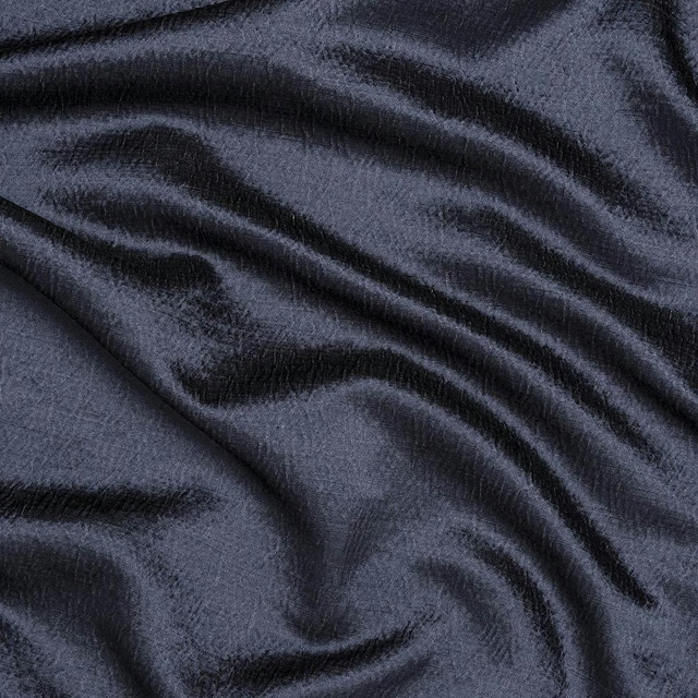

Paint that goes with it
Two ways to take the room. Both colours are from houses we hold, so a pot can come off the same order as the cloth. Screens shift colour, so treat these as a direction and bring the cloth to the shelf before you buy the paint.
To sit quietly behind it
Flint Grey
Zoffany · #d0d0ce
To stand against it
Webbs Blue
Morris & Co. · #5a6e77
Other blue fabrics
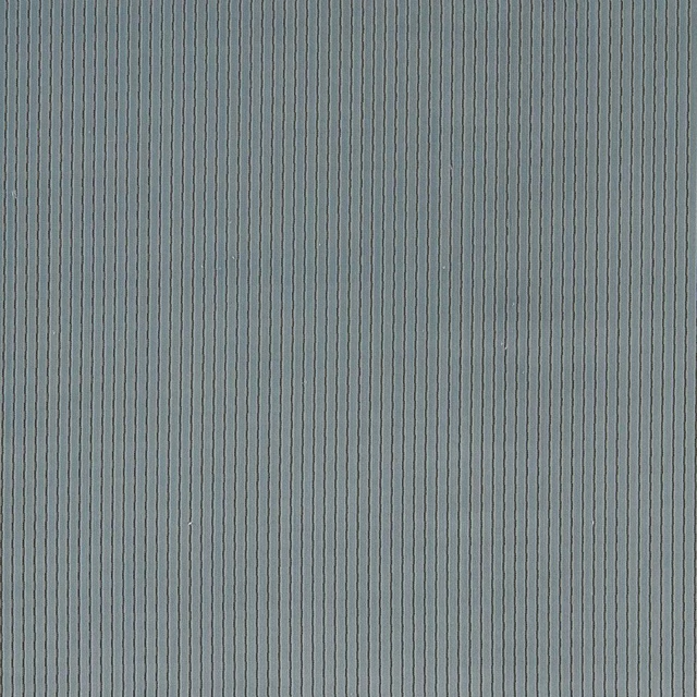
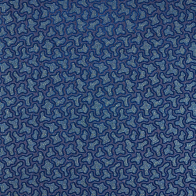
Across the houses we hold. See all 7,254.
Karst Sky
Defined Momentum Velvets
Molten Lapis/Cinnabar
Defined Momentum Velvets
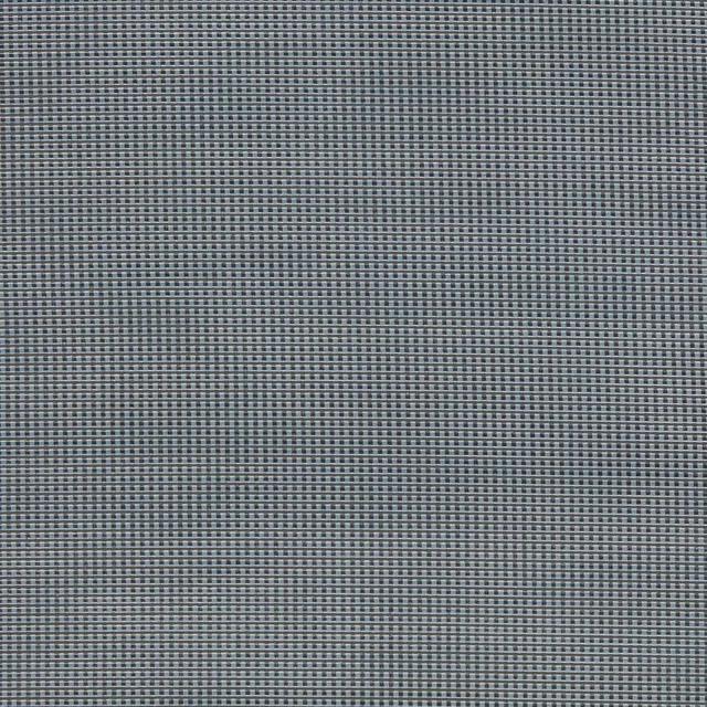
Ore Kyanite
Defined Momentum Velvets
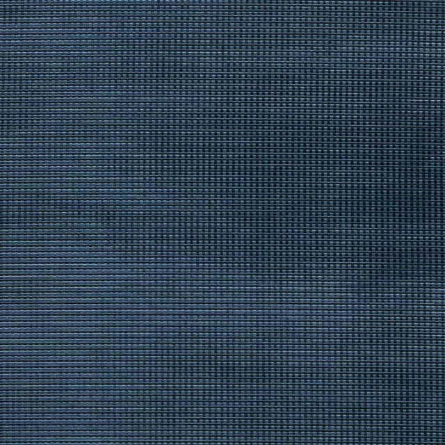
Ore Sapphire
Defined Momentum Velvets
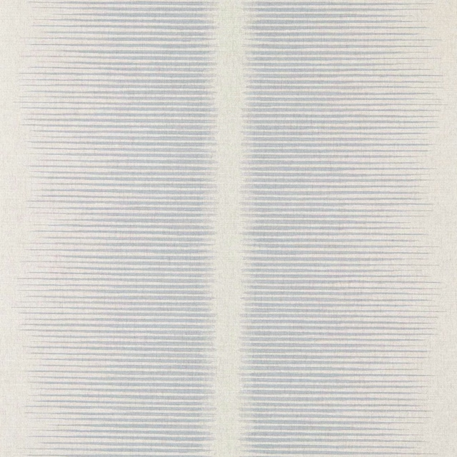
Chaco Sky
Defined Momentum Wallcoverings
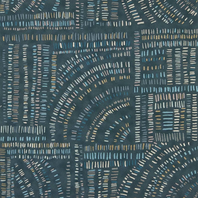
Frescoes Sapphire/Kyanite/Quartz
Defined Momentum Wallcoverings
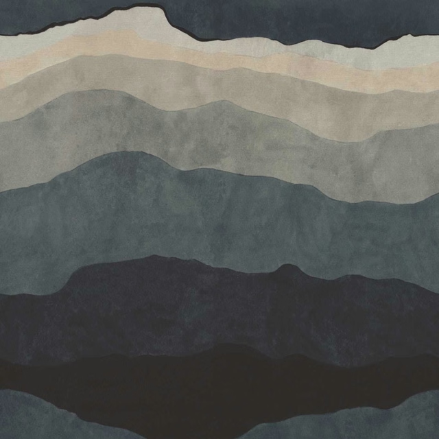
Sedimentary Midnight
Defined Momentum Wallcoverings
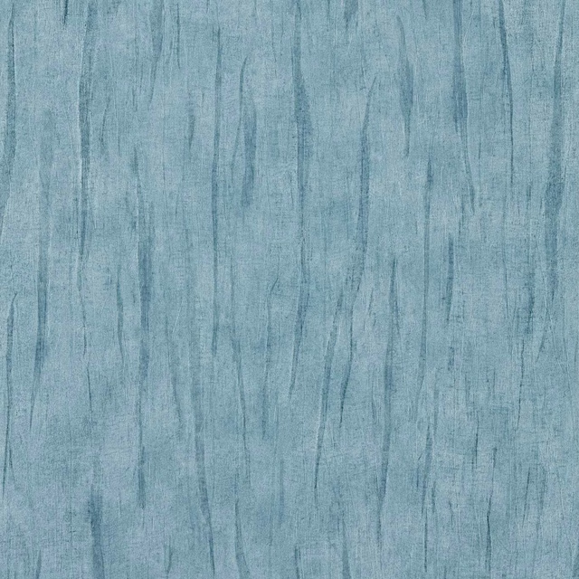
Tule Zircon
Defined Momentum Wallcoverings
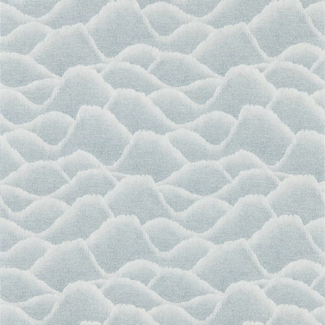
Zuni Dawn
Defined Momentum Wallcoverings
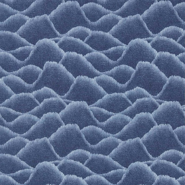
Zuni Midnight
Defined Momentum Wallcoverings
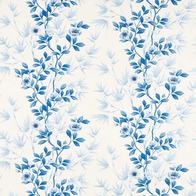
Lady Alford Porcelain / China Blue
Harlequin X Diane Hill Fabrics
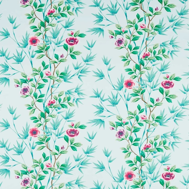
Lady Alford Sky/Magenta
Harlequin X Diane Hill Fabrics