
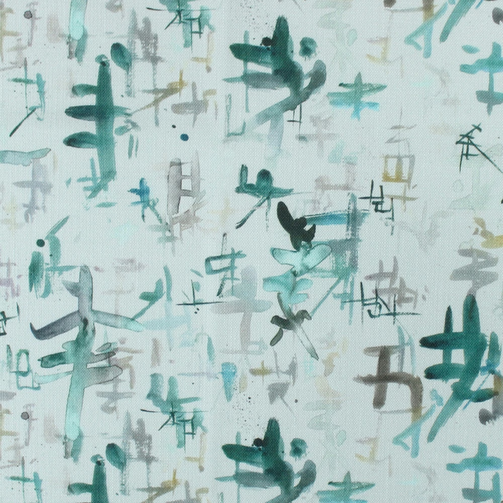

Tap the swatch to see it full screen. Hover it to magnify the weave. Colours on a screen are a guide, not a match, so come and feel the real cloth.
Scroll up or down to zoom in and out.
Imperial Emerald
Misc Fabricimperia/fa1/eme
Imperial Emerald has a pale, watery ground with loose brushy marks in blue-green, soft grey and charcoal. The overall effect is airy and painterly, with the colour sitting lightly across the surface rather than feeling dense.
You have used your previews for today. Send one to Simon and you can carry on.
Your board
0 fabrics
Part of the range we hold from Voyage Maison.
See Imperial Emerald in your own room
A photograph of the piece you want re-covered. Straight on is best, and daylight helps. It is used to make your picture and nothing else.
Looking at your room
We found things here Imperial Emerald could go on. Tap one on the photograph, or choose below.
We could not see anything to re-cover
, s
Imperial Emerald, on your
Drag to compare. AI impression, colours indicative: ask us for a cutting before you decide.
About this fabric
Woven in 82% viscose and 18% linen, this fabric has a smooth, lightly textured handle that suits both upholstery and drapery. The 138cm width gives useful coverage for larger projects, while the 44cm horizontal and 29cm vertical repeat supports the scattered abstract layout shown here. In this colourway, the blue reads cool and fresh, lifted by milky pale tones and small inky accents that keep the design from feeling flat. Spot clean only and do not iron, so it is best kept in gentle domestic use rather than hard-wearing applications.
How to use it
Use Imperial Emerald to soften a contemporary room with pale oak, brushed nickel and off-white walls. The cool blue-green marks work especially well when you want pattern without visual weight.
Pair it with pale timber and chalky neutrals to let the painterly blue marks stay fresh and airy.
More from Misc
The same book, other colourways.
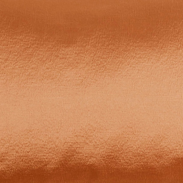
Glaze Rust
Misc
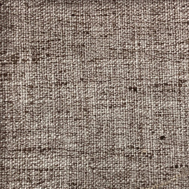
Helmsley Acorn
Misc
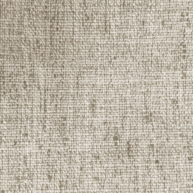
Helmsley Biscuit
Misc
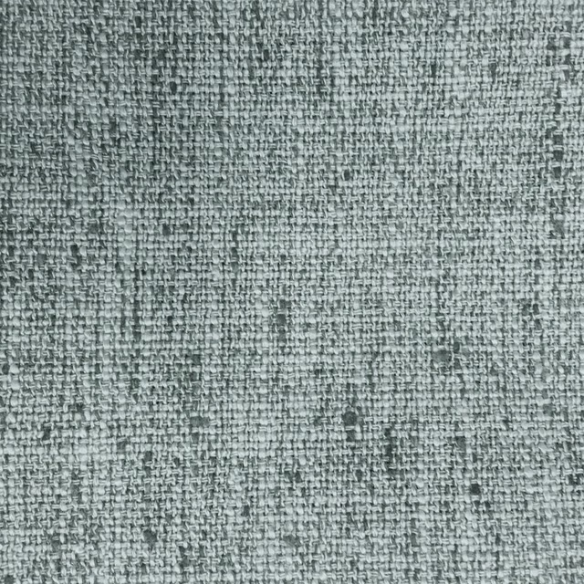
Helmsley Aluminium
Misc
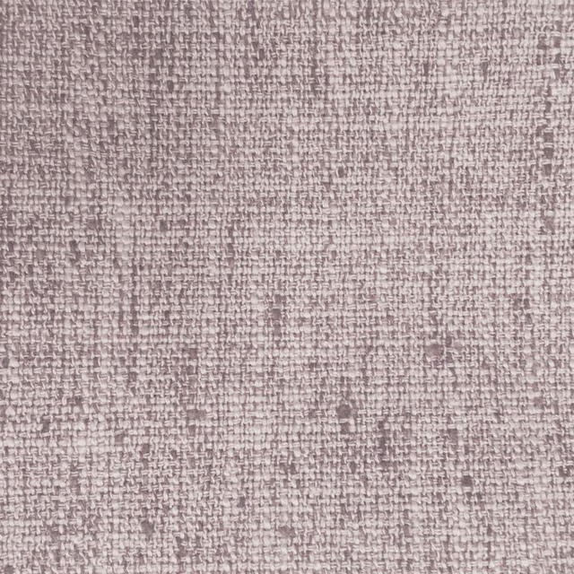
Helmsley Blossom
Misc
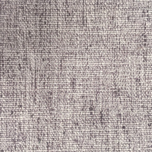
Helmsley Heather
Misc
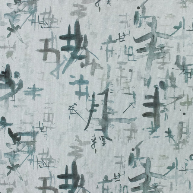
Imperial Bamboo
Misc
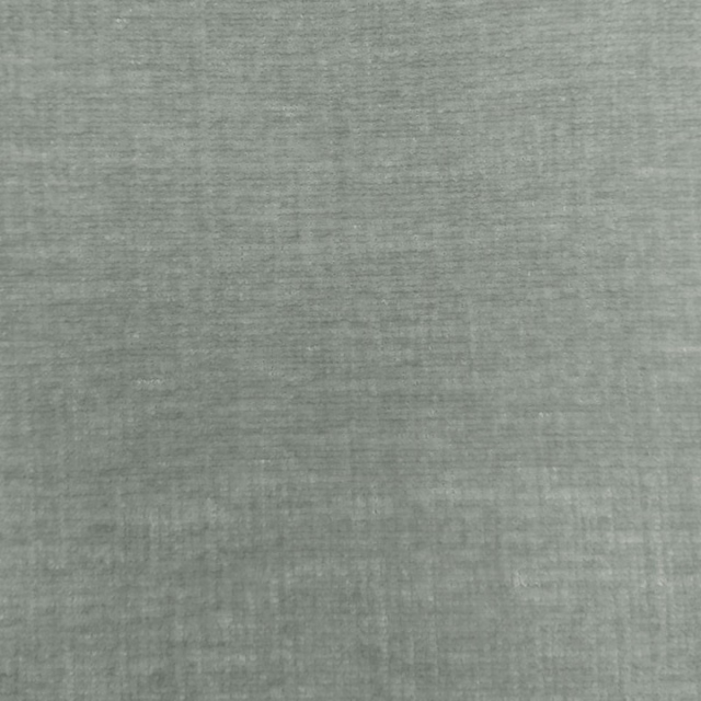
Isernia Mist
Misc
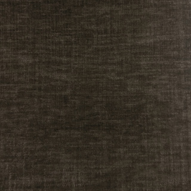
Isernia Bark
Misc
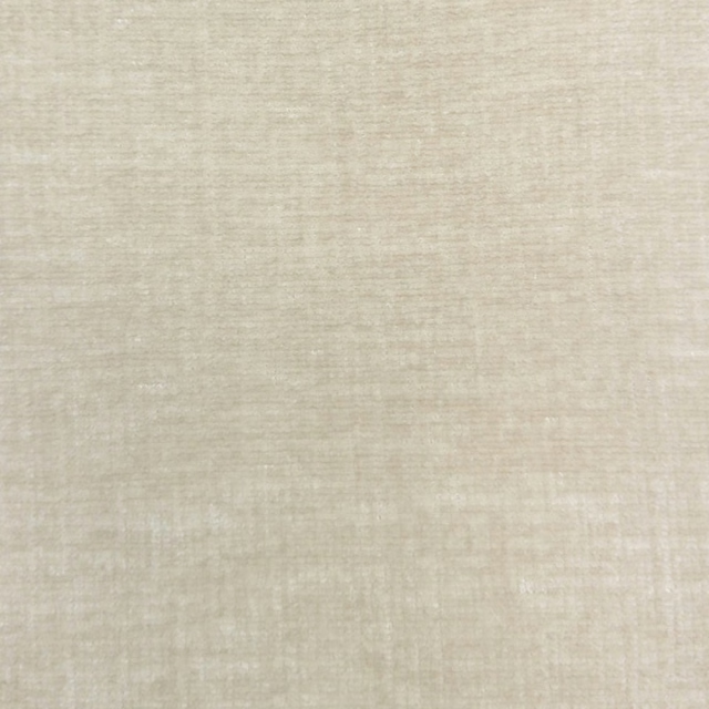
Isernia Ivory
Misc
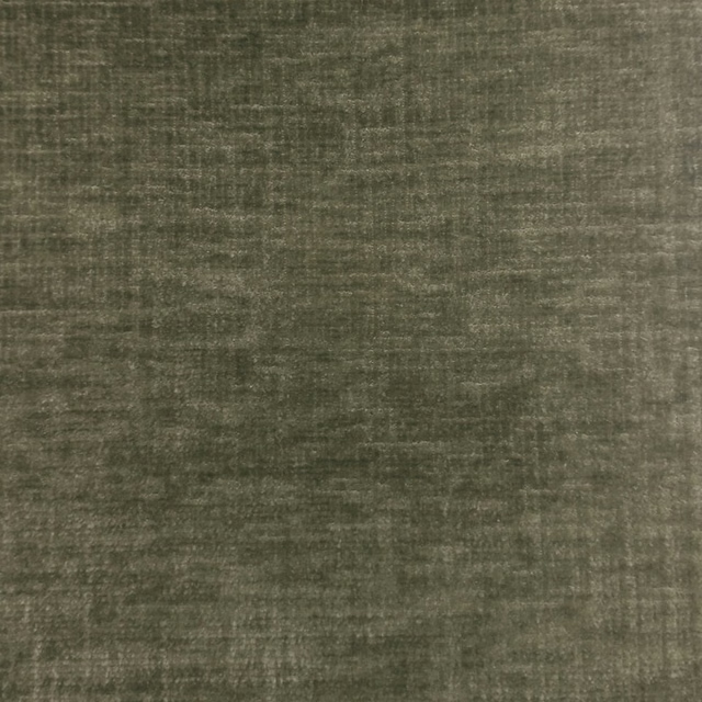
Isernia Earth
Misc
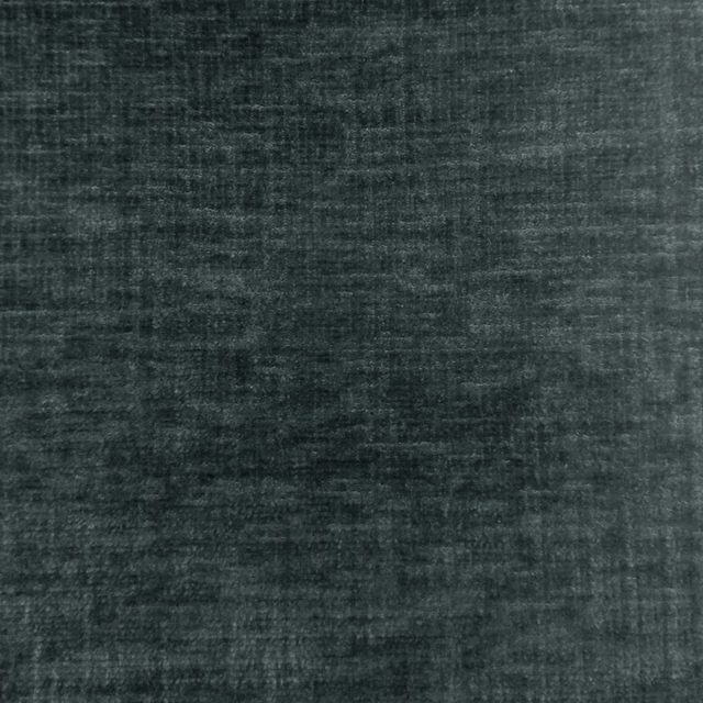
Isernia Charcoal
Misc
Pairs well with
A pattern needs somewhere for the eye to rest, so these are the plains and textures that sit beside Imperial Emerald without fighting it. Mixed across the houses we hold, which is the part a single supplier's book cannot do.
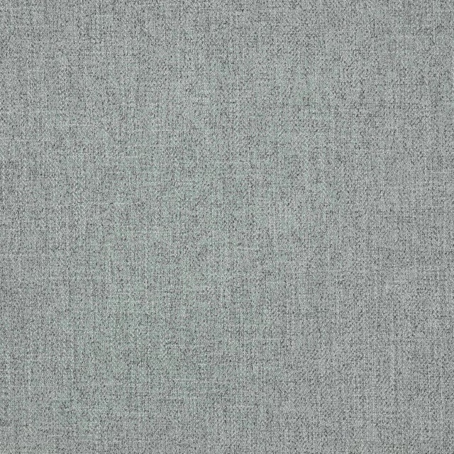
Asta Sea Blue
Asta
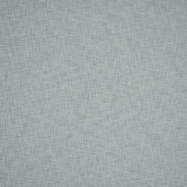
Huxley Sea Blue
Huxley
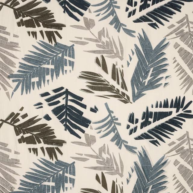
Zoe Sea Blue
Brasilia
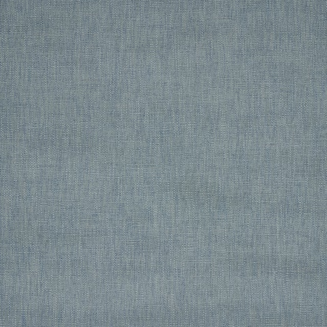
Machu Sea Blue
Misti
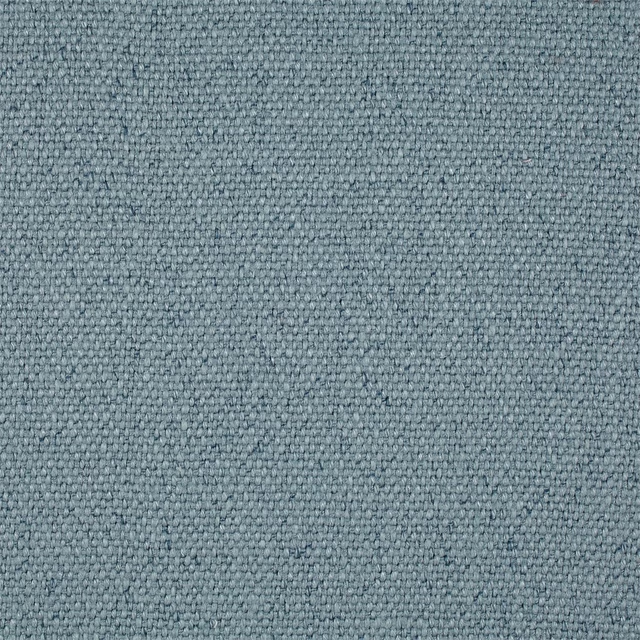
Woodland Plain Sea Blue
Melford Weaves
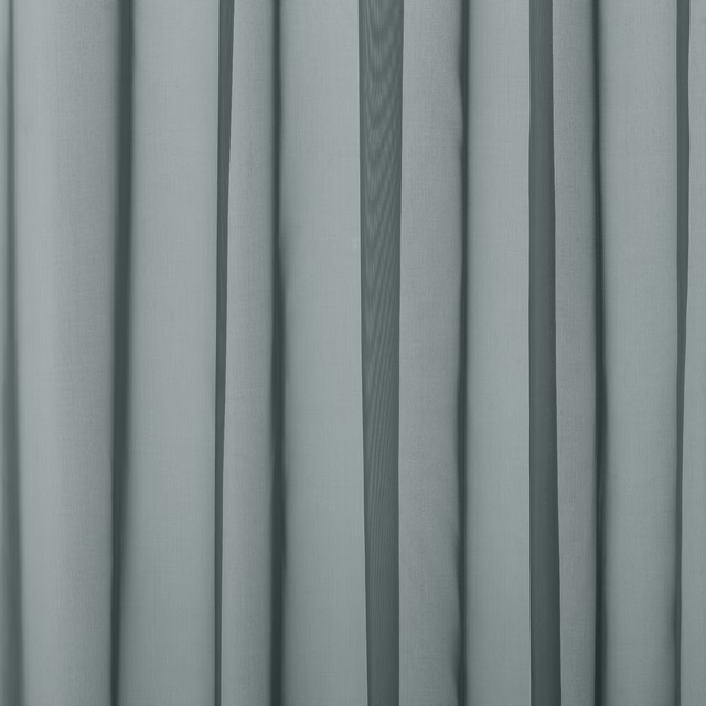
Baltic Sky
Atlantic Collection

Bronte Mineral
Darwin Collection
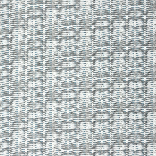
Barbade Turquoise
Nouveaux Mondes Fabrics

Albany Denim
Albany and Moray
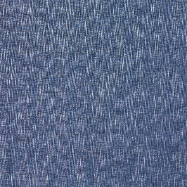
Moray Denim
Albany and Moray
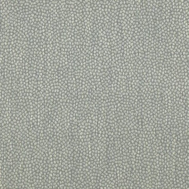
Lyncombe Aqua
Albeck
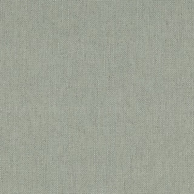
Marldon Pale Aqua
Albeck
Paint that goes with it
Two ways to take the room. Both colours are from houses we hold, so a pot can come off the same order as the cloth. Screens shift colour, so treat these as a direction and bring the cloth to the shelf before you buy the paint.
To sit quietly behind it
Ceramic Blue
Sanderson · #adc2bd
To stand against it
Scree
Little Greene · #595a57
Other blue fabrics
Across the houses we hold. See all 7,566.
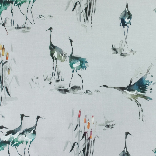
Cranes Cobalt
Kyotogardens
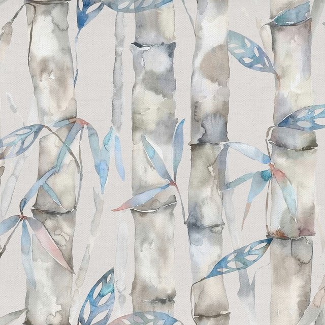
Kanto Cobalt
Kyotogardens
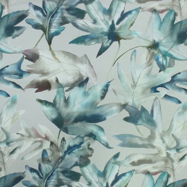
Kimino Cobalt
Kyotogardens
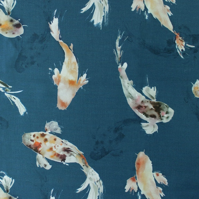
Koicarp Cobalt
Kyotogardens
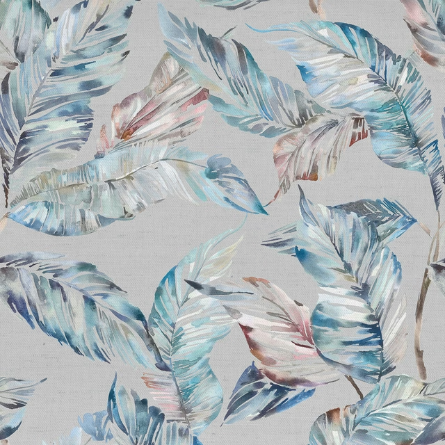
Mizuna Cobalt
Kyotogardens
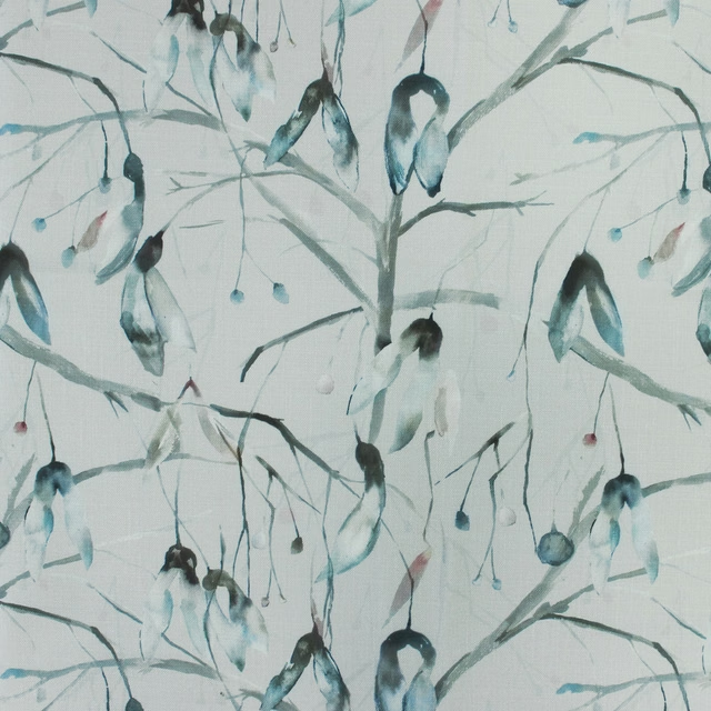
Nara Cobalt
Kyotogardens
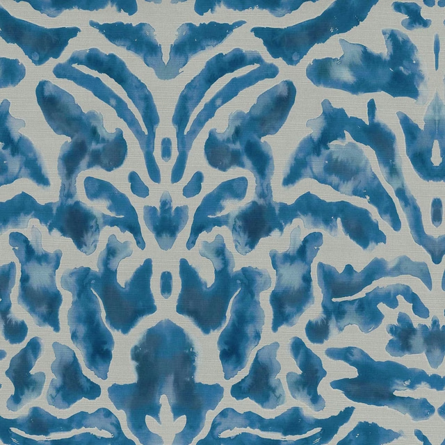
Nikko Cobalt
Kyotogardens
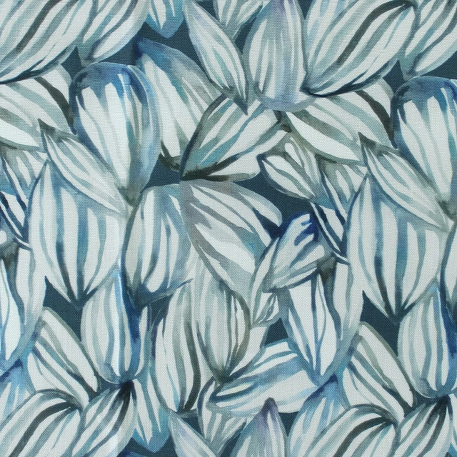
Topia Cobalt
Kyotogardens
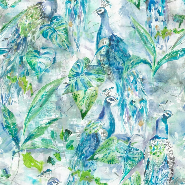
Ebba Sage
Midnightreflections
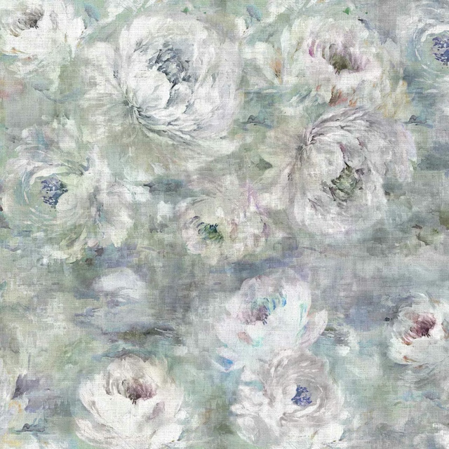
Roseum Agate
Midnightreflections
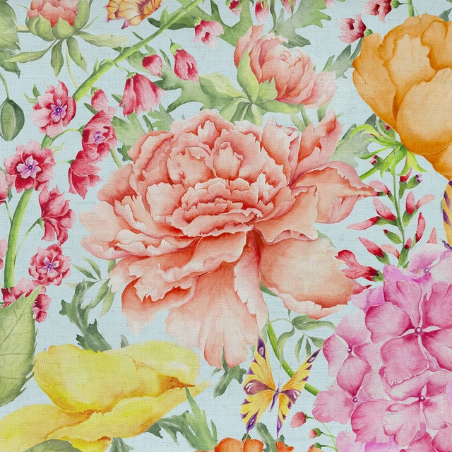
Idalia Duck Egg Blue
Midsummer Meadows
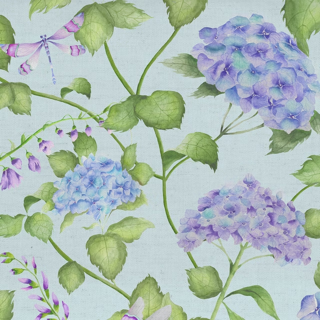
Sylvana Duck Egg Blue
Midsummer Meadows