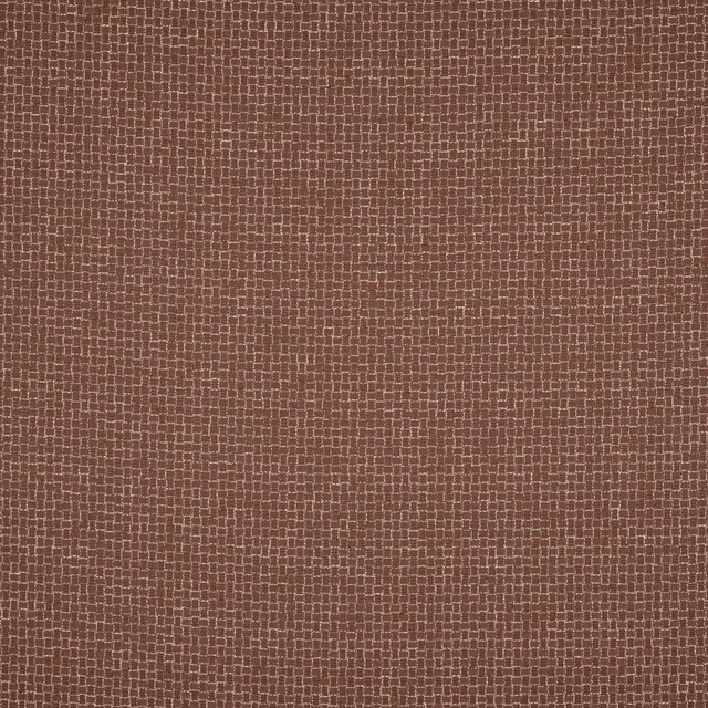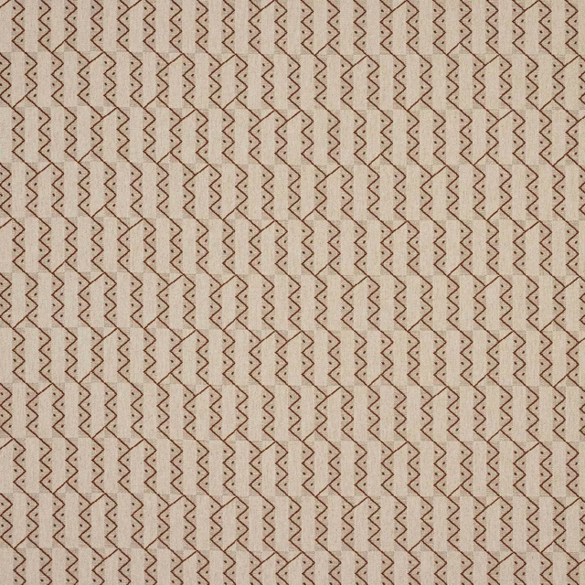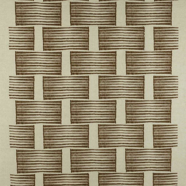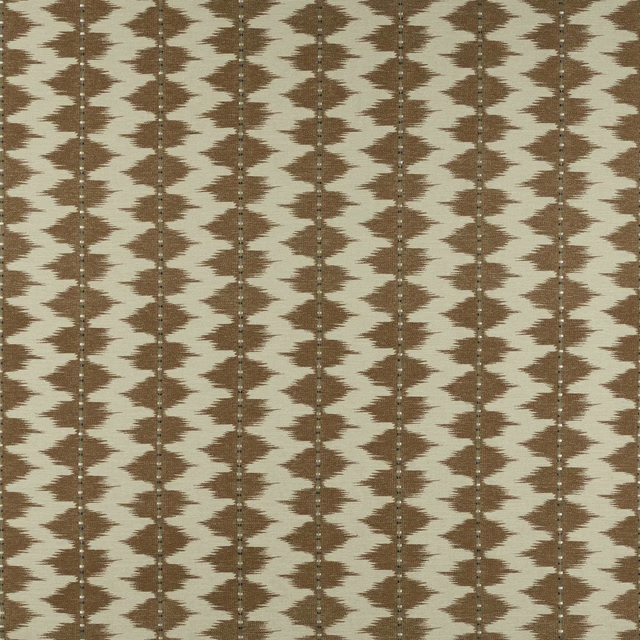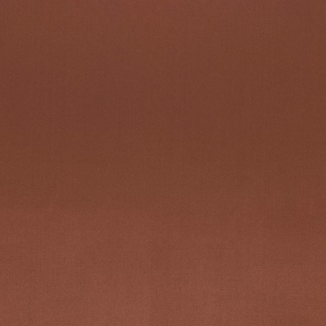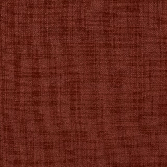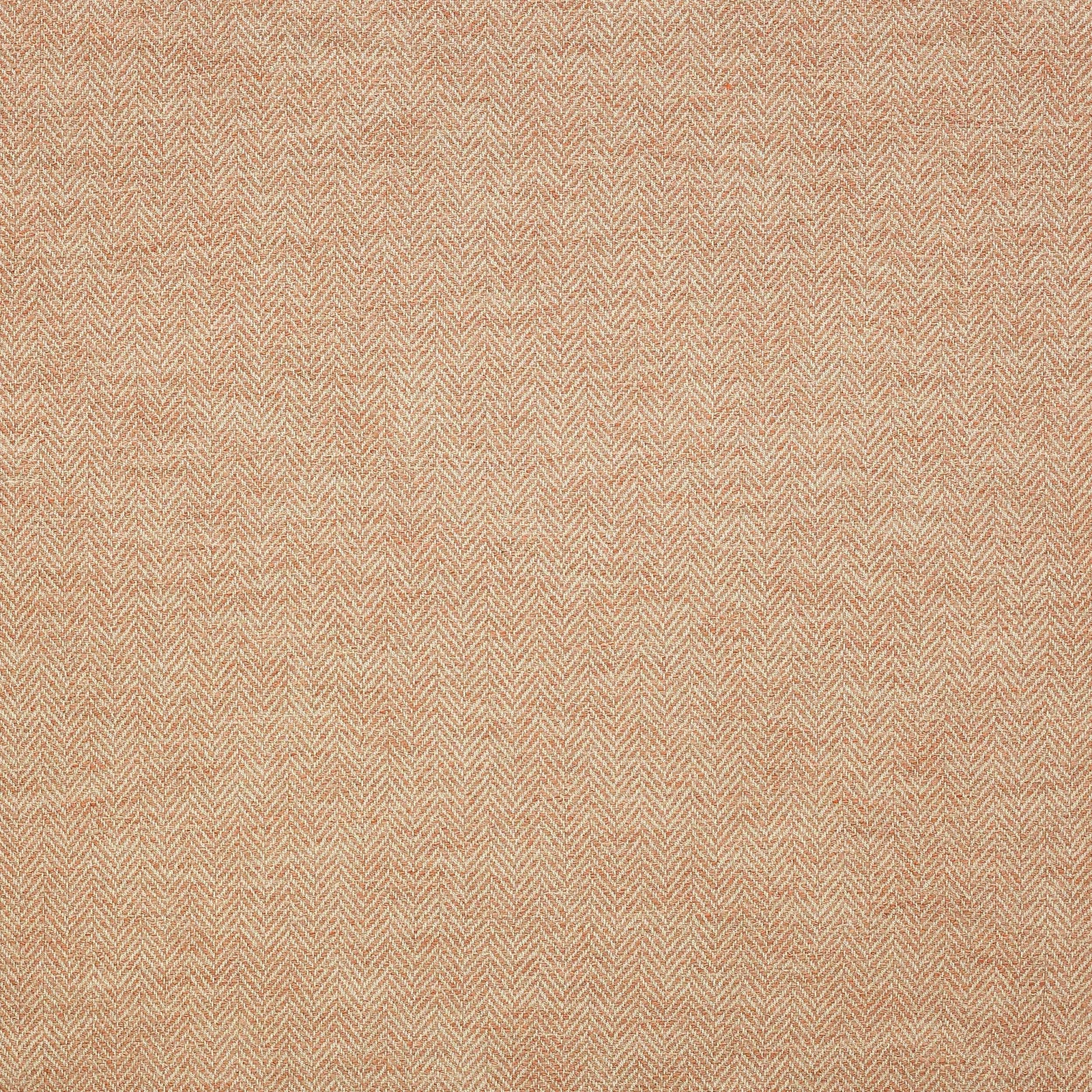

Tap the swatch to see it full screen. Hover it to magnify the weave. Colours on a screen are a guide, not a match, so come and feel the real cloth.
Scroll up or down to zoom in and out.
Bowler Spice
Paxton FabricL9238-04
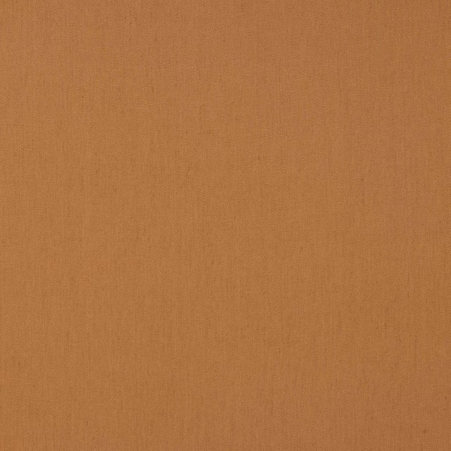
Bowler Spice shows a fine, tightly worked herringbone with a dry, softly mottled surface and a warm spice tone. The pattern reads quietly across the cloth, with lighter threads catching the light against a mellow peach-terracotta ground.
You have used your previews for today. Send one to Simon and you can carry on.
Your board
0 fabrics
See this fabric on Larsen's own site, then order it through us.
See Bowler Spice in your own room
A photograph of the piece you want re-covered. Straight on is best, and daylight helps. It is used to make your picture and nothing else.
Looking at your room
We found things here Bowler Spice could go on. Tap one on the photograph, or choose below.
We could not see anything to re-cover
, s
Bowler Spice, on your
Drag to compare. AI impression, colours indicative: ask us for a cutting before you decide.
About this fabric
Bowler Spice from Larsen’s Paxton collection is a woven fabric with a subtle chevron structure and an approximate repeat of V 1cm / H 6cm. The blend of 43% linen, 21% wool, 18% cotton, 7% bamboo, 6% polyester and 5% polyamide gives the cloth its softly textured, lightly rustic handle. Visually, this colourway sits in a muted terracotta family with apricot, sand and cinnamon undertones rather than a strong orange cast. The pattern is small in scale and the overall effect is understated, with enough texture to add interest without overpowering nearby finishes. At approximately 134cm wide and marked √BM, it suits considered interior applications where a warm, natural look is wanted.
How to use it
Use Bowler Spice to bring warmth to pale oak, plaster pink or limestone interiors, where its soft peachy spice tone can add depth without feeling heavy. It would also pair neatly with muted greens or woven neutrals, letting the fine chevron texture provide quiet movement.
A warm herringbone-like weave that works well on an upholstered chair or soft curtain.
More from Paxton
The same book, other colourways.
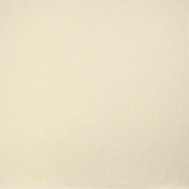
Albers Snow
Paxton
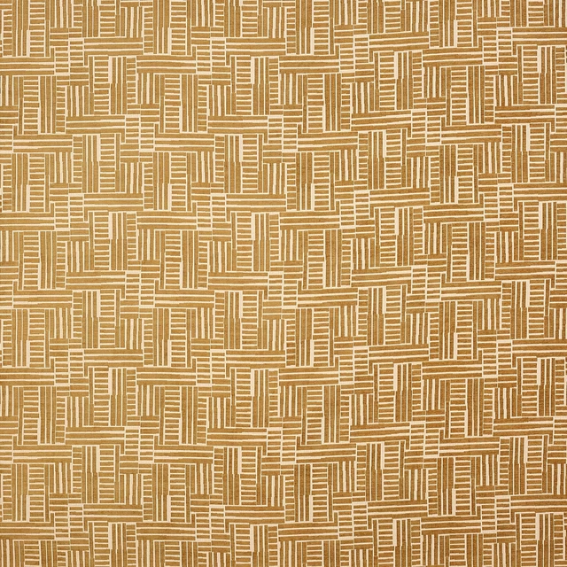
Albers Tobacco
Paxton
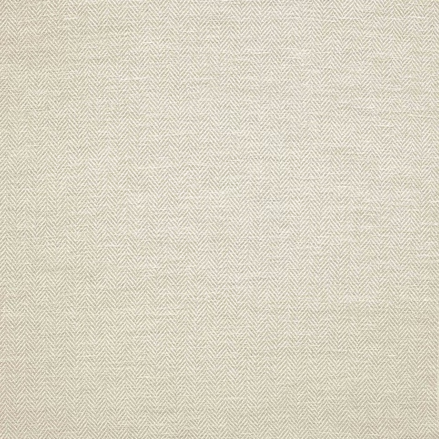
Bowler Birch
Paxton
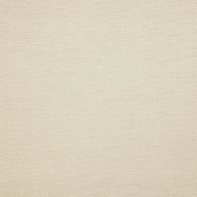
Bowler Clay
Paxton
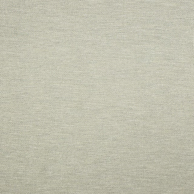
Bowler Glass
Paxton
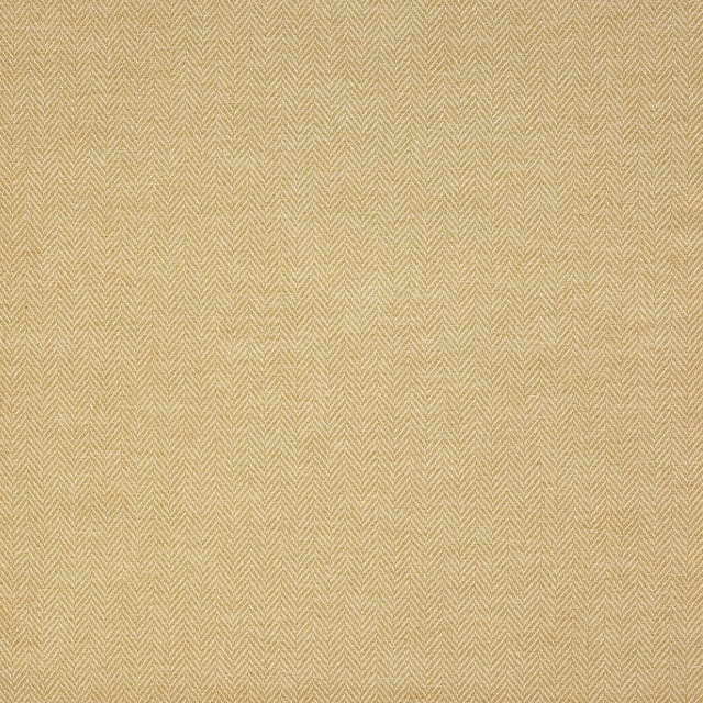
Bowler Honey
Paxton
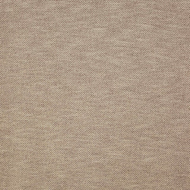
Bowler Wood
Paxton
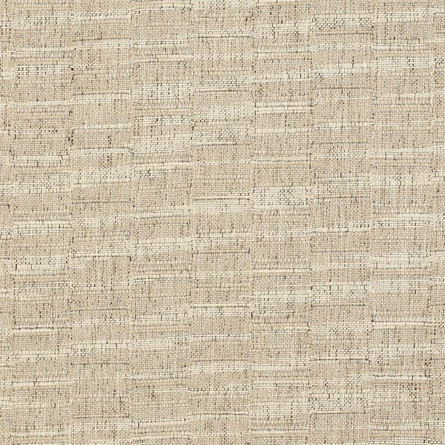
Horato Gull
Paxton
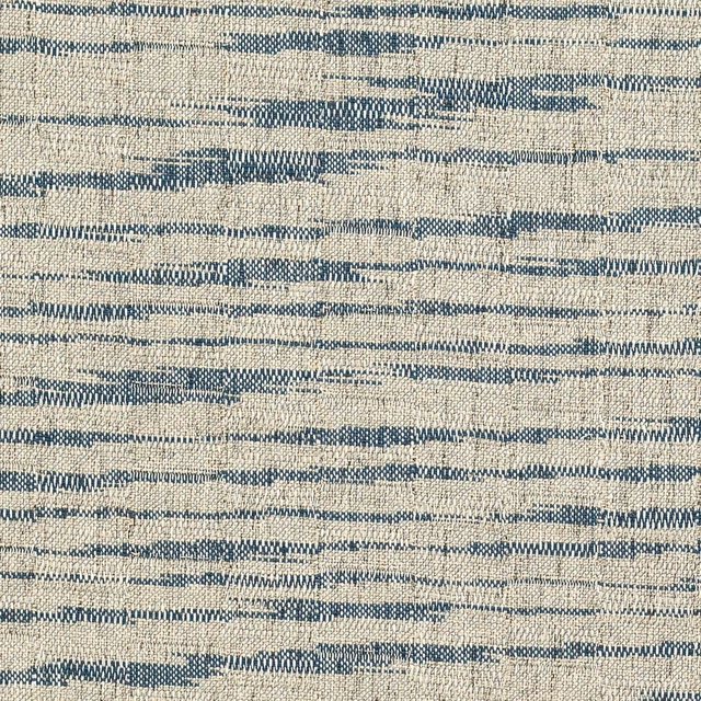
Horato Indigo
Paxton
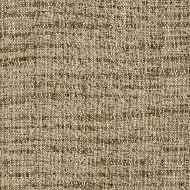
Horato Sage
Paxton
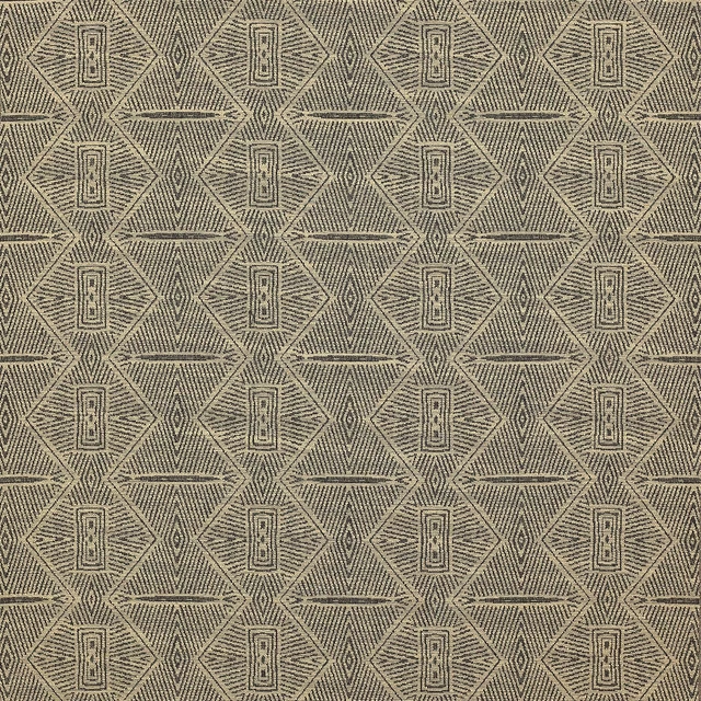
Horta Bark
Paxton
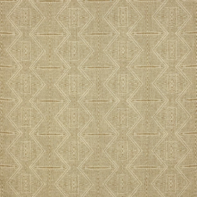
Horta Bronze
Paxton
Pairs well with
A pattern needs somewhere for the eye to rest, so these are the plains and textures that sit beside Bowler Spice without fighting it. Mixed across the houses we hold, which is the part a single supplier's book cannot do.
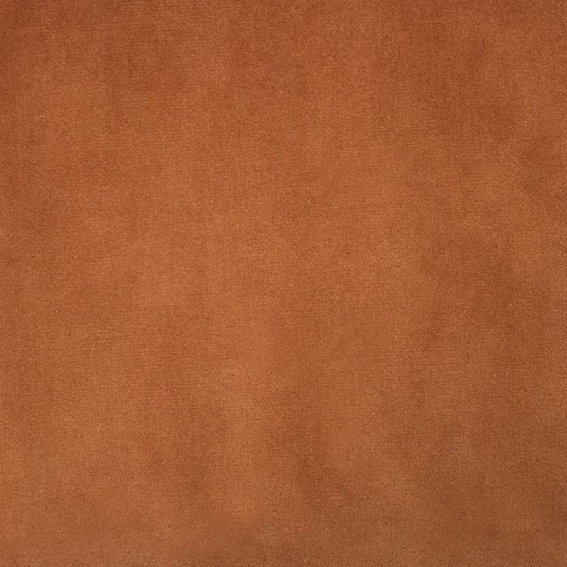
Alaska Rust
Alaska Collection

Alie Coral
Essential Weaves Vol 2
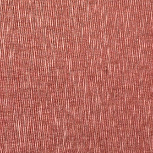
Moray Spice
Albany and Moray
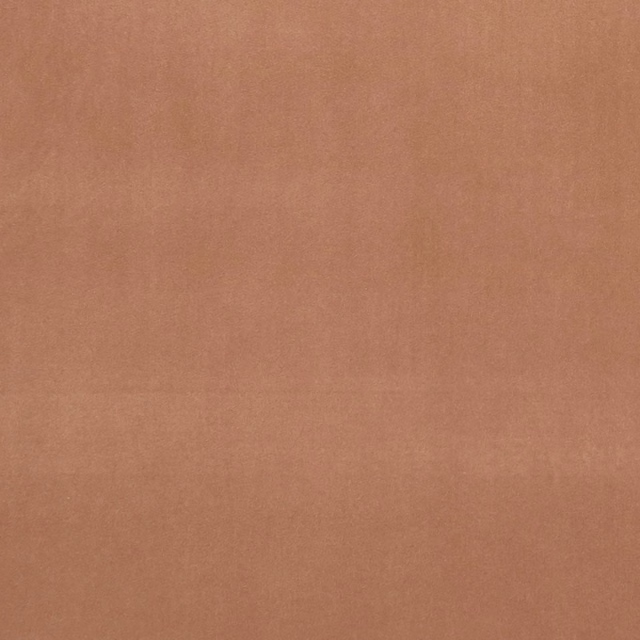
Alvar Sienna
Alvar 2
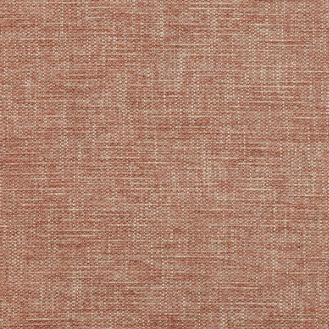
Brandon Terracotta
Albeck
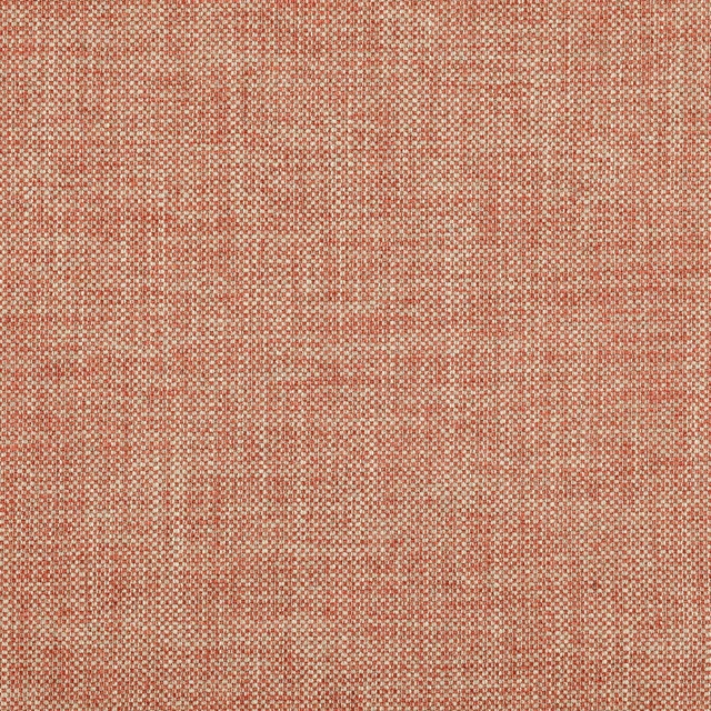
Marldon Brick Red
Albeck
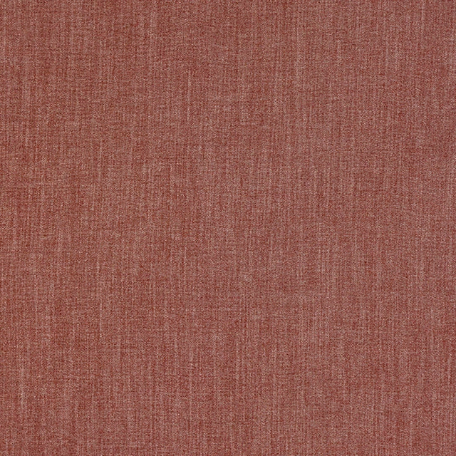
Monza Spice
Arezzo
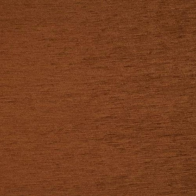
Kensington Spice
Brodsworth
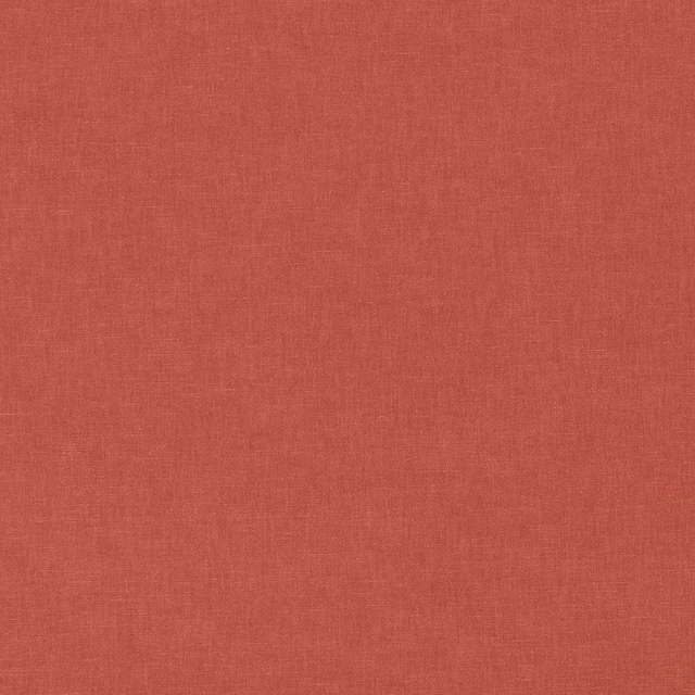
Ario Cameo
Ario
Ario Wide Width Cameo
Ario
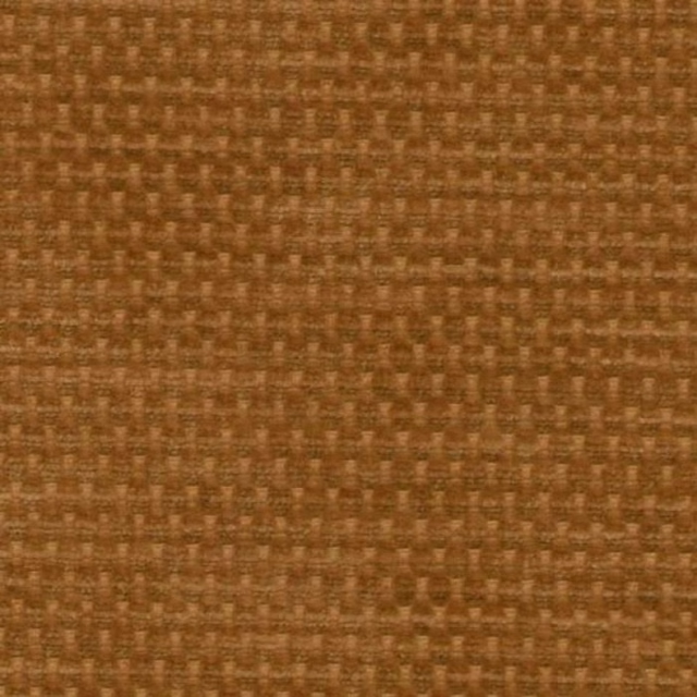
Evergreen Ginger
Evergreen
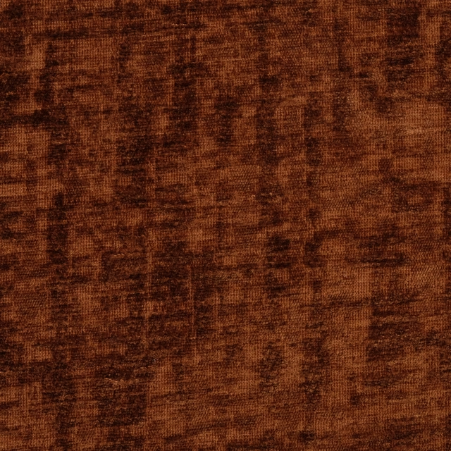
Mimosa Rust
Mimosa
Paint that goes with it
Two ways to take the room. Both colours are from houses we hold, so a pot can come off the same order as the cloth. Screens shift colour, so treat these as a direction and bring the cloth to the shelf before you buy the paint.
To sit quietly behind it
Sybil
Coat Paints · #c1a18c
To stand against it
Harbour Blue
Sanderson · #6b90a2
Other terracotta fabrics
Across the houses we hold. See all 1,701.