
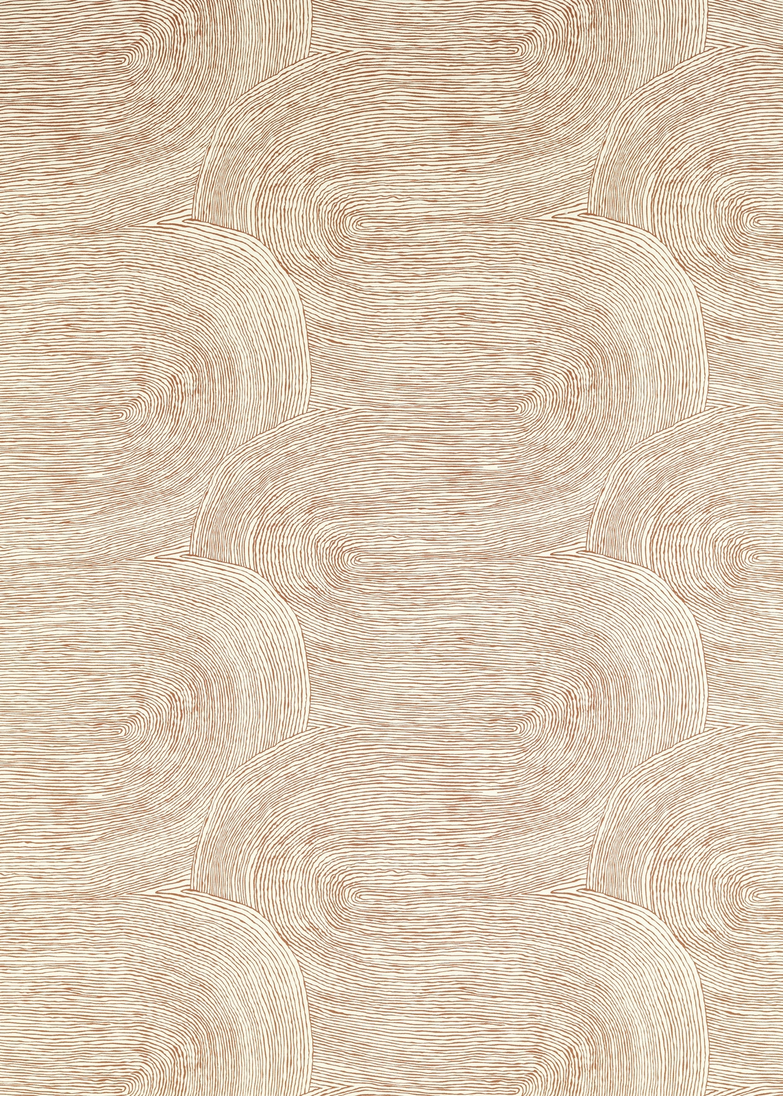

Tap the swatch to see it full screen. Hover it to magnify the weave. Colours on a screen are a guide, not a match, so come and feel the real cloth.
Scroll up or down to zoom in and out.
Nerikomi Terracotta
Harlequin x Henry Holland Fabrics FabricHAF0592-02
Nerikomi Terracotta pairs a pale, sun-warmed terracotta ground with broad, interlocking curves drawn in fine ivory lines. The softly tonal palette gives the large-scale design a calm, tactile presence rather than a high-contrast graphic effect.
You have used your previews for today. Send one to Simon and you can carry on.
Your board
0 fabrics
See this fabric on Harlequin's own site, then order it through us.
See Nerikomi Terracotta in your own room
A photograph of the piece you want re-covered. Straight on is best, and daylight helps. It is used to make your picture and nothing else.
Looking at your room
We found things here Nerikomi Terracotta could go on. Tap one on the photograph, or choose below.
We could not see anything to re-cover
, s
Nerikomi Terracotta, on your
Drag to compare. AI impression, colours indicative: ask us for a cutting before you decide.
About this fabric
The pattern is built from overlapping rounded forms, each filled with closely spaced, flowing lines that create a subtle ribbed appearance across the surface. In this colourway, muted terracotta, blush and beige tones sit beneath lighter linear detailing, giving the cloth gentle depth as the light moves across it. At 274 gsm with 127 threads per cm, it has a versatile mid-weight handle suited to both upholstery and drapery. The 137.5 cm usable width and 62.5 cm vertical by 68.7 cm horizontal repeat provide clear working dimensions for planning the sweeping motif.
How to use it
Use the warm pale terracotta tone on a statement occasional chair, headboard or full-length curtain, then balance it with chalky ivory, light oak and softly aged brass. Its low-contrast curves work especially well where you want pattern without introducing a sharper accent colour.
Use this warm, lightly patterned textile to bring soft terracotta depth to upholstery or relaxed window treatments.
More from Harlequin x Henry Holland Fabrics
The same book, other colourways.
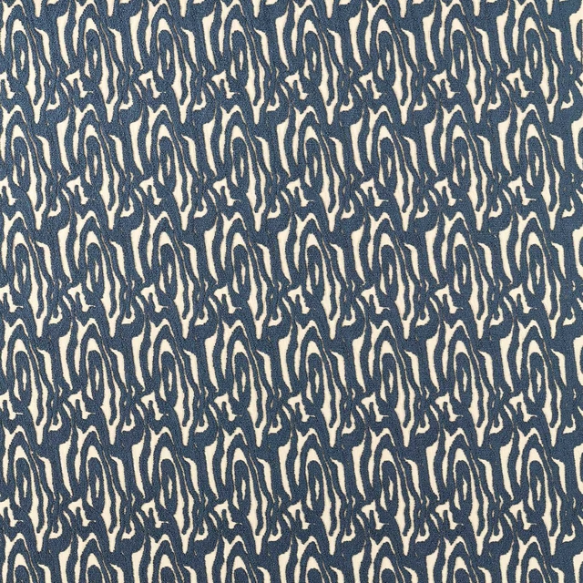
Marble Wave Pacific
Harlequin x Henry Holland Fabrics
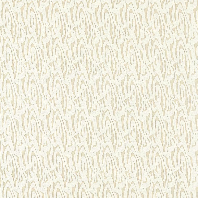
Marble Wave Porcelain
Harlequin x Henry Holland Fabrics
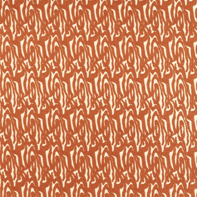
Marble Wave Terracotta
Harlequin x Henry Holland Fabrics
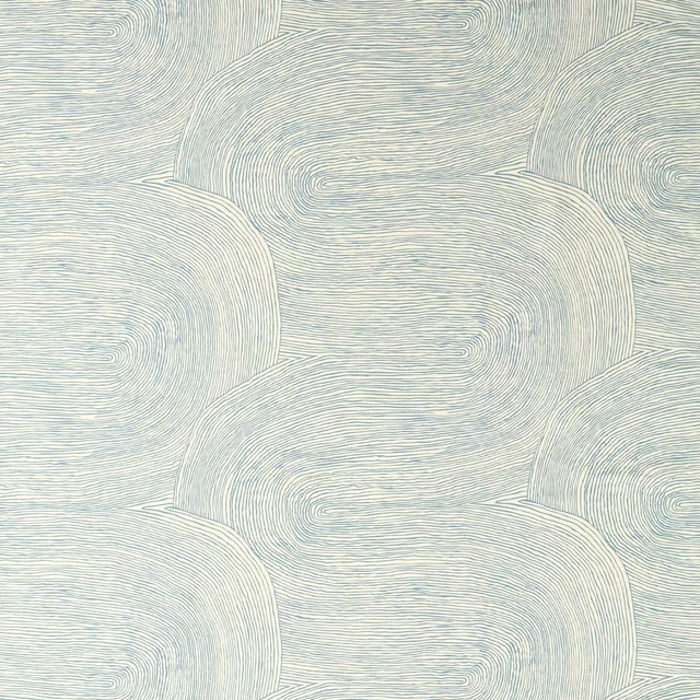
Nerikomi Aegean
Harlequin x Henry Holland Fabrics
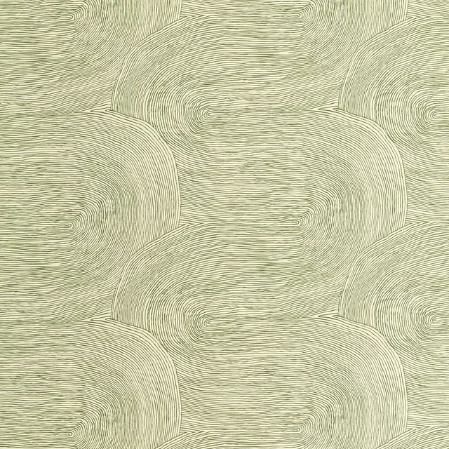
Nerikomi Matcha
Harlequin x Henry Holland Fabrics
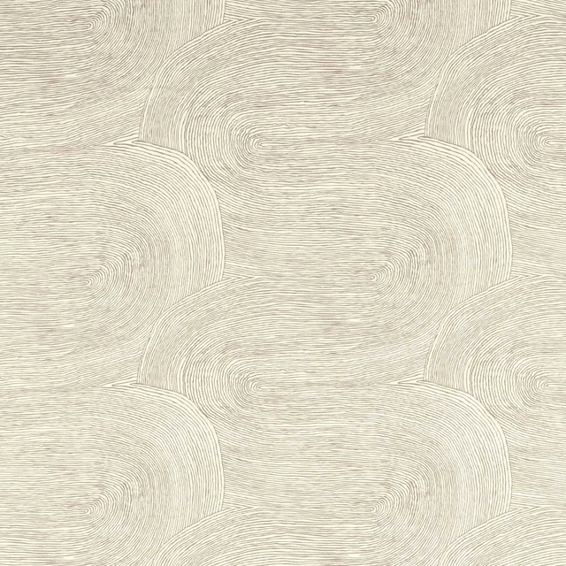
Nerikomi Oatmeal
Harlequin x Henry Holland Fabrics
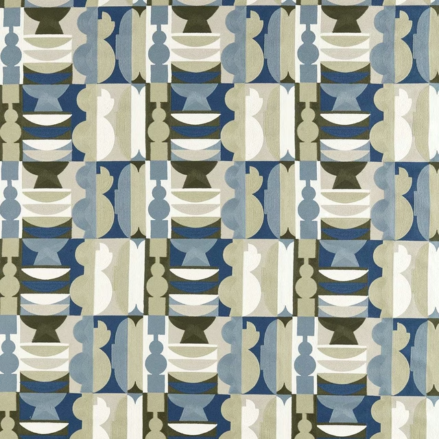
Potshop Atlantic/Neptune Green
Harlequin x Henry Holland Fabrics
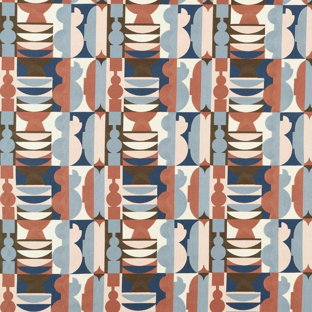
Potshop Rose/Pacific
Harlequin x Henry Holland Fabrics
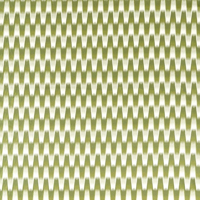
Southborough Matcha
Harlequin x Henry Holland Fabrics
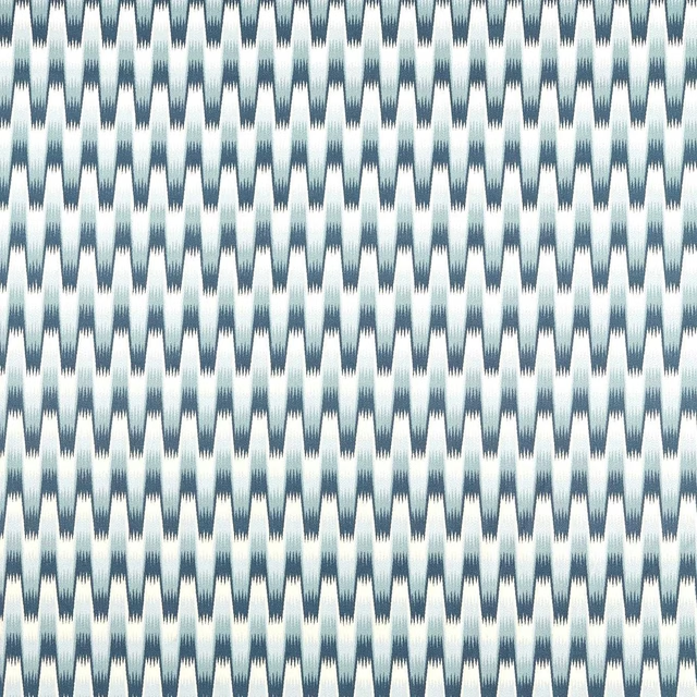
Southborough Pacific
Harlequin x Henry Holland Fabrics
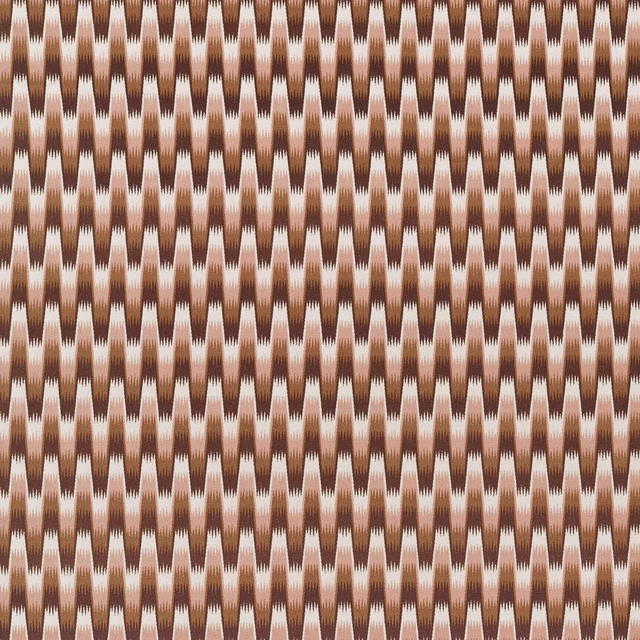
Southborough Rose
Harlequin x Henry Holland Fabrics
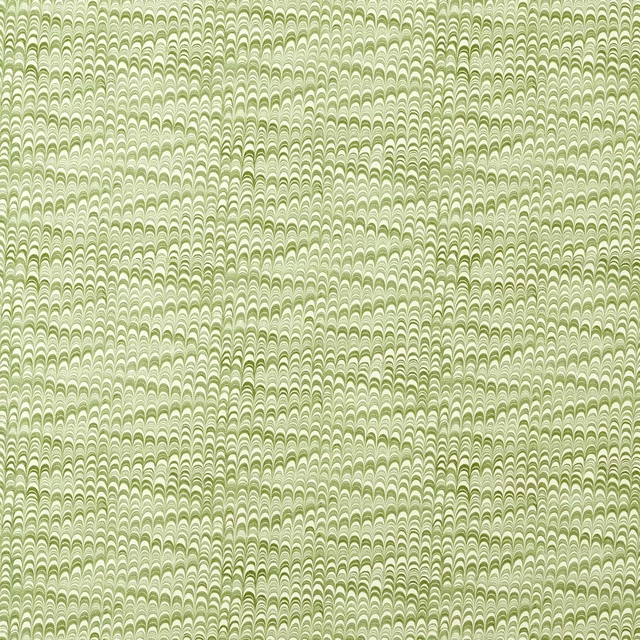
Washi Matcha
Harlequin x Henry Holland Fabrics
Pairs well with
A pattern needs somewhere for the eye to rest, so these are the plains and textures that sit beside Nerikomi Terracotta without fighting it. Mixed across the houses we hold, which is the part a single supplier's book cannot do.
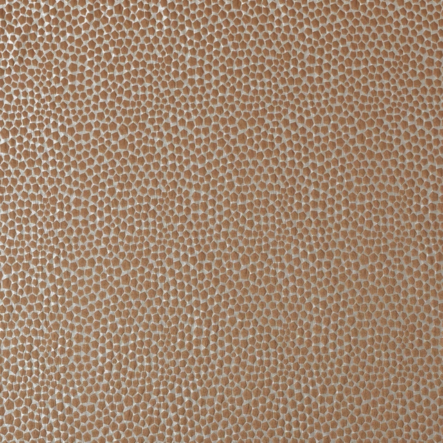
Taurus Copper
Comet Collection
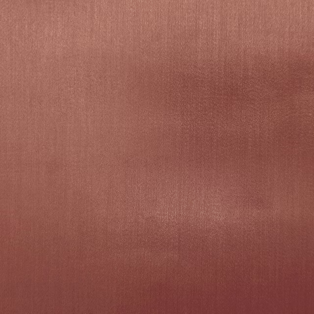
Galaxy Coral
Galaxy Collection
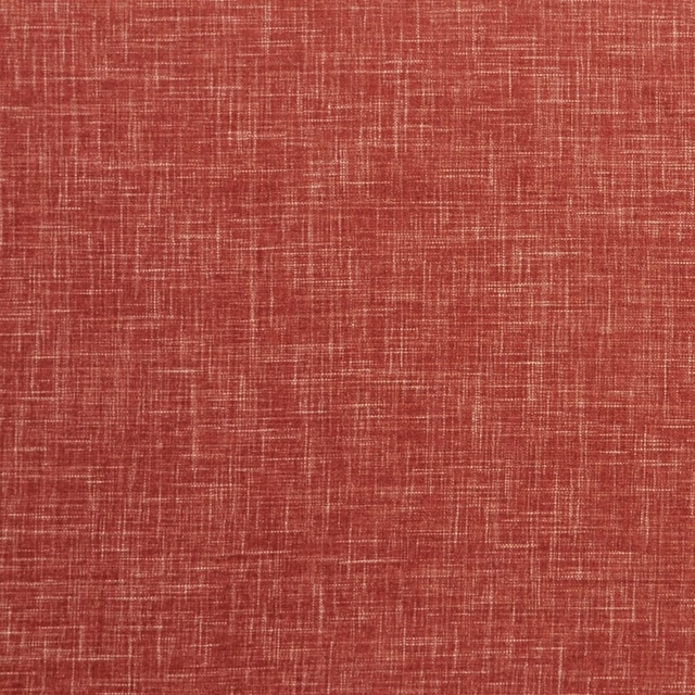
Albany Spice
Albany and Moray
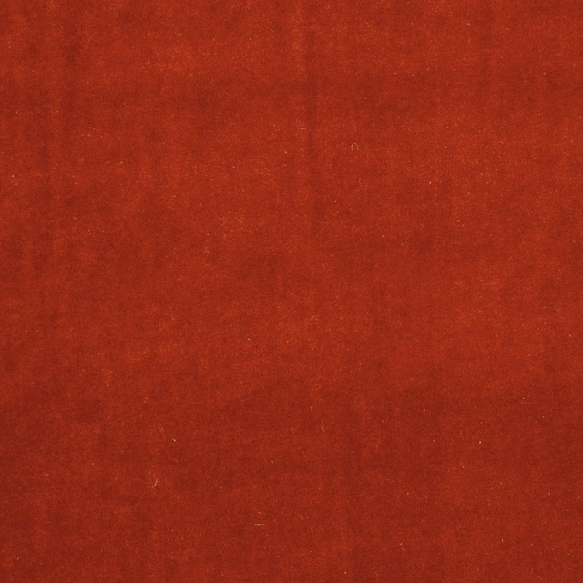
Alvar Flamingo
Alvar 2
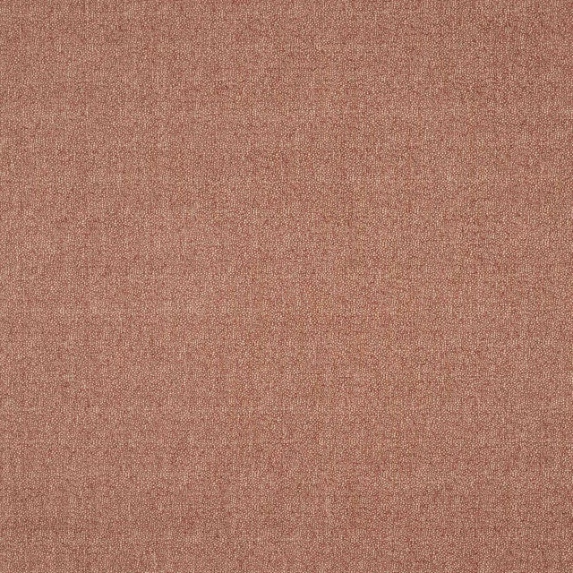
Cotley Red
Bampton
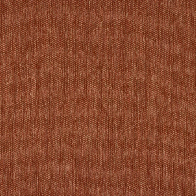
Croft Red
Chester
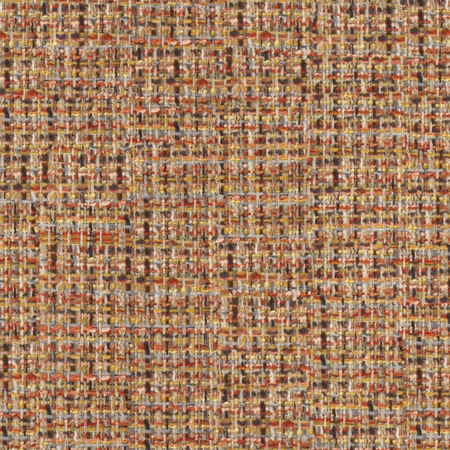
Oakworth Topaz
Oakworth Fabrics
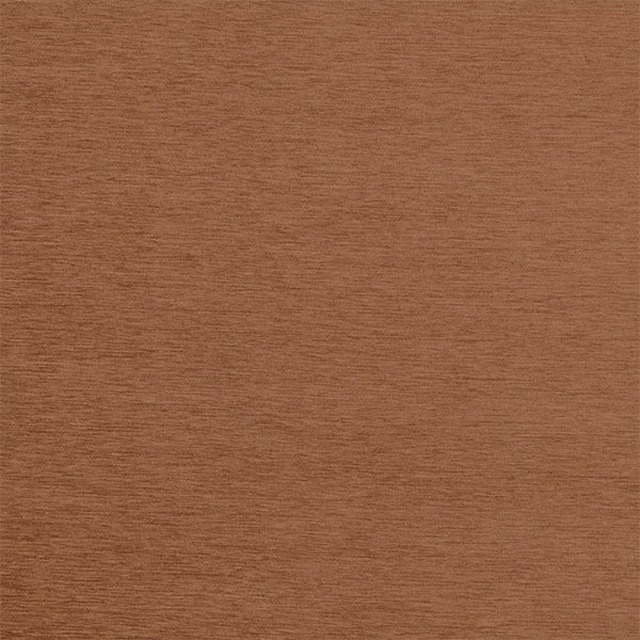
Kensington Copper
Brodsworth
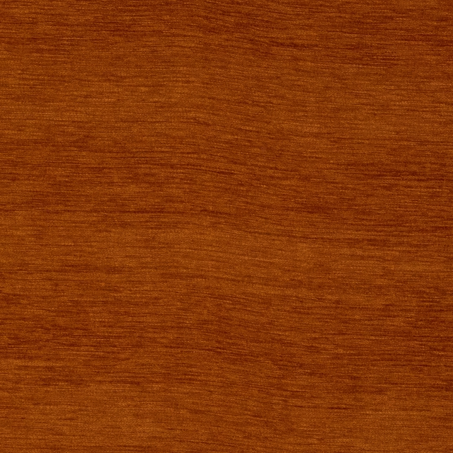
Kensington Terracotta
Brodsworth
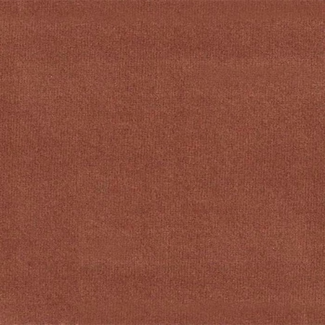
Amalfi Rust
Amalfi
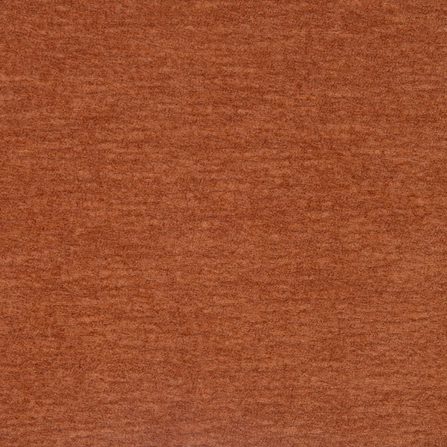
Camden Copper
Camden
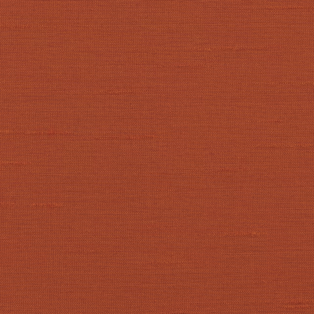
Astor Wallcovering Clementine
Astor Fr
Paint that goes with it
Two ways to take the room. Both colours are from houses we hold, so a pot can come off the same order as the cloth. Screens shift colour, so treat these as a direction and bring the cloth to the shelf before you buy the paint.
To sit quietly behind it
Masquerade - Mid
Little Greene · #e2ccb8
To stand against it
Garden
Little Greene · #739153
Other terracotta fabrics
Across the houses we hold. See all 1,701.

Empower Plain Coral
Empower Plain
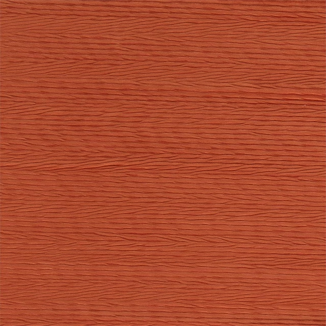
Florio Paprika
Florio Plains
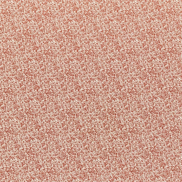
Teesha Paprika
Hamada Weaves
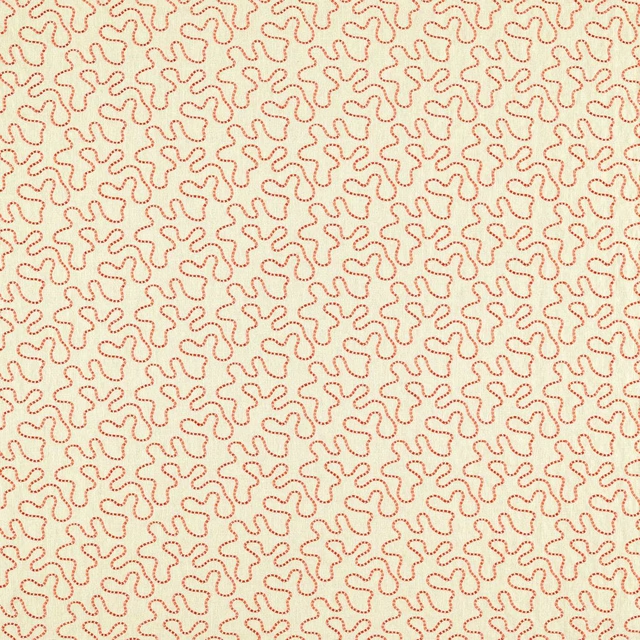
Wiggle Linen/Carnelian
Harlequin X Sophie Robinson Fabrics
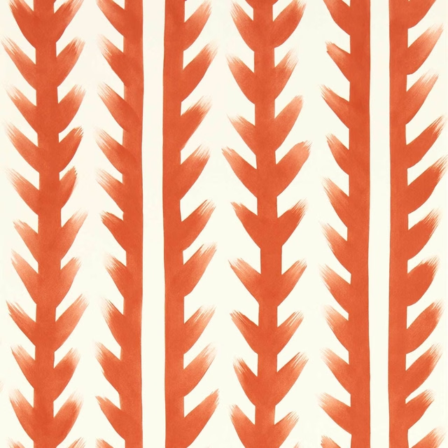
Sticky Grass Carnelian
Harlequin X Sophie Robinson Wallpapers
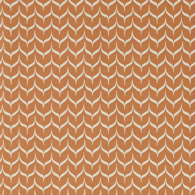
Adderstone Terracotta
Harlequin x Henry Holland Wallcoverings
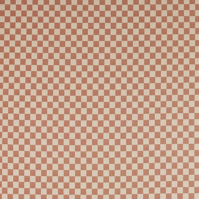
Blenets Check Mini Terracotta
Harlequin x Henry Holland Weaves
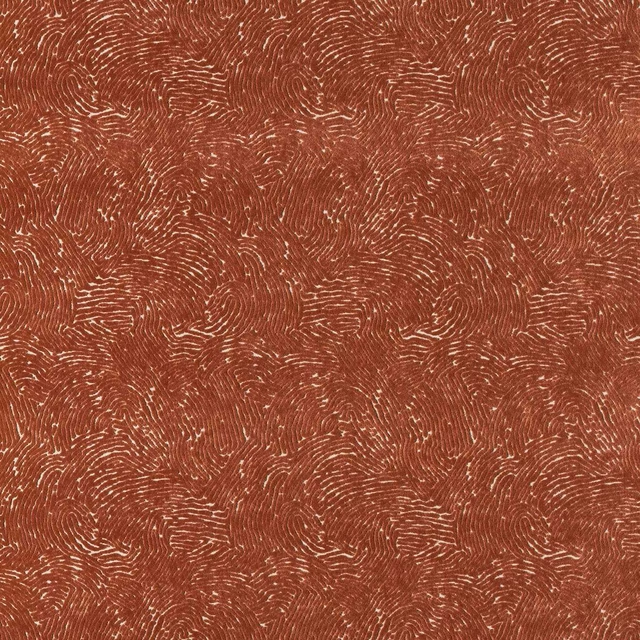
Bonseki Terracotta
Harlequin x Henry Holland Weaves
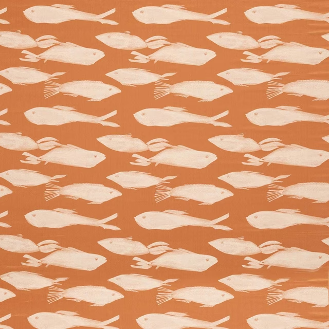
Kaku Paprika
Idyllic Fabrics
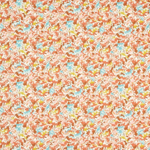
Tree Tops Baked Terracotta/Azul/Honey
Idyllic Fabrics
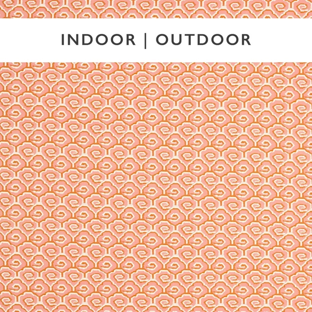
Sora Positano/Paprika
Indoor Outdoor Prints
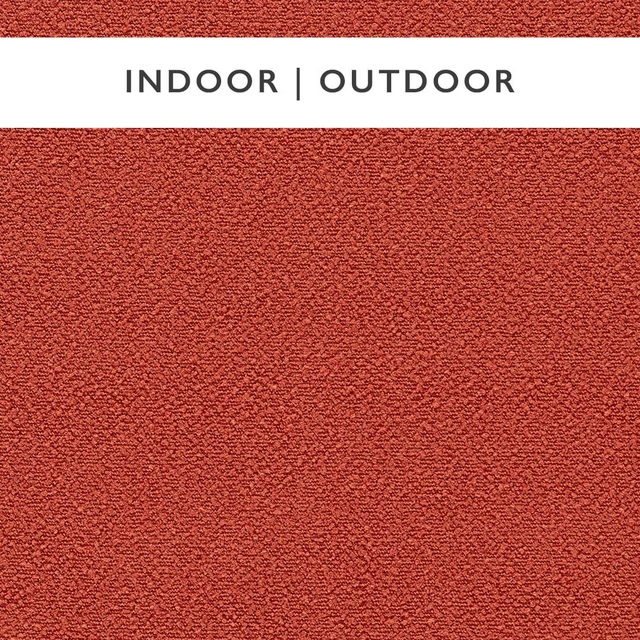
Elio Rhubarb
Indoor Outdoor Weaves