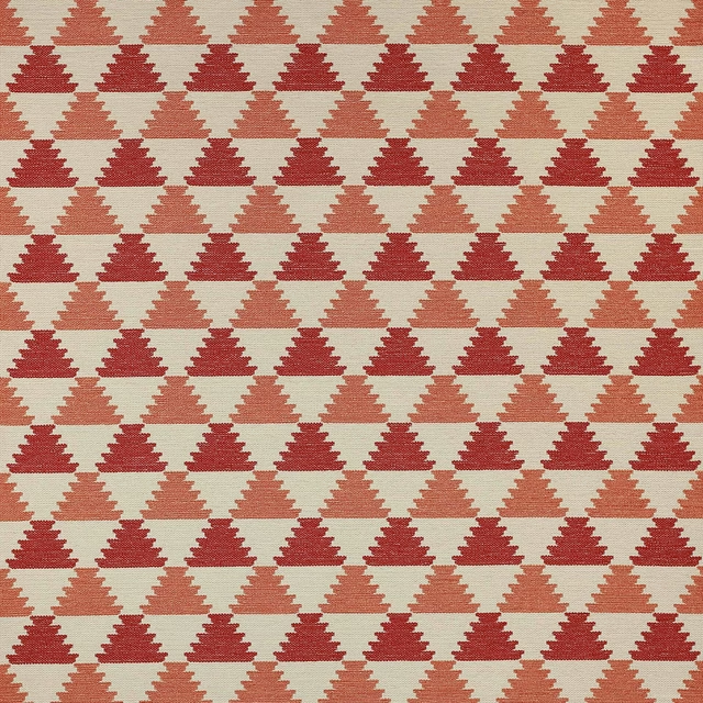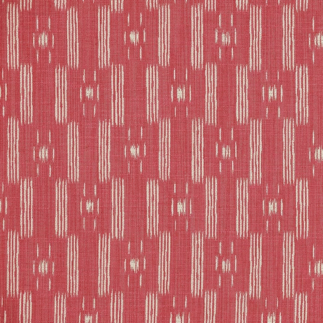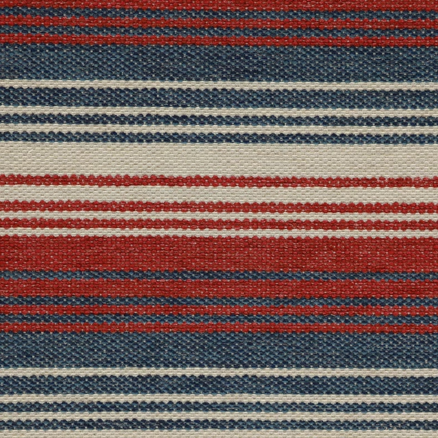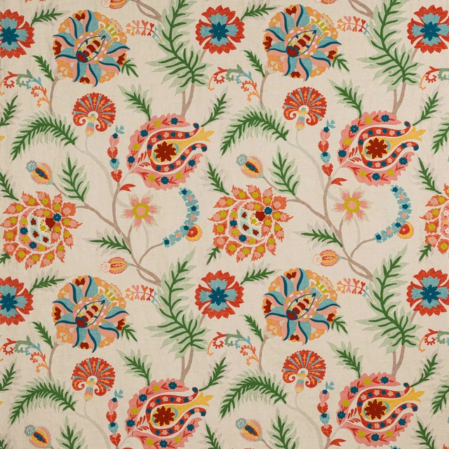

Tap the swatch to see it full screen. Hover it to magnify the weave. Colours on a screen are a guide, not a match, so come and feel the real cloth.
Scroll up or down to zoom in and out.
Tresco Red
Vita FabricJ0093-01
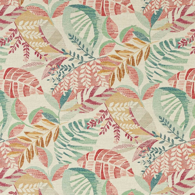
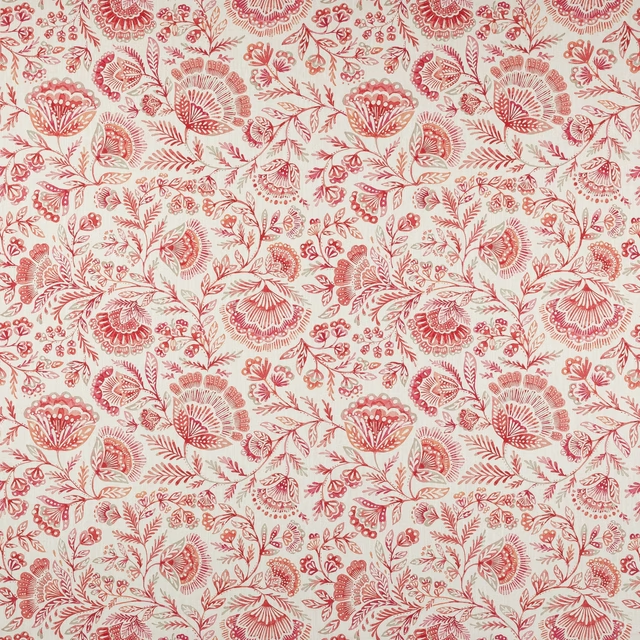
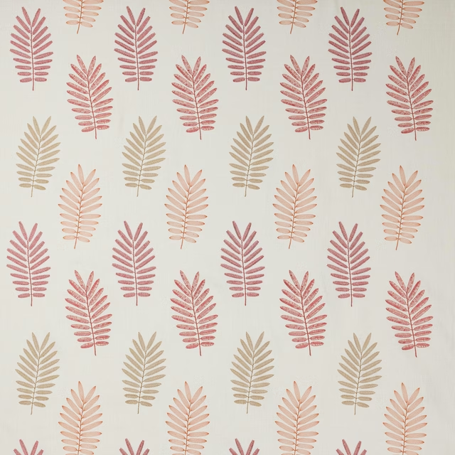
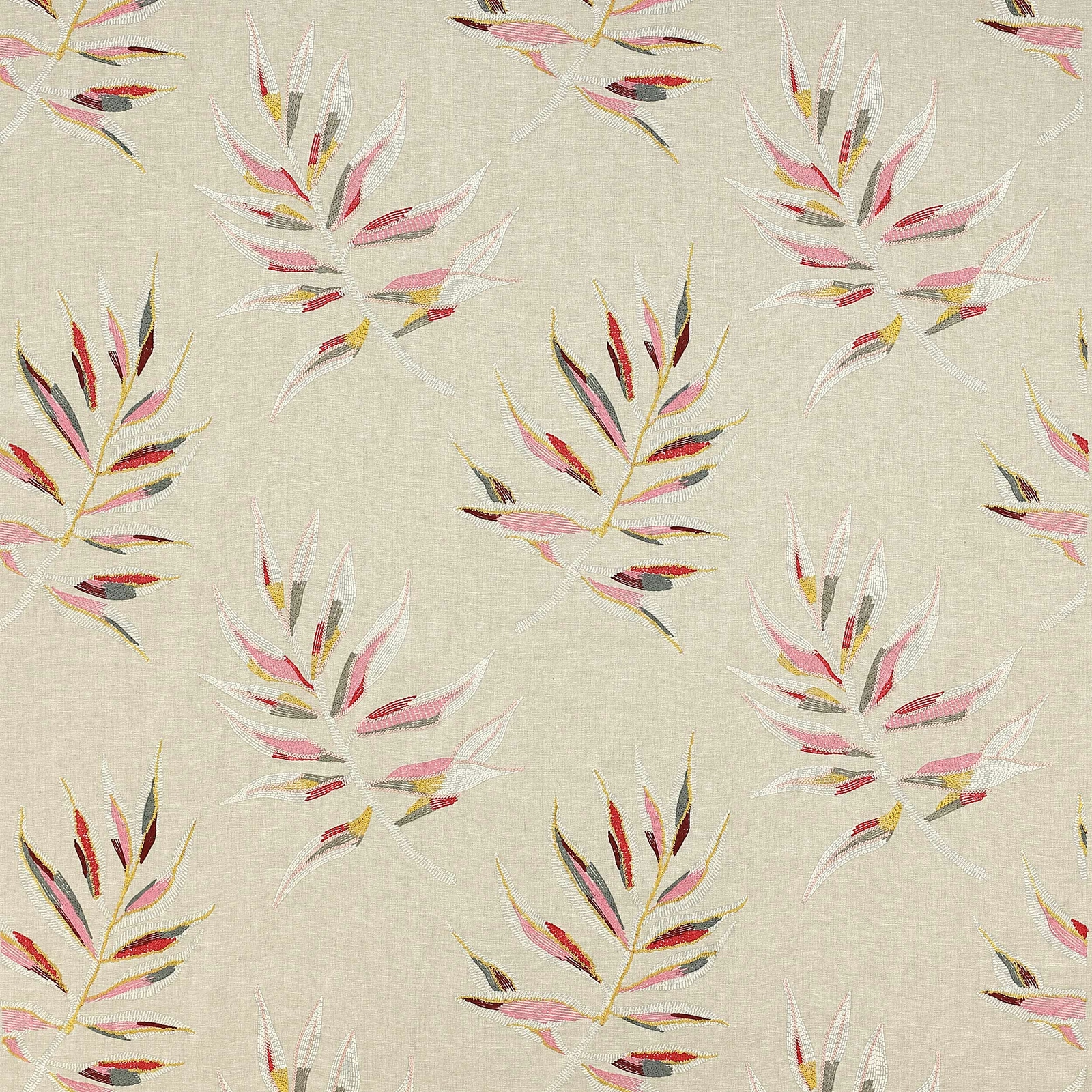
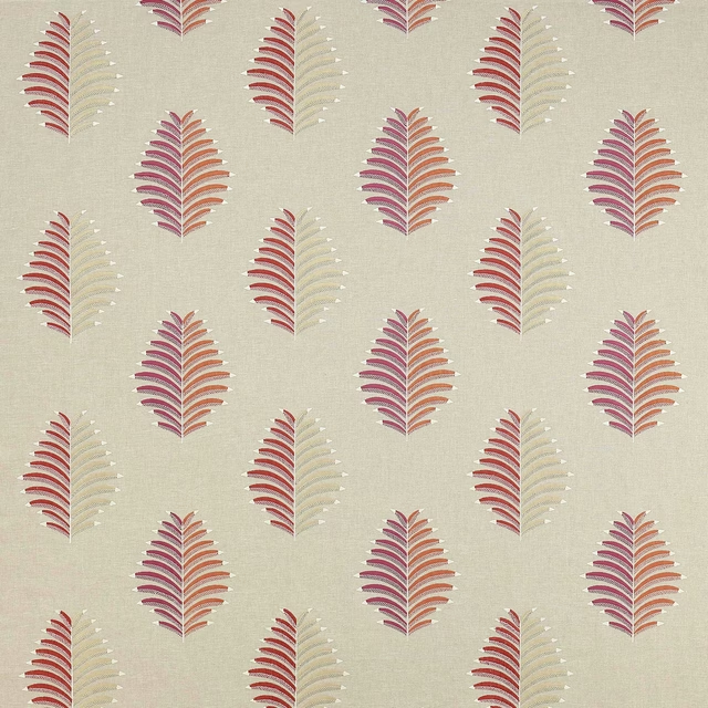
Tresco Red shows a delicate botanical trail scattered across a warm ivory ground, with the foliage picked out in red, pink, cream and small flashes of gold and charcoal. The overall effect is bright but softened, giving the design a fresh, airy character.
You have used your previews for today. Send one to Simon and you can carry on.
Your board
0 fabrics
See this fabric on Jane Churchill's own site, then order it through us.
See Tresco Red in your own room
A photograph of the piece you want re-covered. Straight on is best, and daylight helps. It is used to make your picture and nothing else.
Looking at your room
We found things here Tresco Red could go on. Tap one on the photograph, or choose below.
We could not see anything to re-cover
, s
Tresco Red, on your
Drag to compare. AI impression, colours indicative: ask us for a cutting before you decide.
About this fabric
This Jane Churchill Vita fabric is composed of 68% Linen, 18% Viscose, 10% Cotton and 4% Polyester, with an approximate width of 130cm and a repeat of V 59cm / H 65cm. The cloth reads as a refined mid-weight textile rather than a heavy upholstery material, with the motif sitting clearly on the surface and a lightly textured linen look visible in the ground. In Tresco Red, the palette feels warmer and more spirited than a muted neutral, with the red accents giving the leaf forms extra definition while the pale pink and ivory details keep it from looking harsh. The result is a decorative fabric that feels tailored enough for upholstery and polished enough for drapery.
How to use it
Use Tresco Red to add colour to an armchair, headboard or relaxed curtain treatment where the warm ivory ground can keep the room feeling open. It pairs well with painted wood in chalk white, soft stone or pale grey, letting the red and pink leaf shapes act as the focal point.
A lively mid-weight linen blend that lifts upholstery or curtains with fresh, painterly movement.
More from Vita
The same book, other colourways.
Sibella Blue
Vita
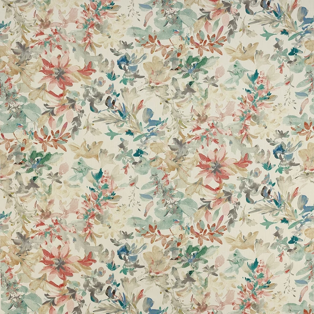
Sibella Neutral
Vita
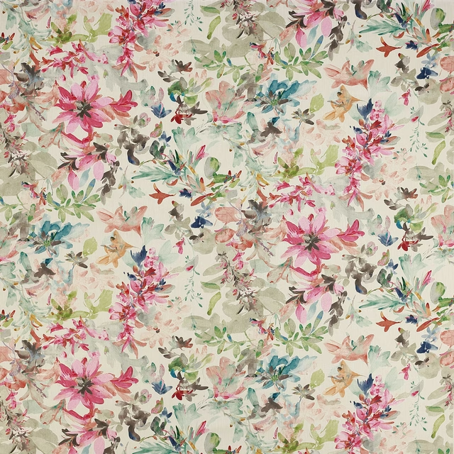
Sibella Pink/Green
Vita
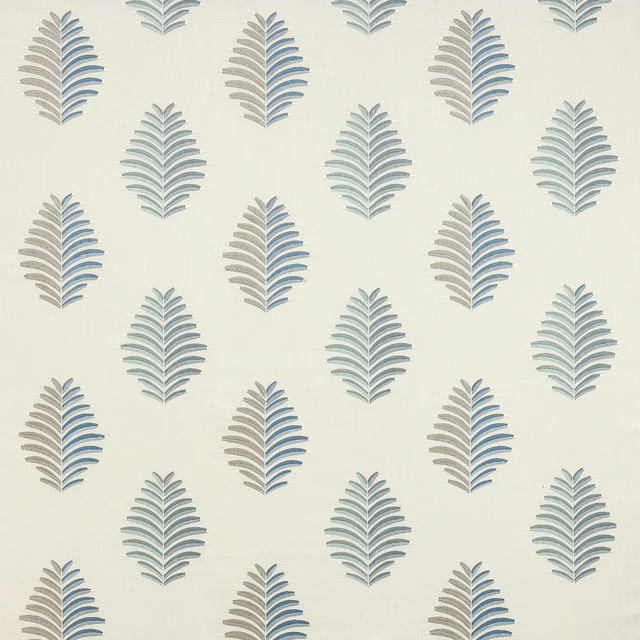
Tambour Blue
Vita
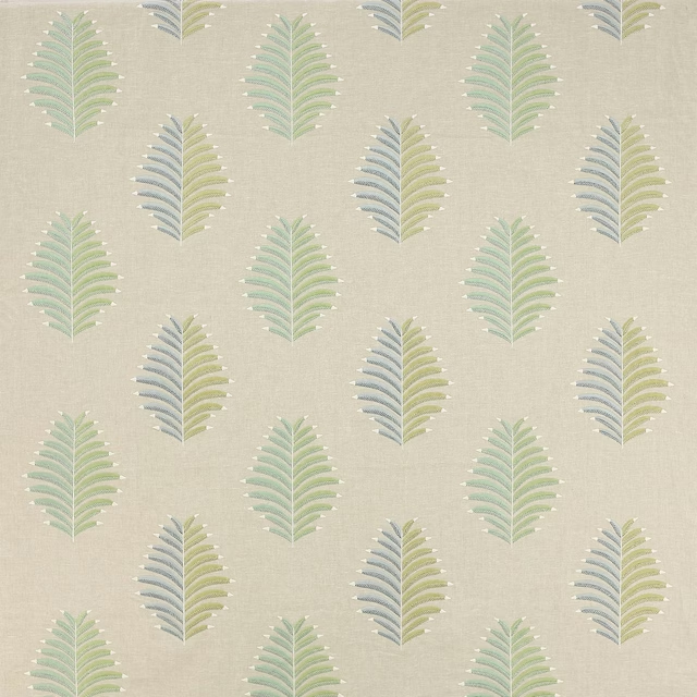
Tambour Green
Vita
Tambour Red
Vita
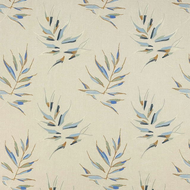
Tresco Blue
Vita
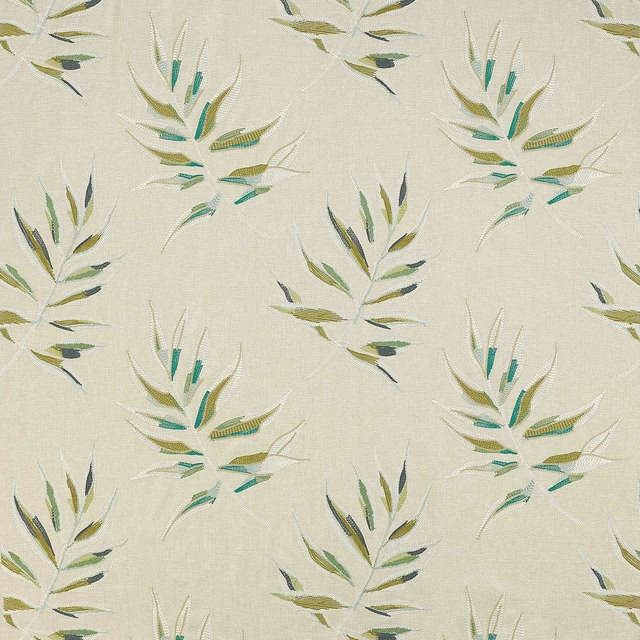
Tresco Green
Vita
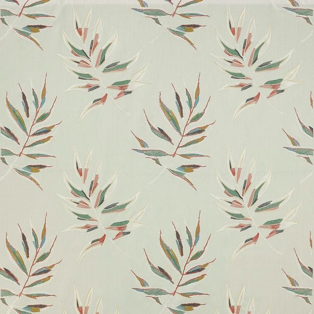
Tresco Teal/Copper
Vita
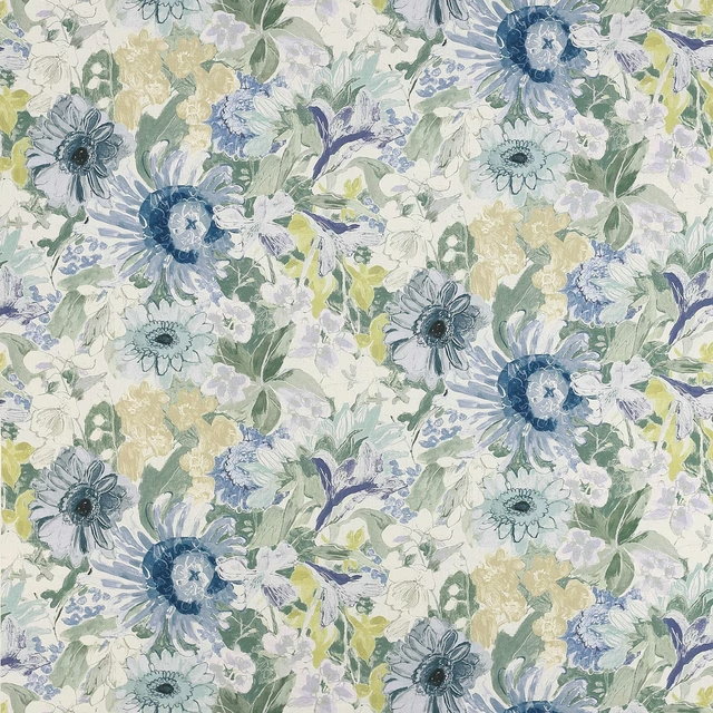
Vita Blue
Vita
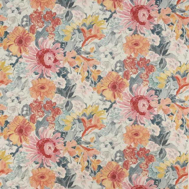
Vita Orange
Vita
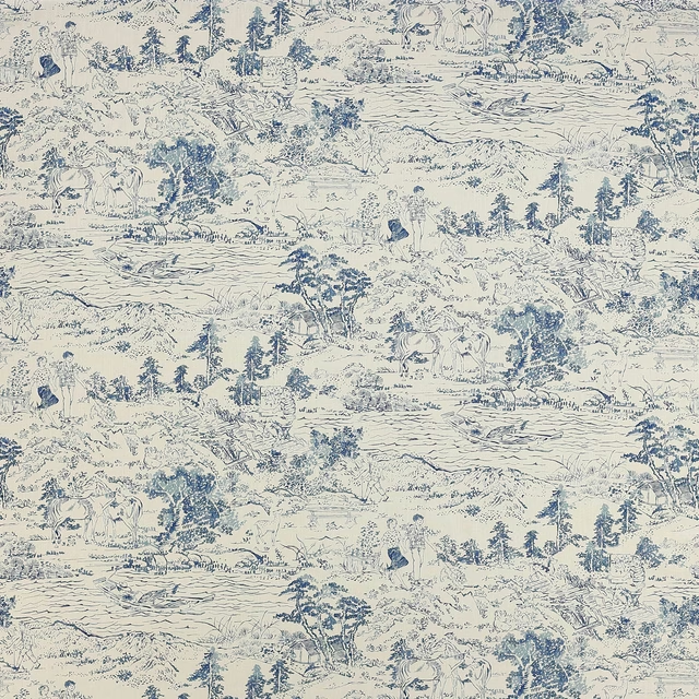
Walk In The Park Blue
Vita
Pairs well with
A pattern needs somewhere for the eye to rest, so these are the plains and textures that sit beside Tresco Red without fighting it. Mixed across the houses we hold, which is the part a single supplier's book cannot do.

Alaska Cinnamon
Alaska Collection

Dakota Claret
Dakota Collection

Roseau Garance
Atelier Camargue Fabrics

Castiglione Garance
Atelier Fabrics

Moray Damson
Albany and Moray
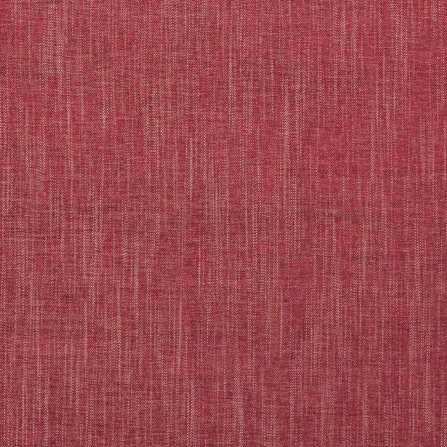
Moray Raspberry
Albany and Moray
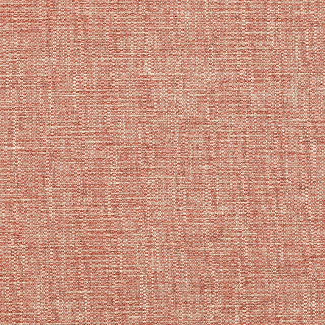
Brandon Red
Albeck

Marldon Red
Albeck

Chambord Claret
Chambord Fabrics

Cheviot Pimento
Cheviot Fabrics
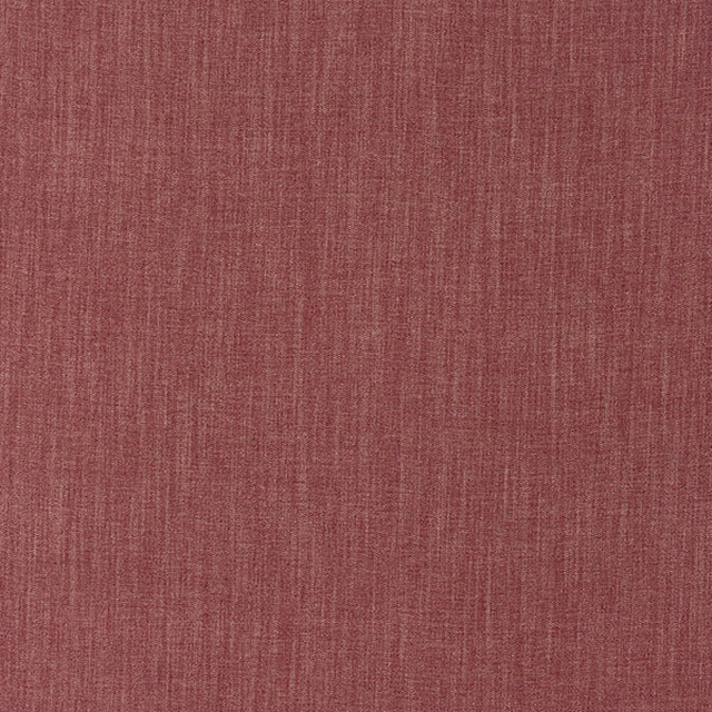
Monza Raspberry
Arezzo

Kensington Brick
Brodsworth
Paint that goes with it
Two ways to take the room. Both colours are from houses we hold, so a pot can come off the same order as the cloth. Screens shift colour, so treat these as a direction and bring the cloth to the shelf before you buy the paint.
To sit quietly behind it
Well Grounded
Coat Paints · #d9cdb6
To stand against it
Poison
Zoffany · #4d7666