
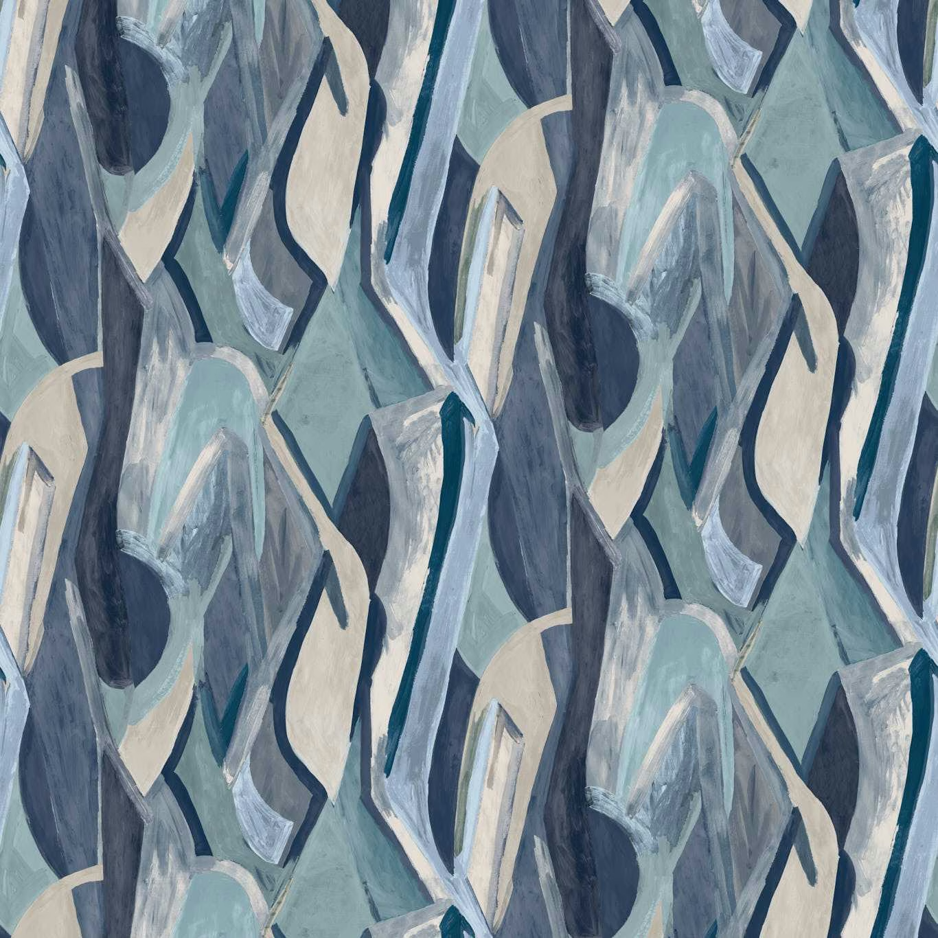

Tap the swatch to see it full screen. Hover it to magnify the weave. Colours on a screen are a guide, not a match, so come and feel the real cloth.
Scroll up or down to zoom in and out.
Dynamic Ink Banner
Metropolitan Wallcoverings WallpaperCCW0140-01
Dynamic Ink Banner is an abstract wallpaper of layered, brush-marked shapes in deep ink blue, slate, icy blue-grey and soft cream. Its cool, mineral palette gives the design depth without losing the movement of the painted forms.
You have used your previews for today. Send one to Simon and you can carry on.
Your board
0 fabrics
Part of the range we hold from Clarke & Clarke.
See Dynamic Ink Banner in your own room
A photograph of the piece you want re-covered. Straight on is best, and daylight helps. It is used to make your picture and nothing else.
Looking at your room
We found things here Dynamic Ink Banner could go on. Tap one on the photograph, or choose below.
We could not see anything to re-cover
, s
Dynamic Ink Banner, on your
Drag to compare. AI impression, colours indicative: ask us for a cutting before you decide.
About this wallpaper
The design combines elongated, angular fragments with looser, translucent-looking brushwork, creating a large-scale composition that shifts between dark navy depths and pale blue-grey highlights. Soft cream shapes interrupt the cooler blue ground, while slate outlines add definition to the irregular forms. This wallpaper has a 68.5 cm usable width, a 13.35 m standard length and a 300 cm vertical pattern repeat, with no horizontal repeat specified. At 130 gsm, it is a lightweight wallcovering suited to carrying the expressive painted motif across a full wall.
How to use it
Use this cool ink-blue colourway as a feature wall behind streamlined furniture, pairing it with slate upholstery, pale timber and brushed metal. The cream accents provide a gentle link to warm ivory furnishings without diluting the design’s atmospheric blue depth.
A cool, painterly abstract in ink blue, slate, pale blue and cream for a confident feature wall.
More from Metropolitan Wallcoverings
The same book, other colourways.
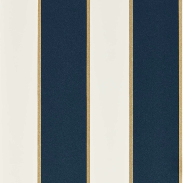
Cosmopolis Ink
Metropolitan Wallcoverings
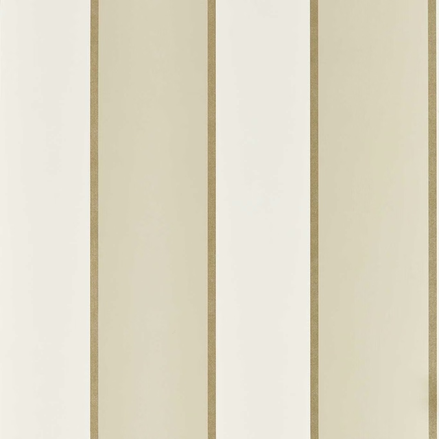
Cosmopolis Linen
Metropolitan Wallcoverings
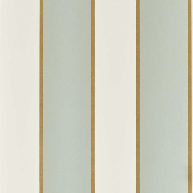
Cosmopolis Mineral
Metropolitan Wallcoverings
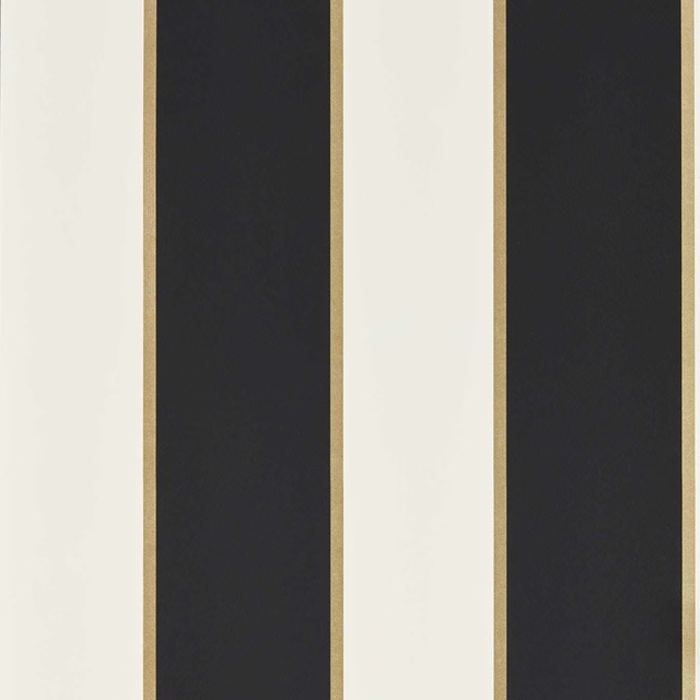
Cosmopolis Noir
Metropolitan Wallcoverings
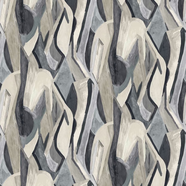
Dynamic Noir Banner
Metropolitan Wallcoverings
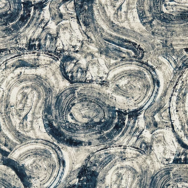
Hatoum Ink
Metropolitan Wallcoverings
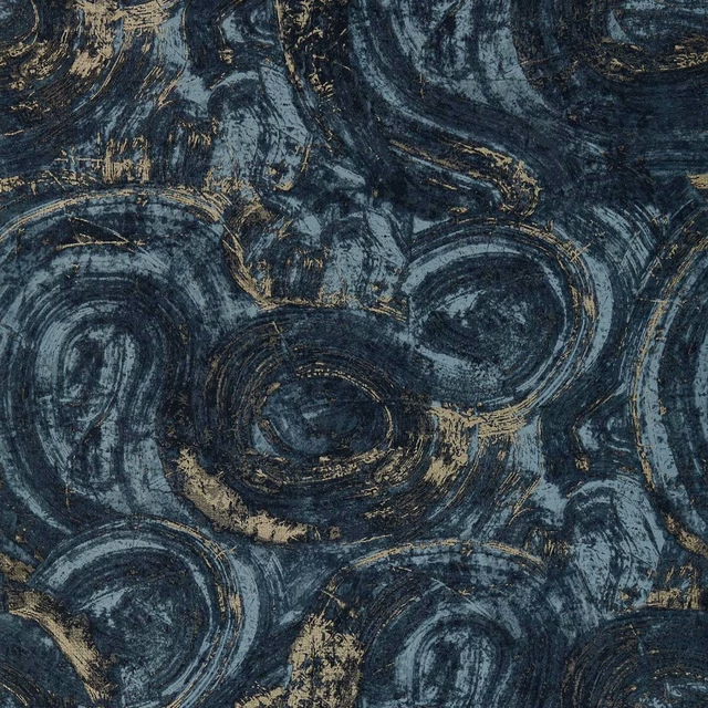
Hatoum Ink/Gilver
Metropolitan Wallcoverings
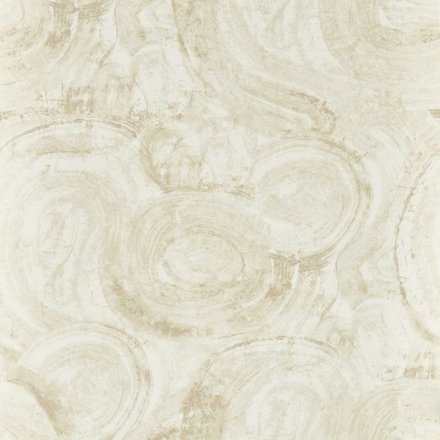
Hatoum Ivory
Metropolitan Wallcoverings
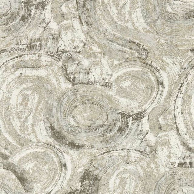
Hatoum Slate
Metropolitan Wallcoverings
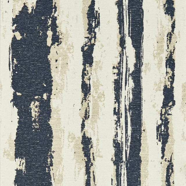
Herrera Ink
Metropolitan Wallcoverings
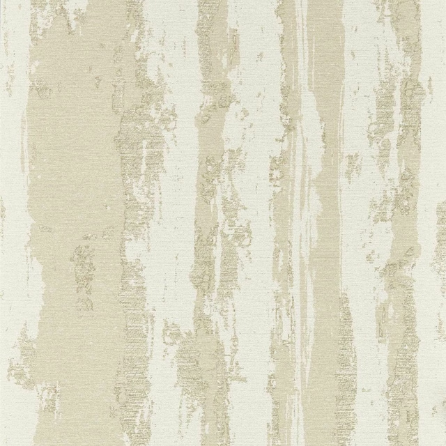
Herrera Ivory
Metropolitan Wallcoverings
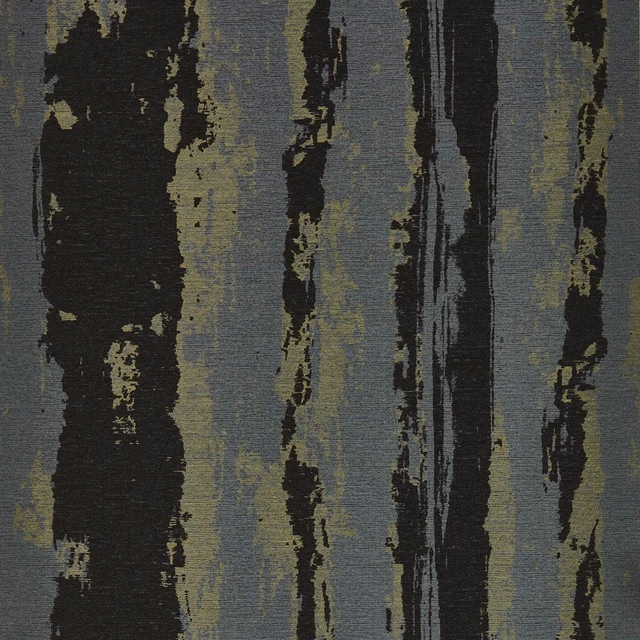
Herrera Noir
Metropolitan Wallcoverings
Pairs well with
A pattern needs somewhere for the eye to rest, so these are the plains and textures that sit beside Dynamic Ink Banner without fighting it. Mixed across the houses we hold, which is the part a single supplier's book cannot do.

Alaska Navy
Alaska Collection

Alaska Powder Blue
Alaska Collection

Beaux-Arts Nuit
Atelier Fabrics
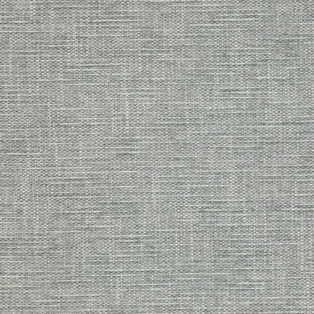
Brandon Aqua
Albeck
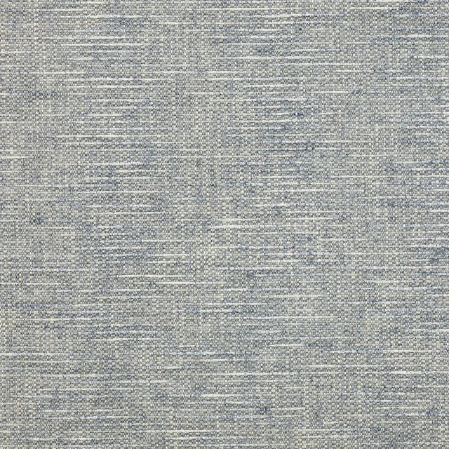
Brandon Blue
Albeck
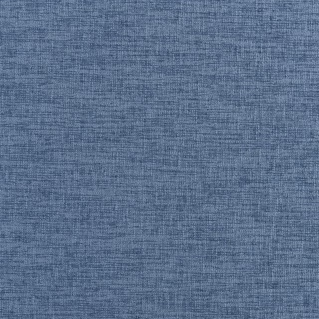
Kalutara Indigo
Ampara Fabrics
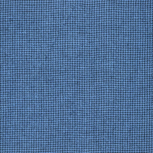
Brera Filato Marine
Brera Filato Fabrics
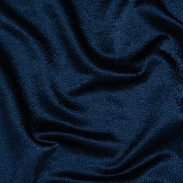
Alchemy Indigo
Alchemy
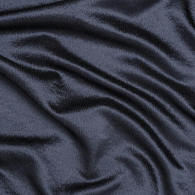
Alchemy Navy
Alchemy
Allegra Atlantic
Allegra
Allegra Blue bird
Allegra

Amalfi Cadet
Amalfi
Paint that goes with it
Two ways to take the room. Both colours are from houses we hold, so a pot can come off the same order as the cloth. Screens shift colour, so treat these as a direction and bring the cloth to the shelf before you buy the paint.
To sit quietly behind it
Mr. Clifton
Coat Paints · #73898e
To stand against it
Lily
Zoffany · #f5f0ea
Other blue fabrics
Across the houses we hold. See all 7,566.
Maddox Denim
Metalli
Matteo Midnight/Gold
Metalli

Quarzo Midnight
Metalli
Tessellati Midnight/Gilver
Metalli
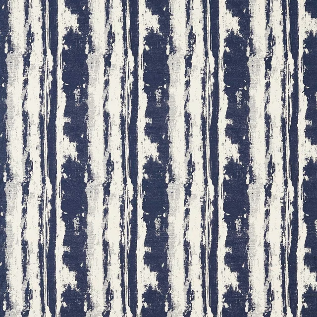
Herrera Ink
Metropolitan Fabrics
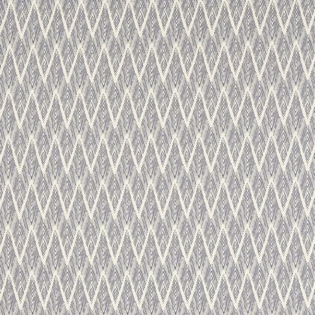
Holzer Ink
Metropolitan Fabrics
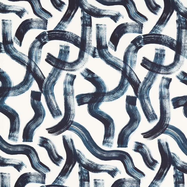
Malevich Ink
Metropolitan Fabrics
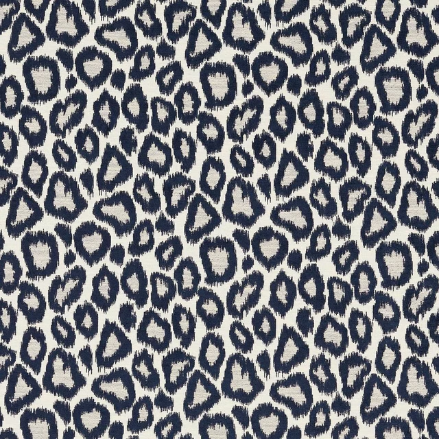
Ortega Ink
Metropolitan Fabrics
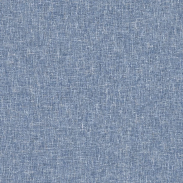
Midori Aegean
Midori
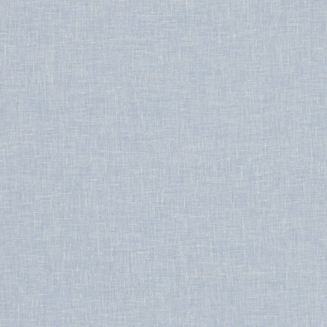
Midori Chambray
Midori
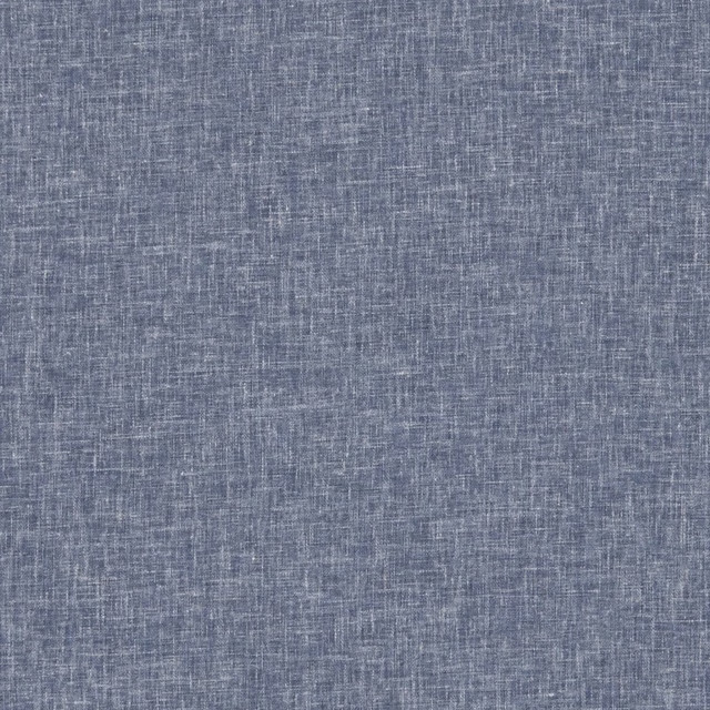
Midori Denim
Midori
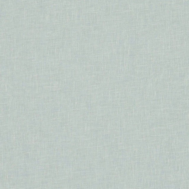
Midori Duckegg
Midori