


Tap the swatch to see it full screen. Hover it to magnify the weave. Colours on a screen are a guide, not a match, so come and feel the real cloth.
Scroll up or down to zoom in and out.
Viggo Prune
Viggo FabricM4132-11
Viggo Prune shows a finely textured weave in a deep berry-prune shade, with small specks of lighter yarn giving the surface a quiet, lively depth.
You have used your previews for today. Send one to Simon and you can carry on.
Your board
0 fabrics
See this fabric on Manuel Canovas's own site, then order it through us.
See Viggo Prune in your own room
A photograph of the piece you want re-covered. Straight on is best, and daylight helps. It is used to make your picture and nothing else.
Looking at your room
We found things here Viggo Prune could go on. Tap one on the photograph, or choose below.
We could not see anything to re-cover
, s
Viggo Prune, on your
Drag to compare. AI impression, colours indicative: ask us for a cutting before you decide.
About this fabric
This colourway reads as a warm prune-red with muted berry undertones, softened by the tiny woven grid visible across the cloth. The fabric is 140cm wide approximately and has no repeat, which suits the regular, small-scale texture seen in the image. Its composition of 39% viscose, 37% cotton, 18% linen and 6% polyester suggests a balanced handle with a natural, slightly dry character rather than a glossy finish. The overall effect is smart and controlled, with the darker threads lending depth while the lighter slubs lift the surface.
How to use it
Use it to add a rich accent to a bench, occasional chair or Roman blind, especially where you want the prune tone to sit warmly against oak, walnut or aged brass. It also works well with ivory, mushroom and tobacco shades that let the fabric’s berry depth stand out.
A richly shaded prune tone with a neat woven surface, ideal for tailored upholstery or elegant curtains.
More from Viggo
The same book, other colourways.

Viggo Creme
Viggo

Viggo Dragee
Viggo

Viggo Framboise
Viggo

Viggo Indigo
Viggo
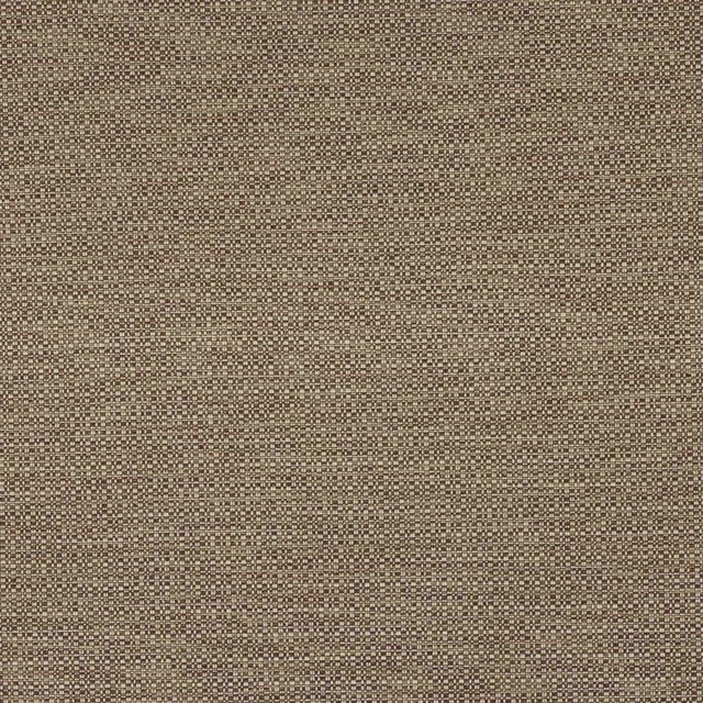
Viggo Manganese
Viggo

Viggo Neige
Viggo

Viggo Opale
Viggo

Viggo Or
Viggo

Viggo Outremer
Viggo

Viggo Prairie
Viggo

Viggo Rose Ancien
Viggo
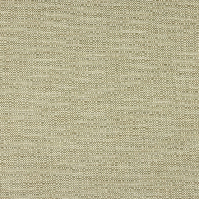
Viggo Sable
Viggo
Pairs well with
Viggo Prune is a quiet cloth, so it carries a pattern beside it: one of these on the curtains and this on the chair. Mixed across the houses we hold, which is the part a single supplier's book cannot do.
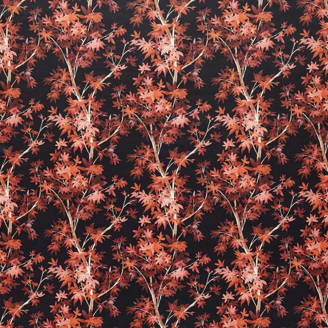
Aspen Scarlet
Tahiti Collection
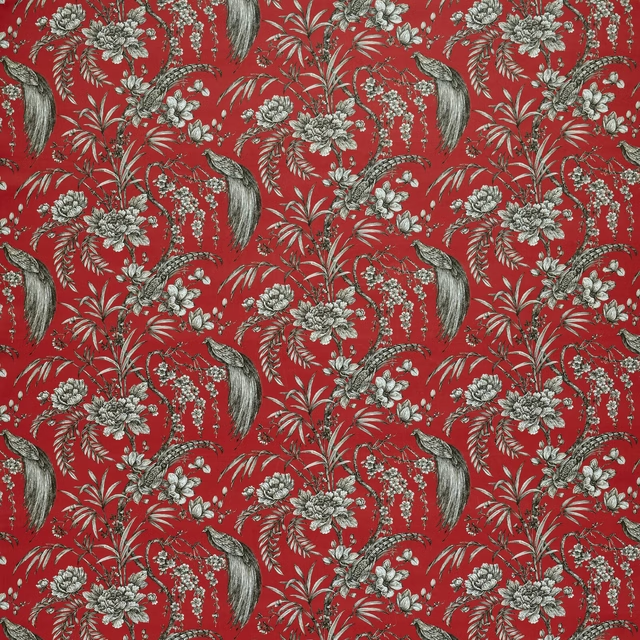
Botanist Crimson
Tahiti Collection
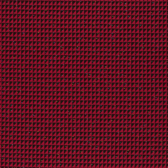
Manta Carmin
Carnets Andalous Fabrics
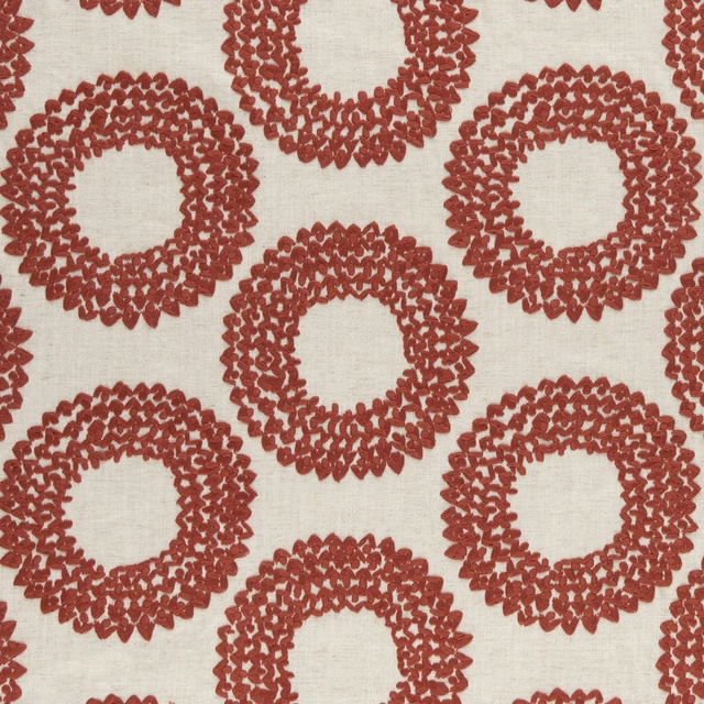
Dashiki Cinnabar
Amara
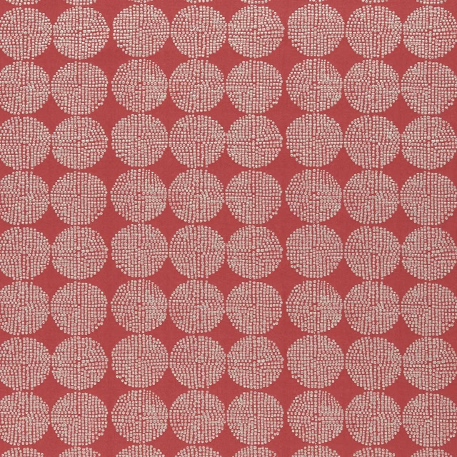
Kiko Red
Amara
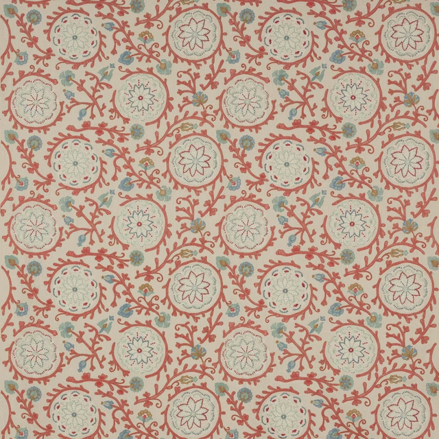
Caspian Tomato
Ashdown
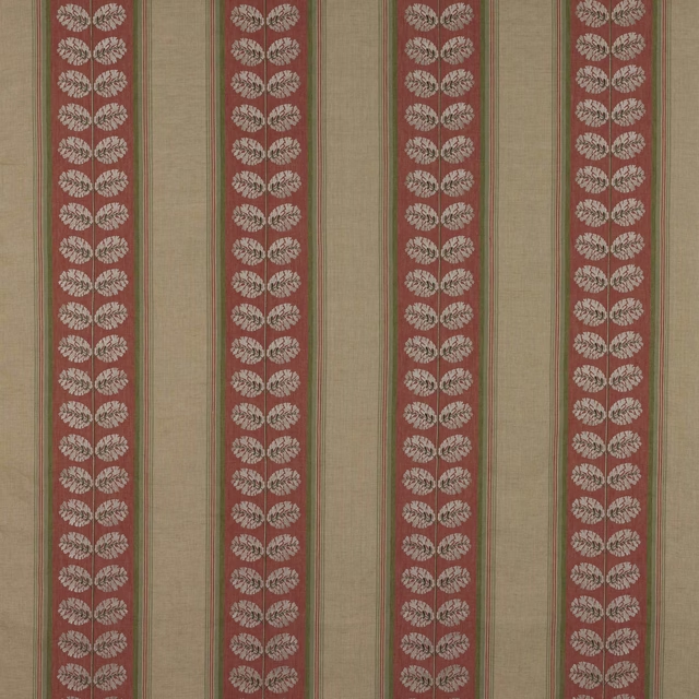
Woodcote Stripe Red/Green
Ashdown
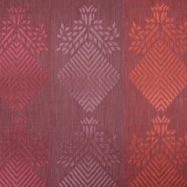
Purachina Scarlet
Amaya Fabrics

Warp Cloth Berry
Tweed FR Fabrics

Kensington Wine
Brodsworth
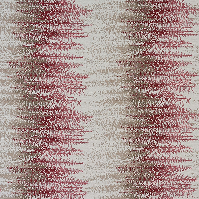
Byron Rosso
Byron

Akari Harrisa/Sunstone
Akari Weaves
Paint that goes with it
Two ways to take the room. Both colours are from houses we hold, so a pot can come off the same order as the cloth. Screens shift colour, so treat these as a direction and bring the cloth to the shelf before you buy the paint.
To sit quietly behind it
Sheldon
Coat Paints · #6b5545
To stand against it
Portland Stone
Little Greene · #c9c5a8
Other red fabrics
Across the houses we hold. See all 2,196.
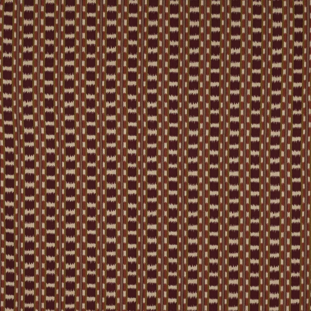
Frida Grenat
Tanya
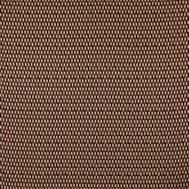
Kita Prune
Tanya
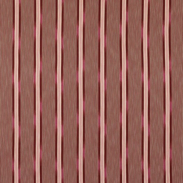
Tanya Grenat
Tanya

Vito Bourgogne
VITO

Vito Brique
VITO

Vito Feu
VITO
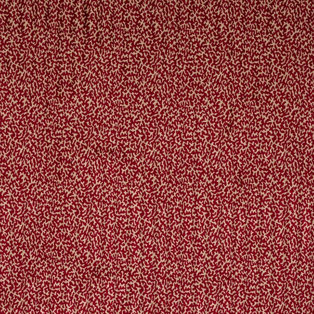
Velours Moorea Ecarlate
Velours Tosca

Voltaire Cassis
Voltaire

Voltaire Cerise
Voltaire

Voltaire Coquelicot
Voltaire
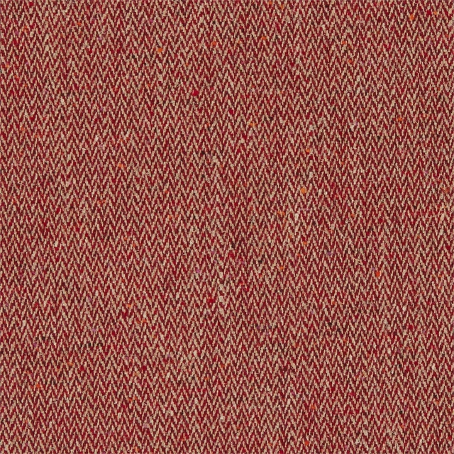
Brunswick Carmine
Archive IV The Collector Fabrics
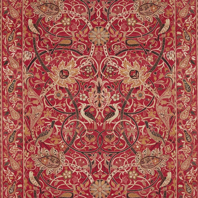
Bullerswood Paprika/Gold
Archive IV The Collector Fabrics