
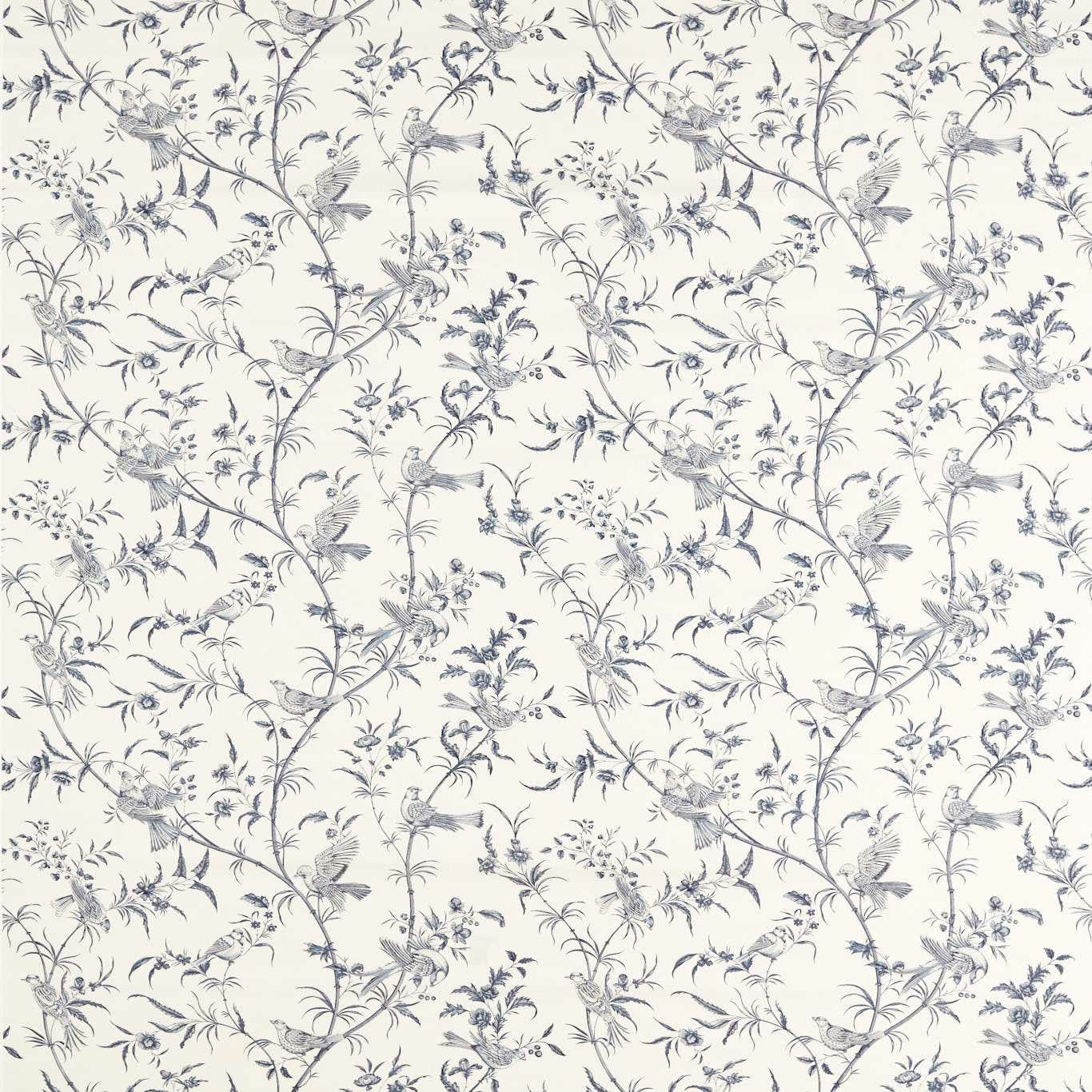

Tap the swatch to see it full screen. Hover it to magnify the weave. Colours on a screen are a guide, not a match, so come and feel the real cloth.
Scroll up or down to zoom in and out.
Paradise Woods Toile Woad
Sanderson x National Trust Volume II FabricSAF0481-01
Paradise Woods Toile Woad pairs a creamy ground with fine woad-blue toile scenes of birds, branches and flowering stems. The overall effect is light, airy and quietly decorative, with the sketchy pattern sitting delicately across the cloth.
You have used your previews for today. Send one to Simon and you can carry on.
Your board
0 fabrics
See this fabric on Sanderson's own site, then order it through us.
See Paradise Woods Toile Woad in your own room
A photograph of the piece you want re-covered. Straight on is best, and daylight helps. It is used to make your picture and nothing else.
Looking at your room
We found things here Paradise Woods Toile Woad could go on. Tap one on the photograph, or choose below.
We could not see anything to re-cover
, s
Paradise Woods Toile Woad, on your
Drag to compare. AI impression, colours indicative: ask us for a cutting before you decide.
About this fabric
This Sanderson x National Trust Volume II fabric is specified at 137.5 cm wide, with a 60 m standard length and a 230 gsm weight, giving it enough substance for versatile interior use. The 43 cm vertical repeat and 68.5 cm horizontal repeat create a generous toile layout, and the 36.2 threads per cm help support the crisp, detailed linework visible in the birds and foliage. In this colourway, the blue reads as a softened woad rather than a strong navy, so the motif feels fresher and less formal against the pale ground. The drawn branches and perched birds keep their outline without looking harsh, which makes the pattern feel refined rather than busy.
How to use it
Use this colourway where you want pattern but not heaviness: it suits relaxed country curtains, tailored Roman blinds, or upholstered accent pieces. The cool blue on cream works especially well with painted woods, chalky whites and pale oak.
Use for elegant curtains or smart upholstery where the pale woad drawing can breathe.
More from Sanderson x National Trust Volume II
The same book, other colourways.
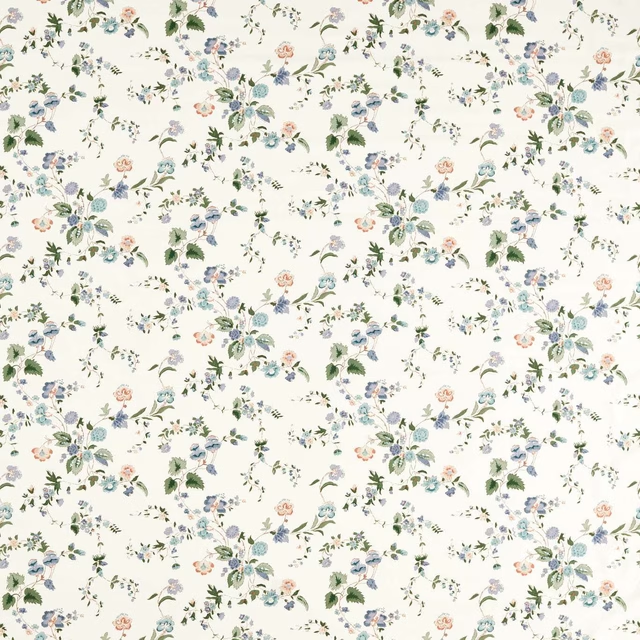
Nectar Fields Cornflower/Mallow
Sanderson x National Trust Volume II
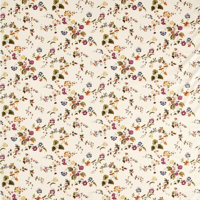
Nectar Fields Damson/Medlar
Sanderson x National Trust Volume II
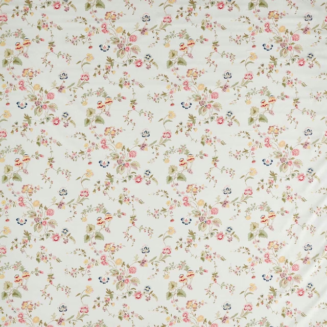
Nectar Fields Porcelain/Blossom
Sanderson x National Trust Volume II
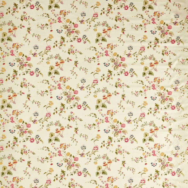
Nectar Fields Sage/Blossom
Sanderson x National Trust Volume II
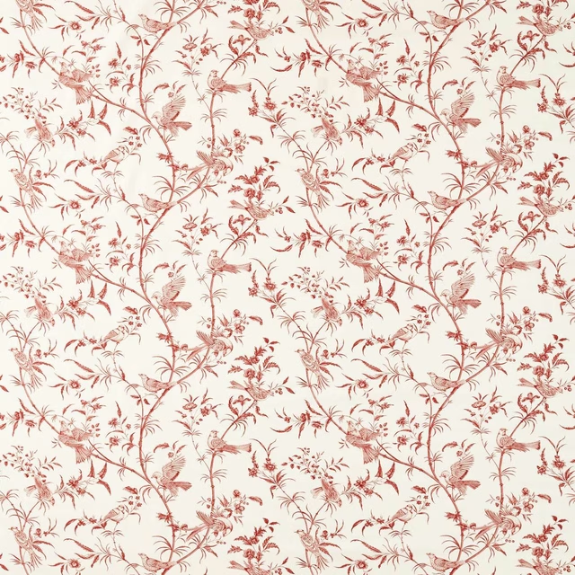
Paradise Woods Toile Madder
Sanderson x National Trust Volume II
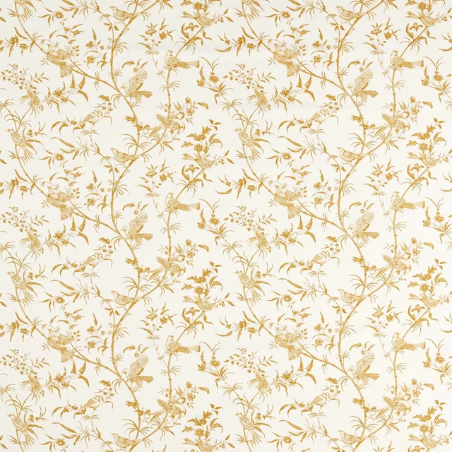
Paradise Woods Toile Mustard
Sanderson x National Trust Volume II
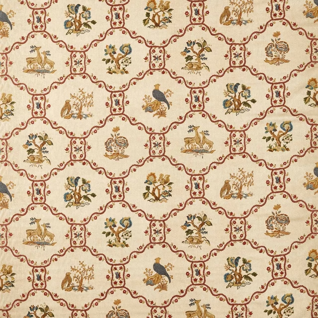
Partridge & Pear Fig/Wheat
Sanderson x National Trust Volume II
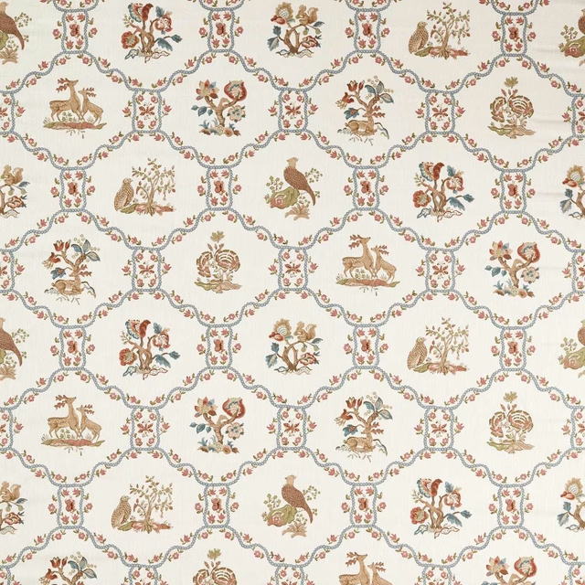
Partridge & Pear Porcelain/Blossom
Sanderson x National Trust Volume II
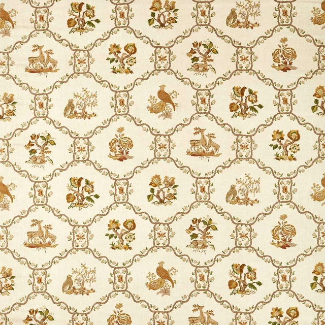
Partridge & Pear Walnut/Harvest
Sanderson x National Trust Volume II
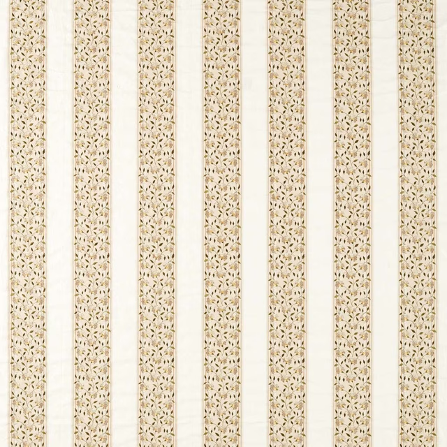
Sloe Blossom Lichen/White Blossom
Sanderson x National Trust Volume II
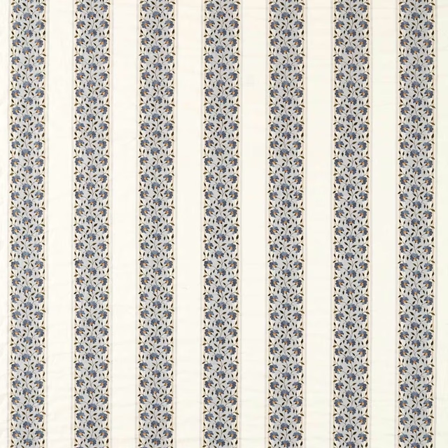
Sloe Blossom Woad/Porcelain
Sanderson x National Trust Volume II
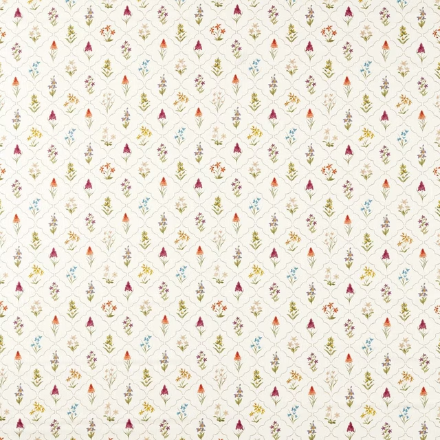
Spring Meadow May
Sanderson x National Trust Volume II
Pairs well with
A pattern needs somewhere for the eye to rest, so these are the plains and textures that sit beside Paradise Woods Toile Woad without fighting it. Mixed across the houses we hold, which is the part a single supplier's book cannot do.

Alaska Navy
Alaska Collection

Alaska Powder Blue
Alaska Collection

Beaux-Arts Nuit
Atelier Fabrics
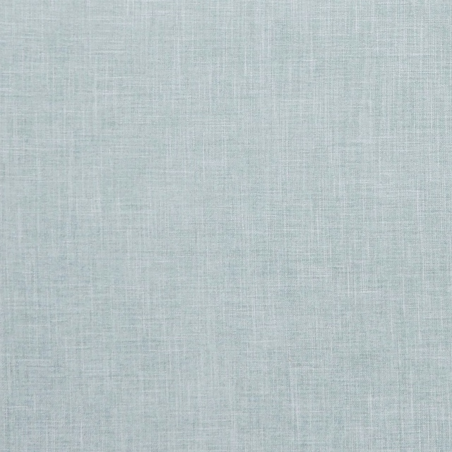
Albany Duckegg
Albany and Moray
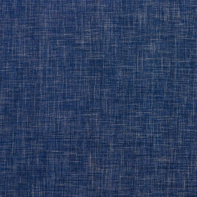
Albany Midnight
Albany and Moray
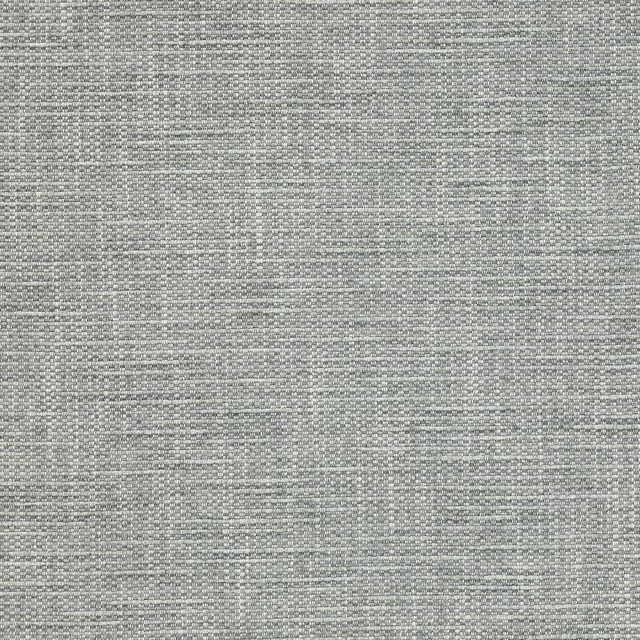
Brandon Aqua
Albeck
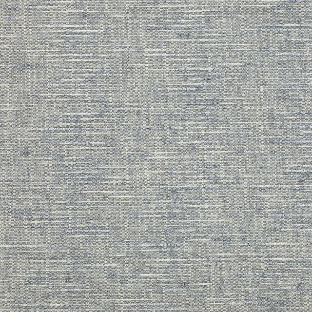
Brandon Blue
Albeck
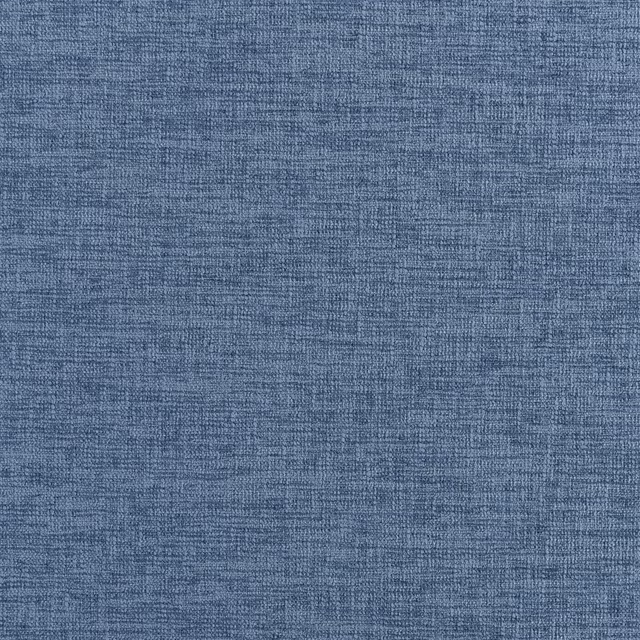
Kalutara Indigo
Ampara Fabrics
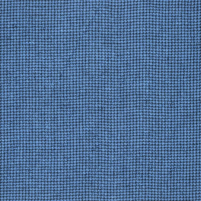
Brera Filato Marine
Brera Filato Fabrics
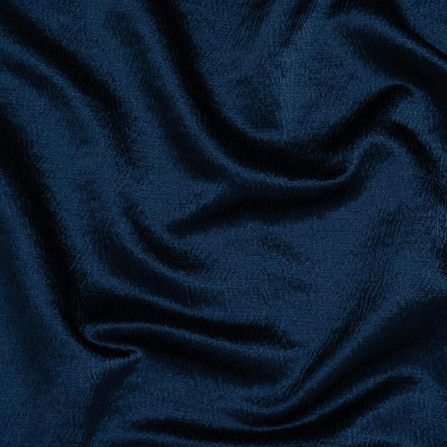
Alchemy Indigo
Alchemy
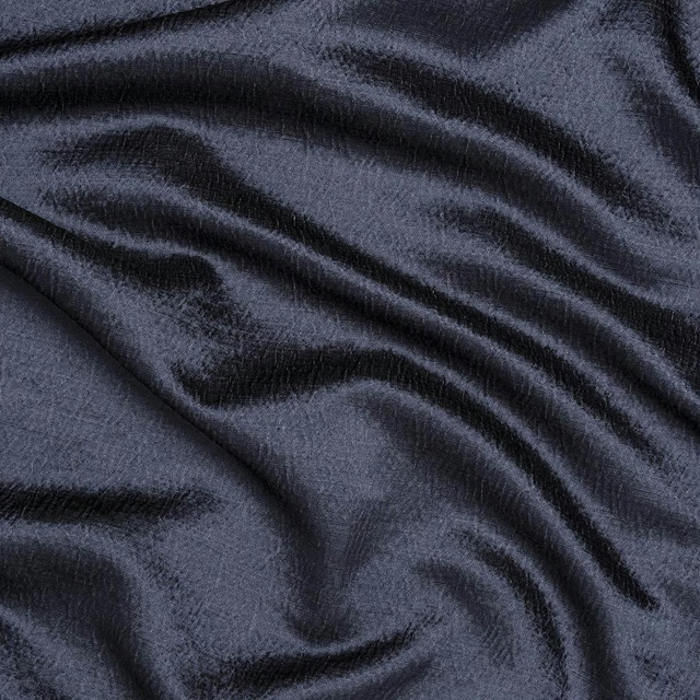
Alchemy Navy
Alchemy
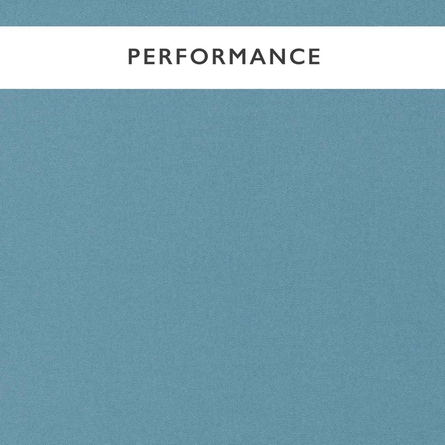
Allegra Atlantic
Allegra
Paint that goes with it
Two ways to take the room. Both colours are from houses we hold, so a pot can come off the same order as the cloth. Screens shift colour, so treat these as a direction and bring the cloth to the shelf before you buy the paint.
To sit quietly behind it
Sweatpants
Coat Paints · #e3e3de
To stand against it
Tivoli
Little Greene · #5c8ea9
Other blue fabrics
Across the houses we hold. See all 7,566.

Regency Aperigon Smog Blue/Linen
Sanderson x Giles Deacon Fabric
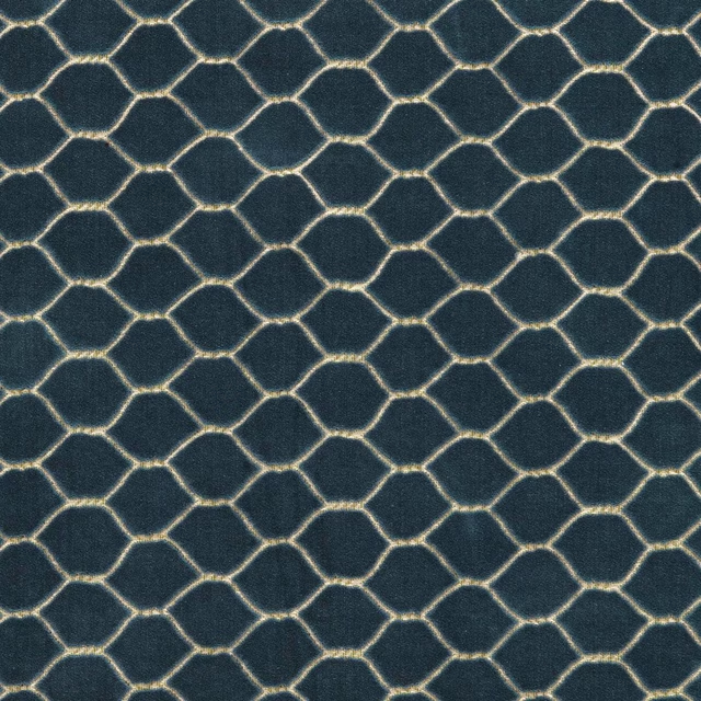
Faraday Velvet Atlantic
Sanderson x Giles Deacon Faraday Velvets
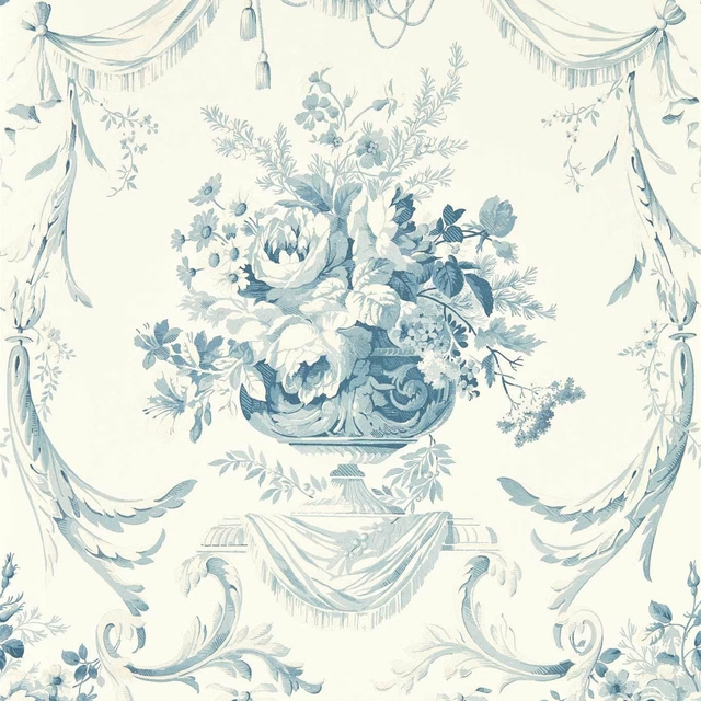
Andromeda`s Cup Olympic Blue
Sanderson x Giles Deacon Wallpaper
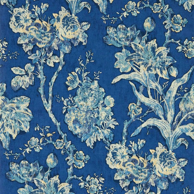
Fringed Tulip Toile Smalt
Sanderson x Giles Deacon Wallpaper
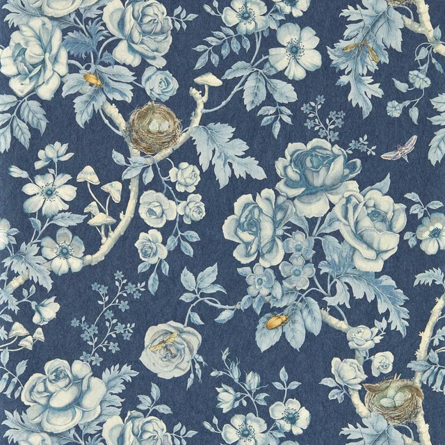
Tansy Bloom Atlantis
Sanderson x Giles Deacon Wallpaper
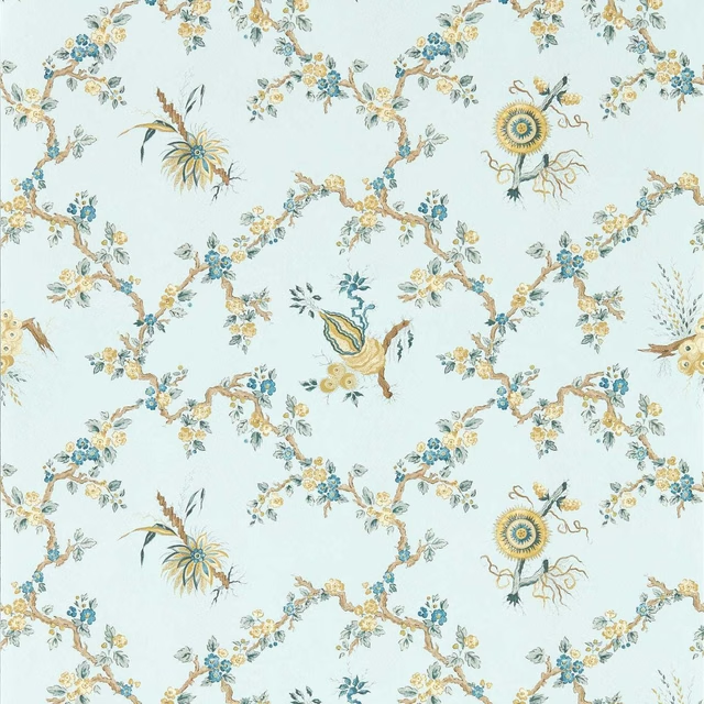
Trelliage Primrose/Danbury
Sanderson x Giles Deacon Wallpaper
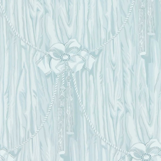
Wilsford Celeste
Sanderson x Giles Deacon Wallpaper
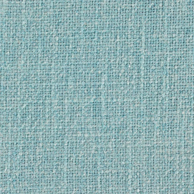
Tuscany Aquamarine
Tuscany II Weaves

Tuscany Cornflower Blue
Tuscany II Weaves
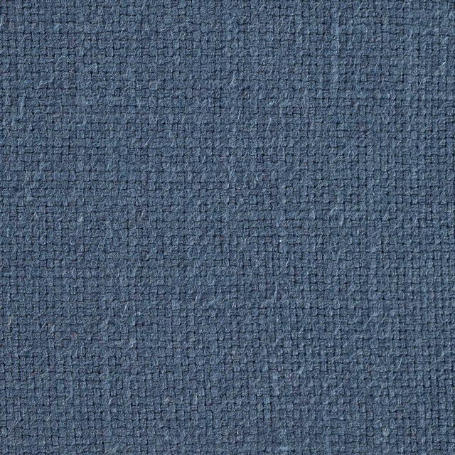
Tuscany Indigo
Tuscany II Weaves
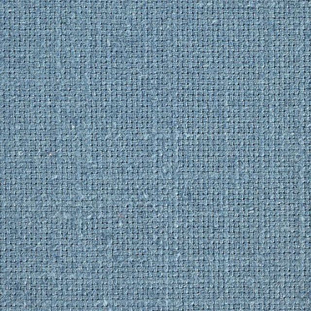
Tuscany II Cobalt
Tuscany II Weaves
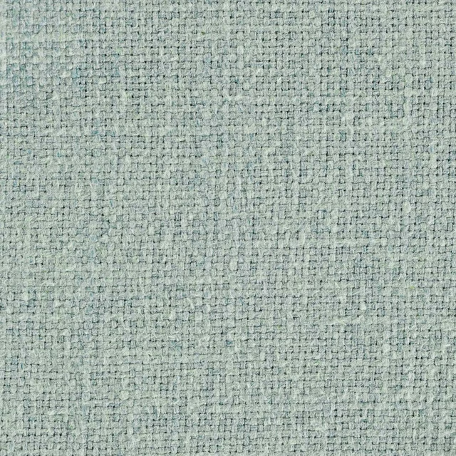
Tuscany II Duck Egg
Tuscany II Weaves