

Tap the swatch to see it full screen. Hover it to magnify the weave. Colours on a screen are a guide, not a match, so come and feel the real cloth.
Scroll up or down to zoom in and out.
Carlyle Soft Red/Teal
Essential Colour III - Colour FabricBF11209.1
Carlyle Soft Red/Teal is a tightly repeated, small-scale woven check where softened red and teal marks sit among cream and warm neutral threads. The close pattern gives the swatch a gently textured, finely grained appearance.
Your board
0 fabrics
See this fabric on GP & J Baker's own site, then order it through us.
About this fabric
The 137 cm (53.82") fabric is composed of 15% linen, 44% viscose, 23% cotton and 18% polyester. Its 11 cm vertical and 9 cm horizontal pattern repeats keep the red-and-teal check orderly and compact across the cloth. With a 31,000 Martindale rub test, it is specified for curtains, loose upholstery, fixed upholstery and bedspreads. Care is professional dry cleaning only: do not wash, bleach or iron.
How to use it
Use this softened red-and-teal colourway to add restrained contrast to a neutral sofa, occasional chair or bedspread, or carry its compact check into curtains for a coordinated room. The cream and warm neutral threads help temper the cooler teal and keep the red feeling muted rather than vivid.
A finely scaled red and teal check that brings gentle colour and woven texture to upholstery, curtains and bedspreads.
More from Essential Colour III - Colour
The same book, other colourways.

Chelsea Check Indigo
Essential Colour III - Colour

Thurloe Plain Aqua
Essential Colour III - Colour

Albermarle Aqua
Essential Colour III - Colour
Daisy Check Olive
Essential Colour III - Colour

Paulton Green/Blue
Essential Colour III - Colour

Portman Aqua
Essential Colour III - Colour

Denbigh Aqua
Essential Colour III - Colour
Airlie Plaid Aqua
Essential Colour III - Colour

Evelyn Aqua
Essential Colour III - Colour
Lansdowne Green/Red
Essential Colour III - Colour
Radnor Aqua
Essential Colour III - Colour
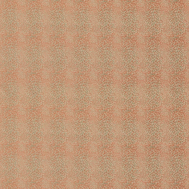
Tavistock Soft Red/Green
Essential Colour III - Colour
Pairs well with
A pattern needs somewhere for the eye to rest, so these are the plains and textures that sit beside Carlyle Soft Red/Teal without fighting it. Mixed across the houses we hold, which is the part a single supplier's book cannot do.
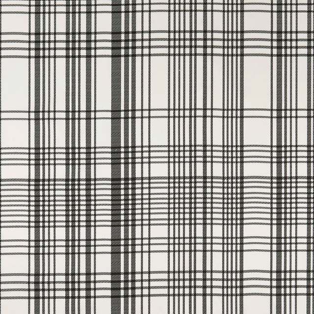
BW1006 Black/White
Black and White

Malindi Mineral/Blush
Breegan Jane x Clarke and Clarke Wallpaper
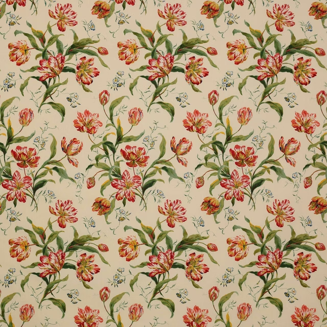
Delft Tulips Pink/Green
C&F Classic Prints
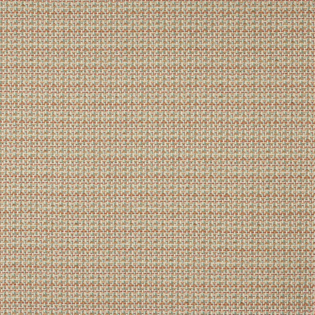
Beal Multi
Pelham

Limosa Loganberry / Papaya / Lagoon
Amazilia Wallpapers
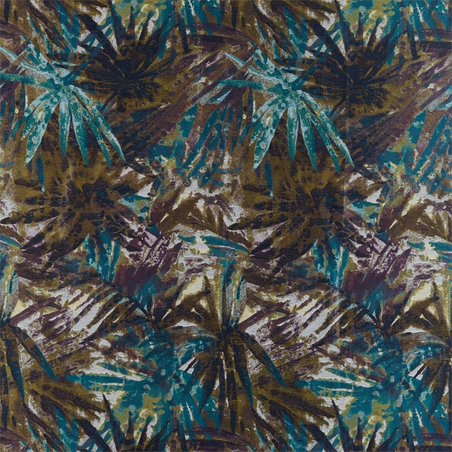
Celadon Marine/Plum/Zest
Atelier Fabrics
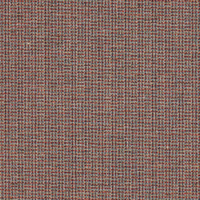
Romey Multi/Indigo
Almora Wvs
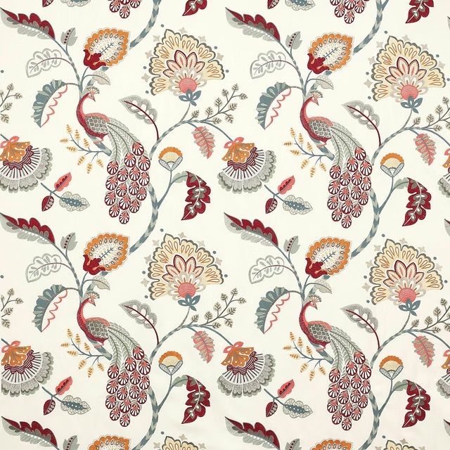
Jaipur Peacock Slate/Red
Azara
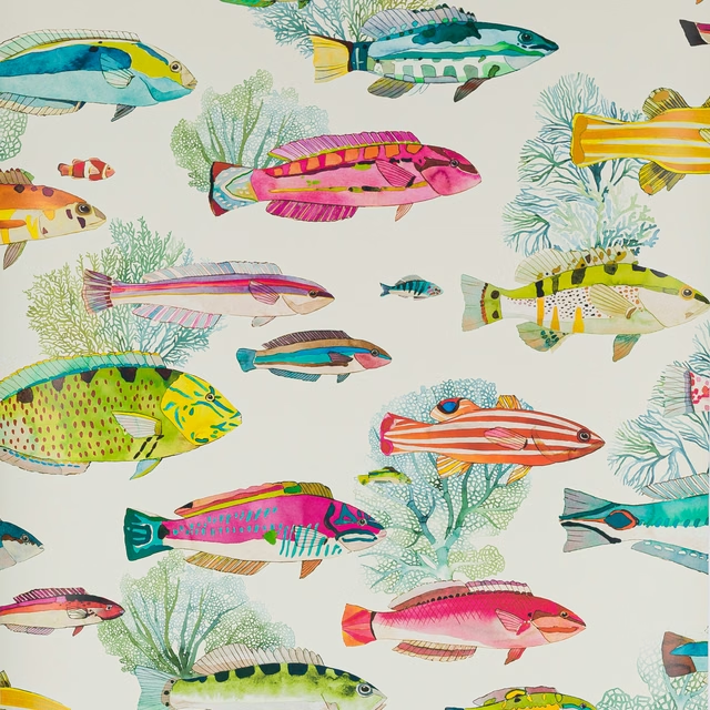
Fidji Wallpaper Corail
Papierspeints Vol 8
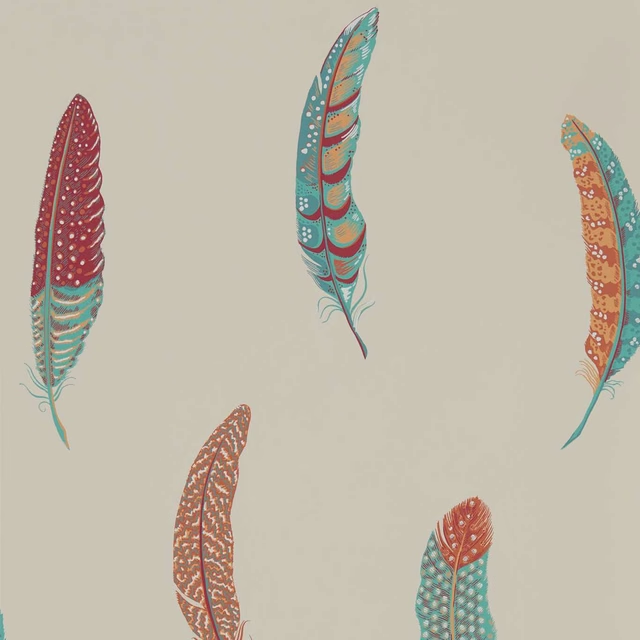
Lismore Russet
Elysian Wallpapers
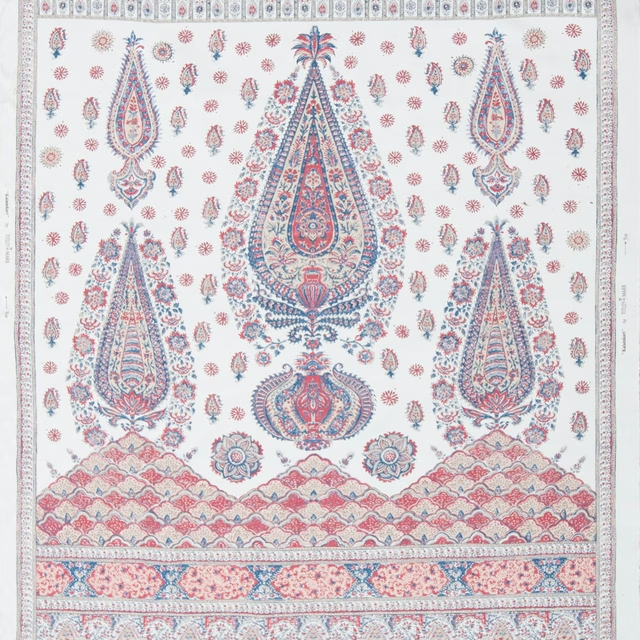
Kalamkari Panel Indigo and Madder
Limited Stock
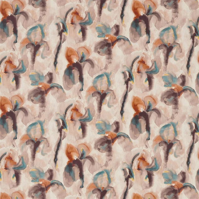
WAter Iris Peacock/Copper
Kensington Walk Fabrics
Paint that goes with it
Two ways to take the room. Both colours are from houses we hold, so a pot can come off the same order as the cloth. Screens shift colour, so treat these as a direction and bring the cloth to the shelf before you buy the paint.
To sit quietly behind it
Gwen
Coat Paints · #bda17e
To stand against it
Amanpuri Red
Sanderson · #7e4043
Other multi fabrics
Across the houses we hold. See all 4,109.
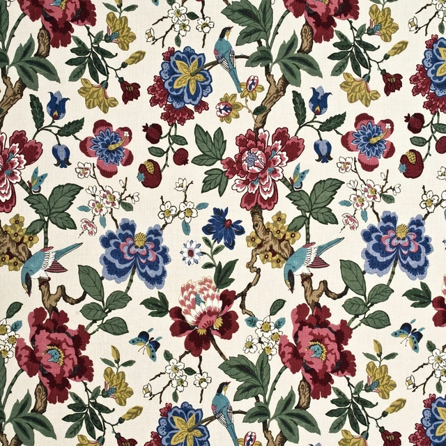
Persian Pomegranate Red/Indigo/Stone
Crayford
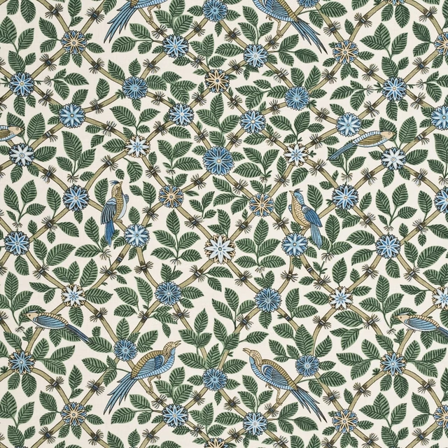
Bamboo Bird Aqua/Teal
Crayford
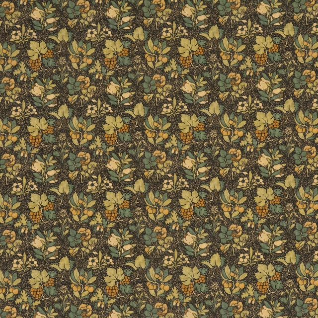
Meadow Fruit Charcoal/Green
Originals V
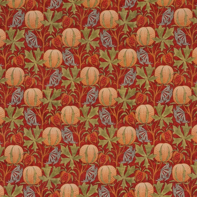
Pumpkins Red/Green
Originals V
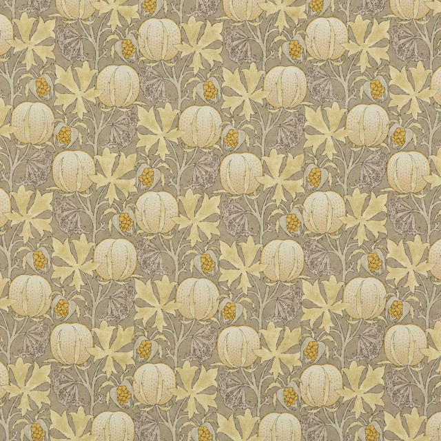
Pumpkins Grey/Ochre
Originals V

Tulip & Jasmine Red/Ochre
Originals V
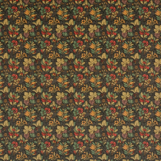
Meadow Fruit Velvet Cinder/Multi
Originals V
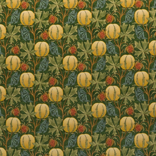
Pumpkins Velvet Green/Terracotta
Originals V
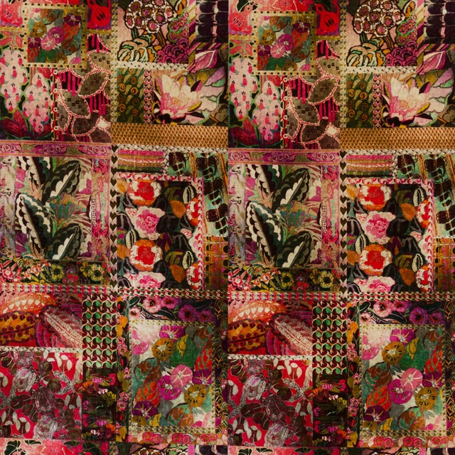
Barcelona Magenta
Rio Velvets
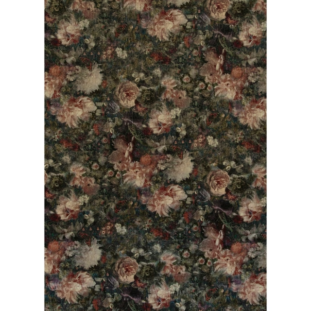
Royal Garden Velvet Quartz
Historic Royal Palaces
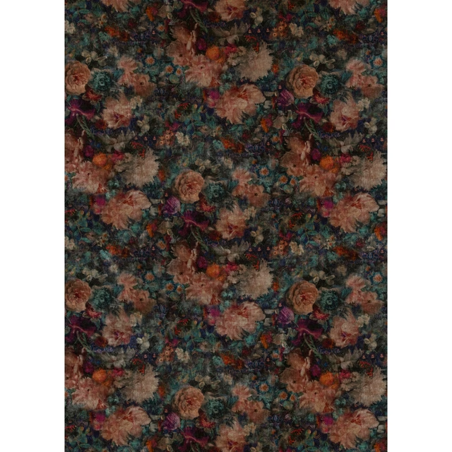
Royal Garden Velvet Jewel
Historic Royal Palaces
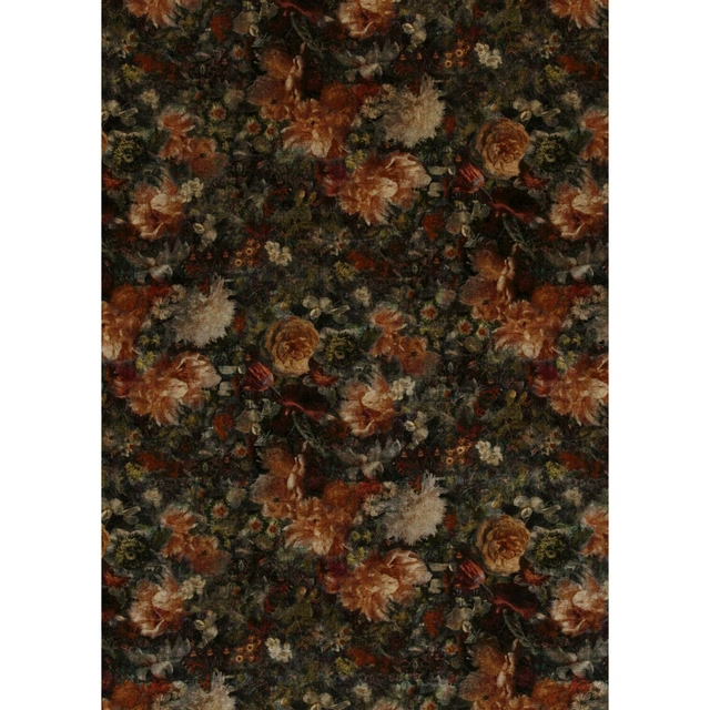
Royal Garden Velvet Amber/Jade
Historic Royal Palaces